
Table of Contents
What makes a successful TV series? An original idea? Good script-writing? Great actors? Being ahead of the times? It’s hard to say. But there is one thing that all hit TV series have in common: they pull viewers into another world. And they start with the opening credits.
Today we’re going to talk about the typographic art and fascinating facts behind some of the most famous TV shows of all time. From the montage that takes us into the town of Twin Peaks to the periodic table of Breaking Bad, via the map of Game of Thrones and the minor typographic masterpiece in Stranger Things (the latter two will return to our screens shortly).
But a word of warning: it’ll be hard to resist binge-watching these shows again once you’ve read this!
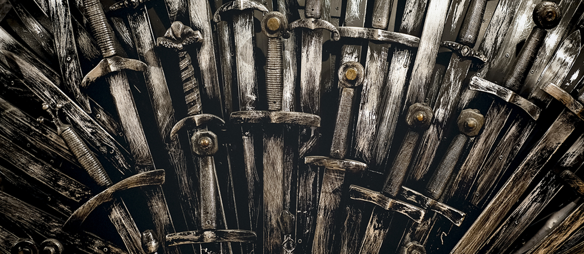
Game of Thrones

Eagerly awaited for months and months, it will finally reach us in April: the eighth and final season of one of the most popular and talked-about TV series of recent times – Game of Thrones.
As you may know, in 2011, the year its first season was aired, Game of Thrones won the Emmy award for best title sequence. But what you probably don’t know is that the titles of one of the most revolutionary fantasy series of all time used a modified version of one of the world’s most common fonts: Trajan.
As its name suggests, the font’s origins lie in the inscription at the base of Trajan’s Column in Rome, erected by Emperor Trajan in the second century AD to celebrate his victory in the Dacian Wars. The modern version of the font was created by designer Carol Twombly who redesigned the typeface in 1989 for Adobe.
Epic, elegant, powerful: perhaps these are the qualities that have led many – perhaps too many – films and blockbusters to use Trajan on their posters and DVD covers (so much so that it’s irritated some in the business). Regardless, the Game of Thrones logo perfectly encapsulates the atmosphere of the series. The updated version of Trajan accentuates the epic nature of the original. It’s no coincidence that the Game of Thrones font has been used several times in political messages by Donald Trump – which hasn’t gone down well with HBO.
Breaking Bad

Released in the US in 2008, the series created by Vince Gilligan remains a high watermark in television thanks to its masterful plot and character development. The story in four words? Someone good turns bad. OK, so maybe it’s not quite that simple, but you get the gist.
The main character’s narrative arc is foreshadowed by the opening credits, with judicious use of two fonts: Arial MT Bold and Bundy.
Arial is one of the most widely distributed fonts in the world (it’s even included with Windows): it features in the Breaking Bad credits as the symbols of two elements from the periodic table (bromine and barium), which are used for the first two letters of the words in the series’ title. Indeed, at the beginning of the series, the main character, Walter White, is a humble chemistry teacher. The Bundy font, which completes the title, shows us how White’s life disintegrates and the dark side of his personality takes over – to the delight of viewers.
Twin Peaks

From one masterpiece to another: Twin Peaks. For many of us, the mere mention of this name sends shivers down the spine.
The opening episode of the cult series created by Mark Frost and David Lynch first aired in the United States in April 1990. The credits feature two unforgettable elements: Angelo Badalamenti’s theme tune and the title lettering. Both have similar characteristics, accentuated by the everyday images in the background: there’s something peaceful and folksy about them, but there’s also something deeply unsettling. The font used for the credits is ICT Avant Garde Gothic. But the acid green outline of the lettering undercuts all the peacefulness conveyed therein.
https://www.youtube.com/watch?v=i7d0Lm_31BE
In an interview, Mark Frost described the first time that he saw the title sequence together with the theme tune created by Lynch and Badalamenti. Stunned, he thought to himself: “This is going to work!”
Stranger Things

We finish with a small masterpiece in graphic design and typography: the Stranger Things credits. No true fan of the series could ever skip them.
And that’s because they do what any great title sequence should: make us forget that we’re in our living room in front of the TV and take us to another world… the sci-fi eighties of Stranger Things!
The typeface used for the actors’ names is ITC Avant Garde (from the same font family used for Twin Peaks, and the similarities don’t end there). As the seconds tick by, the series’ famous logo looms into view. The font used for the title is ITC Benguiat, one of many created by Ed Benguiat, the influential veteran type designer – now 91 – who created over 600 fonts in his career, including the Avant Garde family, and many cinematic fonts, like the typeface used for Planet of the Apes.
The Stranger Things title was created by design agency Imaginary Forces, who were given a very specific brief: to recreate an eighties sci-fi atmosphere which was also modern. To help them, the show’s creators, the Duffer brothers, provided a dozen or so book covers, which included many Stephen King novels.
We all know the end result and we won’t have to wait much longer for the third season, due in July 2019.
What do you think? Which of these four main titles work best?