

Table of Contents
When people talk about typesetting a book, they often picture something purely technical: margins, fonts, page numbers. In reality, typesetting is far more than that. It’s the stage where a text stops being a file and becomes a book—something designed to be read, flicked through and held in the hand.
Good typesetting doesn’t demand attention. You don’t “see” it. You feel it: in the ease of reading, the visual comfort, the way your eye naturally follows the text from page to page. Bad typesetting, by contrast, tires the reader, distracts them and quickly signals an amateur approach—even when the content itself is strong.
This guide is designed to provide context, method and confidence for anyone typesetting a book for the first time, while also clarifying technical details that are useful even if you already have some experience.
What it really means to typeset a book
Typesetting a book means organising content on the page according to a clear editorial logic. It isn’t simply an aesthetic exercise, and it isn’t the same as writing or editing the text.
When you typeset, you make decisions that affect:
- long-term readability
- reading rhythm
- perceived quality
- how smoothly the book can be produced for print
A novel, an essay or a manual isn’t read like a web page. The physical format brings its own rules—refined over time by traditional publishing. Ignoring them doesn’t make you “modern”; it usually leads to an uncomfortable, unprofessional result.

Before you start: how a printed book “thinks”
One of the most common mistakes is opening Word or InDesign without first clarifying a few fundamentals. A printed book has a physical reality that influences every typesetting choice.
Trim size isn’t a detail
Your book’s trim size determines:
- how much text fits on a page
- line length
- how much “breathing room” the text has
Oversized formats can make reading feel scattered; very small formats compress the content. Standard publishing sizes aren’t a creative limitation—they’re the result of decades of experience in legibility.
Page count matters more than you think
Page count affects binding, spine thickness and inner margins. A slim book and a hefty one are not typeset in the same way. Leaving page count to the end often means having to redo work.
Print and digital are not the same
A book designed for print must respect specific physical constraints. Even if you later publish the same content digitally, print typesetting remains the most demanding—and the one that requires the most care.
The grammar of typesetting: an essential glossary
Before we get practical, it helps to clarify the key elements that make up a book layout. These concepts recur throughout the guide; understanding them upfront makes the whole process easier to follow.
Book trim size
The final size of the printed page. Trim size determines text proportions, line length and how the reader experiences the book in their hands. Every later decision depends on it.
Margins
The white space around the text within the page. Margins don’t exist just to “frame” content; they underpin readability and visual comfort. In particular, the inner margin must account for binding so the text doesn’t sit too close to the spine.
Text block (type area)
The area of the page where the text actually sits. It defines where content “lives” inside the margins and sets the visual rhythm. A well-designed text block supports reading without drawing attention to itself.
Typography
The set of decisions about text: typeface, font size, leading (line spacing) and line length. Typography directly affects readability and reading pleasure, especially in long texts.
Book structure
The organisation of the book’s component parts: chapters, paragraphs, prelims, pagination and—if used—running heads. Clear structure helps readers navigate and gives the project order.
Bleed
Extending images or colour beyond the final trimmed edge. It’s only needed when elements run to the page edge and is tied to print production.
Print-ready file
The final document, usually a PDF, containing the correct production settings. Even a well-designed layout can fail if the file isn’t prepared properly for print.
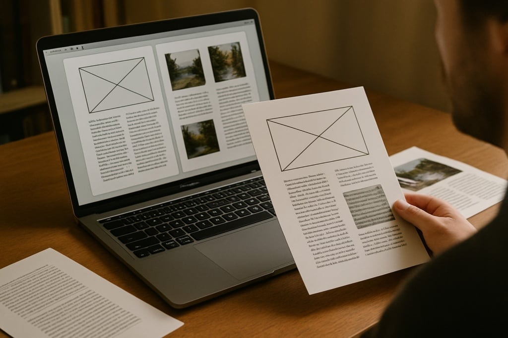
The page: margins, text block and white space
When you flick through a well-made book, the text seems to sit “exactly where it should”. That balance comes from careful management of space.
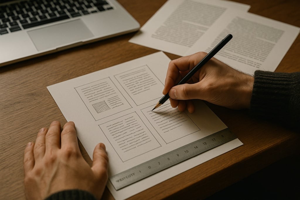
The text block: the heart of the page
The text block is the area that contains the text. It isn’t the same as the page size; it’s the zone where the eye can move comfortably.
If it’s too wide, the text pushes towards the margins and the lines become overly long, making reading tiring.
If it’s too narrow, lines become too short and the eye is forced into constant returns, breaking the rhythm.
A well-designed text block keeps the text in a balanced area of the page, supporting the reading experience without competing with the content.
Inner margin and binding: an expensive mistake
The inner margin, closest to the spine, must be wider than the others. When the book is bound, part of the page is inevitably “swallowed”.
If the inner margin is too tight, readers have to force the book open to read comfortably. It’s one of the most common self-publishing mistakes—and an early sign of inexperienced layout.
White space isn’t wasted space
In publishing, white space is part of the design. It gives the text room to breathe, separates content and guides the eye. Filling every centimetre doesn’t make a book feel richer—it makes it harder to read.
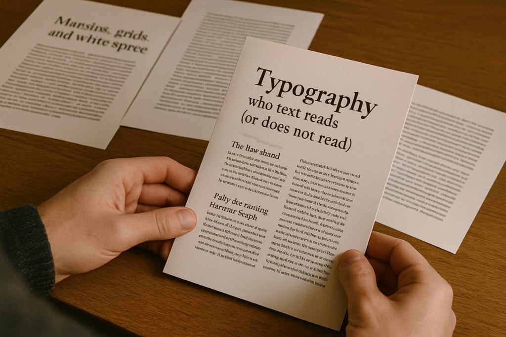
Typography: why text reads well (or doesn’t)
Typography is often underestimated, yet it’s one of the most delicate parts of typesetting.
A good typeface shouldn’t shout
A typeface suited to continuous reading is designed to “disappear”. It should be balanced, with clearly distinguishable letterforms and a design that doesn’t tire the eye over many pages.
Overly decorative fonts—or fonts intended for screen use—can work for headings or short passages, but they become a problem in long-form book text.
Font size, leading and line length
Readability comes from balancing:
- font size
- leading (line spacing)
- line length
When any one of these is out of scale, reading slows down. Readers may not be able to explain why—but they feel it.
Paragraphs and indents: a visual grammar
In books, paragraphs are usually indicated with a first-line indent rather than extra space between paragraphs. It’s a long-standing editorial convention that keeps pages compact and orderly. Mixing approaches creates visual noise.
Book structure: order, rhythm, consistency
A book isn’t a single flow of text. It’s an organised sequence of parts.
Prelims
Title pages, copyright page (colophon) and introductory pages follow established conventions and don’t belong to the main text flow. Treat them as separate sections—especially for pagination.
Chapters
Each chapter starts on a new page. This isn’t purely aesthetic; it helps readers navigate. Pushing text down with manual line breaks is a common mistake when you’re not working with styles and structure.
Pagination and running heads
Page numbers aren’t a trivial detail. They should be consistent, discreet and placed in the same position throughout. Running heads, when used, help orientation but should be handled with restraint. Running heads are short lines of text at the top of the page, typically showing the chapter title or author name, to help readers navigate.
Practical baseline settings for a standard book layout
If you’re starting from scratch, having solid reference values matters. The settings below provide a neutral, professional baseline for most novels and non-fiction. They’re not absolute rules—rather, reliable starting points for a clean, readable layout.
Page size (trim size)
Two widely used publishing sizes are:
- A5 (148 × 210 mm)
- 13 × 20 cm
Both balance handling, line length and reading comfort. For a first layout, it’s sensible to start with a standard size before exploring more unusual formats.
Margins (indicative values)
In a bound book, margins shouldn’t all be the same. A sensible starting point is:
- Inner margin: 2.5–3 cm
- Outer margin: 2–2.2 cm
- Top margin: 2–2.5 cm
- Bottom margin: 2.5–3 cm
A wider inner margin compensates for binding; a slightly larger bottom margin often improves visual balance.
Text block
With the margins above, the text block sits comfortably on the page and avoids lines that are too long or too short.
In practical terms, aim for a line length of roughly 55 to 70 characters (including spaces), which supports fluent, continuous reading.
Typeface and body text size
For a “standard” book, start with a typeface designed for continuous reading, avoiding decorative or highly stylised fonts.
Two widely used, dependable choices for book projects are:
- Garamond
A classic serif widely used in publishing: balanced, highly readable for long texts, with a discreet, traditional tone—well suited to fiction and conventional non-fiction. - Minion Pro
A modern publishing standard: versatile, very readable, and specifically designed for long-form text. It works well across formats and remains clean and neutral.
As a guide:
- Body text size: 10.5–11.5 pt (depending on the typeface and trim size)
pt stands for point (typographic point).
It’s the unit used in typography to indicate font size and other text measurements.
Always validate the final choice by printing a few test pages: what reads well on screen doesn’t always read the same on paper.
Leading
Leading is one of the biggest drivers of reading comfort. A reliable baseline is:
- leading of 1.3–1.5× the body text size
For example:
- 11 pt body text → 14–15 pt leading
Too tight feels tiring; too loose breaks rhythm.
Paragraphs and first-line indents
A common book convention is:
- first-line indent: 4–6 mm
- no extra space between paragraphs
Don’t indent the first paragraph after a heading or at the start of a chapter. The key is to pick a rule and apply it consistently throughout.
A final note
These settings aren’t meant to “finish” the layout—they’re meant to start well. From this baseline, editorial work continues by fine-tuning proportions, spacing and typographic choices to suit the text, the audience and the desired reading experience.
Which software should you use to typeset a book?
Choosing software isn’t about “status”—it’s about fit for purpose. Word and InDesign serve different needs and demand different approaches. More important than picking the “right” tool in abstract is working with a clear method.
Below are two mini-guides offering a practical, usable workflow for each tool.
Typesetting a book in Word: a practical method to stay in control
Word can be a workable option for book typesetting, provided you recognise its limits and work methodically. It suits linear text and simple structures, but it becomes difficult to manage if you improvise.

1.Set up the document before touching the text
Start by defining the core document settings before you edit content: trim size/page size, margins and facing pages view. In particular, allow a wider inner margin for binding; changing this late often forces a rethink of the whole layout.
2.Use styles as the backbone
Styles are the foundation of Word book layout. Body text, chapter titles, subheadings and quotations should be handled through styles. This keeps the design consistent and makes global changes possible without endless manual fixes. Working without styles—especially in long documents—almost always leads to chaos.
3.Manage chapters, page breaks and pagination properly
Build structure rigorously. Each chapter should start with a page break, not manual line breaks. Set up pagination by treating prelims differently from the main text. These decisions prevent ordering issues and keep the document stable.
4.Final checks and export
Before exporting the final PDF, check margins, alignment, consistent styles and the absence of manually inserted indents or spacing. Word can produce respectable results, but once the document grows or you need fine typographic control, its limits become clear.
Typesetting a book in InDesign: how to set up the project correctly
InDesign is built for editorial layout and handles complex books with order and reliability. That’s why the most important phase is setting the project up correctly from the start.
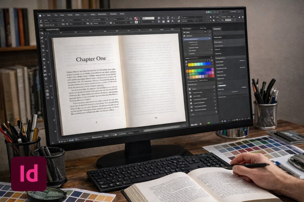
1.Define trim size, margins and text block
Begin by creating the document with precise trim size, margins and type area. InDesign gives far finer spatial control than Word and makes page balance immediately visible.
2.Build master pages
Master pages manage repeating elements such as page numbers and running heads. Setting them up properly ensures consistency across the book and enables global changes without repetitive manual work.
3.Control text with styles
In InDesign, paragraph and character styles aren’t optional. Every textual element should be governed by a style. This approach preserves order, typographic consistency and control—even in long, complex projects.
4.Handle long books and prepare the print-ready file
As the project grows, InDesign stays stable and controllable. It’s ideal for multi-level headings and structured content. Preparing the print-ready file becomes a phase of checking and refining, rather than emergency correction.
Templates: a shortcut to use with care
Templates can be a helpful starting point, especially early on. But they don’t replace understanding layout rules. Always review margins, text block, styles and pagination: a mistake in a template is repeated throughout the entire book.
From file to printed book: when typesetting is truly finished
Typesetting is complete only when the file is print-ready. That means checking:
- correct page size
- margins that suit the binding
- bleed only when necessary
- a consistent, orderly structure
- correct PDF export settings
Many issues appear at this stage. That’s why it pays to think about print from the start—not as the final step.
The most common mistakes (and why they happen)
Most mistakes come from a false sense of simplicity: “it’s only text.” In reality, text—without obvious graphic elements—reveals every imperfection.
Wrong margins, unsuitable typefaces, inconsistent spacing and excessive manual tweaks are typical signs of improvised layout. Avoiding them doesn’t require genius—just method and judgement.
Typesetting a book is an editorial act
Typesetting isn’t about applying rules by rote. It’s about understanding how a book works as an object designed to be read, respecting that logic and translating it into concrete choices.
Whether you’re working on your first book or a more complex project, the goal is the same: make the text readable, credible and ready for print. When the layout works, readers don’t notice it—and that’s exactly how you know you’ve done a good job.