
Table of Contents
The world of colors is not just vibrant and diverse but also deeply interconnected through relationships that define how colors interact, blend, and contrast with each other. At the heart of this colorful interplay are the secondary colors – a trio that includes orange, green, and purple. These hues emerge from the mixing of the primary colors: red, blue, and yellow, which are considered the building blocks of the color spectrum. Understanding secondary colors is not just about knowing how to mix paint on a palette; it’s about grasping the fundamental principles of color theory that apply to a wide range of fields, from art and design to fashion and interior decorating.
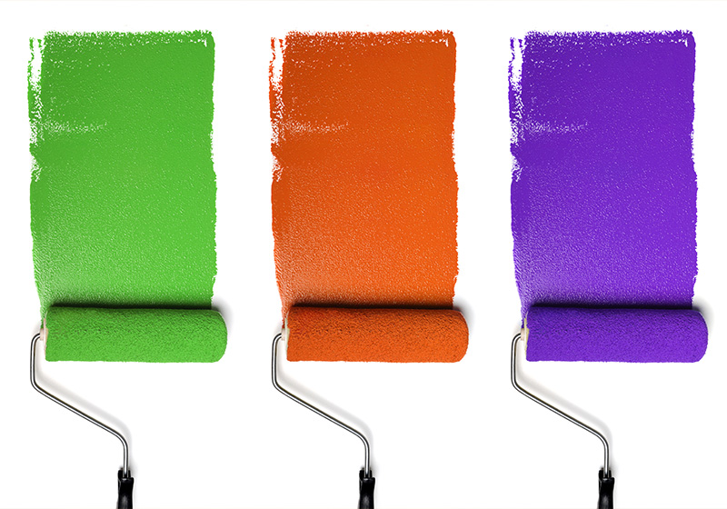
Secondary colors hold a special place in both the color wheel and color theory because they bridge the gap between the primary colors, creating a more complex and nuanced palette. Each secondary color is made by combining two primary colors in equal parts:
– Orange is created by mixing red and yellow.
– Green results from blending blue and yellow.
– Purple (or violet) is the product of mixing red and blue.
This simple act of mixing opens up a whole new dimension of color possibilities and is a testament to the dynamic and transformative nature of colors. Through the lens of secondary colors, we can explore deeper aspects of color harmony, contrast, and the emotional impact of colors. Furthermore, secondary colors play a crucial role in creating tertiary colors, which are formed by mixing a primary color with a neighboring secondary color, thus expanding the color wheel even further.

In the following sections, we’ll delve into each secondary color in more detail, exploring their creation, significance, and application in various contexts. By understanding secondary colors, we unlock a deeper appreciation for the beauty and complexity of the world around us, rendered in an endless spectrum of hues.
Meaning and Application of Secondary Colors
The meaning and application of secondary colors in various fields are as rich and varied as the colors themselves. Each color carries its own set of associations and can be used strategically to convey specific messages, evoke emotions, or create visual impact. Here’s a closer look at the meaning behind each secondary color and how they’re applied across different domains:
Orange
Meaning: Orange combines the energy of red and the happiness of yellow, resulting in a color that is associated with enthusiasm, creativity, and warmth. It stands for adventure, optimism, and confidence. In many cultures, orange also represents autumn and harvest.
Applications:
– Design and Marketing: Often used to grab attention and create a call to action because of its visibility and vibrancy. It’s popular in children’s products and creative industries.
– Fashion: Adds a bold, energetic touch to outfits, often used for statement pieces or seasonal collections.
– Interior Decorating: Warm tones of orange can create a cozy, welcoming atmosphere in living spaces.

Green
Meaning: Green is the color of nature, symbolizing growth, harmony, and freshness. It has a calming effect, often associated with safety and stability. In addition, green represents prosperity and health, reflecting its deep ties to the natural world.
Applications:
– Environmental Initiatives and Brands: Used to signify eco-friendliness and sustainability, appealing to environmentally conscious consumers.
– Healthcare and Wellness: Green’s calming and restorative properties make it a popular choice in spaces dedicated to health and well-being.
– Provides a background that conveys balance and harmony, used in spaces aiming for a natural, calming vibe.
Purple
Meaning: Purple is a color that combines the stability of blue and the energy of red. It symbolizes luxury, power, and nobility but also represents mystery, magic, and spirituality. Historically, it was a color of royalty and wealth, due to the rarity and cost of purple dye.
Applications:
– Branding and Luxury Goods: Often used in branding to convey luxury, sophistication, and exclusivity.
– Creative Fields: Purple is used to stimulate imagination and inspire creativity, making it a favorite in artistic and design-oriented projects.
– Interior Design: Deep purples are used to create a luxurious, dramatic effect, while lighter lavenders can have a calming, restorative quality.
The strategic application of secondary colors can significantly impact how a message is received, the atmosphere of a space, or the appeal of a product. By understanding the psychology and associations of these colors, designers, marketers, and artists can harness their power to achieve specific objectives, whether it’s capturing attention, conveying a brand identity, or creating a desired mood.

Conclusions
The exploration of secondary colors reveals a fascinating intersection of art, science, and psychology, where color theory meets practical application. Orange, green, and purple—each born from the union of primary colors—carry deep symbolic meanings and exert significant influence in various domains, from design and marketing to fashion and interior decorating. These colors do more than just beautify; they communicate, evoke emotions, and even affect decisions. Here are some key takeaways from our journey through the world of secondary colors:
Versatility and Meaning: Secondary colors are incredibly versatile, each possessing unique meanings and associations that can be leveraged in countless ways to achieve different objectives. Whether it’s the warmth and creativity evoked by orange, the balance and growth symbolized by green, or the luxury and mystery associated with purple, these colors have the power to convey complex messages and feelings.

Strategic Application: Understanding the psychological impact of secondary colors allows professionals across various fields to use them strategically. In marketing, design, and fashion, colors are chosen not just for their aesthetic appeal but for their ability to convey specific messages and evoke desired responses from the audience.
Cultural and Contextual Sensitivity: The meaning of colors can vary significantly across different cultures and contexts. Awareness and sensitivity to these nuances are crucial for effective communication and design. What works in one context may not have the same effect in another, underscoring the importance of research and adaptation.
Foundation for Further Exploration: Secondary colors are just one part of the vast and intricate world of color theory. They serve as a foundation for exploring tertiary colors and beyond, offering endless possibilities for creativity and expression.
In conclusion, secondary colors play a pivotal role in our visual and psychological landscapes. They enrich our lives, enhance our environments, and enable us to communicate in more profound and impactful ways. As we continue to explore and understand the complexities of color, we unlock new potentials for innovation, expression, and connection. The study of secondary colors is not just an academic exercise but a gateway to a more colorful and meaningful engagement with the world around us.