
Table of Contents
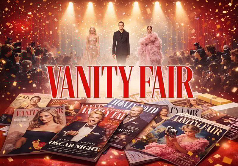
If you still browse newsagents, one magazine will catch your eye out with its promise of luxury and celebrity, intrigue and wit: Vanity Fair. Its covers adorned with famous figures and spicy quotes always stand out.
Filled with sharp and spirited interviews as well as glitzy and entertaining photoshoots, this iconic title is a sophisticated mouthpiece for the world of show business and celebrity. Vanity Fair is the magazine that invented a new publishing language by blending the morbid curiosity of Andy Warhol’s Interview Magazine with the luxurious glamour of Vogue.
In this article, we break down Vanity Fair‘s graphic identity and see how it has evolved in the wake of closure and relaunch.
Born twice, 70 years apart
In 1848, William Makepeace Thackeray published Vanity Fair: A Novel Without a Hero. In it, the author mocked Victorian society in Britain, painting a picture of rampant ambition, blatant opportunism and ruthless social climbing. In 1913, across the Atlantic, American publisher Condé William Nast borrowed the title for a magazine. Nast had just bought Vogue in 1909 and now wanted to relaunch Dress, the men’s fashion magazine he also owned. He initially rebaptised it Dress & Vanity Fair, but wisely shortened the title to just Vanity Fair four issues later.
With its first-class coverage of the arts and profiles of the great and the good, Vanity Fair fast became essential reading for the establishment. But, despite reaching a peak in circulation, ad revenue plummeted during the Great Depression. Deciding the title was no longer viable as a standalone publication, Condé Nast merged Vanity Fair with Vogue in 1936. It wasn’t until 1983 that the magazine was relaunched in its current guise.
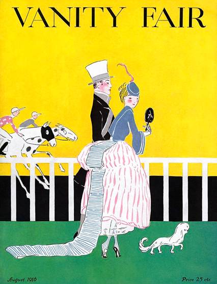
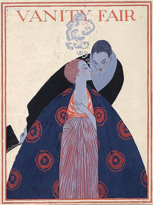
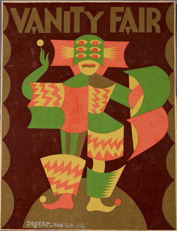
A showcase for art deco illustration (1913–1936)
In its first incarnation, Vanity Fair‘s graphic design was heavily influenced by art deco: luxury, symmetry and elegance were the bywords. It captured some of the same Jazz Age zeitgeist immortalised by F. Scott Fitzgerald in The Great Gatsby.
At the time, covers carried elegant illustrations while photographs only appeared inside. The magazine’s success was rapid. Just two years after the relaunch, it published more ad pages in a year than any other title in the United States. For an artist, publishing illustrations in Vanity Fair was a big deal. It commissioned illustrations, caricatures, drawings and cartoons from leading artists, creating a sort of catalogue of the best art deco illustration: elegant, aloof and witty.
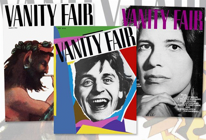
When Vanity Fair disappeared from newsstands in 1936, it left a void in the American magazine landscape. For almost 50 years, the title remained mothballed in the Condé Nast archives. Then, one day in 1983, new editor S.I. Newhouse had an idea: why not revive the brand and turn it into a blend of pop culture, investigative journalism and glamorous fashion? It was a formula nobody had offered before, but many would soon imitate.
The magazine that chronicled Reagan-era hedonism
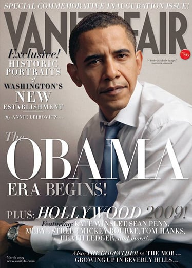
While The New Yorker serves up high-brow long-form journalism and Vogue showcases the elegance and opulence of high fashion, Vanity Fair lets readers get up close and personal with celebrities through interviews and photoshoots. That’s its hallmark: credible and compelling portraits that draw back the curtain on the stars.
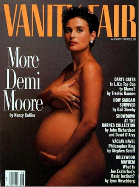
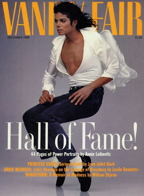
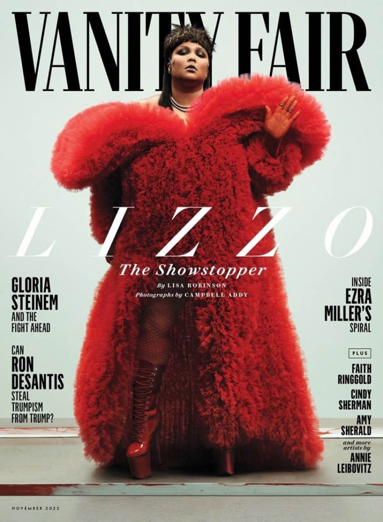
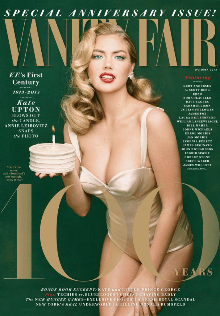
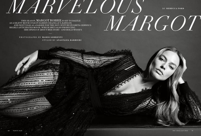
Covers by Annie Leibovitz, for example, have created cultural moments etched in the collective memory. Since the nineties, Leibovitz has created some of the magazine’s most memorable front pages: Demi Moore pregnant and naked; Hillary Clinton as a mixture of authority and fragility; and Caitlyn Jenner sporting a revealing bustier in her first photoshoot as a women.
And Leibovitz followed in the footsteps of other giants of photography like Herb Ritts and Helmut Newton.
Vanity Fair established itself as a promotional vehicle for celebrities and a gatekeeper for the A-list.
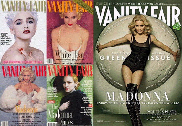
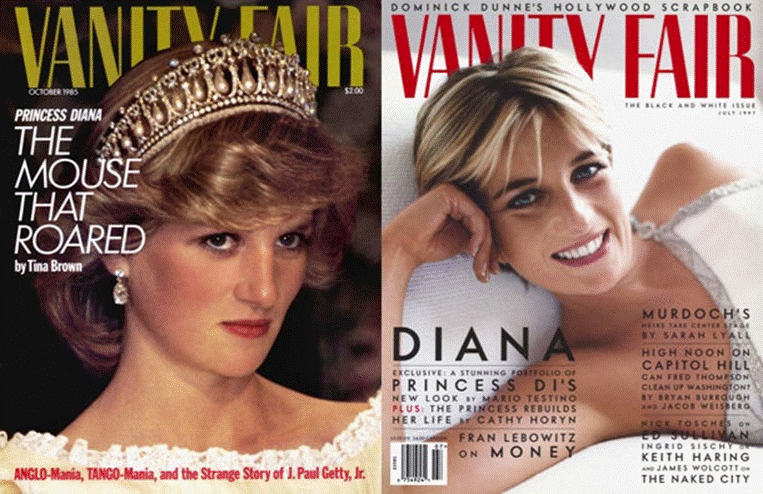
Madonna would feature on five covers over the years, Princess Diana two.
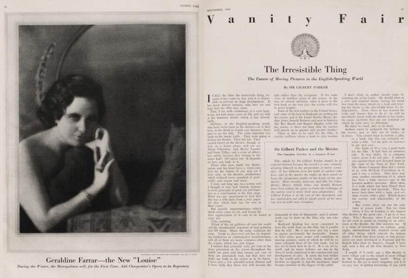
Photos take centre stage within, where they contrast with neat columns of text. Most inside photos have a white background or are cutouts – only a few enjoy a full page and background. There is clear artistic direction behind the visual storytelling. Wardrobe credits are given for the clothes worn by celebrities, just like in fashion magazines, except that here the people shown aren’t anonymous models but household names.
Graphic design for portraits of people
Graphic design in Vanity Fair has always put photographs front and centre. Slightly smaller than a fashion title and slightly larger than a news magazine, Vanity Fair‘s 203 × 276 mm format is easy to hold and flick through. It’s the classic Condé Nast “consumer magazine” size optimised for printing and binding.
When Vanity Fair returned in the eighties, the masthead sported an art deco-style typeface. This got a makeover in 2000 when the magazine adopted a bespoke geometric font, VF Sans, designed by James Montalbano of Terminal Design. Montalbano was inspired by thirties design and this influence can be seen most clearly in the sharp points of the letters “V”, “A” and “N”.
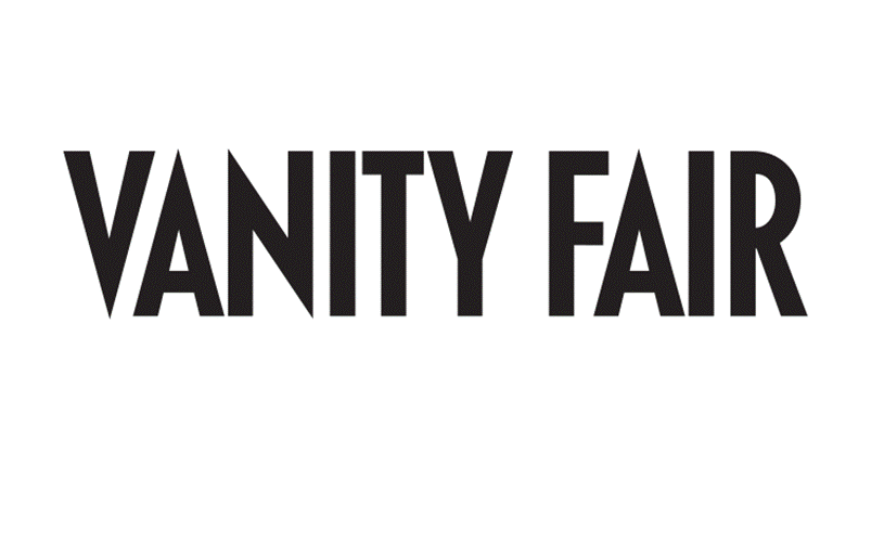
From 2011 this iconic font was joined on the cover by a splendidly refreshed Didot, the elegant 17th-century font that served as the display typeface for over 20 years.The redesign work was done by Commercial Type. A few years later, in 2013, the masthead switched to the one we know today, with its alternating thick and thin strokes.
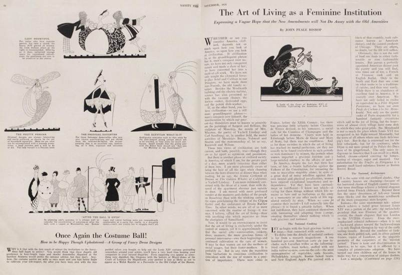
Inside, apart from special pages like Vanities and Agenda, a simple three-column layout is used.
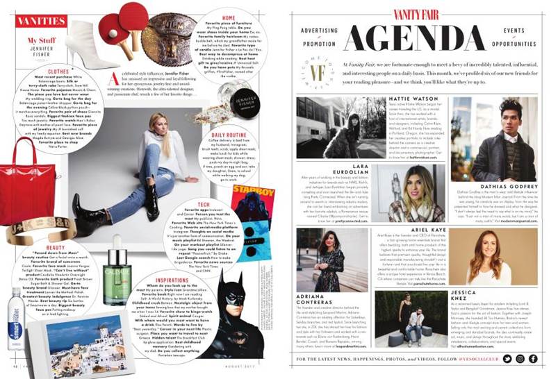
Illustrations and infographics are used sparingly so as not to dilute the glitz and glamour of the publication, which remains celebrity centric. Portraits are often commissioned, including caricatures.
An icon of global magazine publishing
Everyone’s heard of Vanity Fair – it’s sold across the globe (the magazine boasts four international editions). Its success proves there’s hunger for quality journalism centred on the seemingly superficial world of fashion and showbusiness. Its coverage of celebrity is sharp and never too fawning. The photography is always first class and the graphic design measured and functional. And the magazine’s covers have a knack for showing famous figures in a new and revealing light.
With its curious origins, past glory and present ability to capture the spirit of the times, Vanity Fair is a must-read for thinking fans of celebrity culture. And for graphic designers, it offers a masterclass in the use of fonts in magazine publishing.
Long may the fair continue!