
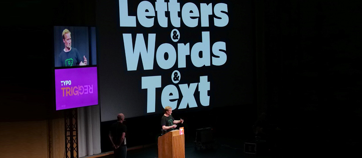
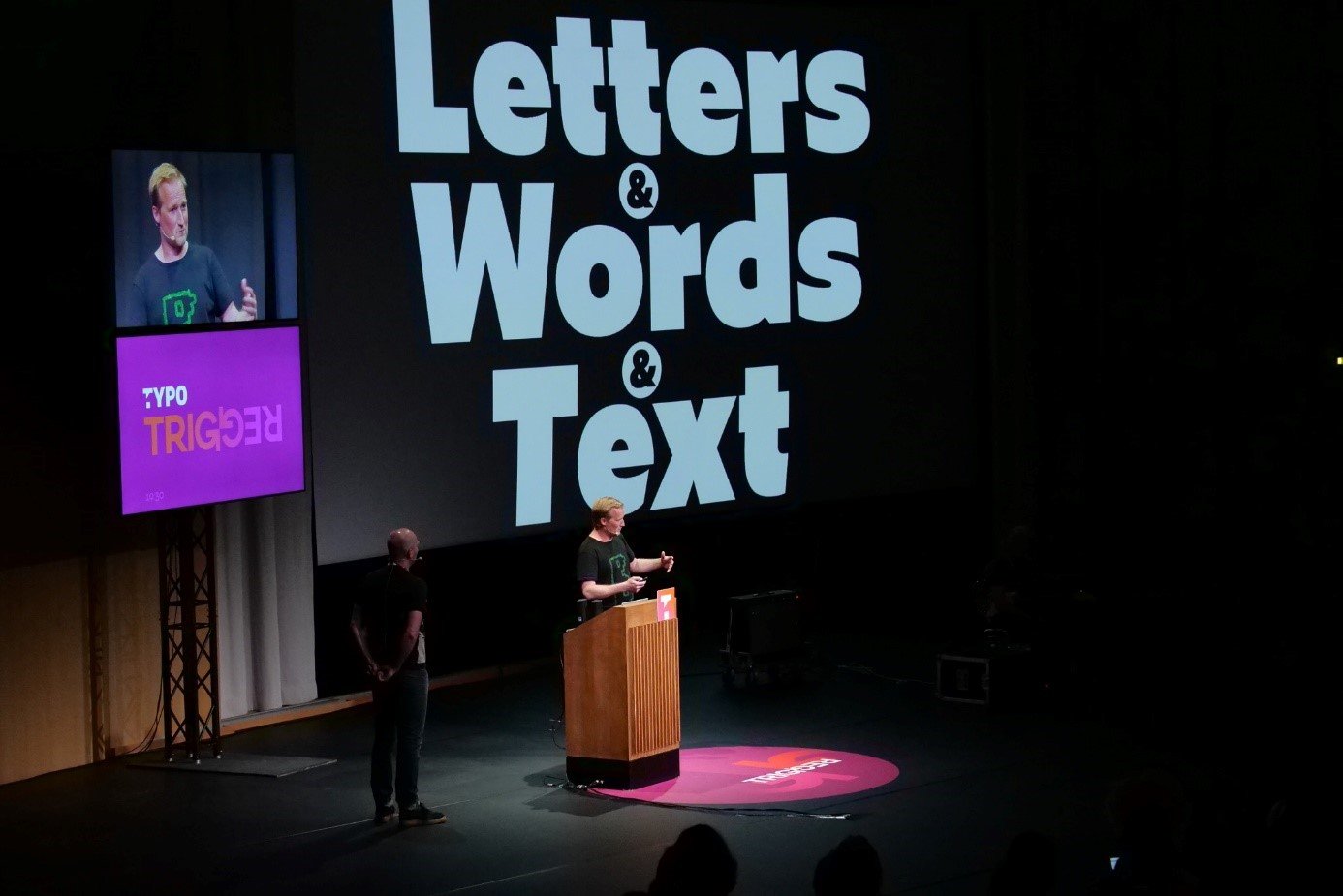
 A number of the presentations at this year’s TYPO, which took place from 17 to 19 May, conveyed the sense that a paradigm shift is approaching. It doesn’t seem all that long ago that we still had a clear idea of what typographers did and what the results of their work looked like. Today, fonts are almost entirely subject to digitisation, both in terms of their design and how they appear to the reader. Calligraphy and hot metal typesetting are popular choices due to their authenticity, but they mainly feature in creative projects and strategies. On a day-to-day basis, digital fonts dominate. People used to read newspapers and books; today they read primarily on their smartphones, then on their tablets, and thirdly on their laptops. One device runs on Windows, the other on Apple – there are mobile operating systems and a whole host of browsers. Users are active in a variety of environments and can be reached via numerous channels.
When it comes to advertising, brands, design, and style, communicating with readers and potential customers calls for a solution that can target them in the same way, anywhere, and at any time. One possibility is to develop new, tailored devices that adjust to the user’s behaviour. One example is voice command technology, which is already functional and widely available through Amazon’s Alexa and Google’s speech recognition.
Typographers’ decision to reject this solution is only natural. Yet there are also many reasons to believe that the written word will live on – especially when it comes to presenting and preparing information, where there is rarely an alternative to text. Crucially, however, it always has to look good and, above all, be problem-free. It should not be the device that adapts to the text, but rather the text that adapts to the device.
In this sense, variable fonts could be seen as a breakthrough of sorts. Before I explain their operating principles and potential impact, however, I would like to break down the impending revolution in typography with a few facts about the history of the industry.
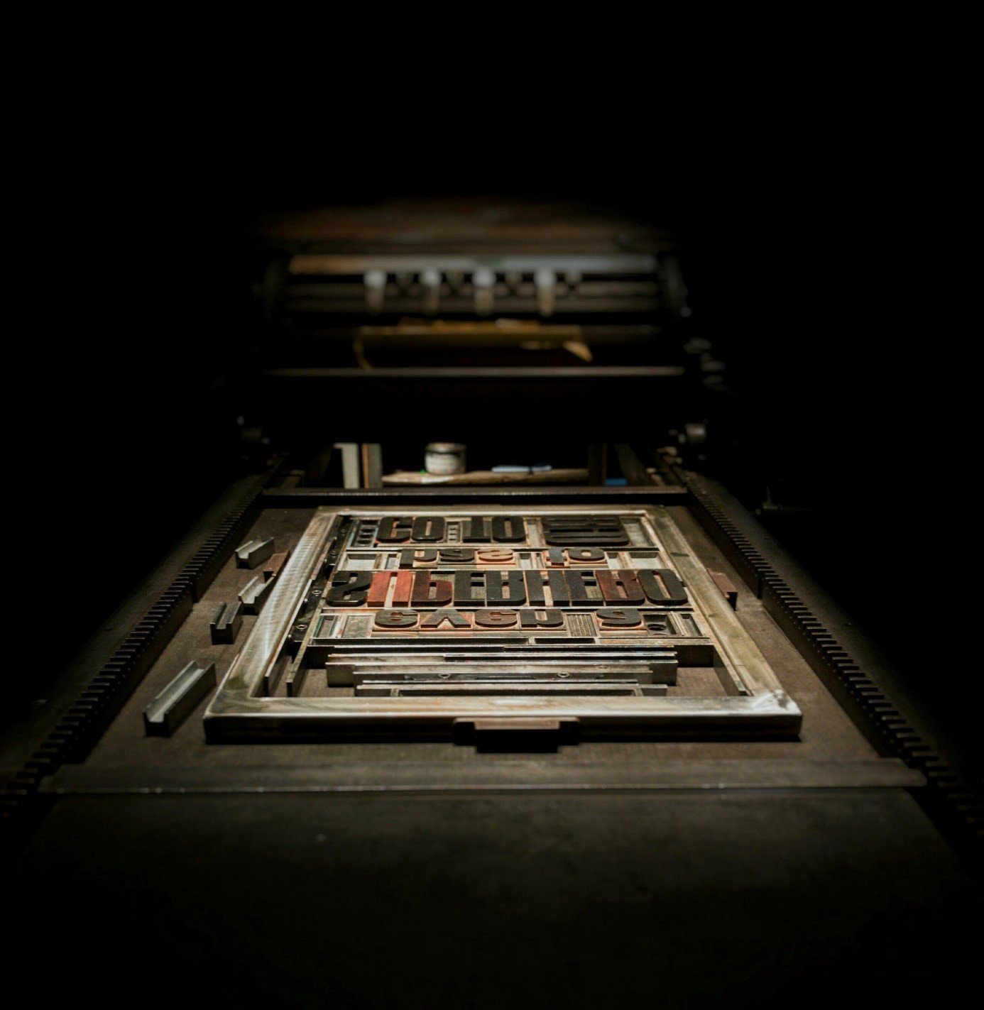
After Gutenberg invented letterpress printing around 1450, typographers developed two very distinct typefaces: Fraktur and Antiqua. In the mid-18th century, the design was systematised and became subject to mathematical rules. At the end of the 19th century, a significant part of typography was characterised by industrial and technical innovation; the Deutscher Werkbund (German Work Foundation) was formed, a famous member of which was Walter Gropius. By this point, typography was gradually becoming an academic subject, representing a form of communication as well as of printing. The digitisation of text in the 1970s, 80s, and 90s resulted in hot metal typesetting being supplanted by filmsetting, an optomechanical process. Finally, as of the mid-90s, the personal computer made its way into households everywhere, and with it came fully digitised fonts. Up to now, analogue and optomechanical fonts were reproduced and replicated on computers, while other fonts emerged that were specifically geared towards screens and the Internet.
Following in the footsteps of hot metal typesetting, filmsetting, and PC and web fonts, variable fonts could prove to be next breakthrough because they function completely differently. Whereas previously, different font files were used for different styles – with one file for bold, another for italics, etc. – now only one file is needed, on the basis of which the fonts can be edited directly on screen. Font engineers like Marianna Paszkowska, who introduced variable fonts at TYPO, adapt existing fonts, programming them based on master styles that represent design extremes (e.g. very thin or very bold). The user can then freely shrink or enlarge the fonts along different axes. Variable fonts work on all screens and in every environment; Paszkowska showed how functional, flexible, and customisable they are even in a virtual 3D environment. Because fonts look and feel completely different depending on the environment, this kind of typeface design, for the designer, means giving up the power to control how his or her own creations are interpreted.
Variable fonts were also the focus of TYPO’s final presentation – that of Underware, a Dutch type foundry. The title of their presentation, ‘The Tale of the Cat’, plays on homophony, when different words sound the same (in this case, ‘tale’ and ‘tail’). In order for an audience to understand this wordplay, a certain amount of context is always necessary.
And it was exactly this context that Underware drew on, arriving with a guitarist and a writer and practically turning the stage into a sort of art installation. The crux of their presentation was that variable fonts offer us the possibility to rethink our habits and systems: fonts are no longer rendered as their designers intended; instead, their appearance depends on how they have been programmed. Moreover, Underware chose not to dwell on the pros and cons of variable fonts, but rather posed the question: ‘What can you do with them?’ They put this to the test with a number of examples, which you can see for yourself on their specially designed website very-able-fonts.com (another wordplay, this time on the capability of variable fonts).
Latin script can be converted into Braille using a slider, while graphic, animated lettering appears and disappears – and is itself composed of fonts. Just like any other piece of text, it can be copied and saved. The new technology reinvents the system by allowing entirely new possibilities, yet remains subject to the rules of programming. You can design fonts whose variability makes them unreadable. It is possible to create a whole alphabet from a single letter, which, responding to its programming, can change into any other letter. However, as Underware questioned, is this something we really need? This was a historical reference, alluding to the scrolling areas of text that once enriched websites. In its time, the Marquee HTML tag was a hit; today, it is no longer used. There is evidence to suggest that the same fate will not befall variable fonts – as long as the innumerable devices and environments today continue to require typefaces.

Underware’s presentation, during which the writer raised the question of reading context and the guitarist made a specially programmed variable font letter ‘dance’ to music, was styled on the Dadaist movement of the early 20th century: It was unconventional and posed a multitude of questions without providing any answers. With a few exceptions, this is more or less the overriding sentiment at the present moment. Variable fonts appear to offer endless possibilities; which of them are merely gimmicks and where they may prove genuinely useful and, for example, demonstrate tangible benefits – like a small file size and therefore faster loading speeds – is yet to be determined.
However, one thing is clear: If you don’t want to miss the ‘next big thing’ in typography, or you at least want to see how it develops, you should keep an eye on variable fonts.