
Table of Contents
I imagine many of our readers might struggle to name America’s bestselling newspaper (and by quite some margin, too). You might guess it would be the country’s most famous title – the New York Times – but you would be wrong. Instead, it is another New York-based publication, which for various reasons is an even truer reflection of American ideology, and particularly the USA’s financial soul: the Wall Street Journal.
It has a daily circulation of over 500,000 copies (2023 data*), almost double that of the NYT, and it represents one of the key symbols of America’s wealth and power: the New York Stock Exchange, AKA Wall Street.
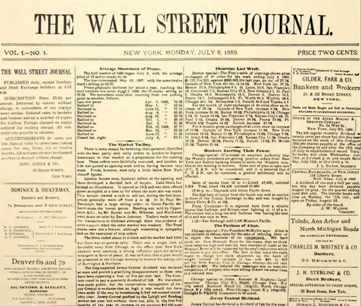
The Wall Street Journal is an international financial newspaper, founded in 1889 by Charles Dow, Edward Jones and Charles Bergstresser of Dow Jones & Company.
The paper started out hand-delivering brief financial bulletins, known as ‘flimsies’, to Wall Street’s stock traders. It is an essential read for senior executives and financial operators alike, and its online version is America’s second-most-visited news site after the New York Times’s page – to a certain extent, each title tends to act as a counterweight to the other.
As we will soon see, it has also always paid a great deal of attention to its graphics and illustrations, and flaunts a unique and world-famous style.

Source: https://en.wikipedia.org/wiki/The_Wall_Street_Journal
A solid tradition
The newspaper retained the same look for over 50 years, from the end of the Second World War to the 2000s, when it decided to reduce the size of its broadsheet layout a little to cut printing costs, sacrificing one of the most popular columns on the first page in the process. The paper has a classic six-column layout, with strong, clearly visible dividing lines. All aspects of the WSJ’s appearance are very bold, with no room for frills like colour or boxes.
The photos appear within the columns, and never exceed the text in terms of the space dedicated to them, particularly on the first few pages.
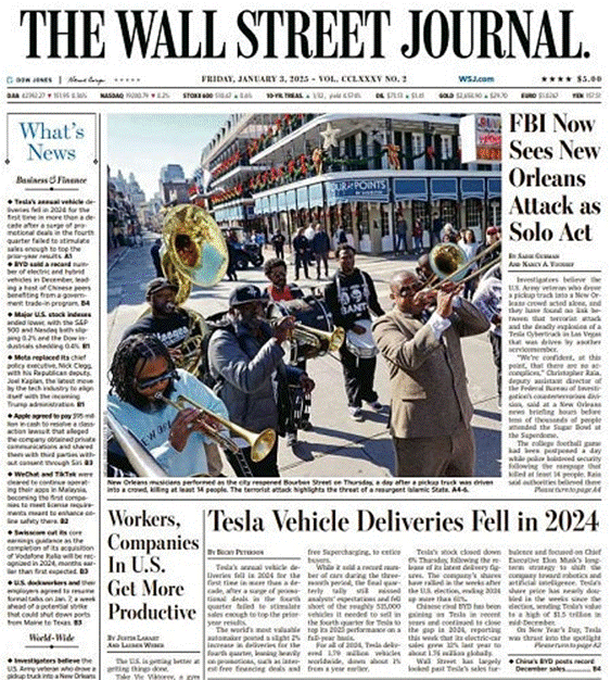
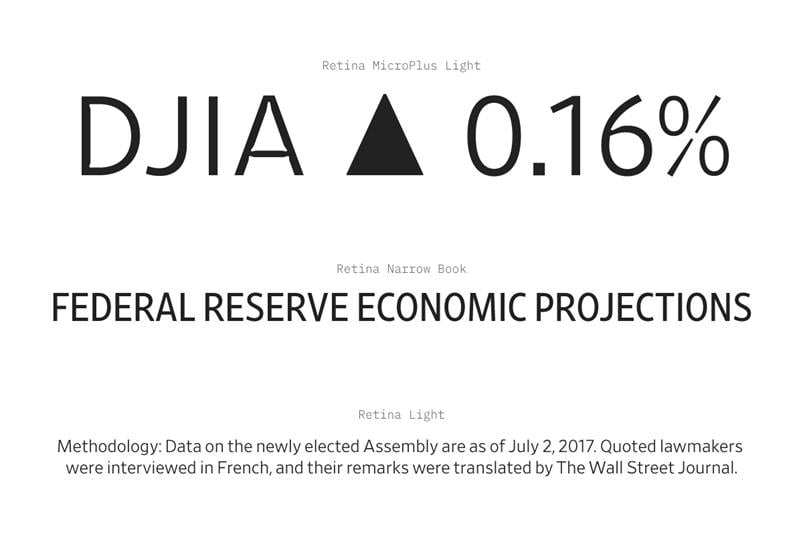
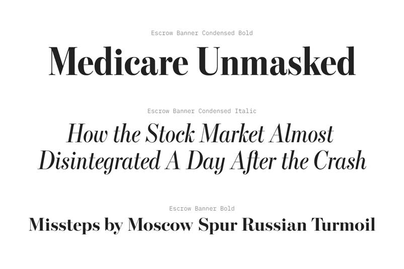
The 2007 redesign introduced the font Escrow for the titles and headings, giving the publication an elegant and authoritative appearance, as well as for the text in the Exchange section, its reduced width helping to optimise space. A few years earlier it had commissioned the famous type designer Tobias Frere-Jones to create a font, Retina, for the share price list sections, designed to be readable even in very small sizes.
In any case, unlike its rival, the New York Times, the newspaper has never seemed overly crammed full of text: careful control of the line spacing and kerning has always ensured the white emerges from the page, giving the text some breathing space. WSJ readers do not tend to want emotions – particularly anxiety-inducing ones – they just want to know how the market is performing, and how it will perform in future. Substance over style, in other words.
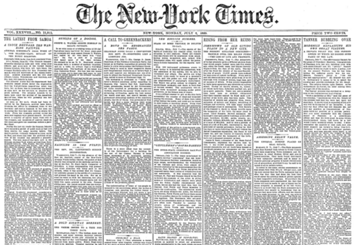
WSJ vs NYT. Source: Atlantic
Caption: As you can see, the New York Times has always appeared much more cramped than the Wall Street Journal.
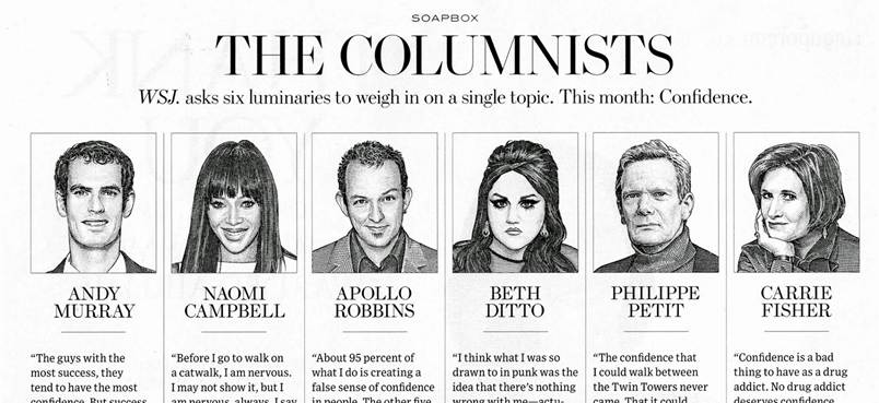
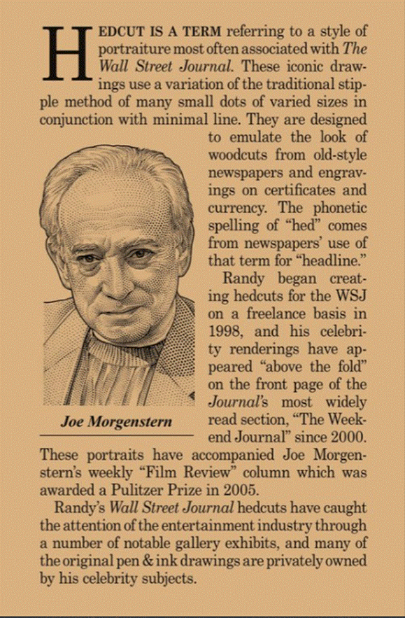
The renowned ‘hedcut’ illustrations, a hallmark of the WSJ
One distinctive feature of the WSJ is the use of illustrations known as ‘hedcuts’, introduced in 1979 by designer Kevin Sprouls. They are made using a stipple technique that imitates the appearance of woodcuts, giving the newspaper a unique visual identity with the added bonus of ensuring that all the portraits have a uniform graphic design.
Source: https://hedcuts.blogspot.com/
The hedcuts are created by hand using very regular dots – like the halftone screens that were popular until the 1980s – and always in black and white. They take up half the column width, and have precise rules, such as always being drawn from photographs of people with closed mouths: apparently people would never send the WSJ photos of people smiling with lips open, because the art department couldn’t do teeth!**.
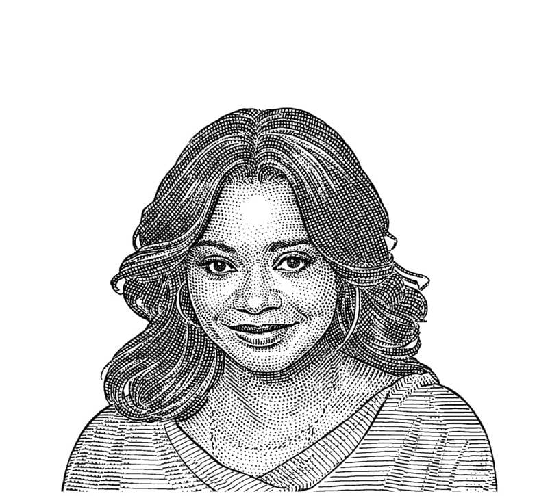
In recent years, the WSJ’s staff have been experimenting with the use of artificial intelligence to create these portraits, but so far the results have not yet been completely satisfactory, particularly when it comes to the hair.
Hedcut-style portraits are now well known across the world, and are widely copied or used as inspiration: many other newspapers and magazines now also use small line-drawn portraits as part of their layout.

The visual system of a newspaper focused on substance over style
For a long time, the WSJ resisted calls to include photographs, as it wanted to be a numbers-based paper, dedicated to describing the financial markets and the forces shaping the economy. It thought it had to be very serious, and therefore full of text, with no space for images, even if there seemed to be a need for them.
As Jim Pensiero, former deputy managing editor of the Journal, who worked at the newspaper from 1984 until his retirement, told the Atlantic: ‘It wasn’t designed to be Life magazine. It wasn’t meant to be pretty…’ In the same article, he described how technology arrived very late there compared to other newspapers, and how the use of typography, the paper’s ‘dingbats’ and the entire appearance of the WSJ aimed to communicate the idea of substance to readers and narrate the specific story of the world of finance.
In recent years, following the major redesign in the 2000s, the paper has started making greater use of infographics, visual stories, illustrations and colour photos, in line with global trends.
Photographs have made their way onto the front page, and the WSJ also uses illustrations, although these tend to be caricatures, rather than conceptual designs.
Given the newspaper’s field of interest, graphs and diagrams have always been important, and these have evolved into simple yet effective infographics, employing just a few colours.
Takeaways
Despite being aimed predominantly at a readership seeking precise news, data and information, and who want something substantial rather than too many frills, the Wall Street Journal demonstrates meticulous attention to graphic design. Twenty years ago, the newspaper opened up to colour and an increased number of images, bringing it into line with international trends.
The Wall Street Journal is the perfect example of a well-designed graphic newspaper, particularly in its balanced use of fonts and the way its spaces are organised.
- 2023 data from the Alliance for Audited Media
https://pressgazette.co.uk/media-audience-and-business-data/media_metrics/us-newspaper-circulation-2023/