
Table of Contents
Cool colours, such as shades of blue, green, and purple, evoke feelings of calmness, tranquility, and introspection, while warm colours like red, orange, and yellow are often associated with energy, warmth, and passion. In this guide, we will explore the characteristics of both cool and warm colours, their psychological effects, and how they can be used in design to create specific moods and atmospheres.
Colours have an extraordinary power over our emotions and well-being. They can influence our mood, making us feel more cheerful and energetic, calmer and more optimistic, or even more thoughtful. At the same time, they can evoke feelings of sadness or anxiety.
Indeed, science tells us that our brain associates states of mind and colours, while different wavelengths of colours change the way our eye perceives them. The connection between colours and psyche is also illustrated by languages that use the same words to describe both a colour and a particular state of mind – like the indigenous Hanuno’o language in the Philippines.
According to colour theory, a key element for distinguishing between colours is their temperature. There are warm colours, cool colours and neutral colours – each of these categories can have a specific effect on our body and state of mind.

Knowing how to combine warm and cool colours (and to what effect) is useful in a range of situations, such as when working on a graphic design or interior design, or when editing a photo or painting.
Read on to learn more about warm and cool colours!
The colour wheel: warm and cool colours
The colour wheel is a graphic representation of colours in the shape of a wheel. Colours in the wheel are typically arranged in primary, secondary and tertiary colour order.
The colour wheel below is divided into two sections: warm colours and cool colours.

We all instinctively categorise colours as warm or cool. But today we’re going to dig deeper into what warm and cool colours are, what changes in their physical structure and how they can best be combined.
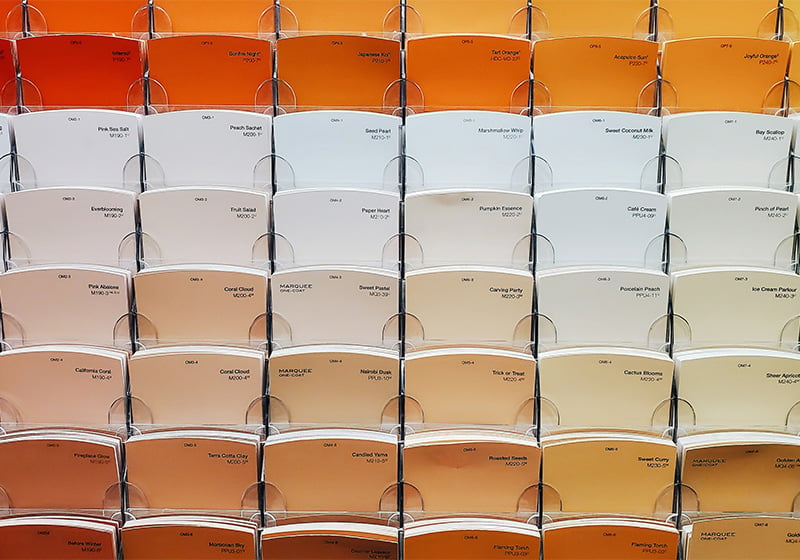
What are warm colours?
The following, in all their different shades, are warm colours:
- Yellows
- Reds
- Oranges

These colours generally convey a sense of energy, vitality, enthusiasm, joy and love, but also human warmth, familiarity and closeness. Sometimes they are used to signal warnings or danger. Warm colours also appear closer to one another compared to cool colours.
What are cool colours?
The following, in all their different shades, are cool colours:
- Greens
- Blues
- Purples

This type of colour generally conveys calm, gentleness, rest, sadness, peace and introspection. What’s more, cool colours appear further apart from one another and stand out less. Because of these properties, if we paint a room in a cool colour, it will seem bigger than it actually is.
What are neutral colours?
The neutral colours don’t appear in the colour wheel. They are:
- Greys
- Browns
- Beiges

Neutral colours communicate elegance, balance, tranquillity and neutrality. When putting together graphic compositions based on colour theory – like in fashion, interior decoration or painting – neutral colours are very useful because they can be combined with both warm and cool colours.
For example, if we use colour theory and a colour palette to decide how to decorate an apartment, neutral colours can help to create an elegant and balanced ambiance.
The science behind warm and cool colours: how our perception changes
Warm colours and cool colours are also different physically.
We know that colours are part of the visible light spectrum that is reflected by objects and that it strikes specific receptors in our eyes. But light isn’t uniform: it comprises electromagnetic waves of varying lengths – some longer, others shorter. Cool colours have a shorter wavelength, while warm colours have a longer wavelength.

However, our eye can only perceive wavelengths between 380 nanometres (the colour violet) and 790 nanometres (the colour red). This helps explain the terms ultraviolet and infrared. In the illustration of the light spectrum below, you can see that on the left are wavelengths that are invisible to the human eye – this is ultraviolet light. On the right are those wavelengths beyond red that we are also unable to see – this is infrared light. And this is where we stop: beyond either end of this spectrum is a world without colour!

When it comes to the physics, there’s actually a specific scale for measuring colour temperature: the Kelvin scale. Somewhat counter-intuitively, warm colours have low temperatures (2700-3000 K), while cool colours have temperatures above 5000 K.
How to use warm and cool colours

As we’ve already touched on, warm colours appear closer to one another, while cooler colours seem further apart. By exploiting these characteristics, we can create a sense of movement and depth. For example, in a composition with lots of cool tones, a warm coloured object will be the first thing seen and will immediately catch the eye.

Furthermore, the temperature of colours depends on the context in which they appear and the type of light with which they are illuminated: this is perceived temperature. For example, a cool colour like blue might appear even cooler if it is placed in a context in which yellows or browns predominate. The temperature of colours also depends on the quantity of light that illuminates them and its source: a yellow will appear even warmer if directly lit by sunlight, for example.
Are you ready to experiment with warm and cool colours?