
Table of Contents
Few directors have a style that is so immediately recognisable as Wes Anderson. All it takes is an highly symmetrical shot, a particular camera movement or a certain colour palette, and you instinctively shout out: that’s Wes Anderson!
But there’s another reason the American director, who has now been shooting films for over twenty years, has become so famous: like the books we read as children, Wes Anderson has an incredible ability to transport us into imaginary worlds that are so credible and consistent they seem real. Whether they are entire imaginary countries, eccentric boats or retrofuturistic cities, each detail is always studied in minute detail, from the clothes through to everyday objects. And naturally this includes the typefaces too.

So today we have decided to dedicate this article on fonts and cinema to Wes Anderson and the interesting typography-related facts we have uncovered in his finest feature films!
The Royal Tenenbaums
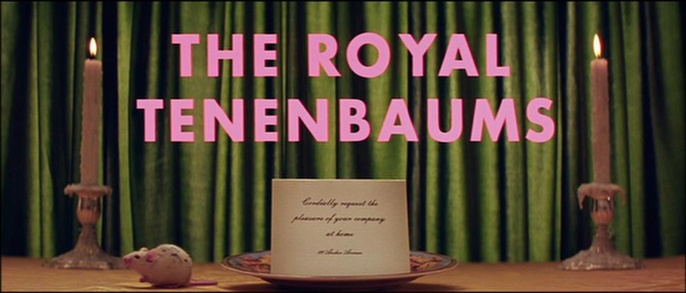
The Royal Tenenbaums, released in 2001, is the film that made Wes Anderson‘s name. In its depiction of a dysfunctional family it incorporates all the elements that make up the Texan director’s unmistakable style: strong images, an incredible focus on the framing of each shot, symmetry and crash zooms, and, of course, one particular font. Wes Anderson has a self-confessed passion for Futura: he has used it in almost all of his films, both feature-length and shorts.
However, in The Royal Tenanbaums, his passion for Futura almost becomes an obsession. We see it in the title (in Futura Bold), in the screens introducing the chapters and in the end credits, but also in practically any writing captured on camera: the buses on the Green Line, the museum’s signs, posters and book covers.
Futura, by the way, is one of the best-loved typefaces in the world. It is a modern, functional and highly geometric font, inspired by the visual elements of the Bauhaus, although not directly associated with the school. It was designed by the German Paul Renner in 1927, initially to be used for Neues Frankfurt (or New Frankfurt), a modernist architectural project for the German city in the late 1930s. From that moment on it rose inexorably to fame, and it even made it to the moon: it is found on the plaque left behind to celebrate the 1969 lunar landing.
Italian readers will recognise the font from the national broadcaster RAI’s logo and the signage used by the national railway company.
Moonrise Kingdom
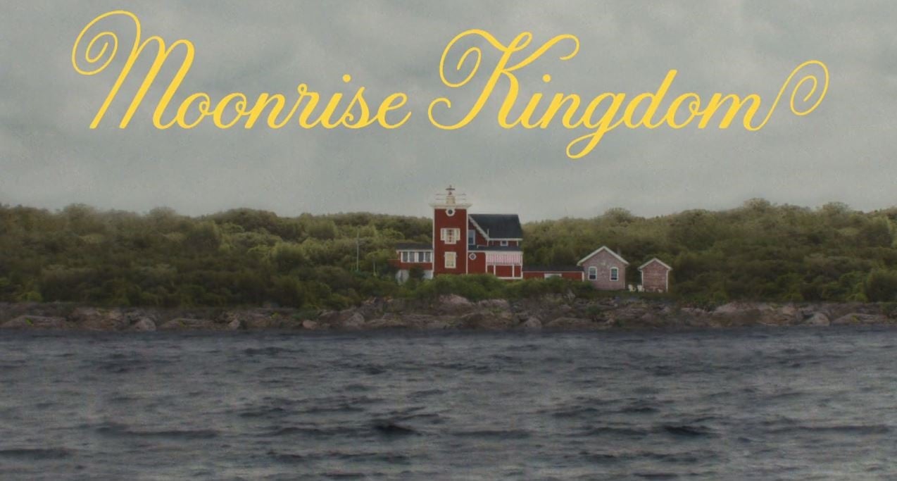
Great directors also know when to move on from their fixations, and how to do it well. So when it came to his seventh feature film, Moonrise Kingdom, released in 2012, Wes Anderson abandoned Futura, the font he had remained faithful to until that point. For the titles of this enchanting teenage love story – which Anderson admitted was his own fantasy when he was that age – the director instead turned to lettering artist Jessica Hische.
The artist was particularly inspired by the lettering from an old French New Wave film La Femme Infidèle, released in 1969 and directed by Claude Chabrol. The reference was suggested by Wes Anderson himself, but the font still needed to be given the right dose of 1960s America, to make it more suited to the imagery of a quiet American province depicted in the film. The meticulous director rejected various initial attempts, but in the end opted for a stylish, sweet and ingenuous font that became a distinctive part of the film, used playfully in an array of bright colours in the opening and closing titles.
The end result is incredible, especially as this was the lettering artist’s first foray into designing fonts for the cinema (you can read a long interview about it here). In 2014 the typeface was released commercially by Hirsche and Font Bureau, under the name Tilda.
The Grand Budapest Hotel
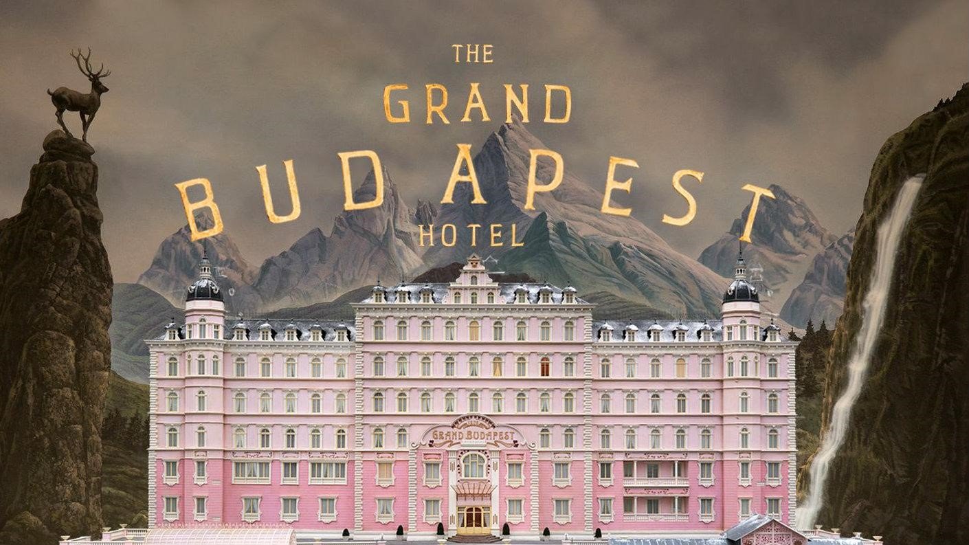
Wes Anderson has a unique talent: he manages to recreate small worlds that lie somewhere between fairy tale and his own personal vintage imagery on film, and does it perfectly every time. After immersing us in domestic environments and taking us on board a boat with its full crew, in The Grand Budapest Hotel, presented at the 2014 Berlinale, the director offered up an entire country for our enjoyment.
Like any self-respecting nation, the imaginary Republic of Zubrowka has its own history, its own uniforms and a flag, but also banknotes, stamps, keyrings, newspapers, books, sweet packets, passports and menus, all with their own typefaces. This makes the film a joy to behold for fans of a certain type of typography.
The onerous task of creating this fantasy world was entrusted to graphic designer Annie Atkins, who drew heavily on the typefaces fashionable in Eastern Europe in the 1930s – for example, the Grand Budapest Hotel’s sign is a reproduction of an original metal sign from 1930s Cairo. Even more complex, however, was creating the various newspapers printed in the imaginary republic, featuring articles written individually by Anderson himself.
In this film Anderson once again shunned Futura, instead choosing the typeface Archer for the actors’ credits. Archer was devised in 2001 for the American lifestyle and entertainment magazine Martha Stewart Living, before being made public in 2008.
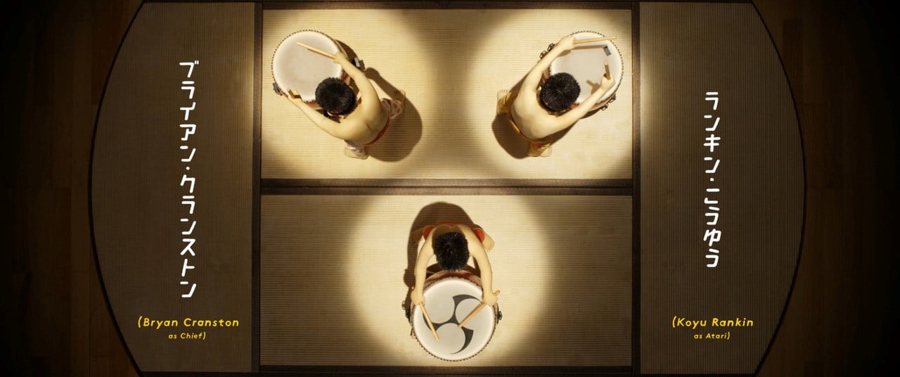
Isle of Dogs
Released in 2018, Isle of Dogs is Wes Anderson’s second animated film, shot in stop motion (for information on this and other animation techniques, see this blog post). Set in Japan, the feature film describes a dystopian future in which all the dogs in Megasaki City are confined to an island due to a new canine flu.

Once again, Wes Anderson immerses us in unusual imagery: Megasaki City has a retrofuturistic feel and is, of course, very, very Japanese. The lettering and typography used in the film were curated by Erica Dorn, a designer and illustrator based in London but born and raised in Japan, and who was working for cinema for the first time.
Once again, the designer had to create over a thousand new objects, including posters, signs, beer cans, milk cartons and the dogs’ personalised name tags. But the lettering used for the titles is particularly interesting – a hand-designed mix of Western and Japanese characters. As Erica Dorn herself explained, it would have been difficult to find a suitable font: there are certainly far fewer typefaces that include all 2,000 Japanese characters than there are Western fonts. The Western font in the titles, meanwhile, remains constant, almost like a sidekick to the strong Japanese visuals. After assessing various options, at the last minute it was decided to design these by hand too.
So how much does the choice of typefaces in Wes Anderson’s films matter? Answer: a lot. Wes Anderson is a meticulous director who creates a profound visual culture and is extremely attentive to detail. He is well aware that the credibility of his imagery also depends on choosing the right typeface: for this reason, every font we see on screen stems from laborious research and numerous rejected alternatives. And how much does he love the font Futura? Well that goes without saying: unconditionally!
To conclude, we’d like to share with you a small gem we stumbled across: a very well made short video that celebrates Wes Anderson’s passion for fonts.
Would you like to help us add to or improve the content of this article? Check our guidelines and send us your request via email at: seo@pixartprinting.com.