Table of Contents
At the very beginning of the year, several large companies and publishers presented new designs. In 2017, brands like Calvin Klein, YouTube, and Audi redesigned their logos. And in 2018, other companies and renowned publishers came up with innovations that will help shape design trends in the years to come.
The Guardian
Among the year’s first releases was the long-awaited redesign of The Guardian. Every section of the UK daily newspaper received a makeover, including the online versions on desktop, mobile, and app, as well as the weekly magazine. The aim was to cater to the growing number of readers who switch between platforms whilst reading.
After the paper’s last complete redesign in 2015, which saw it change from a large broadsheet to a smaller Berlin format, its design team this time opted for a tabloid format. The new size is intended to boost the younger, mobile readership and to save on printing costs. The concept was developed by the in-house design team led by creative directors Alex Breuer and Chris Clarke. Together, they came up with a new layout that is considerably easier to navigate. New, separate colours provide a background to the long reports, making them easier to distinguish from other content.
For the title font, the team turned to Commerical Type, who developed the Guardian Egyptian custom font. The new Guardian masthead has pronounced edges and, in typical Guardian style, is positioned further to the right on the title page rather than centrally. In addition, the word mark of the masthead no longer appears in blue lowercase characters, but in black. This gives it more character, and despite the departure from The Guardian‘s traditional blue, it remains recognisable.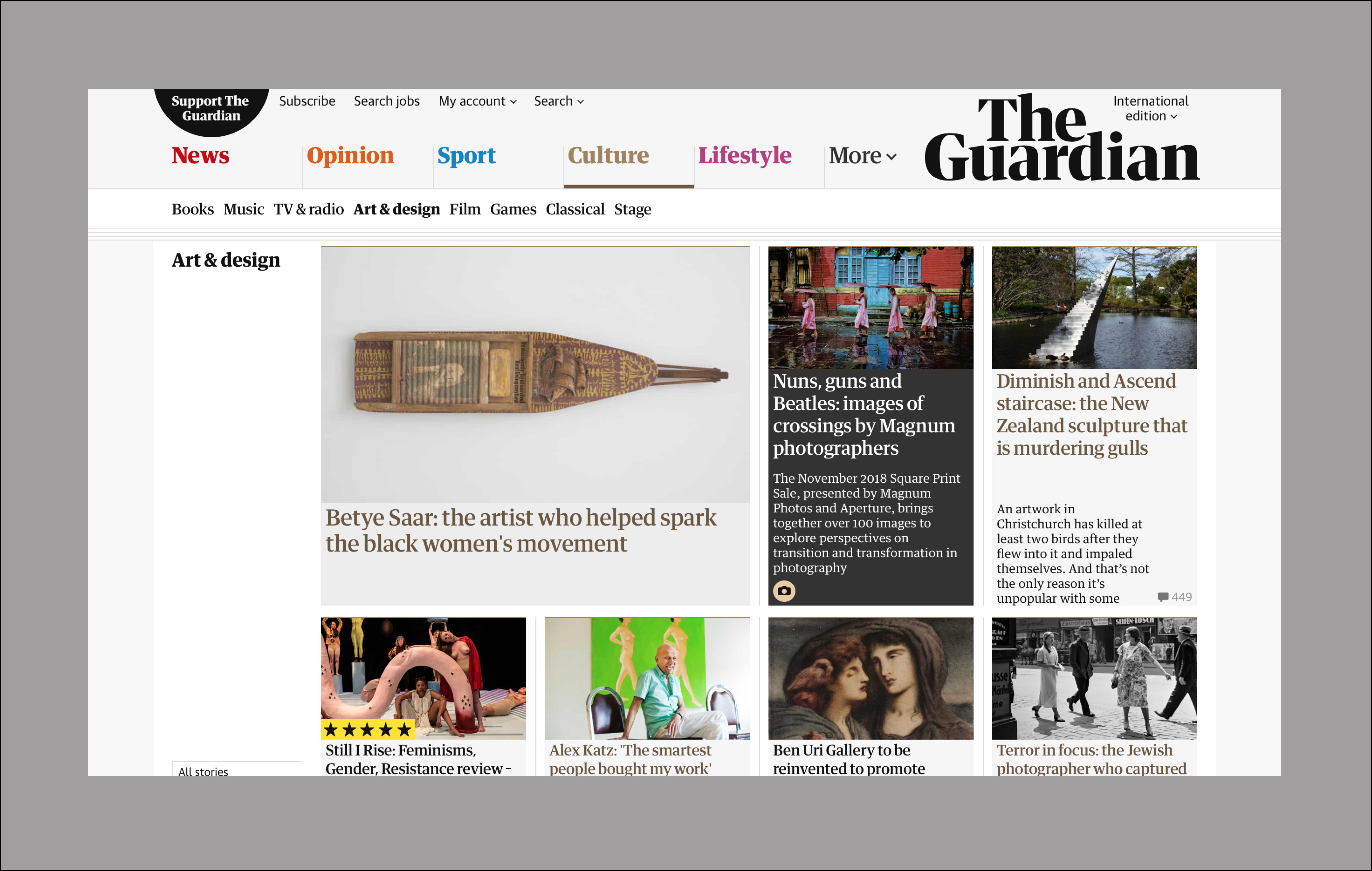
Diet Coke
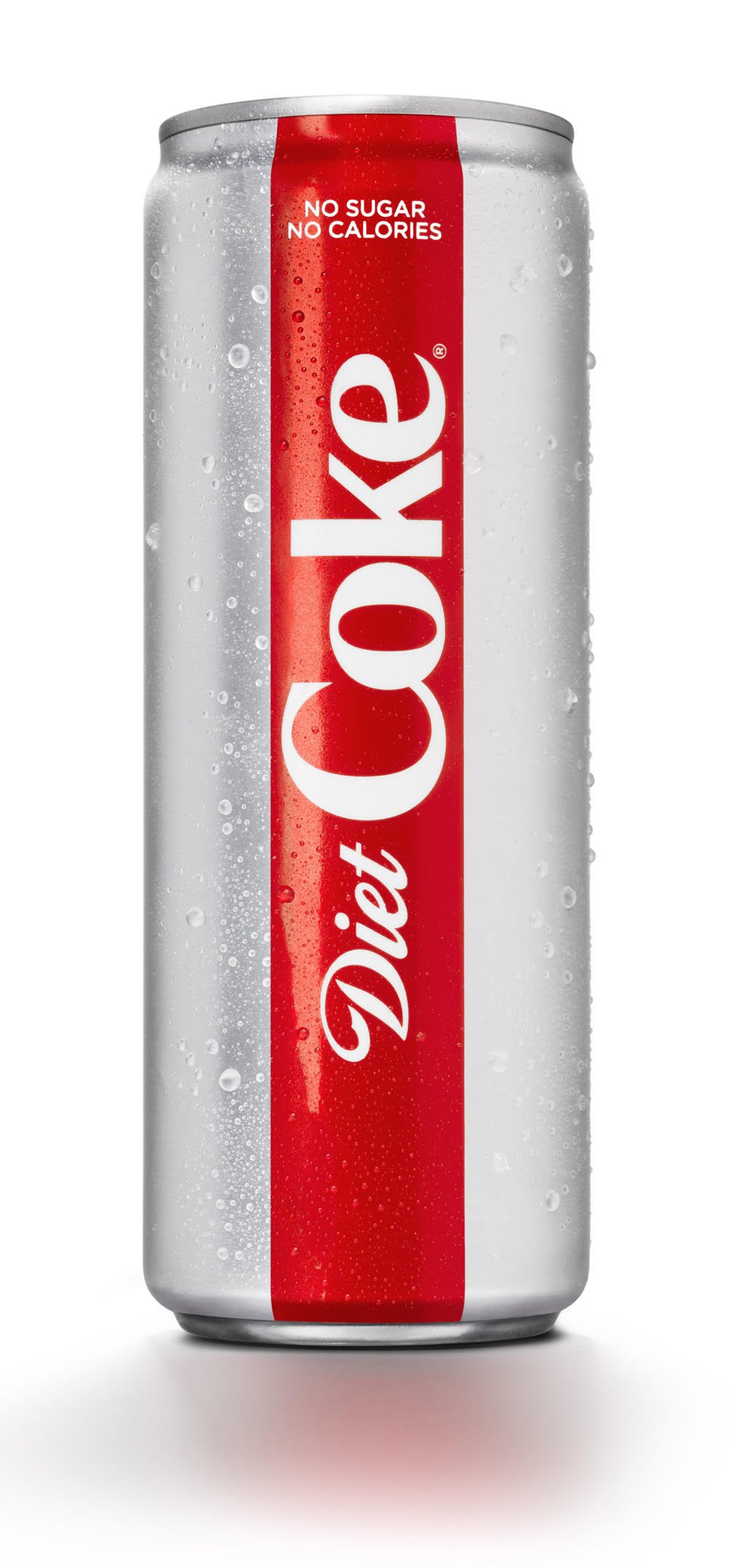
Also in January, the Coca-Cola Company presented the new design for its Diet Coke brand, along with four new flavours. Rethinking the cans for the American market, this represented one of the most elaborate redesign processes in over three decades. Several market research firms took part in the rejuvenation project, with the aim of enabling more young adults to identify with the brand again. The new cans have a simple colour palette, with different shades for the different flavours. They are slimmer and more minimalist than their predecessors and have a more modern aesthetic overall. The Diet Coke logo was updated, too; the changes, though subtle, give it a far more elegant look.
The new concept was a collaborative effort between the in-house Coca Cola design team, led by Vice President of Global Design James Sommerville, and the British studio Kenyon Weston, responsible for packaging design. As part of the rebranding process, Sommerville also came up with a bespoke font, TCCC Unity. With Diet Coke having become the least profitable member of the Coca Cola family in recent years, the purpose of the new look was to draw more attention back to the brand. The accompanying advertising campaign was created by New York studio Anomaly.
 Tumblr
The logo of the blogging platform Tumblr was also reimagined this year. Its edges were defined and adapted to fit smaller screens. The new design places greater emphasis on the serifs, with very subtle changes giving it a more dynamic look. Its unusually open feel can be attributed mainly to the now-missing full-stop at the end of the word mark.
Dinamo Typefaces designed the logo in collaboration with Tumblr‘s creative director, Doug Richard. The Swiss typeface designers also developed the new custom font Favorit-Tumblr, which is based on the Favorit font and is aligned to the x-height of the Tubmlr logo.![]()
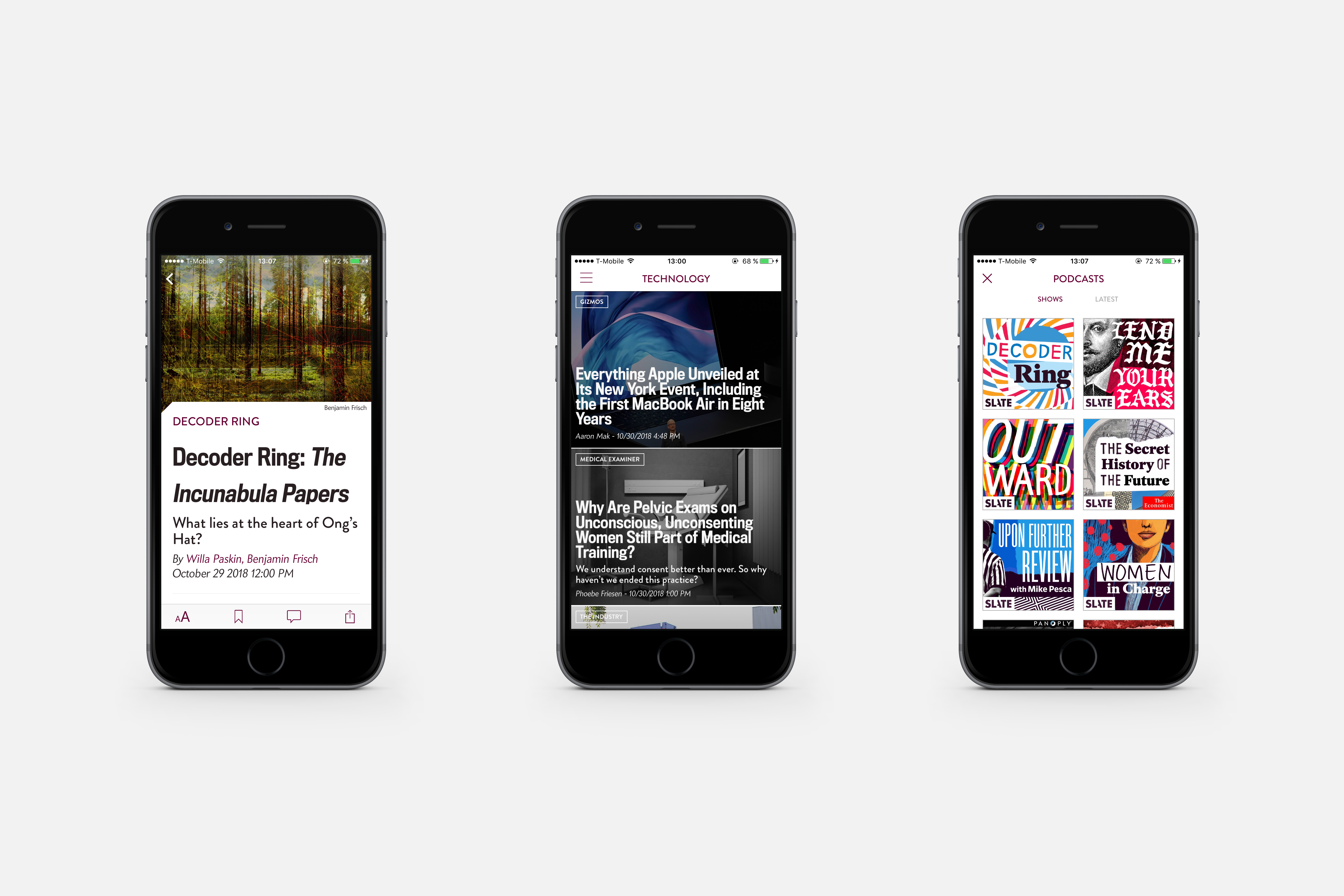
Slate
The UK’s Guardian was not the only publication to reimagine its online presence this year; so too did the American magazine Slate, founded in 1996. The redesign gives it a more cohesive appearance. With its wide uppercase characters and its halved letter A, the logo has an unconventional, light-hearted appeal.
This style has also been applied to the rest of the website, which combines illustrations with typography at different levels to achieve a more varied look. The new logo and redesigned online presence bring a more rounded aesthetic to the reading experience. Slate’s in-house design team collaborated with the New York studio Gretel to develop the concept.