Martina Flor’s job is a “labour of love”, as she describes it. When she designs a letter, nothing is left to chance. Each curve, each texture, each colour is given such a thorough treatment that, at the end of it, the letters take on a life of their own. “That’s why I say it’s a labour of love, in the sense that you trust that all the dedication will ultimately shine through”. And it certainly does that. No wonder the graphic designer and illustrator is considered one of the best lettering artists of her generation.
Martina grew up in Buenos Aires, where she graduated in Graphic Design. She practised the profession for years, until a time came when she felt disillusioned with the job and started searching for something new. Everything began to change when she was awarded a scholarship to study a postgraduate course in Design and Communication Strategies at the Elisava School in Barcelona. “It’s how I fell back in love with design. I decided to continue my studies to develop my interest in typography,” she tells us.
After obtaining a Masters in Type Design from the Royal Academy of Art in The Hague, Martina settled in Berlin and set up her own studio. From the German capital, the lettering artist takes commissions from individuals, agencies, magazines and publishers from all over the world. Her clients include The Washington Post, Vanity Fair, Cosmopolitan, Harper Collins, Fontshop, Monotype, Etsy, Penguin Random House and Planeta. For the publishing house Planeta, she recently created the cover to the enchanting book Alice’s Adventures in Wonderland.
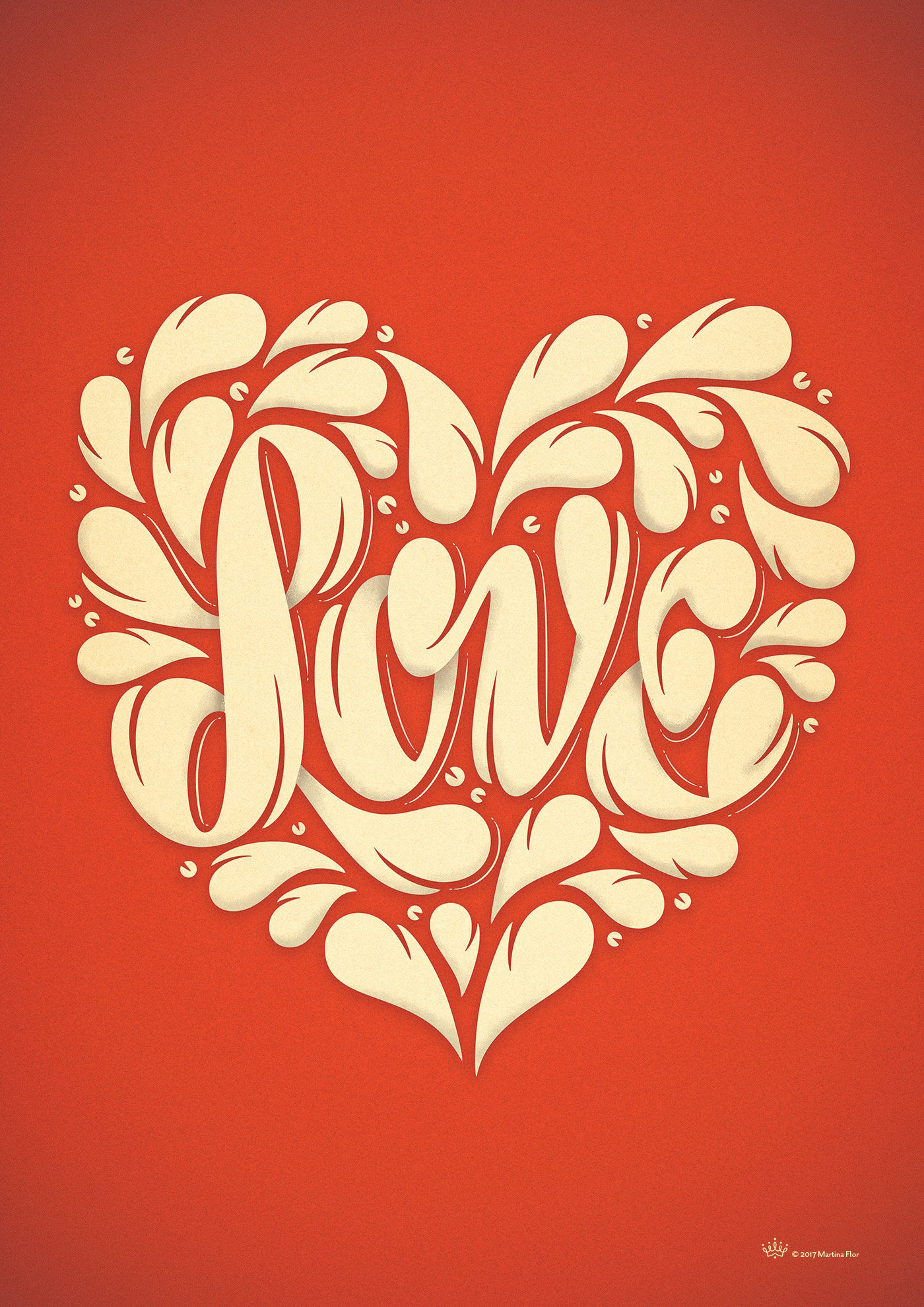 Another of her most impressive projects was the one she carried out for the well-known US software company Adobe. Over three days they did a live broadcast of the process of creating a lettering piece, from the sketch to the final digital design: a heart with the word ‘love’. Martina does not consider herself by any means a conceptual artist: “What I do is very direct; if I’m saying something about love, I’m going to use red and it’s going to be heart-shaped. Although this seems totally obvious, the challenge is to make every polished shape of the piece communicate love”.
As she did with Adobe, Martina usually sketches her design by hand, because she feels most comfortable searching for shapes and structures on paper. It is also a process that saves time, because it “enables me to solve problems before moving on to the digital drawing”, explains the designer and illustrator. Once she moves onto the digital drawing, she starts working on the shapes of the letters with vectors. “There’s a really creative part of the process imagining a story, choosing the colours. But in all honesty much of this job is technical, because it consists of putting dots in the right place so that the curve looks good. And that’s precisely what I like most”.
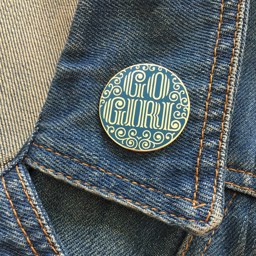
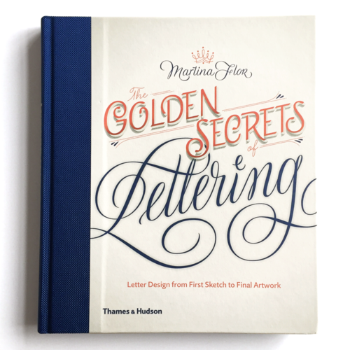
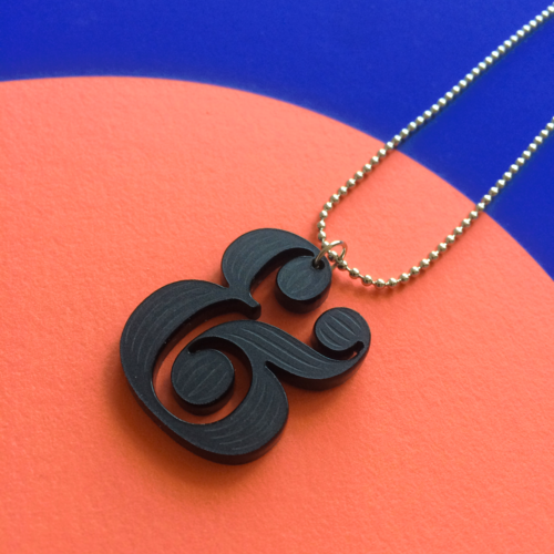
In addition to her commissions, Martina tries to find time for her own projects, such as her Letters Collection, a website for sending postcards handwritten by the lettering artist to other people. She has set up an online shop to sell creative products for everyday life based on customised types, such as brooches and prints with letters of the alphabet, and she has just published the book The Golden Secrets of Lettering, in which she offers readers some examples and tools for getting started or improving in this art.
Teaching is another passion of Martina’s, which is why she organises lettering design workshops under the name Good Type and also teaches online courses in English and Spanish through her website and platforms like Domestika. “Until recently, training in lettering was very informal, when in reality it has its fundamentals, its rules, and it’s a very important tool for designers and illustrators. In my teaching role, what I try to do is formalise the value of lettering a bit more”, says Martina.
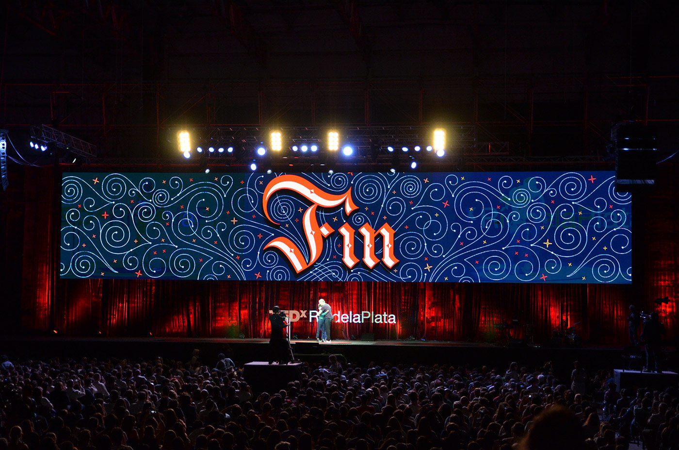
In this respect, she gives lectures all over the world to help designers improve their skills. In 2016, for instance, she gave a TEDx talk in her native country in front of thousands of people, to whom Martina explained how she creates stories through lettering design, drawing on some of the most representative projects from her career and a 30-metre-long piece created especially for the occasion: Fin (End).