
Table of Contents
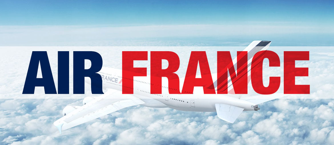
This is the third article in our series exploring the evolution of the visual identity of various household-name brands. Having discussed Versace and Instagram, it’s now the turn of Air France – today we’ll investigate the history of its logo and see how it has changed over time. The story is a long one, beginning way back in 1933, so we’ll focus on the main events – the most significant redesigns.
Fasten your seat belts and prepare for take-off!
The hippocampus, Air France’s first logo
Air France was founded on 7 October 1933 following the merger of four French airlines, and the company’s first logo was inherited from one of its predecessors, Air Orient. It featured a winged hippocampus, a mythological creature with the body of a horse and a fish’s tail, which on-board staff affectionately nicknamed ‘the shrimp’. The blue image was extremely detailed and was accompanied by the name of the company in a plain and simple font (as you’ll see in the video recommended below).
Overall, this was an iconic and extremely elegant logo, undeniably unique, and aimed at everyone looking for a genuine travel experience rather than simply getting from A to B. It interpreted with a healthy dose of romanticism ‘the French art of travel’, where one could expect to receive a luxurious, high-quality service.
1976, the three-coloured stripe appears
Things changed in 1976. The size of the symbol decreased significantly compared to the lettering, and the logo acquired a three-coloured stripe, which, as well as the French flag, also recalled the wings of the hippocampus and the tail fin of an aeroplane.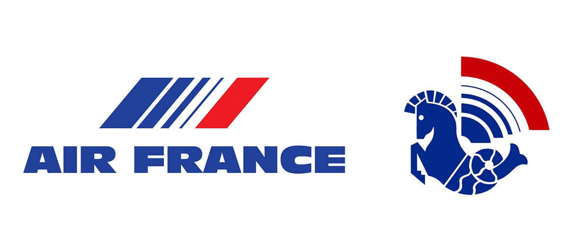
This logo remained more or less unchanged until the brand’s famous rebranding in 2009.
2009, the logo designed by Brandimage
Now let’s touch down in 2009 and have a look at the results of the rebranding carried out by the agency Brandimage. What do you notice when you look at the new logo?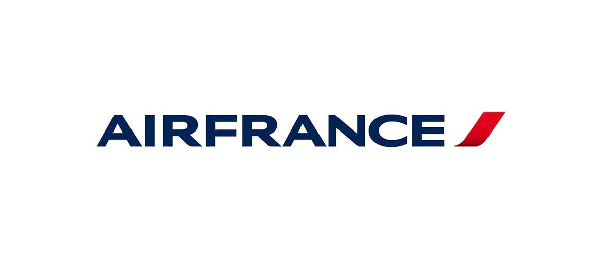
The company name was written in a very simple font, and the three-coloured stripe disappeared, replaced by a single bright red accent paired with the traditional navy blue. This was a much more basic and modern logo, designed to open it up to a global market; indeed this rebranding occurred not long after the merger of Air France and KLM in 2003, and therefore the exposure of the brand to international travellers. As François Brousse, Air France’s advertising manager, stated:
“This new identity, which is both elegant and contemporary, represents the fundamental changes Air France has seen over the past few years. Thanks to the coherence between the old and the new logos, we can ensure a gradual transition for our passengers”.
But what happened to the hippocampus? It wasn’t killed off – just simplified.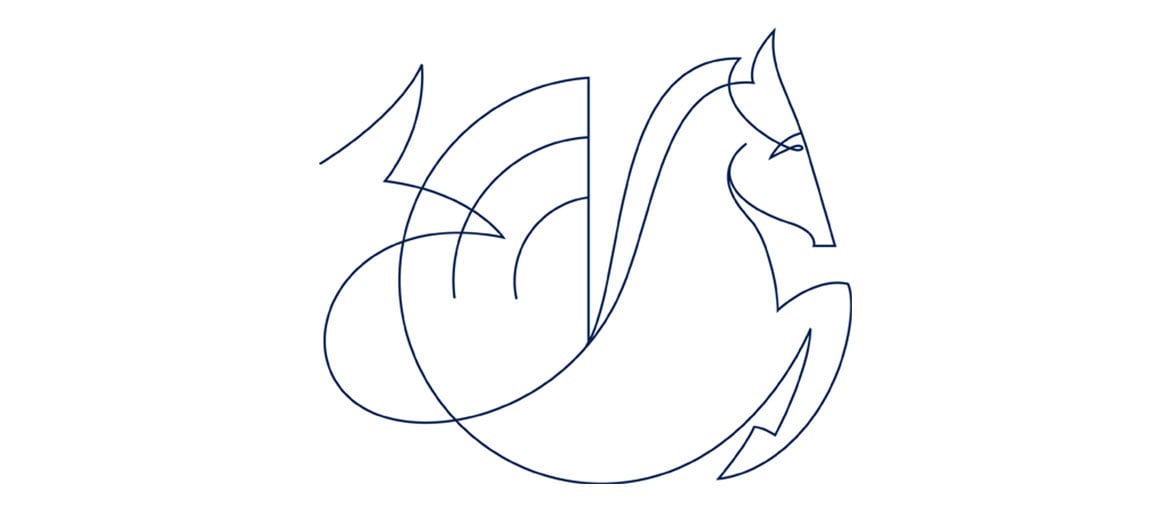
This video explores the history of the logo, from its origins to the point we’ve reached so far, 2009.
2019, the We Are Air France campaign
Now let’s fly forward to 2019 and the company’s most recent campaign: We Are Air France. The narrator on this video is pilot and astronaut Thomas Pesquet.
Although we see pilots, flight attendants, mechanics, engineers and all the company’s staff at work, the video actually dedicates very little space to Air France’s services; the real focus is clearly the sense of wonder one gets when exploring the skies. The video draws on France’s tradition as the country that invented aviation, and looks to the future, with new technology and major space missions – it is no coincidence that the narrator is both a pilot and an astronaut. Watch it again and focus on the individual frames: there are numerous shots of the plane, and especially the cockpit.
What is Air France trying to do with this video? Perhaps trying to make us dream, with that quintessentially French penchant for romanticism. As the slogan says: ‘France is in the air’.