
Table of Contents
Of all the colours of the rainbow, red perhaps has the biggest variety of well-known shades: there’s crimson, scarlet, maroon, Pompeiian red (which we discussed here) and pink. And then there’s amaranth. This red hue with strong hints of purple is one of the most distinctive colours around: dark yet bright at the same time. It’s a profound shade, and its story is… well… magical!
It is no coincidence that the ancient Aztecs considered the plant amaranth – which gives the colour its name – a gift from the gods. Amaranth was also the colour of choice of one of the most influential families in Western history: the Medici in Florence. Today, amaranth is used by some historic football teams, in the armed forces and – more prosaically – in interior design, to give our homes a refined touch.
So, without further ado, let’s take a look at the origins and most interesting uses of amaranth, with some interesting anecdotes thrown in too! Be prepared to be amazed… This colour is associated with one of the nicest human characteristics: our sense of wonder!
What colour is amaranth?
Amaranth is a purply shade of red. Although it is quite dark, it is nevertheless also bright, solid and bold.
In colour psychology terms, amaranth is considered a very strong and authoritative colour, and is associated with wonder and our ability to be surprised.
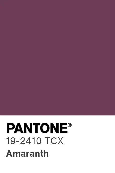
In printing, the Pantone code for amaranth is 19-2410 TCX. If you want to use it in the digital sphere, meanwhile, the Hex code for amaranth is #9F2B68 (although it is worth mentioning that it comes in various shades, including some softer, pinkish hues).
Where does amaranth come from?
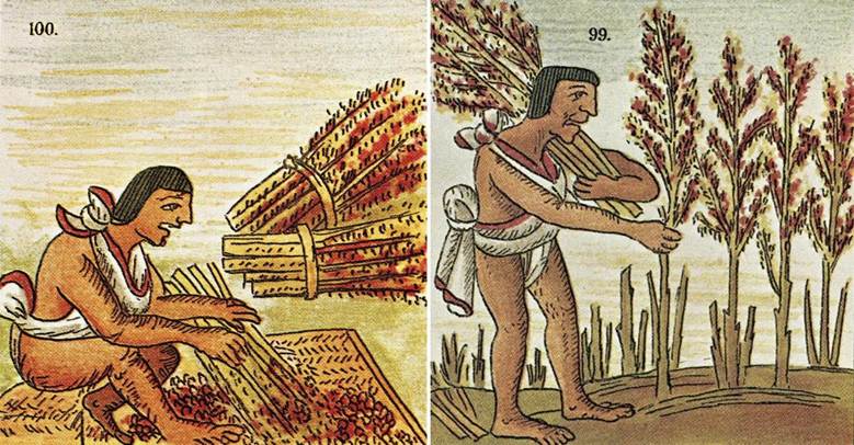
Amaranth gets its name from a plant. And not just any plant: amaranth was vitally important for the Aztecs, Incas, Mayans and other civilisations from Central and South America: it was considered the grain of the gods.
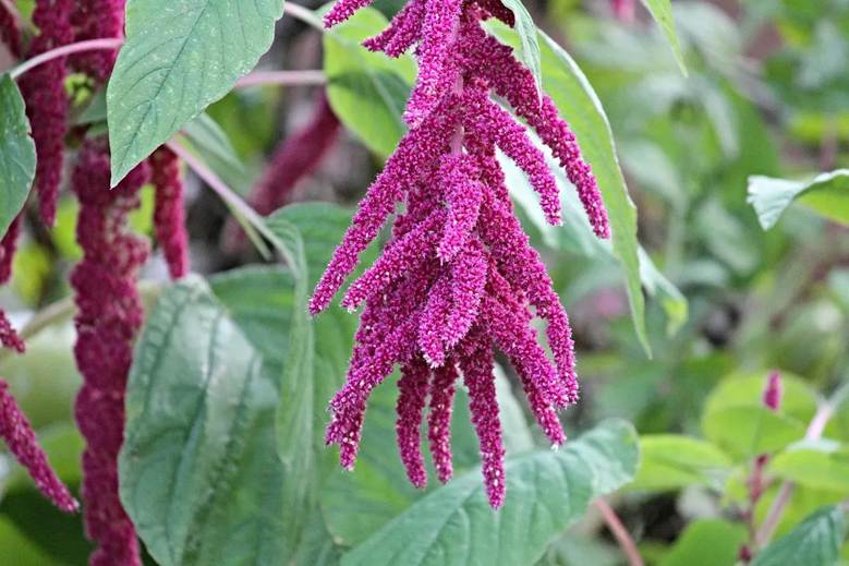
Amaranth – which has dozens of different species – originally comes from Mexico. The best-known species have a unique shape like an ear of wheat, with a wonderful reddish hue. Ancient people are believed to have eaten both the seeds and the leaves. Pre-Columbian civilisations consumed it in vast quantities, along with corn, due to its excellent nutritional properties (nowadays amaranth is often used in food designed for coeliacs, as it is naturally gluten-free). Concoctions based on amaranth were also used for religious rituals and to create anthropomorphic idols.
The word amaranth comes from the ancient Greek and means ‘immortal’ or ‘imperishable’. There are records from ancient Greece and Rome describing a plant called amaranth that was used as an offering, to ask the goddesses to look upon them favourably. However, these sources most likely refer to another plant, as amaranth wasn’t imported into Europe until the eighteenth century.
Amaranth, a powerful colour: from the Medici to Ferrari
Amaranth therefore has a long history of being used by humans, and it cropped up again in the Renaissance period as the colour of the powerful Medici family, which ruled the city of Florence.
Amaranth has also been widely used in the military sphere. During the Second World War, amaranth (or maroon) was a symbol of the UK’s Royal Air Force. And the Italian Folgore specialist parachute unit still wear a famous amaranth beret today.
Amaranth is also very popular in sport, and is associated with various teams, including two Italian football clubs, Livorno and Reggina.

The Ferrari F1 racing team – usually associated with another famous red – also took advantage of this colour’s symbolism and power. In 2020, the renowned Italian team celebrated its 1000 Grands Prix raced in 70 years by dressing its special Ferrari SF1000 in a striking amaranth-coloured livery.
It chose this colour because back in 1950, at its first ever Grand Prix in Monca, Ferrari raced in futuristic amaranth-colour cars.

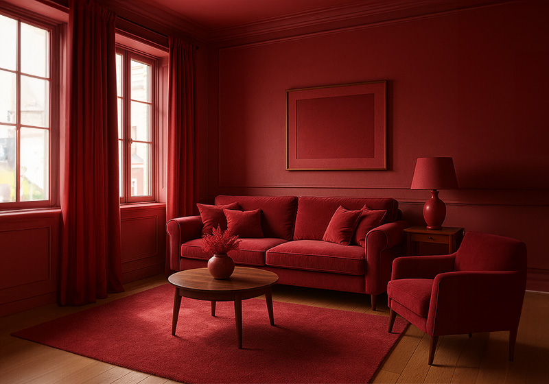
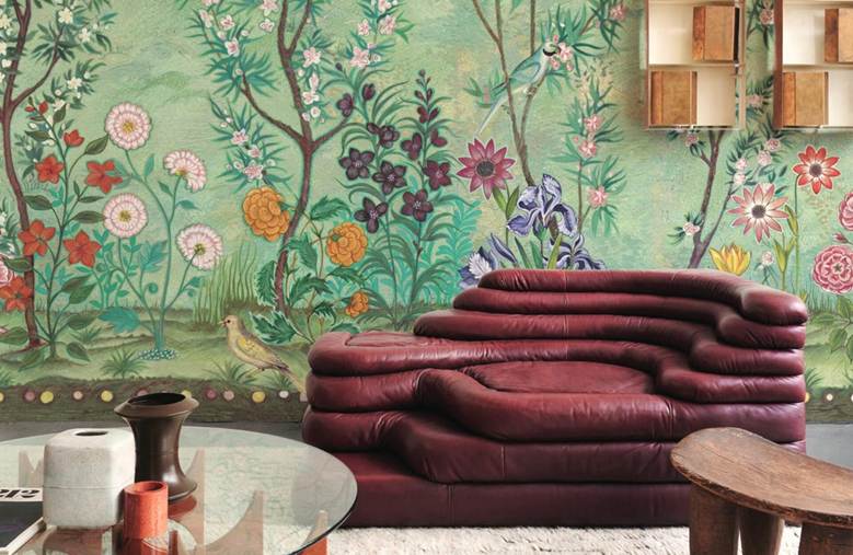
But amaranth is probably at its best in more everyday contexts, including, undoubtedly, interior design, where it is used to give spaces an elegant and refined feel. It is perfectly ‘at home’ in both industrial and ethnic styles, although it comes with a warning: as it is quite a strong hue, it is best not to go too mad! We recommend using it to bring out more delicate shades like white, pearl grey and pastel green.
Do you have a special affinity for amaranth? Have you used it in any of your projects? We’ve just got one piece of advice… be inspired by its wonder!