
Table of Contents
A few centuries ago, artists, cultural patrons and aristocrats from all over Europe began travelling across the continent to hone their taste and appreciation of beauty. When they reached the Naples area, the travellers’ diaries and journals describe admiring a beautiful red colour in the villas and many other buildings of an ancient city.
That city was Pompeii – buried by a volcanic eruption long ago and brought to light, to widespread amazement, in the eighteenth century – and that specific red became known as Pompeiian Red.
As a result, Pompeiian Red made its way into Western colour schemes: today it is a classic hue, the star of countless architecture, design and fashion projects. And now also the latest stop on our journey exploring iconic colours!
What colour is Pompeiian Red?
Pompeiian Red is known by many other names, including Herculaneum Red, Pozzuoli Earth Red, English Red and Verona Red Earth. Whatever you want to call it, it is an ancient, intense, austere and stylish colour.

Pompeiian Red has a Pantone code: 18-1658 TPX. And if you want to use it online, according to Encycolorpedia the HEX code for Pompeiian Red is #a42a2e.
Some people confuse Pompeiian Red with another colour, Dragon’s Blood, but the two tones are not actually quite the same: although both pigments were used by the ancient Romans, they come from completely different sources. Dragon’s Blood is produced from an organic substance, a plant from the genus Dracanea, while Pompeiian Red, as we will see, is inorganic: it has a mineral composition.
Where did Pompeiian Red come from?
Pompeiian Red became famous in the eighteenth century, when major archaeological digs unearthed two incredibly well-preserved ancient Roman cities: Pompeii and Herculaneum.

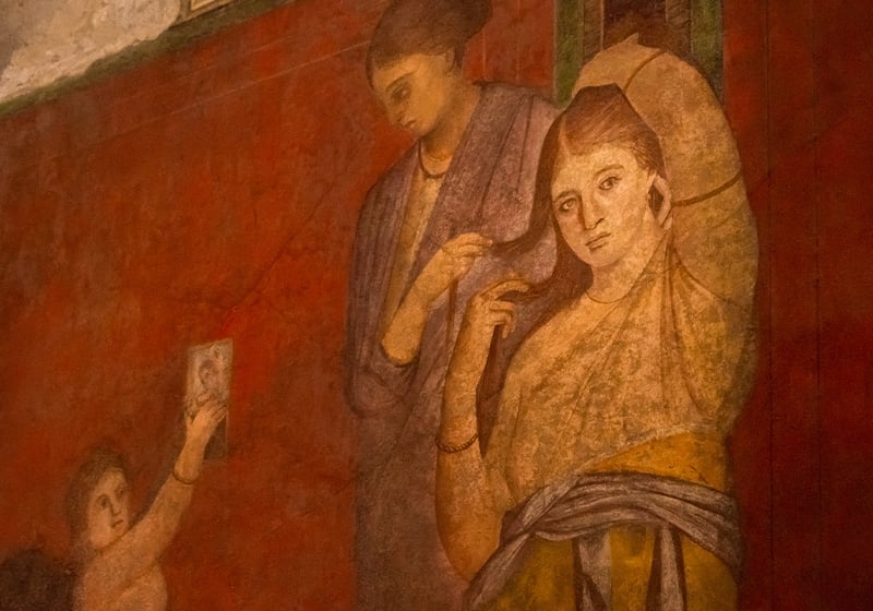
Many of the Roman villas in the two cities turned out to have incredible, captivating frescos in a perfect state of repair. And one of the things the first archaeologists found most striking was the colour: numerous walls were painted in an intense shade of red, which became known as Pompeiian Red.
Pompeiian Red soon became renowned in the courts and salons of the rich and famous across Europe. Touring Pompeii and Herculaneum was already a popular undertaking for scholars, aristocrats and people in positions of power. These journeys, known as the Grand Tour (which incidentally gave us the modern word ‘tourism’) shaped the tastes of an entire ruling class. For instance, writer and poet Johann Wolfgang von Goethe – a student of colour theory, about which he wrote a long essay – dedicated several pages to describing Pompeii’s monochrome walls and paintings, which he saw on his journey through Italy.
Pompeiian Red therefore undoubtedly played an important role in defining Western aesthetics at the time, and this has had an important bearing on current tastes too. That said, there are also a few myths to dispel about the colour…
Pompeiian Red didn’t originate in Pompeii
The first surprise in the history of Pompeiian Red involves its origins. Despite the name, the pigment did not actually come from Pompeii; it was probably imported from Turkey. In ancient Rome, Pompeiian Red was known as sinopsis, a reference to Sinop, a Turkish city where, according to the ancient chronicles, Pompeiian Red was used for the first time.

The pigment used for Pompeiian Red is of inorganic origin, meaning that unlike many other pigments it is derived not from a plant but from a mineral. The colour was produced from a blend of cinnabar – a compound containing mercury – and minium, a compound based on lead.
These pigments were rather rare, very expensive and extremely harmful to human health. Even in ancient times, people were probably aware of Pompeiian Red’s toxicity: most of the workers who extracted cinnabar – which was also used to make mercury – from the Spanish and Italian mines were slaves.
Another myth: not all Pompeiian Reds were red
There’s perhaps another myth to dispel about Pompeiian Red too. According to a team of researchers, only some of Pompeii’s walls were originally painted red: the rest were probably closer to ochre, and so more of a yellow.
These recent studies have ascertained that the current red colour of many of Pompeii’s walls stemmed from the volcanic gases and high temperatures produced by the famous eruption of 79AD coming into contact with the yellow ochre pigment: this would have baked the ochre, turning it a similar hue to Pompeiian Red.

It is therefore probable that only a small proportion of Pompeii’s walls and frescos were originally red, which after all was a very expensive colour to produce. The laundries, for example, were most likely painted in the cheaper ochre yellow, with the red kept for the most opulent rooms, like the mesmerising Villa of the Mysteries, where detailed paintings stand out against the red backdrop of the walls.
The fashion for Pompeiian Red in architecture
Aften the digs at Pompeii and Herculaneum, Pompeiian Red became an increasingly sought-after and fashionable colour, particularly in architecture.
Sir John Soane, the English architect who inspired the design of the iconic red British phone box, was apparently particularly fond of Pompeiian Red. And he wasn’t the only one.
In the centre of Bolzano, a town in northern Italy, a Pompeiian Red house stands out from the surrounding buildings. It is now a research centre, but it used to house meetings of the Gioventù Italiana del Littorio (GIL, the Italian youth wing of the Fascist Party), one of many buildings that sprung up across the country for this purpose during the Fascist era. Further south, on the Amalfi coast, one of the stand-out structures in the brightly coloured village of Positano is an old Pompeiian Red building: the historic Le Sirenuse hotel, which has also incorporated the colour into its branding and merchandise, including various company-branded garments.

A much more famous example of Pompeiian Red in architecture is Villa Malaparte in Capri. The bizarre structure entered the public consciousness when it was used as the backdrop to a divine Brigitte Bardot in Jean-Luc Godard’s masterpiece of French cinema Contempt.
The building, designed by Italian architect Adalberto Libera and combining surrealist and rationalist features, is a Pompeiian Red colour box overlooking the sea, dominated by a strange staircase.
From pop to fashion: Pompeiian Red today
Nowadays Pompeiian Red is used successfully in countless other contexts – from sport to design.

For example, the Italian football team AS Roma features Pompeiian Red – paired with ochre yellow – in its coat of arms. It was also used for the team’s strips in the 1990s and early 2000s. In a completely different sector, Jennifer Lopez turned up at the Billboard Music Awards in Las Vegas in 2014 wearing a stunning dress by fashion designer Donna Karan. The Pompeiian Red added to the American singer’s sensual style, with a nod to ancient Rome.
Interior designers frequently use Pompeiian Red in many rooms of the house, from the living room to kitchen, on both the walls and furniture.

Some major design objects have also included Pompeiian Red, like the restyling of Arne Jacobsen’s iconic chairs by gallery owner Carla Sozzani.
Overall, this ancient hue has come a long way, reinventing itself and finding new relevance among creative minds all over the world!
How about you? How would you use Pompeiian Red in your design projects?