
Table of Contents
The ampersand (&) is one of the most unique and interesting typographic characters. This symbol, widely used and appreciated by many type designers for its great creative potential, has ancient origins that few people are aware of.
The character has different names in different languages: in Italian it is known as an e commerciale, in French it is an esperluette, in German it is Et-Zeichen, and it entered the English dictionary as ampersand in 1837.
& was the final letter in the English alphabet until the early twentieth century; the alphabet ended “X, Y, Z and per-se and”, and the contraction of and-per-se-and gave rise to its current name.
History and evolution

Although it was brought into common use by the British, the ampersand was first created in the first century BC by the Roman slave Marcus Tullius Tiro, who was Cicero’s personal secretary. Even after he was made a freeman, Tiro continued to transcribe Cicero’s texts, and by 63 BC he had developed a system of shorthand to speed up the writing process, known as the Tironian Notes.
In Old Roman Cursive the ampersand was the ligature between the letters “e” and “t” (“et” means “and” in Latin). With the development of New Roman Cursive, many ligatures appeared between various letters. Although the use of these ligatures reduced significantly during the transition to Carolingian, the & symbol remained, becoming gradually more stylised and so concealing its origin.
From the second half of the eighth century AD onwards, the ampersand was used widely by scribes. The aim of this and many other ligatures was to fit as many words as possible onto one line. Being able to vary the length of words was very useful so every line could be filled with a justified layout (where all the rows of a column of text are aligned vertically at both the left and the right).

After the advent of printing in Europe in 1455, printers also started making use of this symbol, both for Roman type and for cursive. The ampersand survived the manually-operated printing era for the same logistical reason: more movable characters could be positioned on a single line by replacing “and”, “und” or “et” with “&”. Nowadays, the character is practically identical to the Carolingian version established in the ninth century. In cursive type, the ligature between “e” and “t” arrived later, during the Renaissance, and was usually more creative and decorative in its design.
The ampersand in contemporary typography
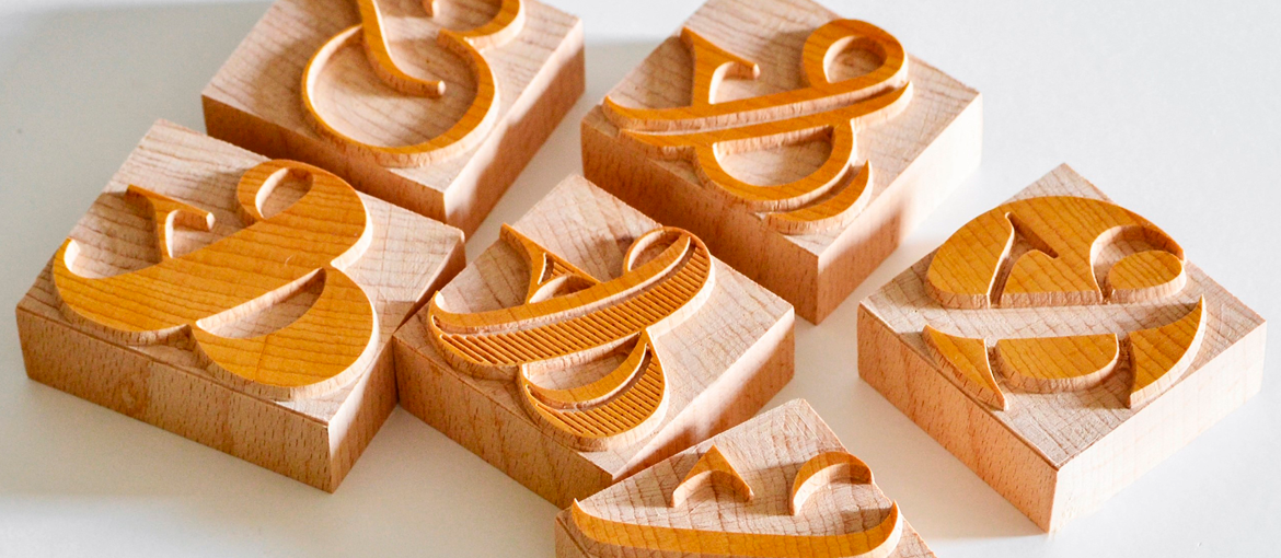
Nowadays the & symbol is included in the design of all new fonts, and forms part of every Latin script in existence. There are countless variations on the ampersand, especially in cursive fonts. Although it has gradually been stylised over the years, it still retains the basic combination of the shapes of “e” and “t”.
These historic origins are clear in certain fonts with a more obvious separation between the letters, such as Rotis Sans, Trebuchet and Bebas Neue.

However, the most commonly used ampersand, the one found in the majority of current fonts, is based on the Carolingian design. It is used both in serif typefaces like Didot, Bodoni and Bembo and sans serif fonts like Akzidenz Grotesk, Helvetica and Univers.


In addition to these simple ampersands, used mostly in Roman fonts, there is also a cursive style with more pronounced curves, influenced by calligraphy. This style is generally very elegant, and has given rise to a range of genuinely creative and diverse symbols.

Bottom row from left to right: Garamond Italic, Sabon Italic and Monotype Corsiva Italic.
There are many interesting variations on the ampersand, including those created by Ludovico degli Arrighi, the Renaissance-era master engraver and calligrapher, and Robert Granjon, the sixteenth-century French type designer.
The 1992 font Poetica, created by Robert Slimbach for Adobe based on chancery hand, a form of calligraphy used in thirteenth-century commerce, offers an impressive collection of 58 ampersands.

& in corporate identities
The ampersand has become a true icon, used widely in both logos and typograms. It is a common feature in the logos of various famous companies, including the multinational telecoms firm AT&T, whose logo features a blue-and-white striped globe and the company’s name in a sans serif font. In the consumer goods sector, meanwhile, the ampersand is used by the company that produces the “colourful button-shaped chocolates” M&M’s (Mars & Murrie Ltd) and by Head & Shoulders, the renowned American firm that specialises in anti-dandruff shampoo. This brand is owned by The Procter & Gamble Company (P&G), which also has an ampersand in its logo. Another famous example is the Toni & Guy chain of hairdressers, founded by two brothers from Campania in the south of Italy, who moved to London in the 1950s.

Bottom row from left to right: Head & Shoulders and Toni & Guy.
In the arts world, the Victoria and Albert Museum in London arguably has the most successful logo featuring an &. The symbol helps to round off the letter A visually, producing a well-balanced result. The creative agency & Walsh made the ampersand a key part of its identity – the character has the additional function of creating a link between the company and the client (client & Walsh). And the publishing house Mondadori Electa, which specialises in art and design publications, also uses a version of & in its logo.

From left to right: Victoria & Albert Museum, & Walsh and Mondadori Electa.
The fashion sector also makes heavy use of the ampersand. In the world of haute couture there is the luxury Italian brand Dolce & Gabbana and & Other Stories, the company that grew out of a collaboration between a small group of creatives. And the symbol is also famous in the “fast fashion” arena, for example in the logos of H&M and Pull&Bear.

Bottom row from left to right: Pull&Bear and H&M.
The most amazing thing about the ampersand is the symbol’s longevity – it has been around throughout the history of typography and graphic design, all the way through to the present day. Initially made famous by its abbreviatory function, which allowed precious space to be saved, it is now an iconic character that is used widely in all sectors and in many forms of communication.