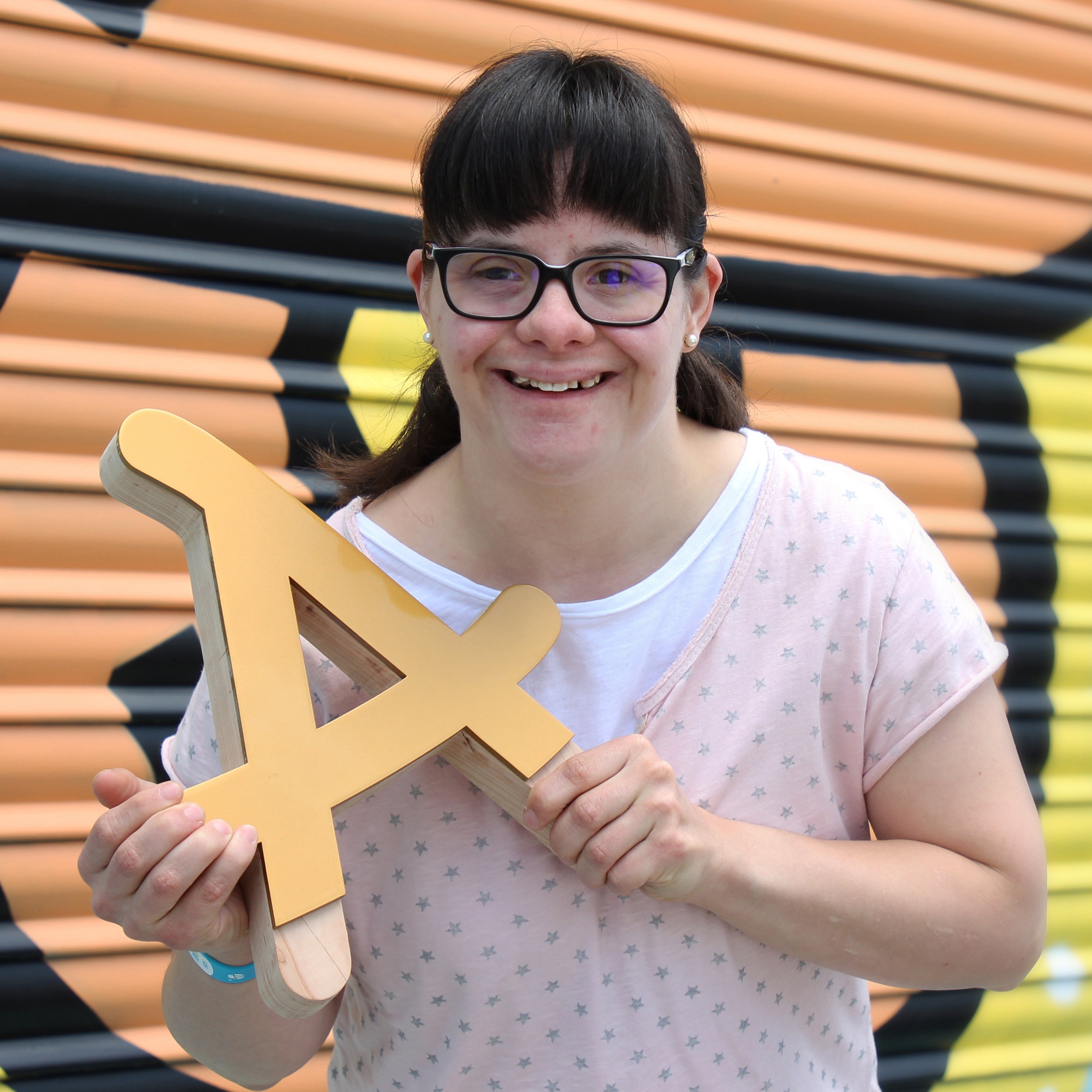
Her brother Marc says that, since she was a little girl, Anna has always enjoyed painting and writing as a form of expression. “For Christmas, she always asked for crayons, pens, paper.” The family could never have imagined that, years later, her artistic inclination would lead her to design her own typeface, most probably the first in the world designed by a person with Down syndrome.

It all began in 2011 after Anna Vives had a very bad introduction to the world of work. She was employed in a supermarket, where she was only trusted to gather up the trolleys that people left at the main entrance. The feeling that she was not useful, as well as the lack of contact with her colleagues, made her sad, so when the contract came to end she didn’t want to continue.
After five months stuck at home, Marc took her to the Itinerarium Foundation, which he runs in Barcelona, “with no idea what she could do.” In the end they thought that, since she didn’t know how to write on a computer, perhaps it would be a good idea to learn to type. “On the first day, she made 450 mistakes, and I told her, “When you make none, I’ll take you out to a restaurant,” he explains. That day arrived a year later and Anna left a post-it note on her brother’s desk: “Marc. No mistakes. Restaurant.”
What happened during that period is that Anna, helped by a member of staff at the foundation, fully immersed herself in the universe of letters. Every day, she stuck the typefaces she found in newspapers and magazines into a notebook. They went out together to see typography in the surroundings, such as at restaurants, and they also formed letters with sticks on the ground. Little by little, Anna learned what A, B and C were, and by the end of the process she had created her own writing system. In 2012, it was digitalised.
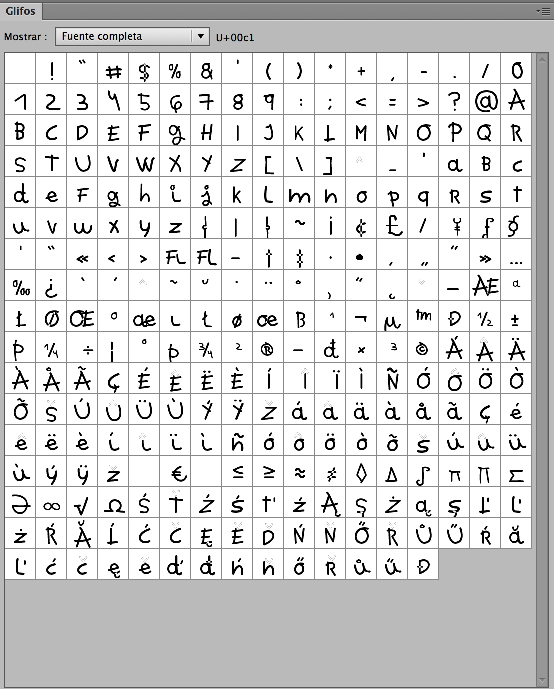
The result of all this effort — which was also a very enriching process — was the typeface named after this girl with Down syndrome, made up of 126 characters of the Latin alphabet, punctuation, accents and some special characters. The font, which is unique because it combines upper and lower case letters interchangeably, is available for any type of computer and it can be downloaded free of charge for private use.
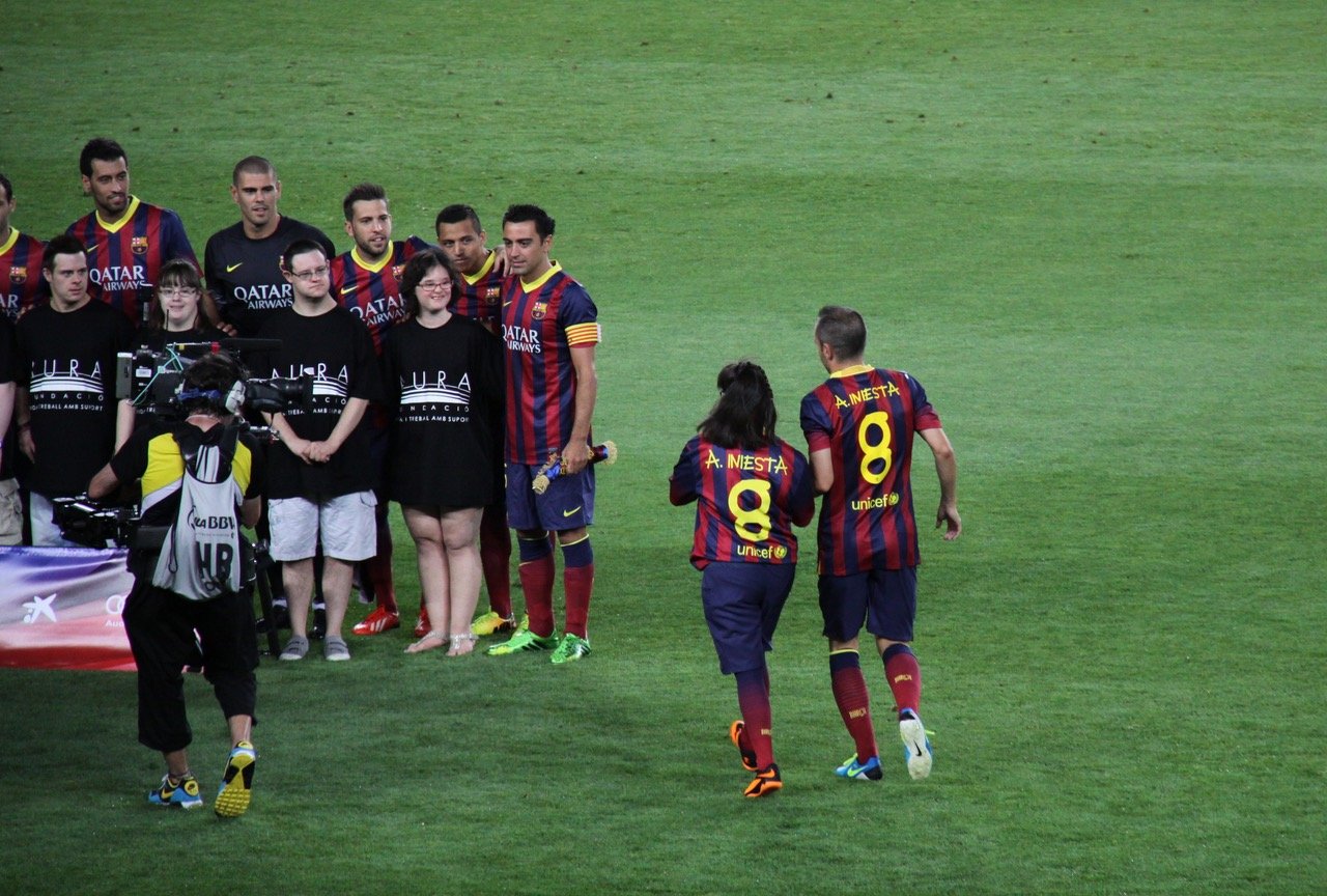
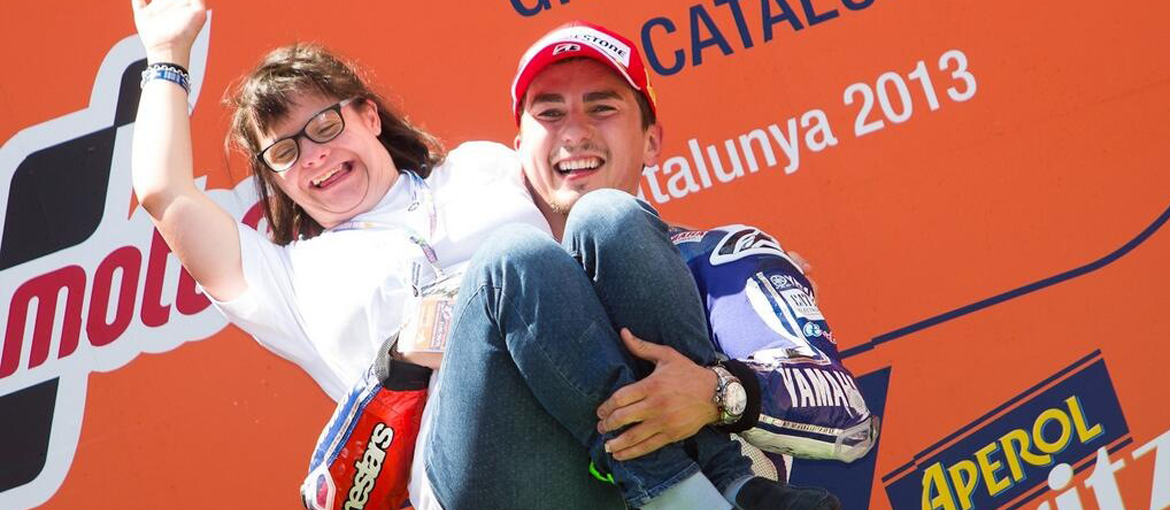
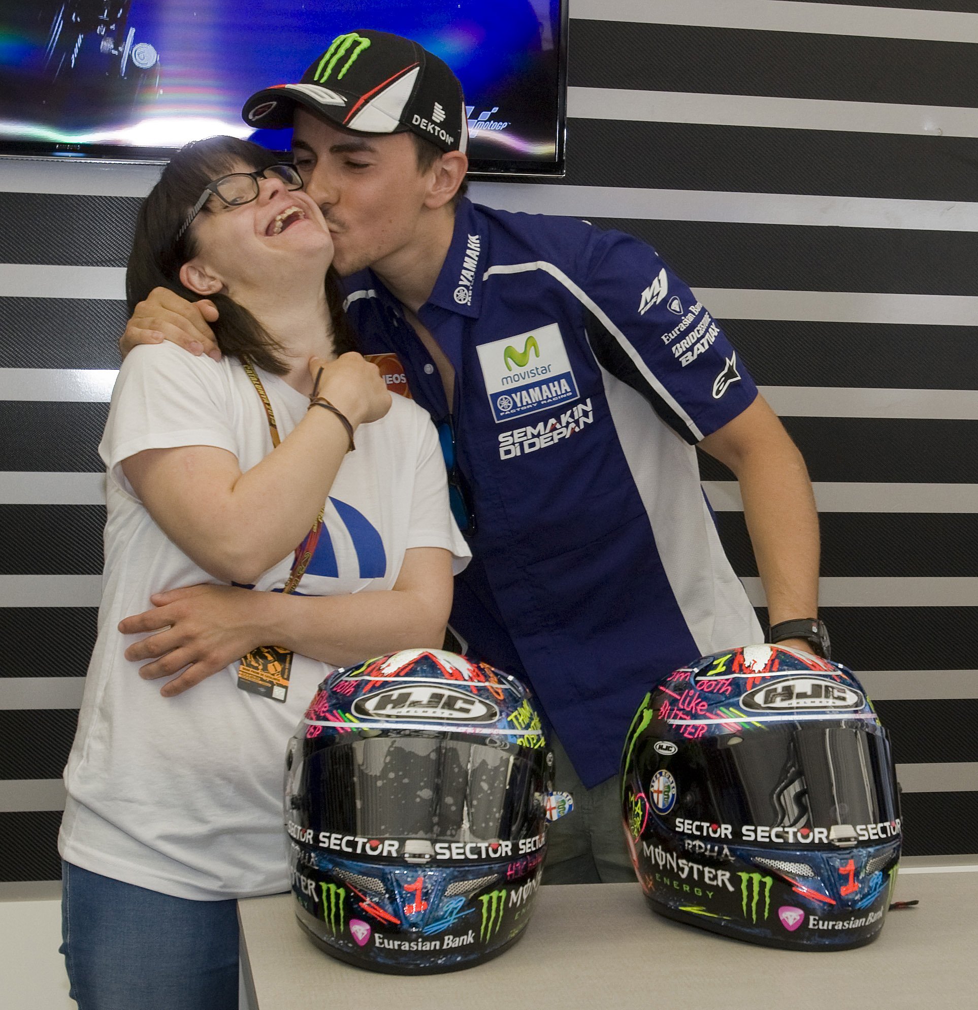
Since its launch, Anna’s typeface has been used in a large number of increasingly exciting projects. FC Barcelona wore it on their first team shirts in the 2013 Joan Gamper Trophy, and it has also been worn by other clubs around the world such as River Plate. Anna also appeared in the newspapers in 2013 arm in arm with motorcyclist Jorge Lorenzo on the podium of the Catalan Grand Prix. And it hasn’t just been sportspeople like Mireia Belmonte, Pau Gasol, Kilian Jornet and Gemma Mengual who have helped make the typeface famous, but also restaurants like Carme Ruscalleda’s Sant Pau and brands like Geox, which has created three trainer collections inspired by her designs.

Her story has also been made into a book, ‘Si crees en mí, te sorprenderé’ (If You Believe in Me, I’ll Surprise You), a she even made it to the Vatican. In fact, last July, Anna had an audience with the Pope, who she gave one of the latest shirts worn by the now former FC Barcelona player Andrés Iniesta.
The ultimate aim of the typeface is to promote social equality and the importance of teamwork — “adding abilities” as the Itinerarium Foundation’s main motto says. Since it was founded in 2007, this organisation has promoted inclusion and equal opportunities for people with special needs through collaborative work and educational innovation. Anna’s is one of 21 projects currently underway, which also include robots made from recycled materials by Joan, a boy with ataxia, and ‘La empresa más loca del mundo‘ (The Craziest Enterprise in the World), a Youtube series.