
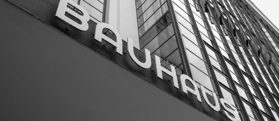
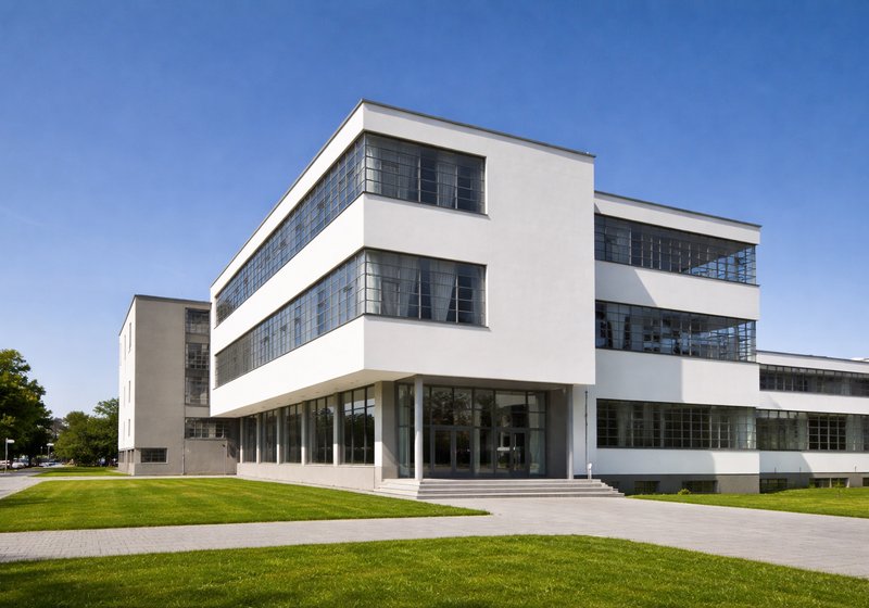
One of the most formative and progressive design schools of the last century, Bauhaus this year celebrates the 100th anniversary since its founding. Many design icons emerged during the modernist school of art’s 14-year existence. Prominent, multidisciplinary designers of the time, who fused art with craftsmanship, taught at the Bauhaus. Ideas and works conceived at the iconic institution have had an enduring influence on design.
The reproduction of Bauhaus chairs is experiencing a boom, while a copy of the famous cantilever chair by Marcel Breuer can be found in almost every doctor’s surgery; and now, an unknown and partly unpublished portion of the Bauhaus typeface – lost in the archives for years – has been rediscovered.
As part of this year’s 100th anniversary celebrations, the Bauhaus Dessau Foundation, in collaboration with Adobe, called on font designers at the former art college to reinterpret five Bauhaus typeface designs and bring them into the digital realm.
Through the combined efforts of five universities and the renowned typographer Erik Spiekerman, a handful of students were invited to the Bauhaus to take up the challenge. Among them were Flavia Zimbardi and Luca Pellegrini, who got to work with selected font designs, typographical sketches, and poster designs that spent decades in the Bauhaus Dessau archives.

One of these font designs is Xants by Xanti Schawinsky, recreated by Luca Pellegrini, graphic designer and master’s student at ECAL. Schawinsky, an interdisciplinary artist of the Bauhaus, designed an entire font back in the early 1930s; Luca Pellegrini has now brought it up to date with additional characters such as currency signs, punctuation, and mathematical symbols. The resulting Xants typeface has stencil-like characteristics and, despite its linear design, a neoclassical quality. Particularly striking are its sharply contrasting lines.
The second typeface reprinted for the Hidden Treasures: Bauhaus Dessau project is Joschmi. In contrast to Xants, there were initially only six analogous lowercase designs (a, b, c, d, e, g) available for Joschmi. Joschmi was designed by Joost Schmidt, who studied at the Bauhaus and went on to teach typeface design, among other subjects. The typographer to breathe new life into the font was New York resident and Cooper Union graduate Flavia Zimbardi.

The resulting Joschmi font comprises simple geometric forms, which, as is characteristic of Bauhaus, are aligned on a grid. Using additional parameters, Flavia Zimbardi developed a working typeface design based on the six lowercase characters. In spite of its prominent edges, Joschmi has a surprisingly minimalist aesthetic. Its chunky, curved shape clearly evokes the Bauhaus style. The stencil effect lends the condensed font a conservative yet playful charm. And its use of additional white space makes the thick lines more reader-friendly.Work on Joschmi therefore began not with a blank canvas, but with pre-existing character designs. Flavia Zimbardi describes how the process of digitally recreating a font differs from designing a new one, and the challenges of reinterpretation, as ‘a game in which the player has to decide when to remain faithful to the original and when to make aesthetic improvements in order to transform the concept into a functioning product for the modern day.’
Flavia Zimbardi says the process of redesigning fonts is an exciting one, as it opens the door to a wealth of opportunities in the digital realm. Working with a grid system was especially important to her: ‘This allowed more room for trial and error and meant I could create lots of alternative forms – which are available as open-type styles in the finished font.’
Recreating a font poses new challenges. There is no blank canvas on which to experiment; indeed, it is important to understand the concept of the original within its historical context, as well as the story behind the font. The aim is to analyse the individual character components, establishing a grid system in order to discover a pattern in the font design. According to Flavia Zimbardi, this aspect of redesigning typography is ‘like being an archaeologist and designer at the same time.’
As part of the ongoing Hidden Treasures: Bauhaus Dessau project, a further three fonts are set to be (re)published, taking their place alongside Xants and Joschmi.
The original versions of the soon-to-be-released fonts were designed by Bauhaus masters Carl Marx, Alfred Arndt, and Reingold Rossig, and are expected to be published one at a time over the coming summer. The fonts that have already been published can be found on Adobe Typekit.