Table of Contents
The official poster
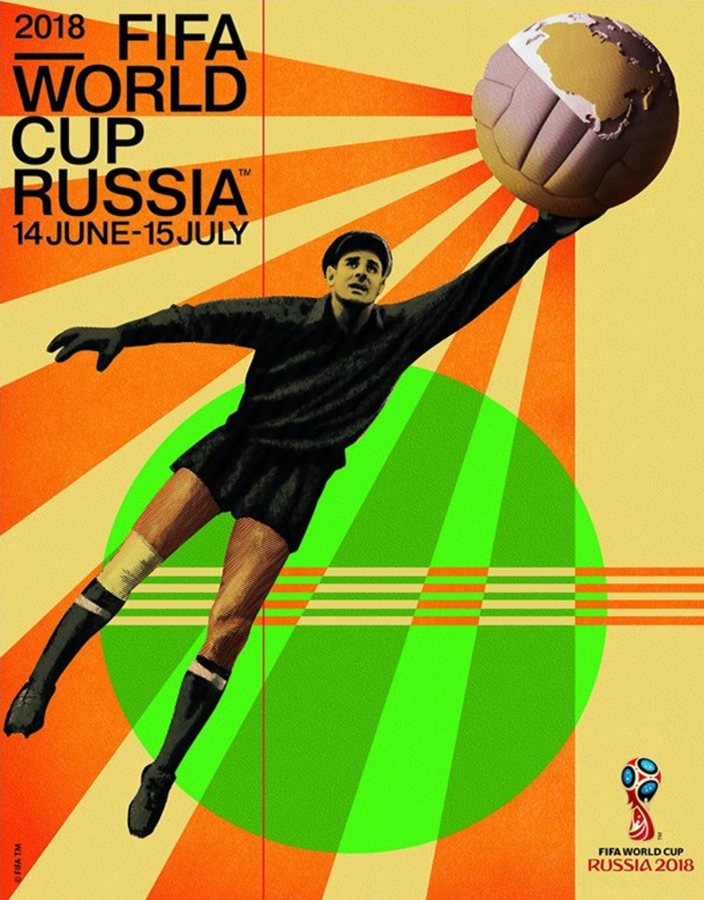
Let’s start at the beginning: the official poster for the 21st FIFA World Cup. Created by Igor Gurovich of design agency Ostengruppe, it references Russia’s constructivist movement from the 1920s and 1930s. Gurovich was particularly inspired by the work of Dziga Vertov and the Stenberg brothers. The poster features legendary Russian footballer Lev Yashin. Considered one of the greatest ever goalkeepers, Yashin is the only keeper to have won the Ballon d’Or! It was therefore logical for him to be the host nation symbol. In the poster, he’s pictured mid-save in his traditional goalkeeper’s garb. Dived in two halves, the ball represents both an old-fashioned leather ball and a globe showing Russia seen from above. The rays of light symbolise the “energy of the tournament” and the whole world’s focus on this event.
Last of all, the green circle represents the pitches in the 12 stadiums of the 11 host cities.
The shirts
Do the shirts at this tournament give you a sense of déjà vu? Don’t worry, it’s normal, because like everywhere else, fashion on the football pitch is constantly going around in circles. This year, many national shirts are inspired by previous incarnations. None more so than those made by Adidas, which has drawn heavily on classic shirts of the past.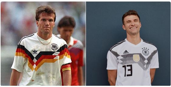 Take the Nationalmannschaft shirt. This features many similarities with the strip worn by the re-unified Germany team crowned world champions at Italia ’90. On the latest version, lines in various shades of black and grey replace the colours of the German flag.
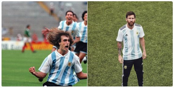 For the Albiceleste’s 2018 jersey, to bring the best of luck to Lionel Messi’s teammates, the brand was paid homage to the shirt worn by Argentina in 1993, the year they won the Copa América.
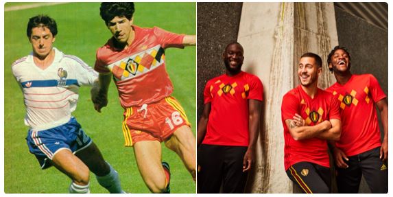 As for the Red Devils, their new top is a nod to the kit worn by Belgium in 1994. It has the same jacquard design but minus the white band.
Advertising
Now let’s turn our attention to advertising and kick things off with the ad produced by BBC Sport. It uses Russian cultural object, tapestry, to create an animation that is both vintage and ultra-modern, and depicts some of the greatest moments of this global event.
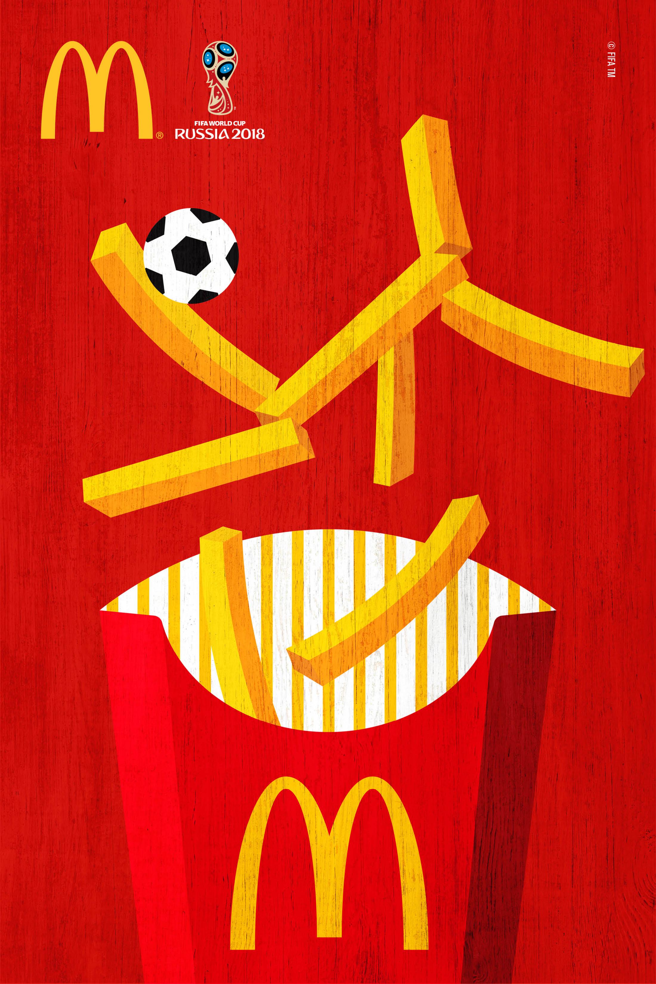
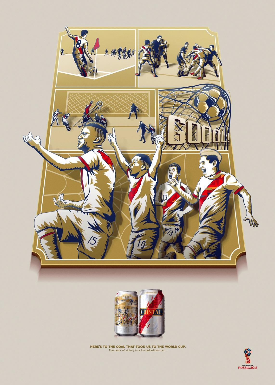
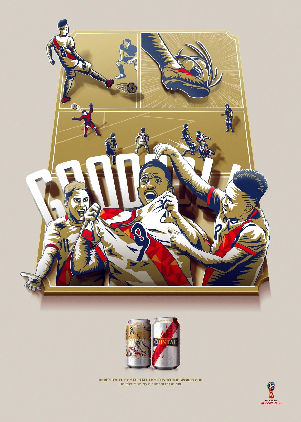
McDonald’s and Peruvian beer brand Cristal also took advantage of this Russian world cup to create colourful advertisements in the bold and unmistakable graphical style of Soviet propaganda posters.
McDonald’s:
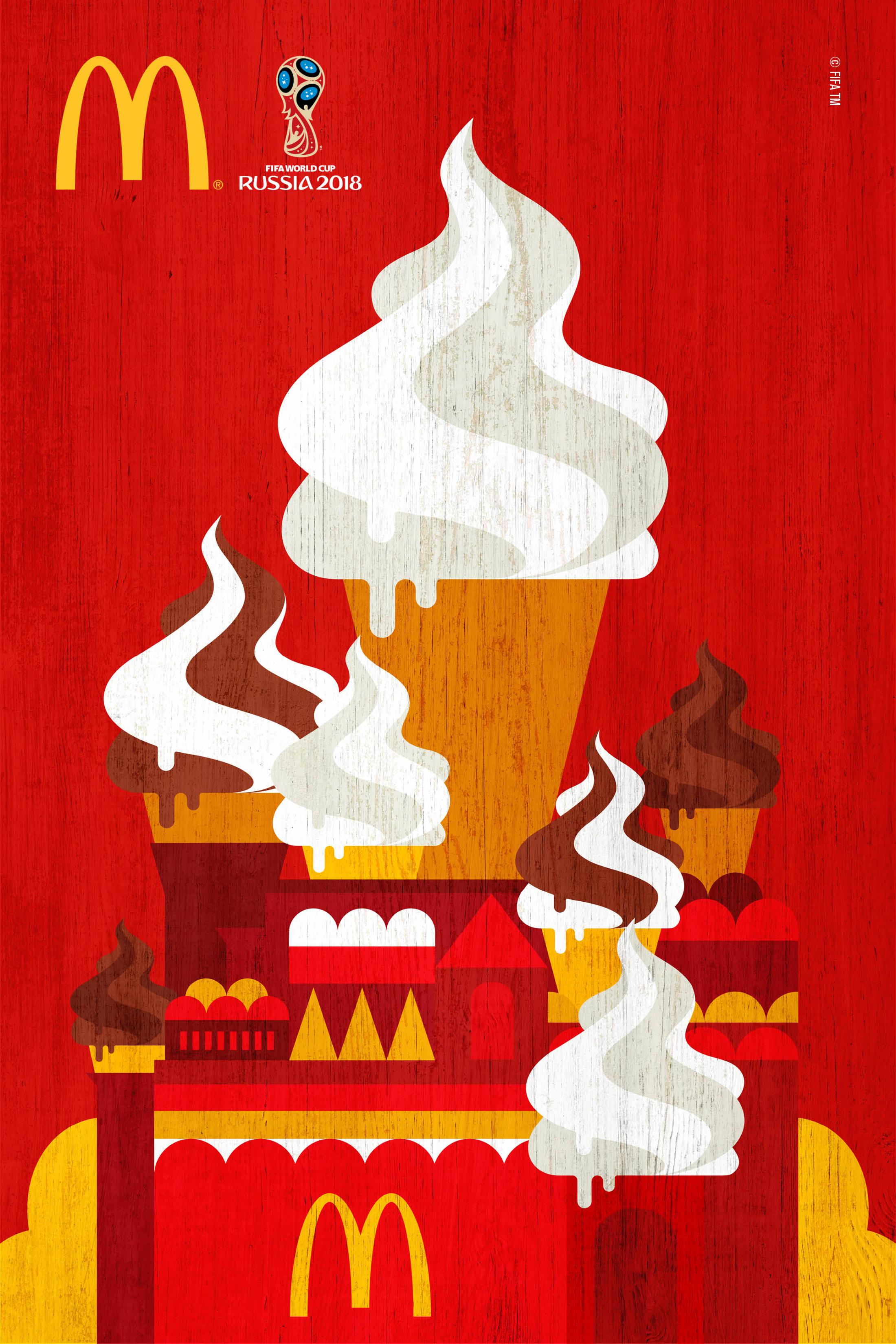
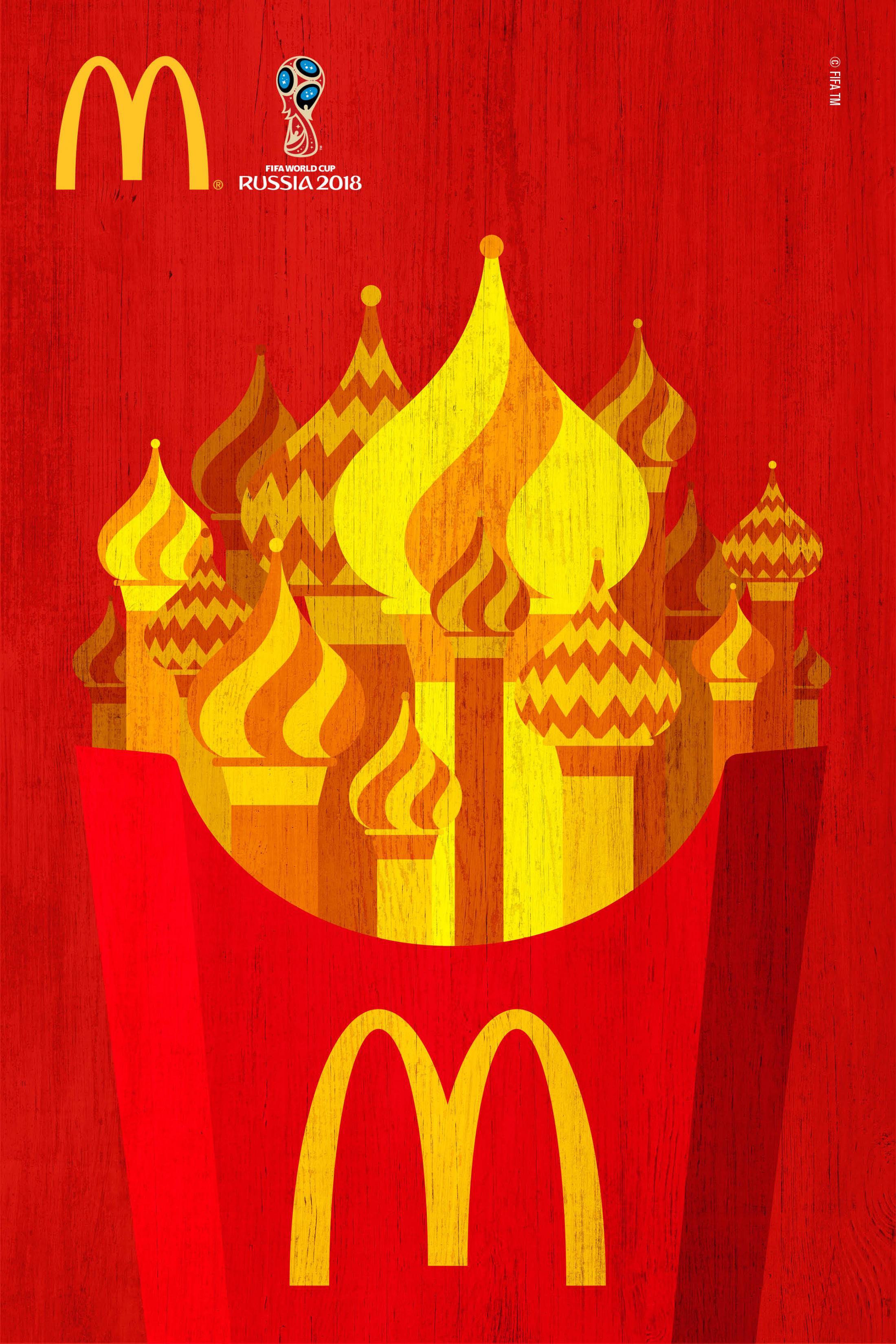
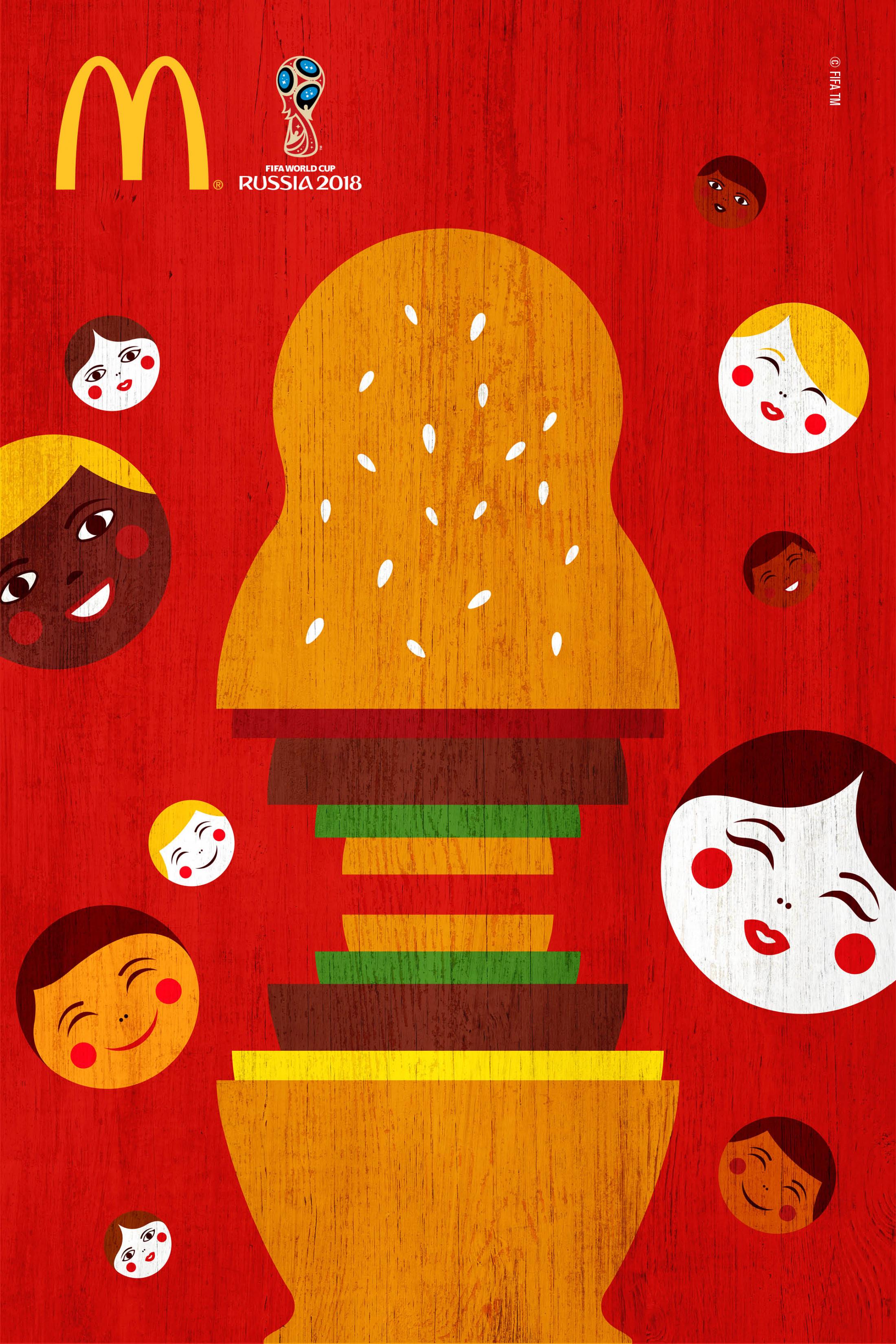
Cristal:
The press
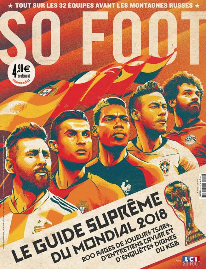
This style was also adopted by French football magazine So Foot, which commissioned Brazilian illustrator Cristiano Siqueira to design the cover for its World Cup 2018 issue. It features world football’s biggest stars depicted as Soviet heroes.
Agencies and graphic designers
To wrap things up for the 2018 World Cup and retro design, let’s check out the work of an agency and a graphic designer:
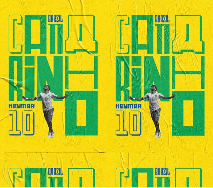
The agency is Lovegunn. These football-mad Brits have produced a series of posters mixing photography, geometric shapes and typefaces.
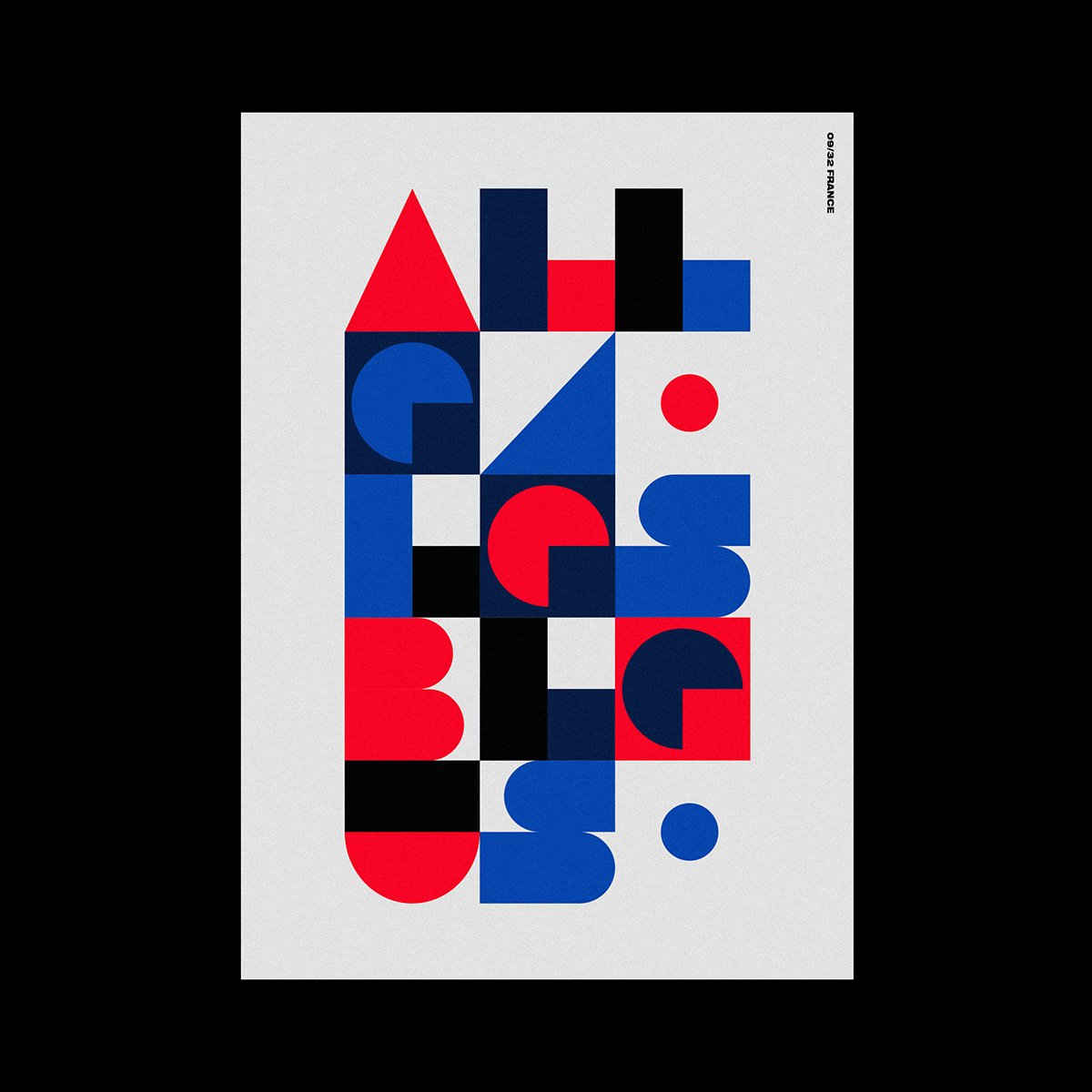
The graphic designer is Tom Anders Watkins. He has created a poster for every team present at the world cup. Blending typography and graphic design, each poster features the nation’s colours along with a chant sung by their fans.

