
Table of Contents
We’re a curious lot. We like to poke around on the web to find the latest colour trends. Every year, Pantone publishes a list of trend-setting colours, colours that we’ll see on the catwalk and in the world of design, interiors and graphics. Tones that will colour the pages of the sharpest magazines and, therefore, pass through our printing presses!
What’s the most on-trend colour of 2018? Which tones will colour this summer? If you’re curious, read on, because this article will reveal all! 😉
Ultra Violet: the colour of 2018
On 7 December last year, the Pantone Color Institute, the consulting arm of Pantone which forecasts colour trends, chose the colour of 2018. Drum roll… it’s Ultra Violet! Here we explain the characteristics of this colour, which isn’t any old violet.
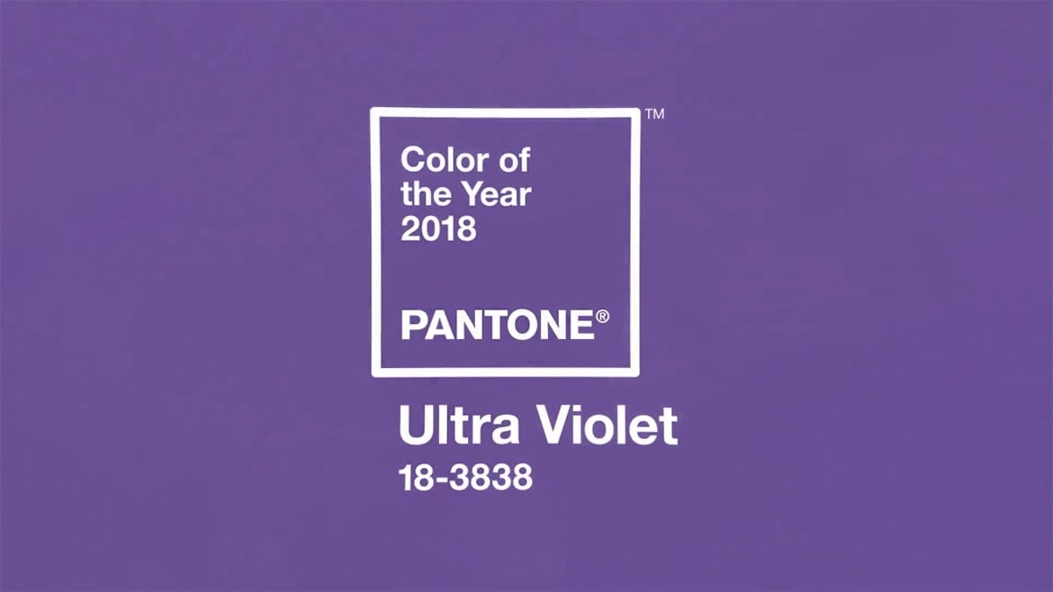
Ultra Violet 18-3838 is not the colour of aubergines, nor of lavender or even amethyst. It’s a bright and intense shade of violet.
As Leatrice Eiseman, Executive Director of the Pantone Color Institute, explains, violet is a complex colour because it’s a blend of two apparently contrasting colours: red and blue. It’s a colour with an ancient history, a history that dates to the time of the Phoenicians. This dye was produced in the city of Tyre and was extracted from… … the mucus of sea snails! It was one of the most costly and sought-after traded by city, so much so that the ships that carried the dye from Tyre to Jerusalem were constantly attacked by pirates.
Violet holds a particular fascination because it evokes the colours of the cosmos, the planets, nebulae and everything that takes us out of our world and encourages us to explore our imagination. It’s also the colour of spirituality, meditation, magic and fantasy. Ever noticed, for example, that unicorns are usually depicted with violet manes? And there’s more… violet is also a noble colour: in the 16th century, Elizabeth I forbade her subjects from wearing violet clothes, reserving the colour for members of the royal family only.
That’s why in this interview a violet-clad Leatrice Eiseman doesn’t hesitate to tell the interviewer that her favourite nail polish colour is Ultra Violet.
The colours of spring-summer 2018: Pantone’s selection
Summer 2018 will not just be purple: a wide and varied palette will colour the season. The Pantone Fashion Color Trend Report, released by the firm every six months, gives us the colours that will be most used in fashion and design over the summer season. And we can tell you this: the tones ooze vitality, energy, good vibes, calm and a sense of confidence. As Leatrice Eiseman told the New York Times: for 2018 “we wanted to pick something that brings hope and an uplifting message.” In a word: optimism.
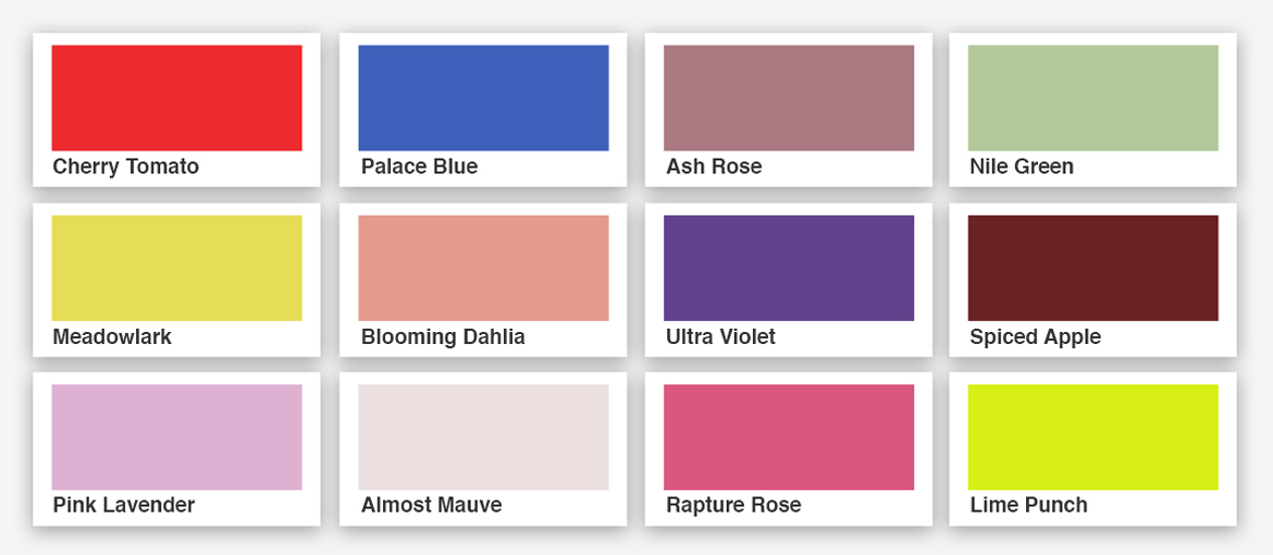
Indeed, Pantone spring/summer palette goes from delicate Pink Lavender to vibrant Cherry Tomato, via the soft and relaxing Almost Mauve and Ash Rose, evocative of flower petals, to the bold Lime Punch, sharp and zesty as its name suggests, to the lively Meadowlark and bright Palace Blue.
Here’s the palette of 12 colours chosen for spring-summer 2018.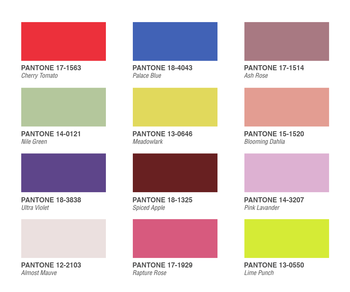 What are your favourite colours?
Pixartprinting wishes you a vibrant and energetic, calm and relaxing summer… just like the colours of 2018!