
Table of Contents
In the late 17th century, Swiss doctor Johannes Hofer first used the term ‘nostalgia’ to describe the yearning for home that filled the soldiers of his country. With the passage of time, nostalgia came to define a collective sentiment for something more than a country – for the culture of another era.
And if there is one era that is currently being recalled with special fascination, it is without doubt the 1980s, characterised by shoulder pads and too much hairspray, but also rebelling against the norms and the desire to show one’s own individuality. It was a highly expressive time, especially when it came to music, art, fashion and design. And of course, typography was also influenced by this explosion of colour, extravagance and neon lights. This was also thanks, in part, to the emergence of personal computers and the first design software, which allowed for risk-taking and experimentation.
Nostalgia for the 80s is what has led contemporary graphic designers to continue to create fonts inspired by the aesthetics of the decade. Some with overwhelming success. Look no further than the poster for the Netflix series ‘Stranger Things’. We at Pixartprinting have compiled a list of the best fonts, most of which are free for personal use.
THE BEST 80S FONTS: PIXEL FONTS
Pixel-based lettering were very popular in the 1980s, when the digital era was just beginning. They’re associated with gaming arcades where kids spent countless hours.
Arcade Classic

This font is based on video game machines that were available in shopping centres, bars and arcades, known as arcade machines.
Sabo
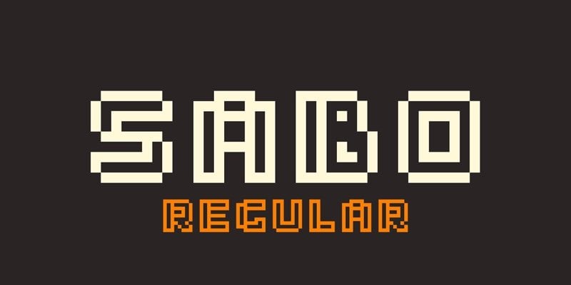
Created by Swiss graphic designer Philippe Moesch, Sabo is an 8-bit pixel font ideal for T-shirts, posters, and any design with a retro arcade theme.
THE BEST 80S FONTS – VIDEO GAME FONTS
In addition to arcades, another major influence of the time was the emergence of video games, which resulted in a typography style with a futuristic and digital aesthetic in the design world.
PacFont
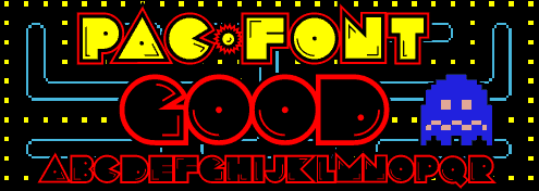
Pacman became a global phenomenon in the gaming industry following its launch in the early 80s. This font is based on the original game.
THE BEST 80S FONTS – VHS FONTS
They may seem like a relic to us now, but the fact is that in the 1970s, and in particular the 1980s, VHS was the most popular analogue home video recording and playback system. And today some fonts are still emulating its aesthetic.
Alien Encounters
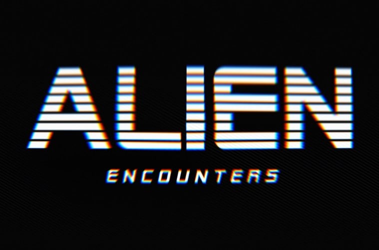
Although we don’t know what it has to do with extraterrestrial life forms, Alien Encounters is associated with science fiction products from the 1980s. It invokes the forward-inclined and horizontal cut fonts of films such as ‘Blade Runner’.
VCR OSD Mono
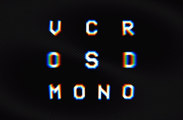
For those nostalgic for the imperfections of worn out VHS tapes, VCR OSD Mono will make an ideal font for contemporary projects with a vintage feel.
THE BEST 80S FONTS- NEON AND COLOURFUL FONTS
Any text that uses neon effects, bright dots or multiple colours for a bold and striking effect can be classified as the type of font that harks back to the 1980s.
Bayshore
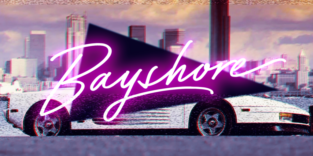
Reminiscent of games, films and music of the era, this font with radical strokes is ideal for giving a retro touch to logos, packaging, titles, headings and posters.
Retro Wave
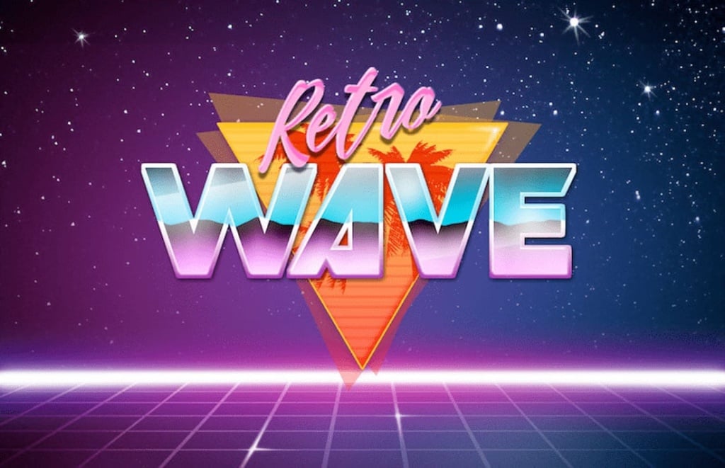
Retro Wave is strongly inspired by the new wave and soundtracks to classic 80s films, video games, cartoons and TV shows.
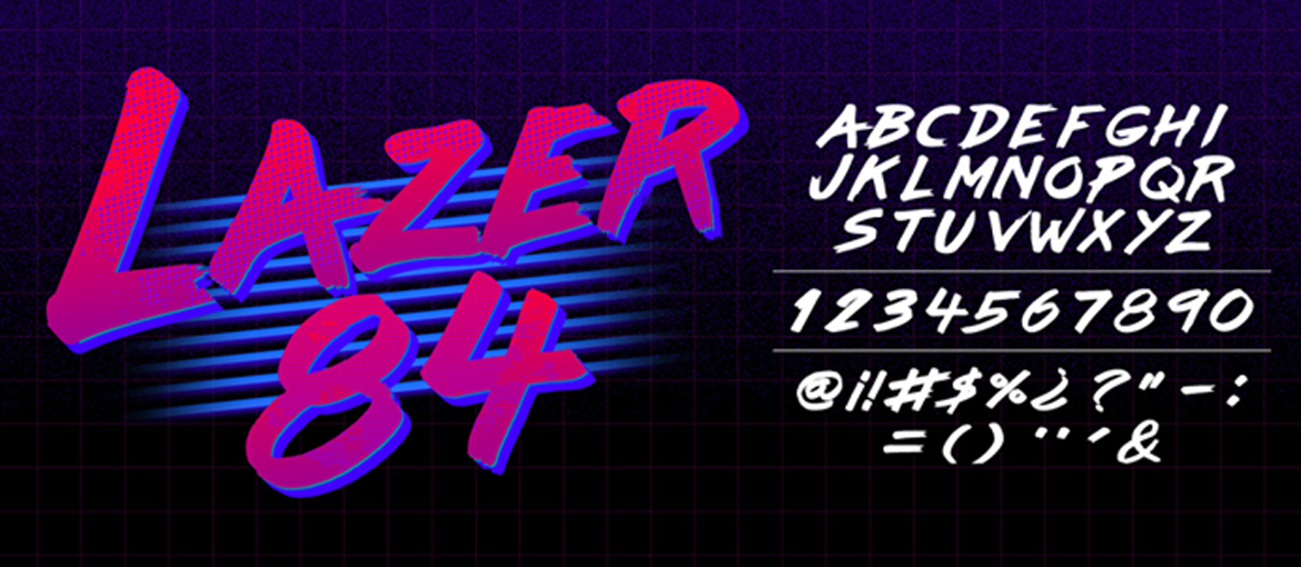
Lazer 84
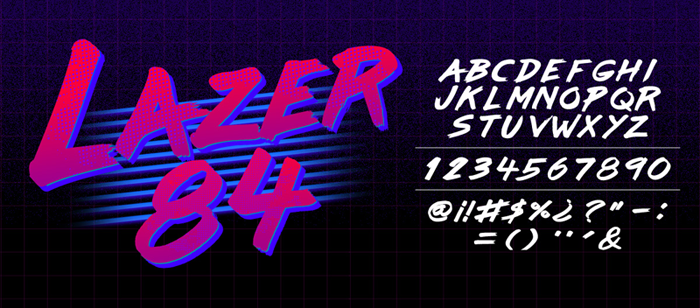
With its flashy colours, this retro 80s-inspired font is particularly suitable for more daring designs. The font includes numbers, symbols and accents.
THE BEST 80S FONTS – METAL FONTS
In the 1980s, many fonts adopted the style of the heavy metal scene of the time, and became popular for both album posters and movie posters.
Copper
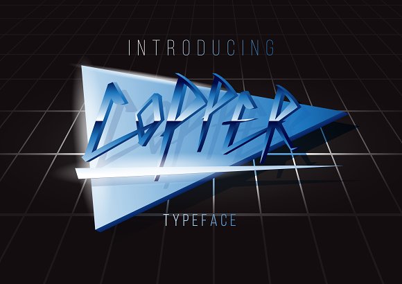
This avant-garde font with tapered strokes and sharp corners works especially well for logos, headers, event posters, invitations and other similar formats in need of an extravagant design.
THE BEST 80S FONTS – RETRO-FUTURISTIC FONTS
These days, many graphic designers are making use of retro-futuristic fonts for their projects – simultaneously inspired by modern design trends and the aesthetics of titles and movies of past decades.
Stargaze
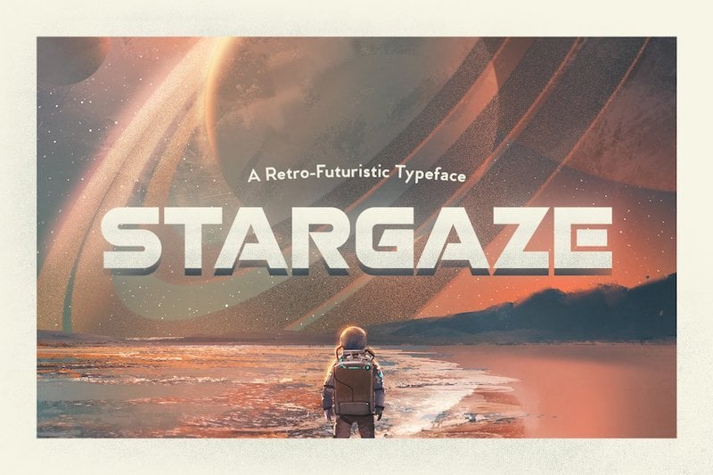
Stargaze has a great style that combines sharp and round corners, like the titles from old science fiction movies. The font includes upper case letters, numbers, and punctuation in several languages.
Paralines
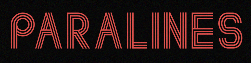
Lovers of film and television titles from the 70s and 80s will instantly recognise the parallel lines of this font style. It works well for graphic designs and posters.
Modern Applications of 80s Fonts in Design
The resurgence of 80s fonts in modern design is more than a trend; it’s a strategic choice for many industries aiming to blend nostalgia with contemporary aesthetics. These fonts are being effectively used in various sectors:
Tech Startups: Companies like Slack and Dropbox have incorporated neon and pixel fonts into their branding to evoke a sense of innovation coupled with a nostalgic touch, creating a unique brand identity that stands out in the tech landscape.
Fashion: Brands such as Gucci and Balmain use retro fonts in their promotional materials and product designs. The bold, expressive typography resonates with consumers who appreciate the vintage flair and its association with high fashion from the 80s.
Entertainment: The movie and music industries frequently use 80s fonts for marketing. For instance, the promotional materials for Netflix’s “Stranger Things” heavily feature 80s-inspired typography, which helps in setting the retro theme of the series.

These fonts’ bold, colorful nature is ideal for grabbing attention and conveying messages quickly, making them popular for advertising and social media graphics. Additionally, understanding the emotional connection that people have with the 80s era can significantly enhance brand loyalty and engagement. For example, brands often use 80s fonts to evoke a sense of nostalgia, which can create a strong emotional bond with their audience.
By merging 80s fonts with modern design elements, businesses can craft visually striking and emotionally resonant identities. Techniques such as combining retro fonts with minimalist layouts or using modern color palettes can create a fresh yet familiar look. This strategic use of 80s fonts not only pays homage to the past but also appeals to contemporary tastes, making it a powerful tool in the designer’s arsenal.
The Psychology of Nostalgia in Typography
Nostalgia deeply influences the appeal of 80s fonts, leveraging emotional connections to that era. These fonts can enhance brand perception and consumer behavior in several ways:
Emotional Engagement: 80s fonts evoke memories and feelings, fostering a stronger emotional bond with the audience. For instance, using retro fonts in branding can remind people of their childhood, enhancing emotional attachment.
Comfort and Familiarity: Recognizable fonts provide comfort and familiarity, making consumers more receptive to a brand’s message. This is especially effective in advertising, where familiar typography can make campaigns feel trustworthy and relatable.
Psychological Impact: Nostalgic design elements trigger dopamine release, boosting mood and positive feelings. For example, using 80s fonts in marketing can create a feel-good factor, making consumers more likely to engage with and purchase from the brand.
Targeted Demographics: Brands can effectively target Gen X and older Millennials, who have a strong emotional connection to the 80s. Tailoring marketing strategies to these groups can result in more effective and impactful campaigns.

By tapping into the psychological effects of nostalgia, designers can create powerful visual experiences. For example, Coca-Cola’s use of retro fonts in its “Share a Coke” campaign successfully evoked nostalgic feelings, leading to increased consumer engagement and sales. Understanding these psychological impacts allows brands to craft designs that resonate deeply with their audience, driving both emotional and financial rewards.