
Table of Contents
Despite being the most printed, distributed and translated book in the world, the Bible has not changed greatly in its format or layout since the nineteenth century. The technological and digital innovations that have completely revolutionised the world of publishing have allowed cheaper (and lower quality) Bibles to be produced, but they have not led to any significant variations in the book’s design or usability. For centuries, people have had a fixed idea of what the Bible should look like: a hardback leather cover, a gold leaf title, thin pages full of dense text, and red bookmarks and page edges.
It was this type of edition that Brian Chung, who co-founded Alabaster along with Bryan Ye-Chung, had in his hands the first time he read the Bible at university:
“I remember when I got my first Bible. It was a black, leather bible. The text was densely packed on each page, the pages were razor thin, and the whole experience made reading the Bible, honestly, really intimidating.”
Alabaster’s Bible Beautiful: giving the Bible an innovative, modern look
It was this that inspired Alabaster’s Bible Beautiful project, which provides a fresh, more Millenial-friendly approach to the Bible’s design. Bible Beautiful is the perfect response to a culture that is ever more obsessed with images, and which increasingly uses aesthetic appeal as a yardstick. Brian Chung explained:
“We live in an increasingly visual culture. Everyone has a smartphone with a camera, we consume lots of visual-based media, and we judge websites based on how well they’re designed. Instead of shying away from these realities, we thought – how could we bring this to a faith-based context?” .
The two founders both graduated from the University of Southern California – Brian studied business entrepreneurship and marketing, with a minor in communication design, while Bryan studied animation and digital arts. With clear ideas on business and the potential of design, and a shared Christian faith, they founded Alabaster with the aim of exploring what happens when creativity and religion come together. “The Bible, and God’s Word, is already beautiful, but could we create a beautiful reading experience?” they wondered, and so began designing an entirely new way of reading and approaching the Bible.

In September 2016, after meticulous and painstaking research, they created prototypes of the first books, producing just a few key double-page spreads, and launched a campaign on Kickstarter. The two founders kept the project secret until its launch, with the exception of a few close friends, who provided them with valuable feedback. After the campaign launch, those involved immediately started spreading the word. One of Brian Chung’s students wrote about it in the university newspaper, and a few days later, a former student from the university contacted them for an article in the Huffington Post. The campaign was successful, collecting $62,000 in thirty days, almost double their initial target.


A new graphic design for the Bible, inspired by indie magazines
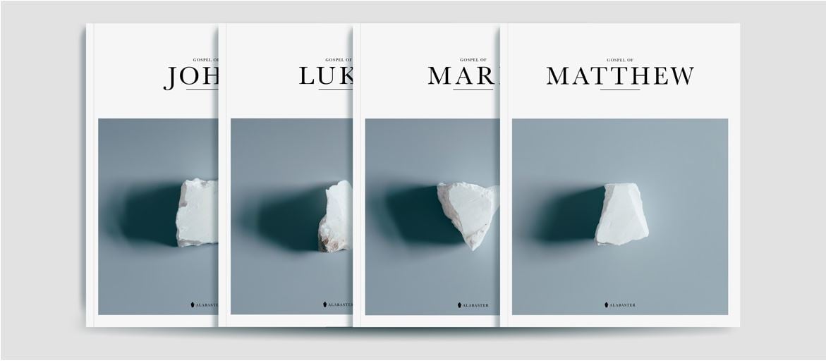
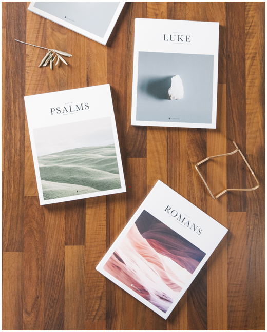
Inspired by indie magazines like Kinfolk, Cereal and Drift, the duo redesigned the Bible to make it easier to read and a more pleasant and meaningful experience. Instead of a single book packed with writing, their creation is a series of volumes that look like magazines, one for each book of the Bible. You can currently buy the four Gospels, as well as Genesis, Psalms, Proverbs and Romans.

The text is accompanied by photographs that frequently do not provide a didactic illustration of the words, but instead offer an interpretation, inviting readers to ask questions and find the answers themselves.
“The Gospels set ‘balloons spread’ comes from the Book of Luke, and the story of the lost son. There is an older son and a younger son, and the younger son wanders off and comes back home. As soon as the son comes back, the father throws a party for him. The tension in the story is that the older son does not want to join the party and stands outside, upset. We wanted to illustrate this tension. The two images represent the two different sons and their unique perspectives, emotions, and feelings at this party.”
The images also often help to shed light on aspects of the text that may evade readers used to more modern language.

Another crucial, and highly distinctive, element introduced to the layout is an abundance of blank space, something which is virtually absent in traditional Bibles. This gives breathing space to the paragraphs of text and to the images, making the reading experience smoother and more contemplative. A colour-coding system also helps with reading – each book uses colours that reflect the spirit that pervades it.

A lot of research goes in to defining the visual material used in each book:
“For each of the images, we start with an in-depth study of the book, looking for themes, tensions, and insights we can highlight and depict.”
For the first books they published, the four Gospels, 90% of the photos were taken by Bryan Ye-Chung. Since then, although a large part of the visual material is still produced in-house, they have started working with a varied team of photographers, a mix of up-and-coming creatives and well-established professionals, already working for brands like Adidas.
A new design and new materials: printing choices
Their focus on design is also shown by the attention they pay to the materials used in the publications: 380 gsm paperboard with a soft-touch aqueous coating for the cover, and uncoated 70-80 gsm paper for the inside pages; all printed lithographically to ensure as precise a result as possible.

The contemporary design and bespoke photographs combined with the choice of high-quality materials and printing techniques have ensured their customers and readers not only enjoy a different reading experience, but also store the book in a different place and access it in a different way:
“Traditionally, Bibles have always been placed on the bookshelf. And it’s been interesting for us seeing how a simple design change can change the function and placement of a book in a home. No longer is it tucked away on the bookshelf; instead it’s placed at the centre of the home, at the centre of where conversation happens.”
Underpinning Alabaster is a desire to devise new ways of approaching the Bible and the Christian faith in general by using art and design in a way that is more in line with present-day visual perception and aesthetics. The name Alabaster derives from one of the few times Jesus uses the word “beautiful” in the Bible, in the Gospel of Mark – a woman breaks an alabaster jar of fine perfume onto Jesus’ head, and he calls it a “beautiful thing”. As well as the Bible, Alabaster also aims to create content and a lifestyle that allows creative individuals to produce religious content and succeed. They continue this interesting conversation on their blog and in their book, All That is Made.