
Table of Contents
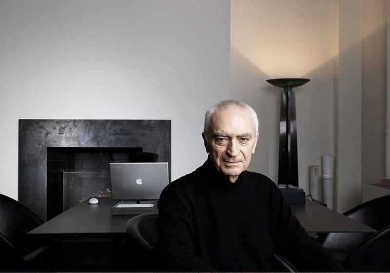
Massimo Vignelli was an Italian graphic designer who spent most of his working life in New York. Born in Milan in 1931, he studied architecture before branching out into the world of design, including graphics, furniture, interiors and signage.
Design is one was his motto — and that of his wife Lella, with whom he worked throughout his life. For the Vignellis, whether a visual identity, sign, chair or cup, the problem and solutions were the same. They designed with the same discipline, coherence and emphasis on function.
The Vignelli Canon
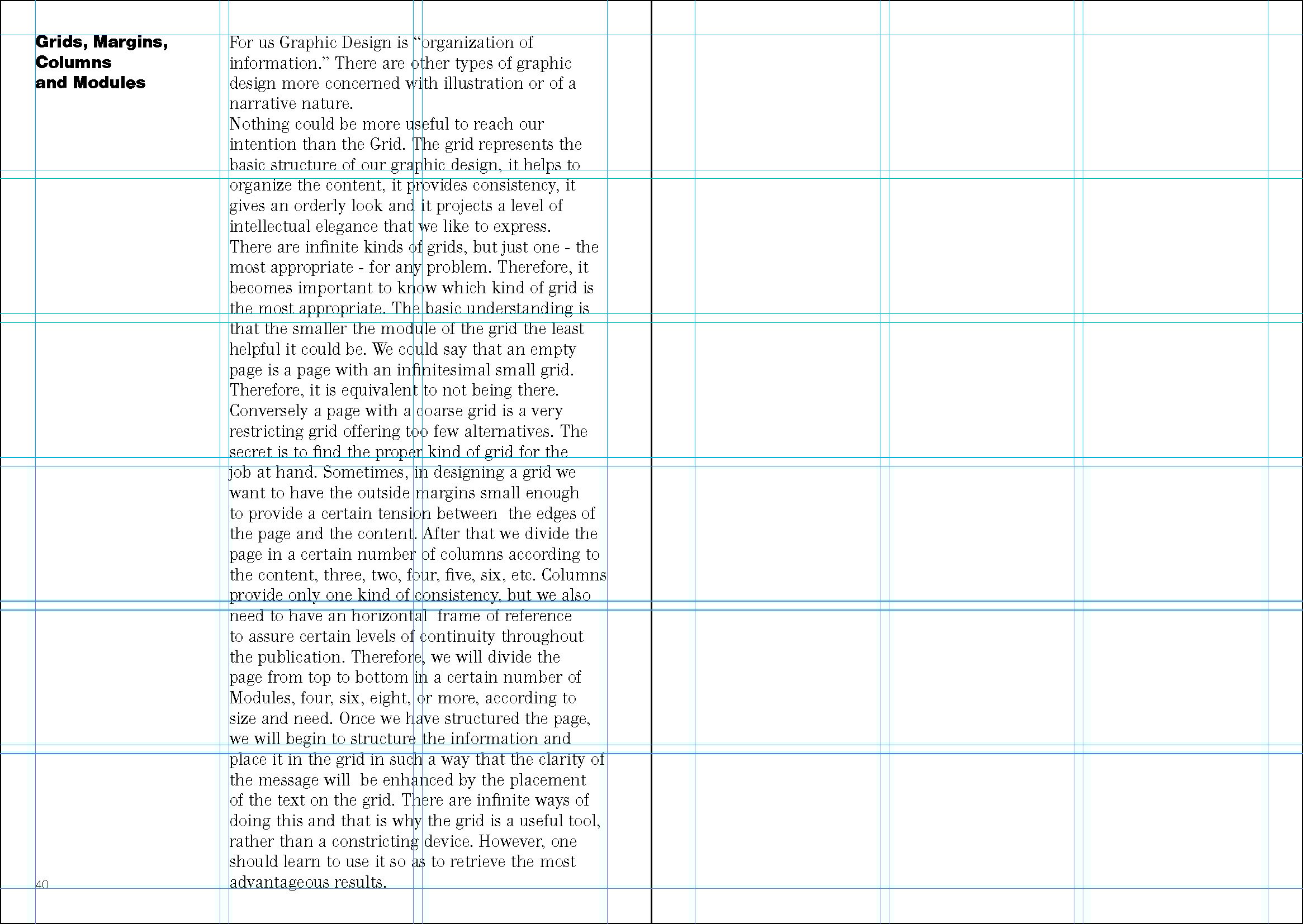
In 2010, Vignelli published the Vignelli Canon[1], a small book, made freely available on his website, in which he sets out his design philosophy. The book is divided into two parts. The first covers the intangibles of successful graphic design, such as semantics, syntactics, timelessness, responsibility, discipline and appropriateness. The second part looks at the tangibles – like how to create a grid, use colours or handle text – using practical examples that are mostly taken from the projects that Vignelli worked on during his long career.
According to Vignelli, you must first search for the meaning of whatever you are designing. The search for meaning allows you to better understand the nature of the project and to find the right path to take.
Other than having meaning, a design must be syntactically correct. It must speak the language of design properly, using the right words, which in graphics means grids, typefaces, text and images. It must make everything coherent and connect the elements to one another.
If we create designs that are rich in meaning, syntactically correct but hard to understand, we’re not doing things right. It’s pointless. “Whatever we do, if not understood, fails to communicate and is wasted effort.”
Vignelli’s work – some fascinating examples of his skill
At the start of his career, Vignelli worked with architectural practices and taught industrial design at Venice’s IUAV architecture school, where he had studied, but never graduated. Posters for Milan’s Piccolo Teatro were one of Vignelli’s the first major design projects at the start of the 1960s. Text only, their dominant feature was information (the name of the play, date and cast), which ran counter to trends at the time.
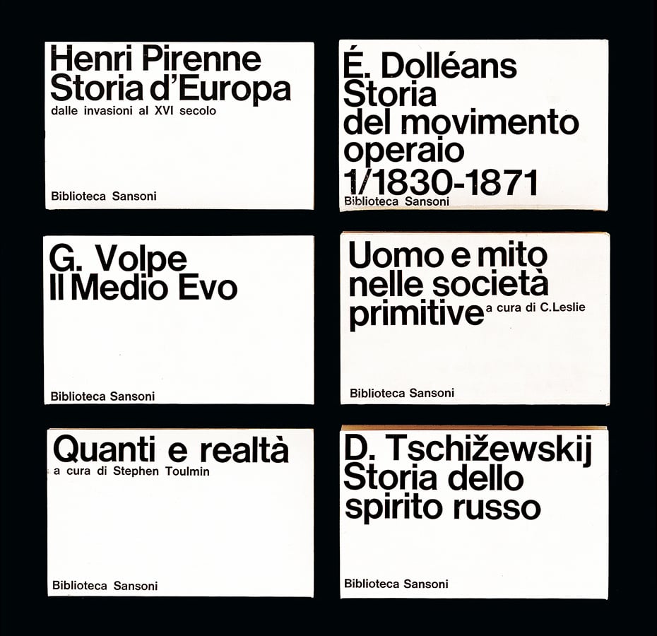
It was in this period that Vignelli provided the graphic design for the Biblioteca Sansoni series of books as well as a number of posters for Pirelli and the Venice Biennale. It was also the decade in which he founded the Unimark agency, together with Bob Noorda, and designed the graphics for another series of books, this time for Feltrinelli.
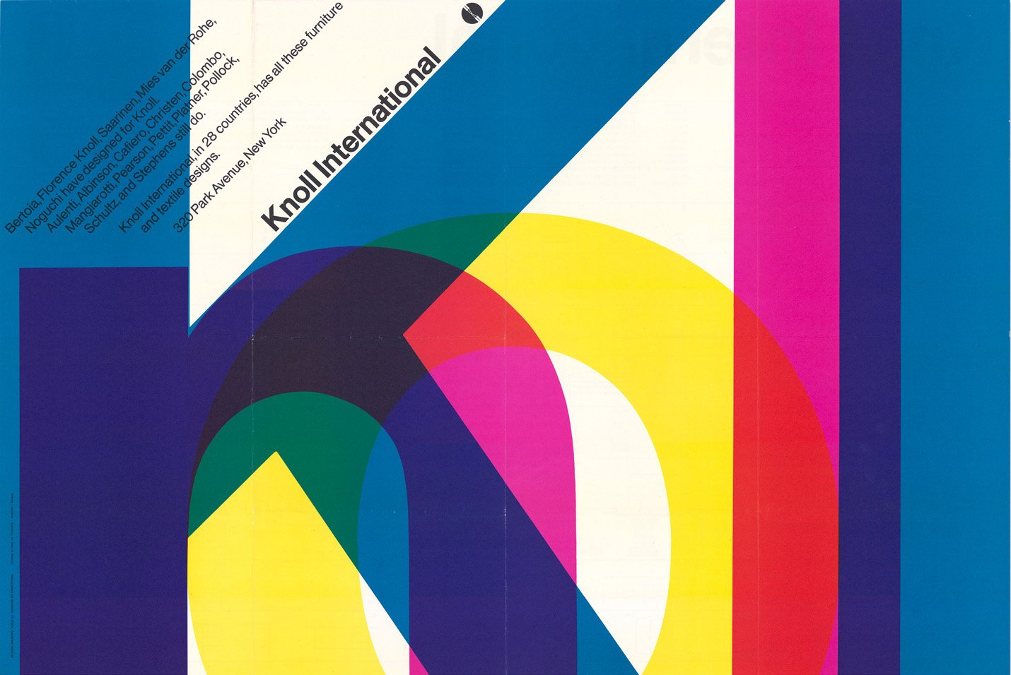
At the end of the 1960s Vignelli and Unimark moved to New York. The agency opened offices in various US cities, including Detroit, where Ford was a first major client. Unimark did work for other big firms, including Knoll and American Airlines, to name just two.
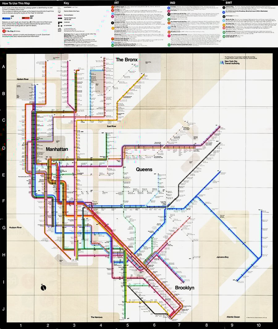
Vignelli designed the signage for the New York subway. In 1972, he also designed the subway map, which would become one of his most famous pieces of work. The map shows just coloured lines and dots, with no geographical landmarks, an approach which has since been used for transport system maps around the world. The manual created for New York subway signage was recently republished by Standards Manual.
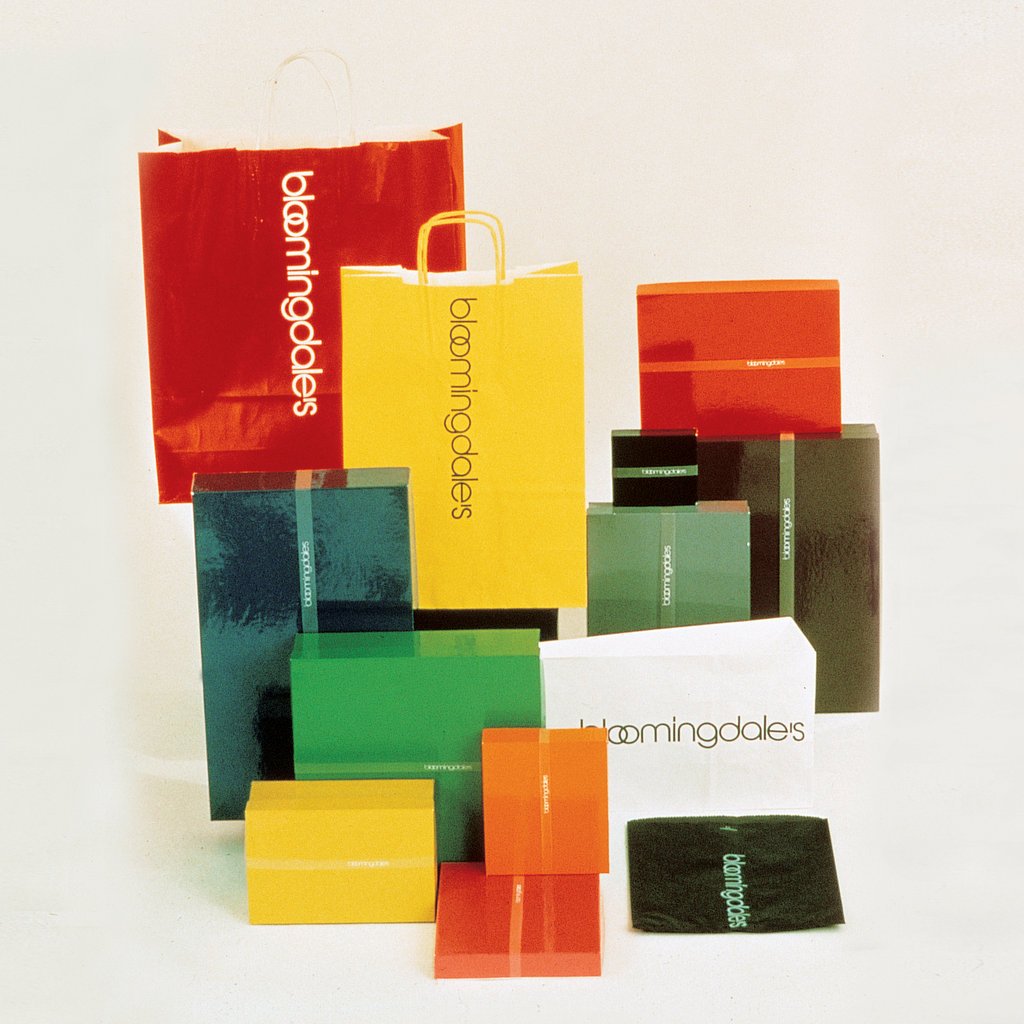
Vignelli then parted ways with Unimark and started his own agency. He designed the brand and packaging for the Bloomingdale’s department store. Like much of Vignelli’s work, his bags and boxes for Bloomingdale’s were iconic, colourful and logo free. The logo only featured on the tape used to wrap the box, disappearing once opened.

When Vignelli reflects on this design, he emphasises the balance that must be struck between identity and diversity. If you go too far in either direction, you run the risk of a getting something boring or lacking personality: too much identity creates redundancy, while too much diversity creates fragmentation. Neither help make a brand memorable to users or customers.
A life dedicated to design
Vignelli’s life was dedicated to design. Much of his work has become iconic, so much so that David Lasker, an authority on design, once said:
“practically everyone in the Western world, at some time of the day, interacts with Vignelli’s handiwork[2].”
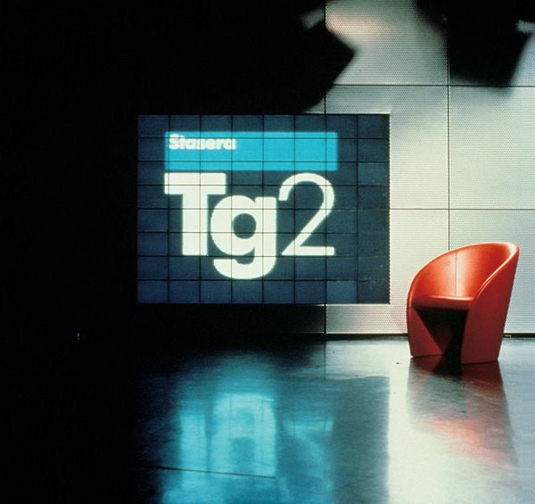
Vignelli worked for many Italian clients, including Benetton, Cinzano, Lancia, Poltrona Frau, Ducati and Ferrovie dello Stato, the state railway company (for whom he designed signage). He also designed the brand and visual identity for the Italian state broadcaster’s news programme, Tg2.
Vignelli’s total dedication to his profession even led him to design his own funeral down to the smallest detail — as reported in Quartz magazine — from the layout of the chairs to his crematory urn. The urn now resides in New York City’s Saint Peter’s Lutheran Church, for whom he and his wife designed the interior in the 1970s.
Michael Bierut, one of the greatest living graphic designers, and a partner in the New York office of Pentagram, began his career at Vignelli Associates. In an article published in Design Observer after Vignelli’s death in 2014, he talks about his experience working for the Italian designer. Bierut had planned to stay for 18 months, learn as much as he could, and then move on, but he ended up staying for 10 years. He writes:
“It was Massimo who taught me one of the simplest things in the world: that if you do good work, you get more good work to do, and conversely bad work brings more bad work. It sounds simple, but it’s remarkable, over the course of a lifetime of pragmatism and compromise, how easy it is to forget: the only way to do good work is simply to do good work. Massimo did good work.”
A total designer
Vignelli was a total designer. He designed everything: posters, magazines, newspapers, books, chairs, brands, churches, interiors, wine labels[3]. He designed a modular system for printing leaflets and brochures for the United States National Parks Service (NPS). There are over 400 national parks in the US and they are visited by almost 300 million people each year, meaning that, even today, a huge amount of printed material for visitors is required.
In 1977, Vignelli designed the Unigrid system for the NPS. It’s a modular grid system based on A2 that enables the NPS to create brochures in ten different formats while maintaining coherent and recognisable structure, thus generating significant production and print savings.
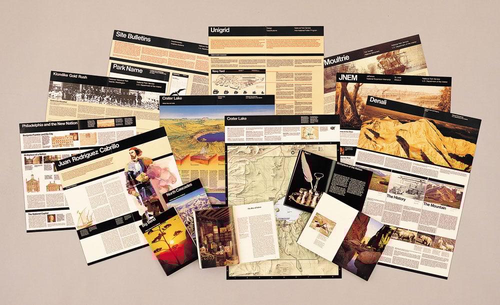
It’s a design that perfectly encapsulates Vignelli’s philosophy. A timeless design (Unigrid is still used today), in which his idea of graphics, based on the organisation of information, is fully expressed. A “responsible” design, another intangible value of the canon:
“As designers, we have three levels of responsibility:
One – to ourselves, the integrity of the project and all its components.
Two – to the Client, to solve the problem in a way that is economically sound and efficient.
Three – to the public at large, the consumer, the user of the final design.”
Further reading
In this article, we’ve covered just a small part of Vignelli’s work. To find out more, I recommend reading his book Design: Vignelli, a collection of works from 1954 to 2014, watching the documentary Design is One and following the Instagram account of the Vignelli Center.
The Vignelli Center is part of the Rochester Institute of Technology in upstate New York, and is home to an archive containing all of Lella and Massimo Vignelli’s work. It’s at the Vignelli Center that you’ll find fascinating items like the packaging designs created by Unimark in 1973 for McDonald’s (which never went into production).
Other links
- Massimo Vignelli, Design Culture
- Timeless by design, New York Times Magazine
- Vignelli Gala at the Architectural League, Pentagram
- I.P. Massimo Vignelli, One Of The Greatest 20th Century Designers, Fast Company
- Se non lo trovi, disegnalo tu, Doppiozero
- Museo del Marchio
- Interview on YouTube for the Il Design parla italiano channel
[1] The Vignelli Canon is available free in English in PDF format.
[2] Massimo Vignelli, celebrated designer whose work included NYC subway map, dies at 83, Emily Langer – Washington Post
[3] In this video on YouTube, Vignelli talks about the design for Feudi di San Gregorio wine labels