
Table of Contents
Trends in Wine Label Design
Deciding on a bottle of wine can be challenging.
Some people really know what they like and prefer a specific grape or region. Some people only like fresh white wines, whilstothers prefer a tannin rich red. But most of us might not be as informed about this topic and when we have to choose a bottle of wine as a gift or for our next dinner party, we mostly choose depending on the label. We will give you a good overview of wine label design trends and production, finishing off with tips and tricks when creating your own wine label.
A New Area for Designers to Dive Into?
As survey done by wine.net in 2016 proves that most consumers choose a wine by the label. This comes as no surprise: a label can suggest and say a lot about a wine – it can make it look very expensive (even if it’s not), it can appear fresh, modern or suggest a certain taste. The consumption of wine worldwide is still on the rise. In 2018, the total volume of wine produced was estimated to be around 292.3 million hectoliters worldwide.
Small wineries and natural, ecologically produced wines are especially becoming more and more popular, so the choice in stores or supermarkets is increasing r. A winemaker will want to stand out to catch the eye of the consumer but also wants to present their wine in the best light, tell a story and most importantly, make you want to try it.
The label also communicates information which, depending on the country of origin, are even specified by law and regulations. Besides the regulatory information, the wording on the label is crucial as well – here you have the option to describe the wine, its region, the winemaker. The text is as important as the copy on an advertising poster – it’s where the brand can speak to its consumers.
Classic or Modern – What is Trending?
Winemakers are getting braver and more experimenta: often hiring designers and agencies to create outstanding labels.And while the number of wines is rising, so is the number of designs for labels – there are a few trends though, that we will explain below.
Wine labels: The Classic
A lot of traditional wineries still want to appear in an old heritage style, with a vintage look that gives the idea of a high-quality wine. This will be presented in their label design – a font that represents handwriting suggests old age, and therefore tradition. We often found illustrations of the wineyard itself and golden foil print or hot-stamping which gives the bottle a certain expensive appearance.
We can see this classic style, on this design as a rebrand for a 500-year-old, traditional winery in France. The winemaker Chateau Fonplégade decided to keep most of the classic elements, like handwriting font, a pictured illustration of the winery building and a mostly muted colour scheme are given for this classic wine label design.
In the comparison picture you can see that merely the perspective was adapted and the overall look seems cleaner – this design will immediately make you think of a nice french red wine.


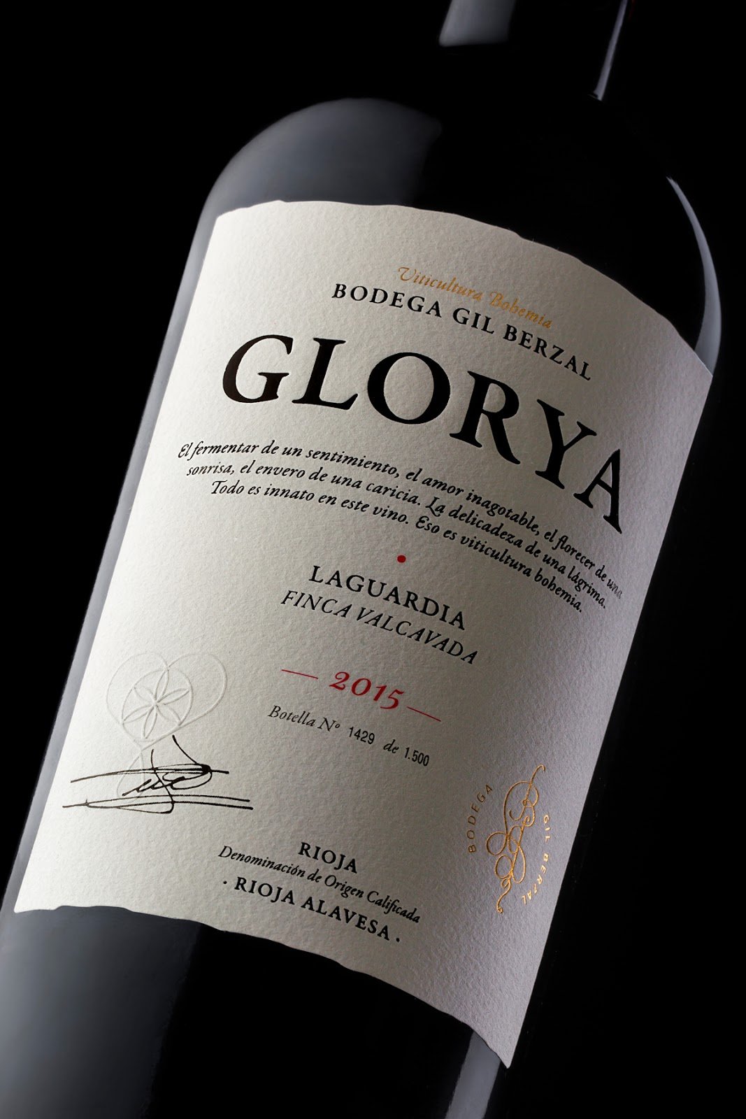
The same feeling arises by looking at this beautiful design for a spanish Rioja. The use of a very traditional font, muted and clean, almost no colour on the label and an elegant use of the information placement tells us the story of a wine, that is made by a traditional wine maker who knows his craft.
Wine labels: Modern Design or Modern Art Design
Designing a wine label with graphics, contemporary fonts, abstract forms and colours or asymmetrical shapes will get the attention of the wine lover. It can be very unexpected and is a great way to get consumers interested in a new wine or refresh a well-known wine brand.
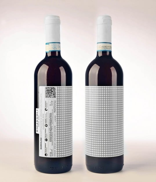
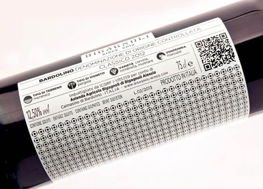
Even though most wineries in Northern Italy use very classic labels, this fairly new wine producer is shaking up the market with its modern design. Geometric patterns are only used in black and white and are different for each product. The information is placed horizontally on the side of the label, rather than vertical and reminds of museum descriptions.
This wine label design from Spain even comes with its own story – the story of friends and social media. From afar, the labels look simply nice and colourful, but “The label design aimed to use the language of Instagram (where we see images of our friends) but using blurred images, similar to the loading experience when we don’t have a strong internet network.” A truly modern approach to a traditional drink.

Wine labels: Minimal Design
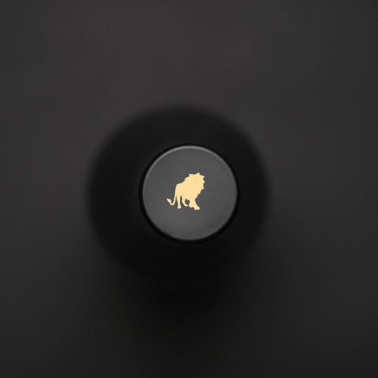
Minimalism has currently caught everyone’s interest and might be one of the strongest trends – from interior design, branding and lifestyle – minimalism is also used with a lot of wine brands right now. This usually means that the message on the bottle is reduced to its bare minimum, using simple graphics and shapes, very little colour and simple angular fonts. The name of the wine or winemaker and logo might sometimes be the only thing visible. In this example from Germany, the winemaker only added the name of the wine and the logo for the type of wine. Little details, like adding the logo to the bottle cap as well, show that even though minimal, the design is well thought through.
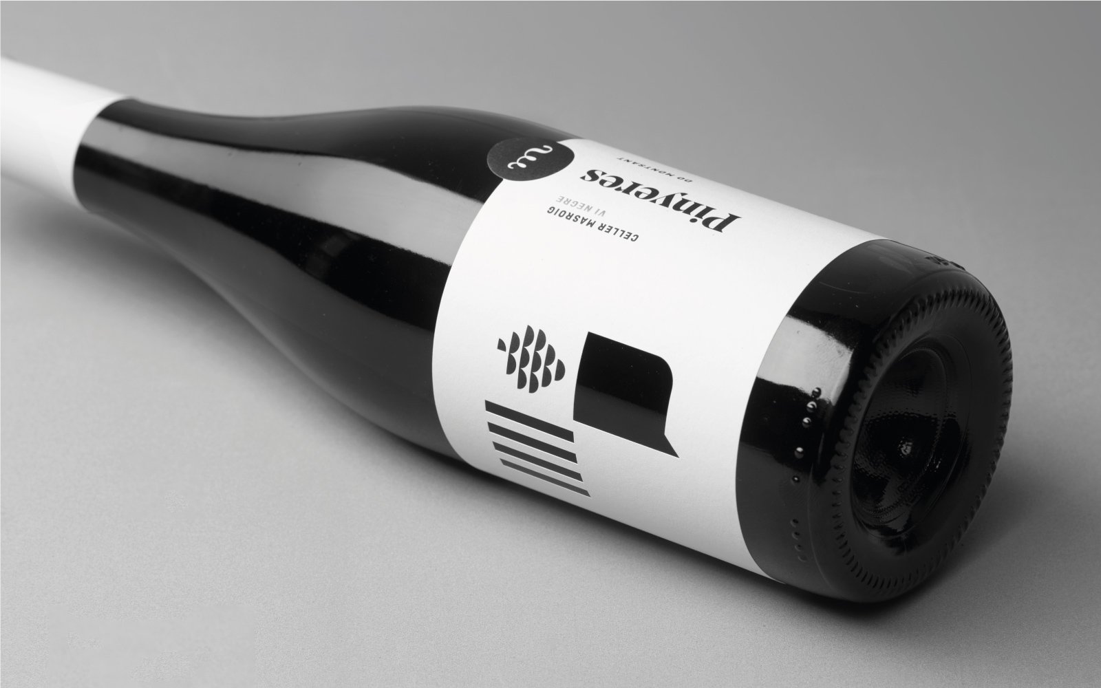
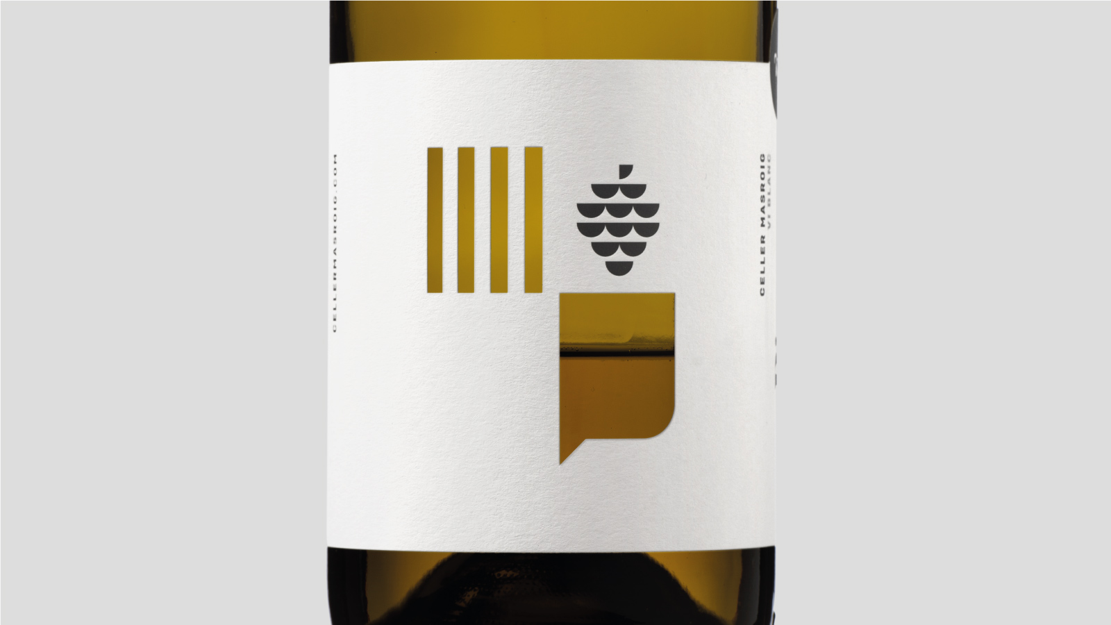
Similar is this design for a spanish wine company, which uses pictograms and a simple placement of fonts. Very minimal is also the printing method here – taking a closer look reveals that the design is cut out instead of printed, so the bottle shines through and gives the design its “color”.
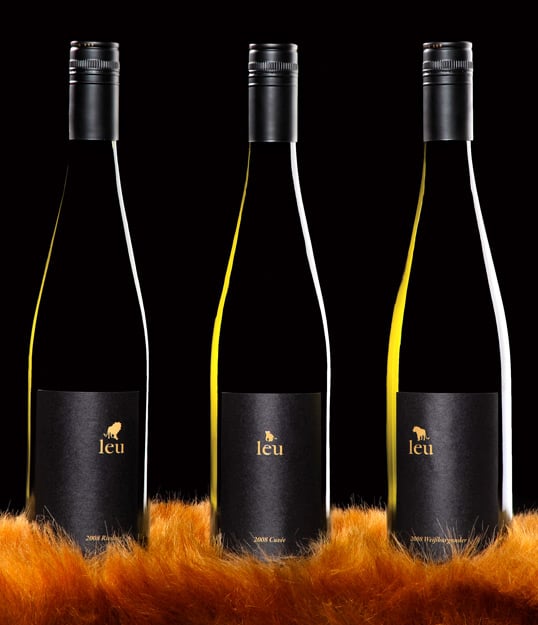
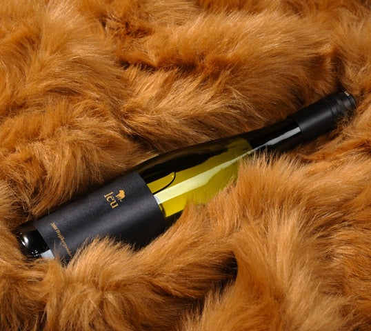
Wine labels: Images and Illustration
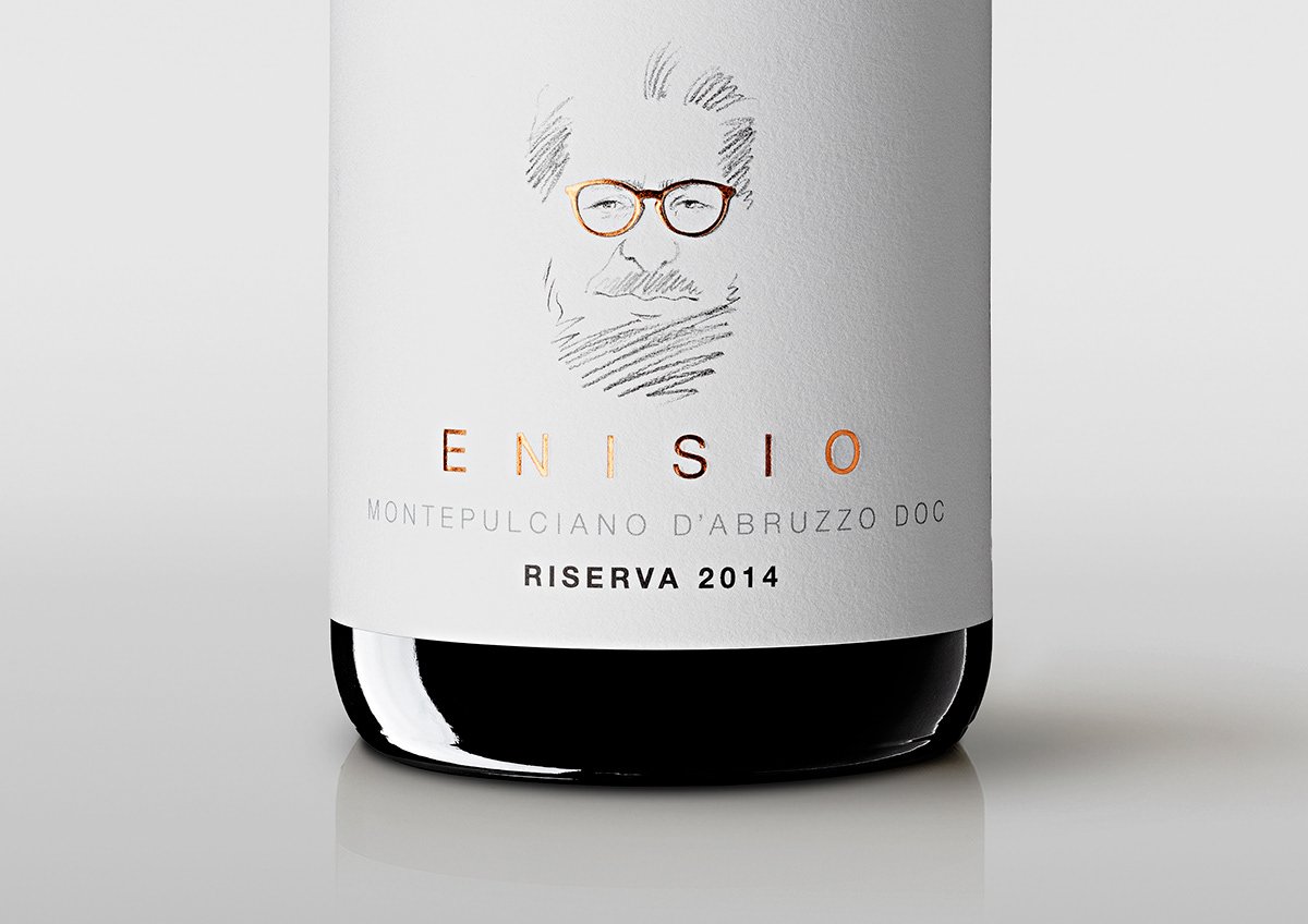
This trend is or can be similar to modern art but it doesn’t need to be abstract. Some brands and winemakers use this trend to distinguish a certain wine speciality (like a special grape blend or a limited edition) or to introduce a new variety within their range.
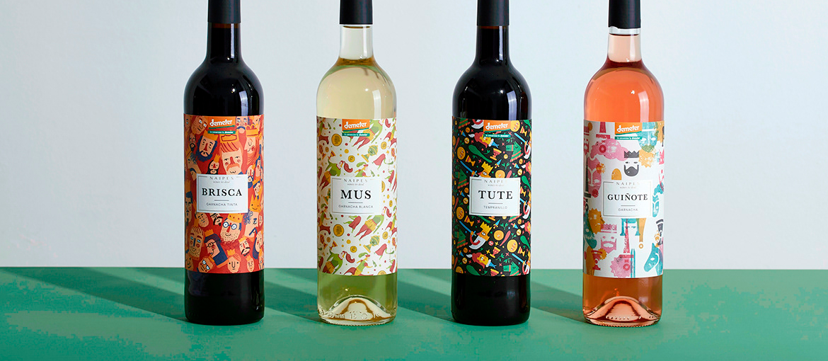
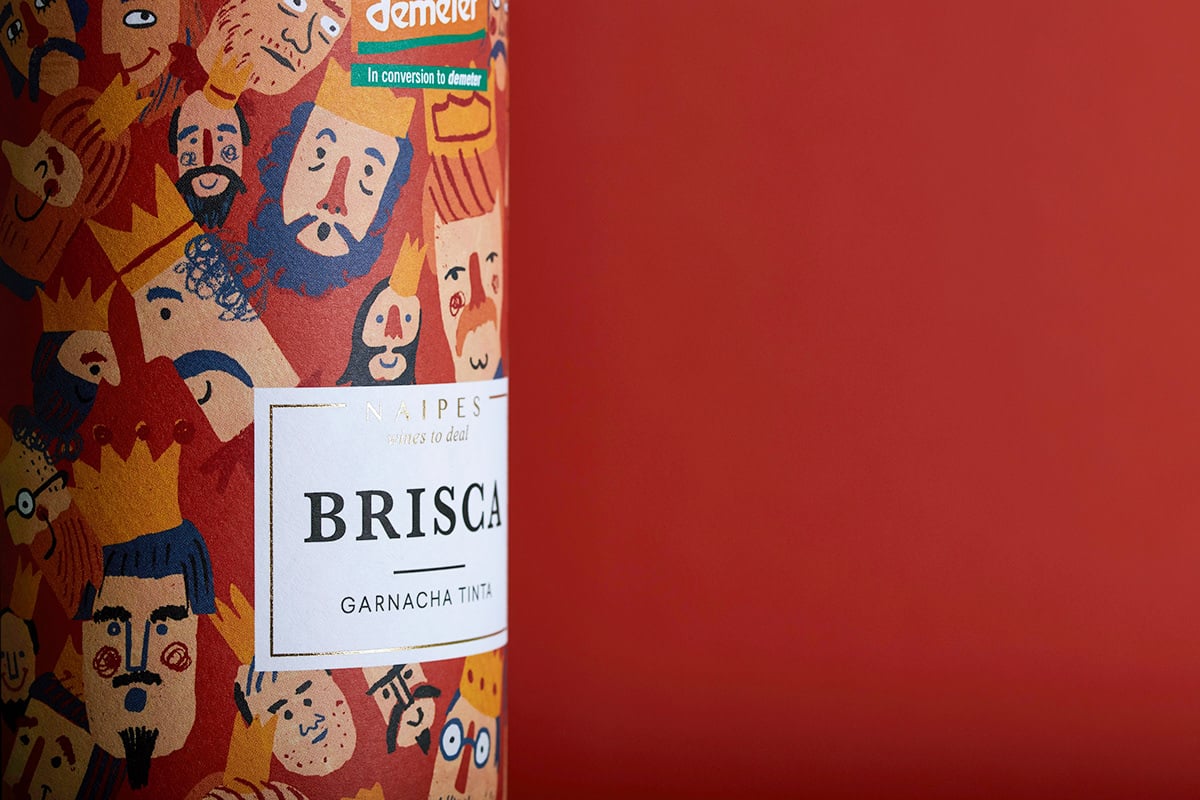
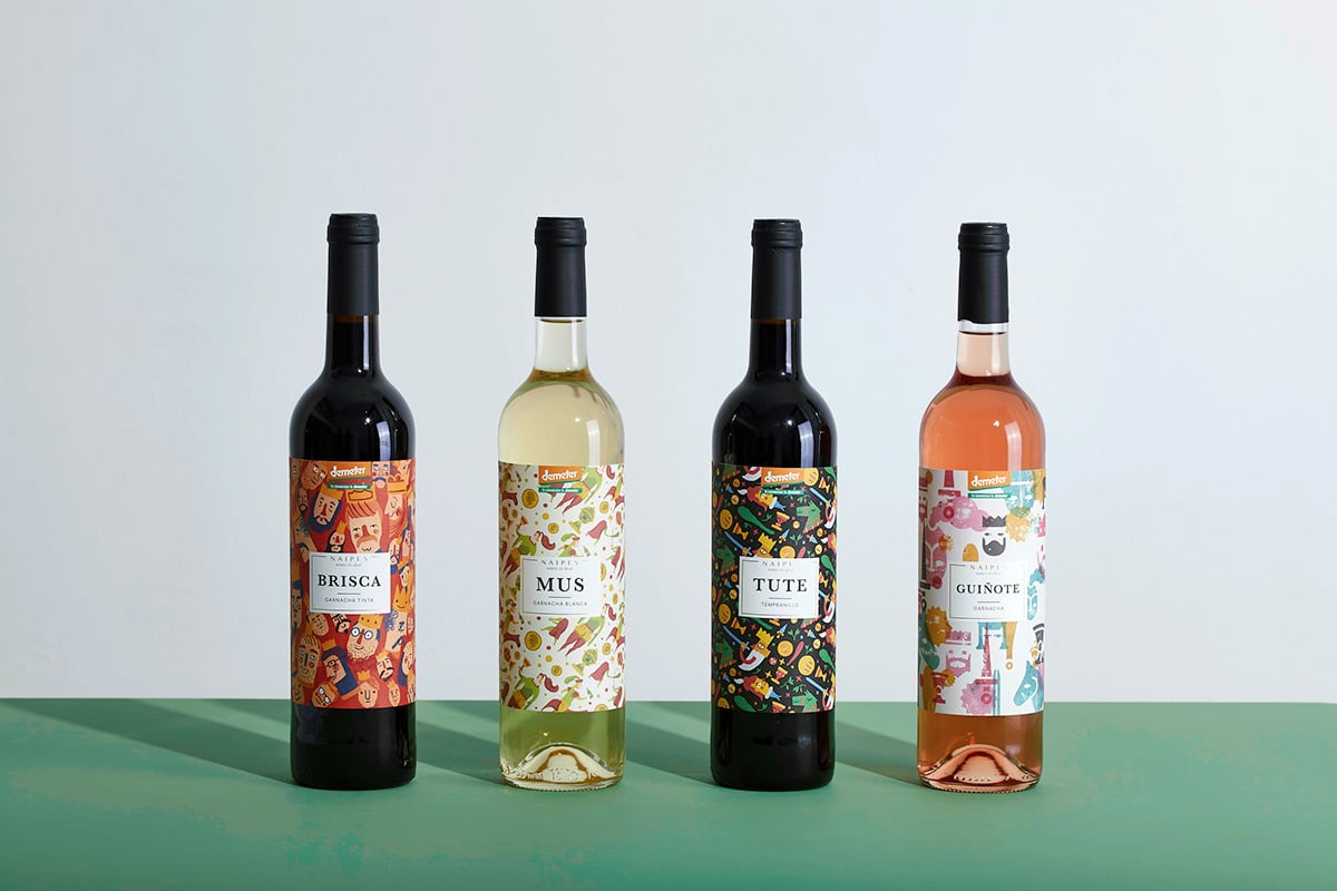
And some winemakers (and their design agencies) simply have a lot of fun. This project itself is described as “different illustrations that interpret the characteristic figures (jack, knight and king) and suits (golds, cups, swords and clubs) of the Spanish deck.”

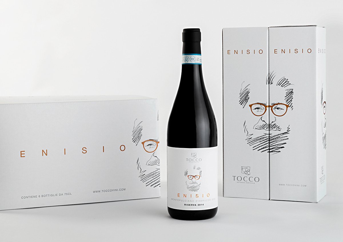
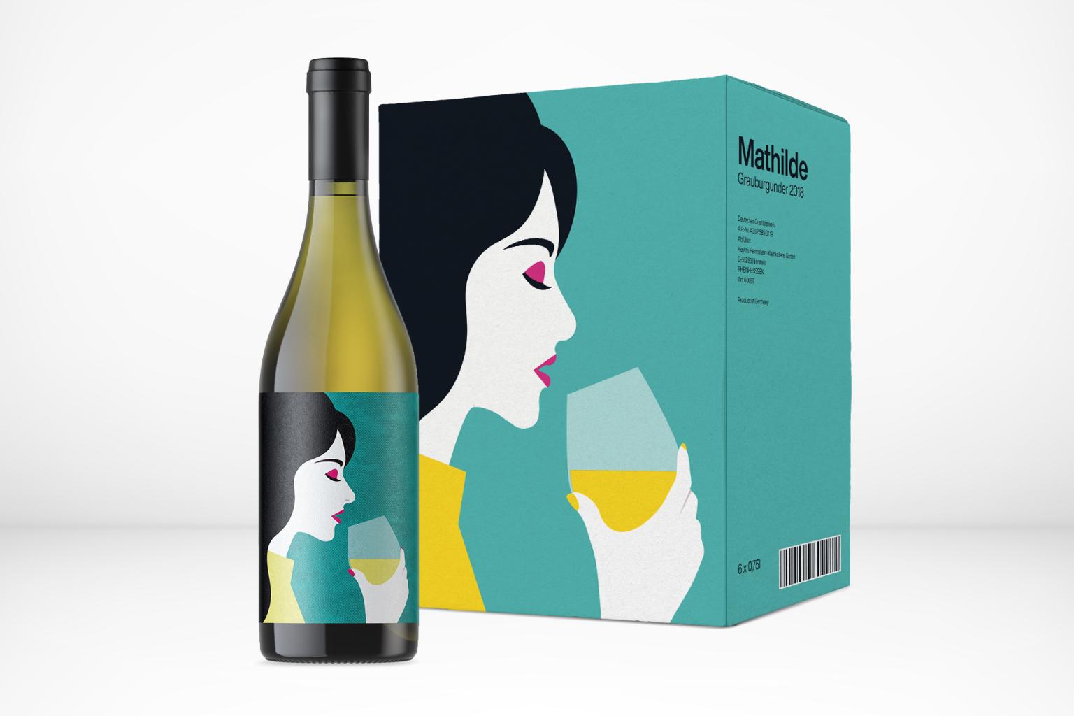
Instead of multiple images and illustration, a German wine producer uses one large illustration on the label and on the packaging. The design waivers its logo and detailed information and simply, but with high effect, catches the eye of the consumer.
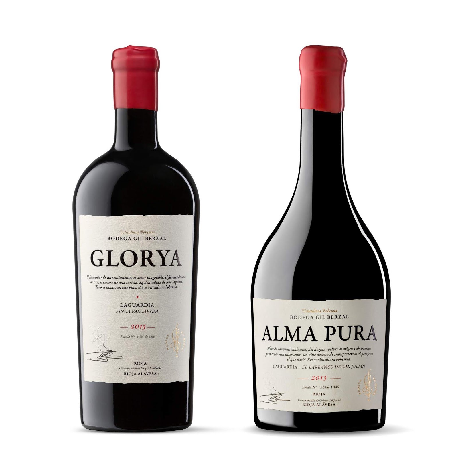
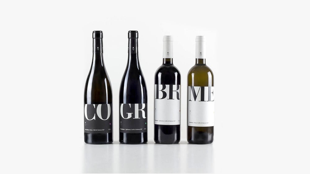
Wine labels: Typographic labels
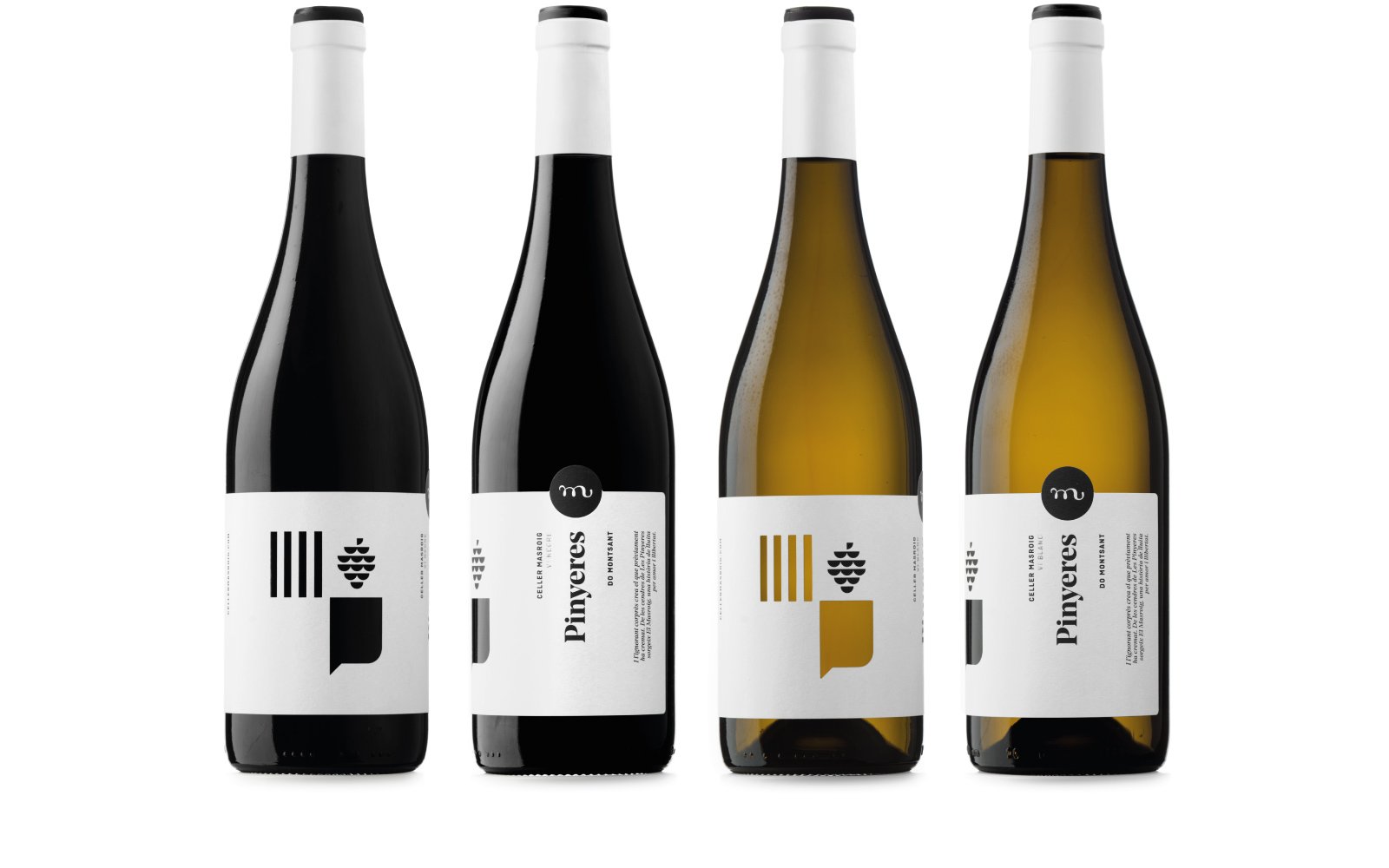
You might think that this trend might be similar to the minimal’s design trend but the opposite can be the case. Using typography within wine label design can be beautiful and crafty. Some brands mix a few types to create graphic images whilst still including information. Other winemakers use it to create a range of wine to look coherent with each other but also make the bottles by itself stands out perfectly.
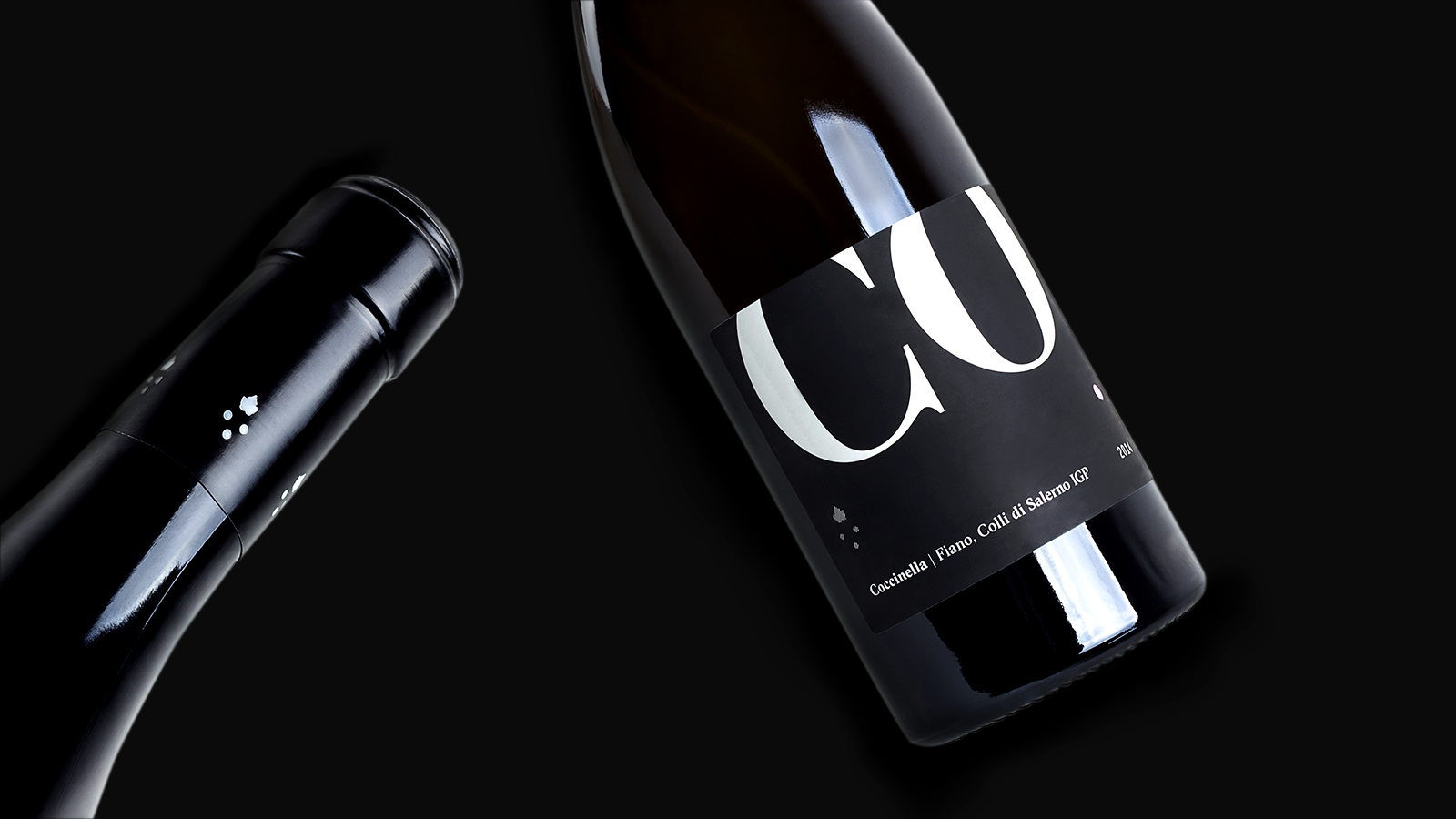
Just like this range of Italian wine does. Made in the family winery, the design uses big bold letters in black on white, or white on black for a simple but very coherent look. It is appealing to use a classic font in such a smart way.
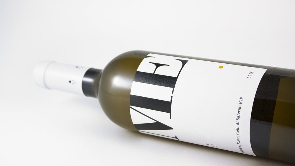
But it doesn’t always need to be brand fonts to use in a type-heavy wine label design. A custom font or even a handwritten logo will give products, like in this example, a very noticable, unique character.
Wine labels: but What About Production?
Of course the design, look,feel, and catchiness of the wine label is crucial for a brand or winery to stand out, but how the label is produced can be as important. You can add so much more through certain techniques, that the production even is part of the appearance.
Within the trend of the classic design, when brands want to make the product look special, pricey and high quality, hot-stamping with gold or silver foil and embossing will make the bottle appear extra special. Both techniques can be used to frame the label, but can even be part of the design – maybe the name of the grape needs to stand out byembossing it, maybe the images have elements, which can be highlighted through a gold hot-stamp.
And of course, both methods give the consumer a very nice and haptic experience when touching the bottle – it might be a reason for them to pick it up in the first place!
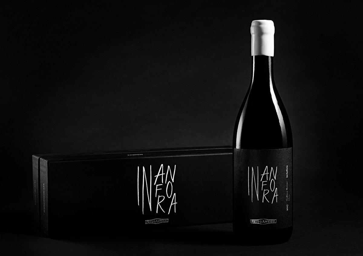
To create a unique product, you don’t have to stop at the label, but also design the packaging. An Italian winery uses gold foil emboss on their bottles as well as on the packaging.
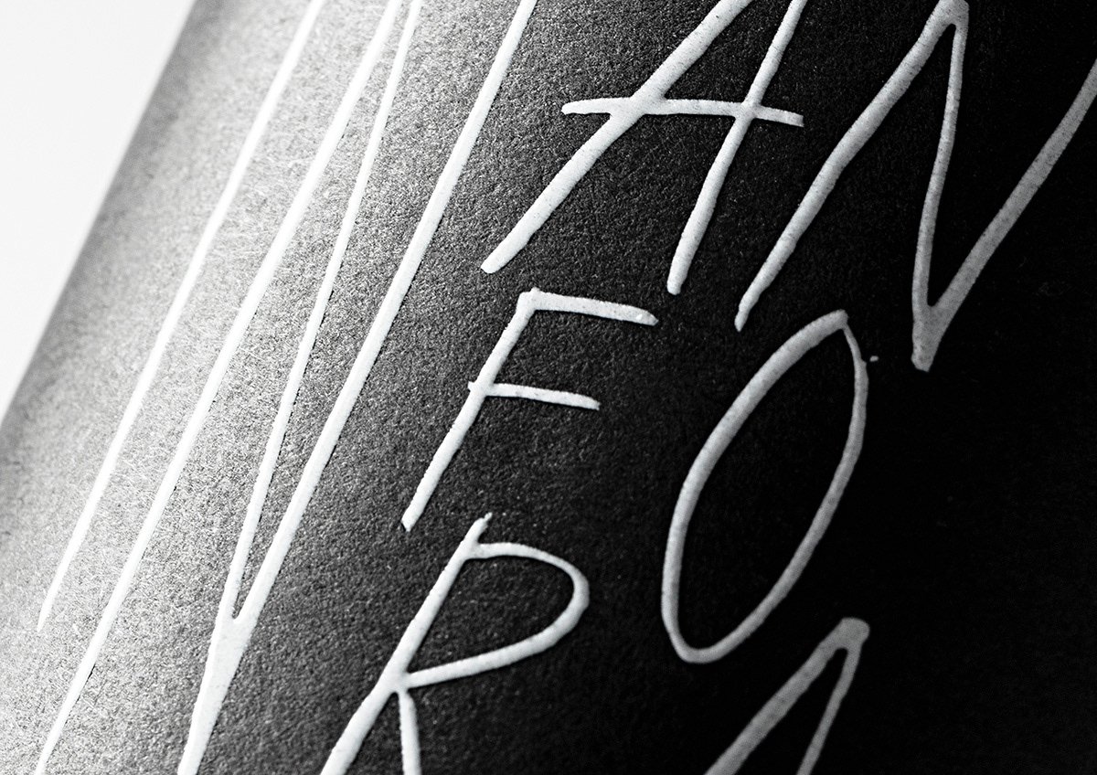
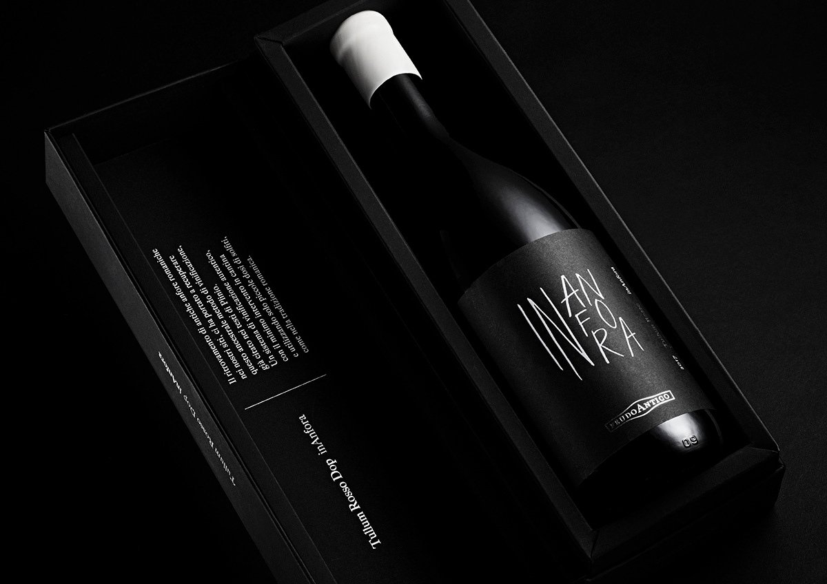
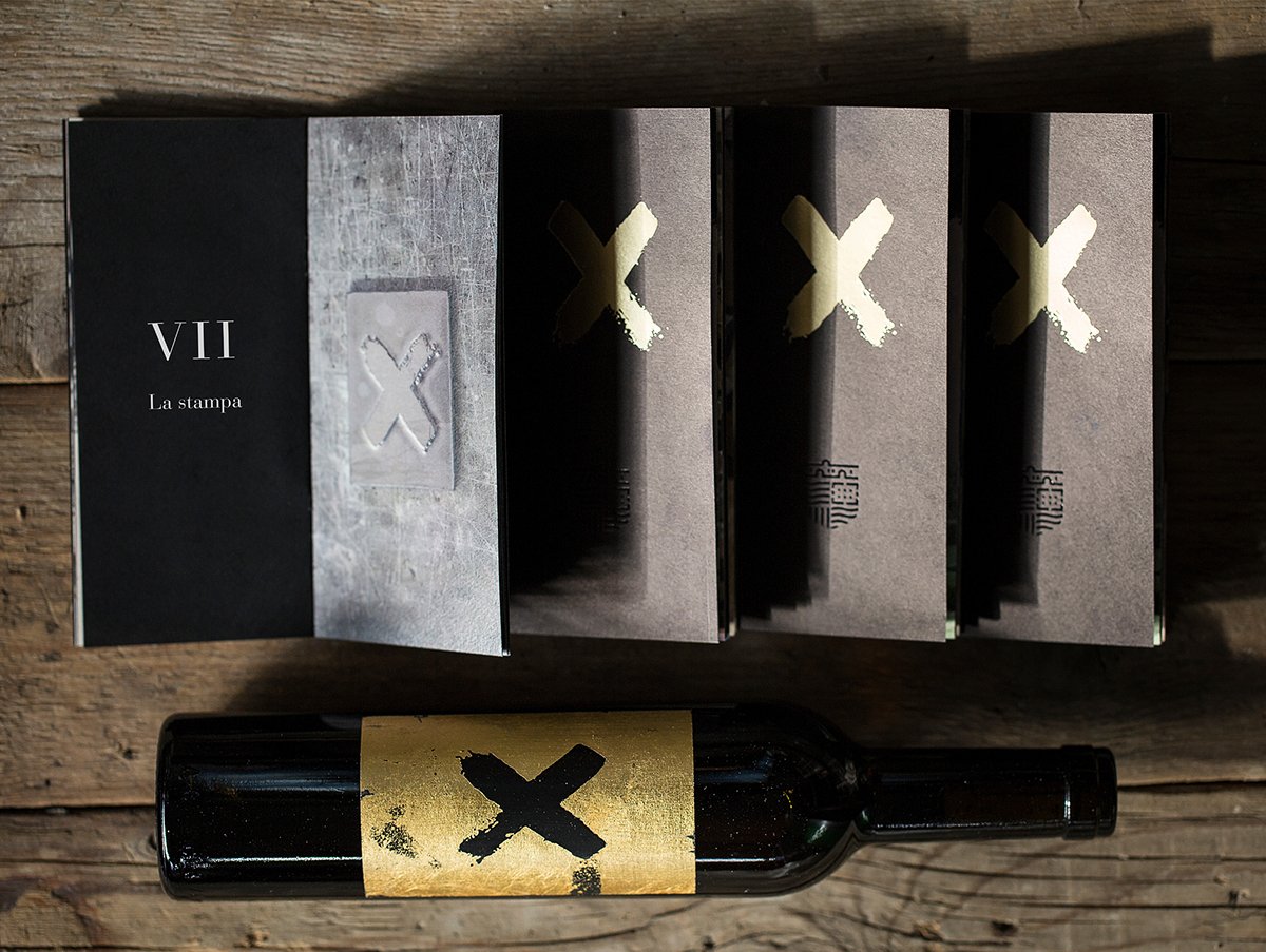
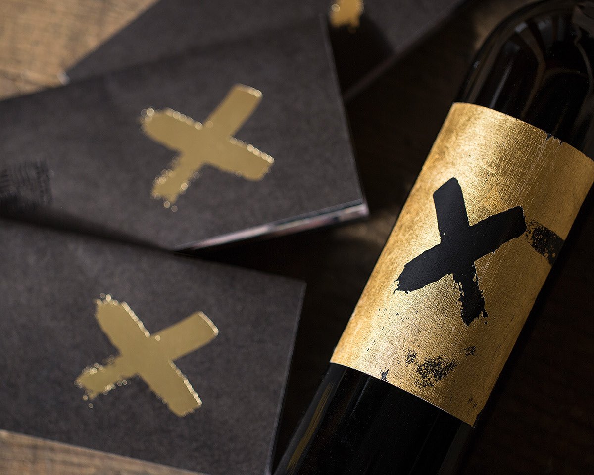
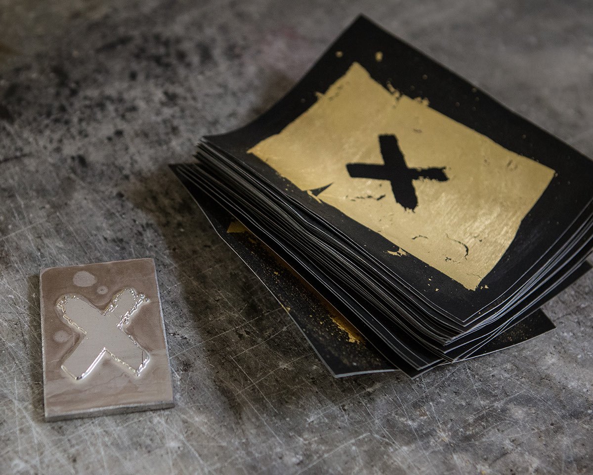
While embossing or foil prints add finesse to your wine label, for some wine makers that produce limited edition bottles, the design can get extra, extra special. This finishing is next level – gold leaf, a custom dye, black thick paper – a wine label made for a limited edition of special wine.
Wine labels: How You Can Design a Great Wine Label?
As the production and consumption of wine will not end anytime soon, many agencies, designers and printers could benefit by getting into wine label design. The industry is full of rewarding and fun jobs, but what is there to look out for if you dive into this field?
Research is the first important step. Depending on where the product is from, there are certain regulations for mandatory information to be labeled on beverages for the consumer. Make sure you know what these are.
From the wine production to the consumer’s table – a wine bottle, and therefore the label, passes through many hands and situations. Labels might get wet, cold, warm and are handled a lot. Think about this when choosing material and print method, so the label will look fresh and new. Be knowledgeable about the product and the producer itself. What is the history of the vineyard, is there a story to tell about the winemaker? Maybe you can even try the wine! There is so much history and tradition, and so many in this field – use this to create a label that will make the shopper pick up the bottle right away.