
Table of Contents
Work on a brand’s identity does not end once the company has established its personality. Branding is a versatile entity, which is used in multiple communication channels and can even be used by people outside the business. So how do you avoid your identity falling by the wayside? Brand guideline manuals (or brand manuals) do just that, both protecting and promoting the brand’s identity.
What is a brand manual?
Brand guideline manuals are documents that explain how a brand should be presented in public and how people should come into contact with it. They are used not only by those working within the company, but also, most importantly, by those using the brand externally. They contain practical instructions to ensure the brand always remains recognisable, whichever communication channel is used.
Why does being recognisable matter so much? Because consumers, when purchasing something, often opt for something with which they are already familiar. It is therefore crucial to put a lot of energy into brand awareness, and then make sure that this work is respected through the brand manual. This applies equally to brands and to SMEs.
How do you create a brand manual?
It is impossible to put together a universal brand manual template, since every brand creates their manual in their own image: they are intimate documents that can vary enormously from company to company. However, there are some aspects that are found in the majority of manuals, such as instructions on the logo, colours and fonts, how to pronounce or write the brand names and directions on the company’s tone of voice. For the logo, for example, the following are essential:
- The positive (with the standard combination of colours) and negative (with the colours inverted) versions of the design.
- The colour palette.
- The minimum dimensions, beyond which it cannot be shrunk any further.
- Its position in space. For example, can it be rotated?
- Its position compared to the lettering, and the proportions to maintain between the logo and text.
The rest of the contents need to be assessed on a case-by-case basis. However, there are some general pieces of advice that are worth bearing in mind when you create your manual:
- It should be coherent with the brand, using the brand’s colours, fonts, images and tone of voice.
- It should be detailed. Even if it risks appearing pedantic, it must fulfil its function and rule out any possibility of mistakes being made.
- It should not be considered as being set in stone. Following any repositioning of the brand, the document can be looked at again and altered.
- It should be clear and concise. This does not mean it necessarily has to be short, but the contents must be easily and immediately understandable.
- If the manual is long and split into different sections, it is important to include an index so people can find the information they need instantly.
- It should be full of explanatory images and packed with examples. A picture is worth a thousand words.
Talking about images and examples, we’ve put together a few manuals from well-known brands below. This is your chance to gain some inspiration.
Examples of brand manuals
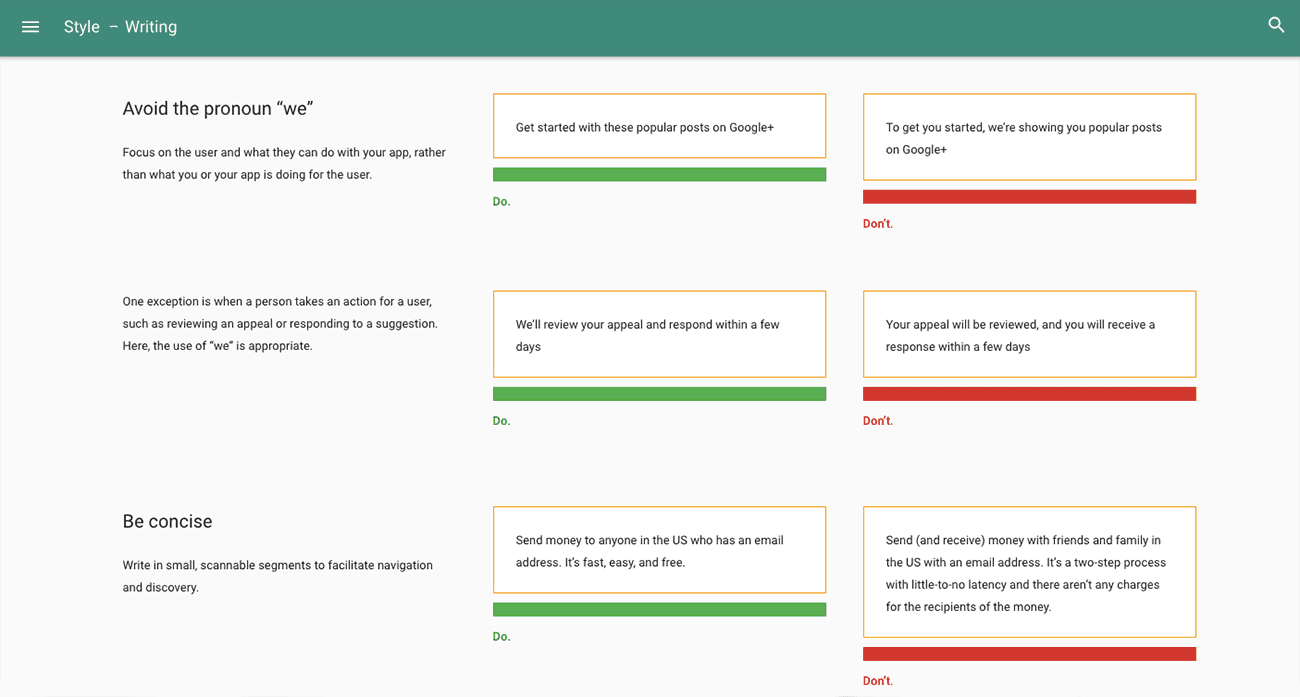
Google’s brand guidelines manual is a perfect example of how to manage a long, detailed and multi-section guide. The index makes it easier to browse, and guides the reader towards the contents they need. The manual is divided up into lots of different sections: Material, Design, Motion, Style, Layout, Components, Patterns, Growth & Communications, Usability, Platforms and Resources, and each of these is then divided up in turn into subsections. Everything is explained with visual examples or specific case studies. For example, the ‘Style – Writing’ section describes the brand’s writing rules.
Clarity and simplicity are the hallmarks of the IKEA brand manual.
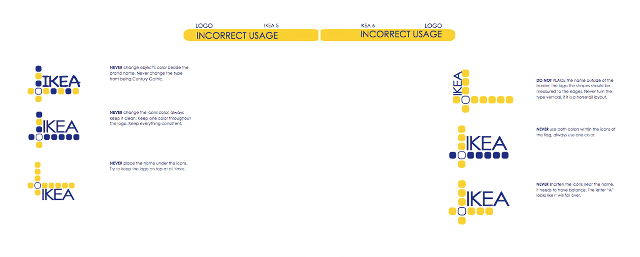
IKEA’s manual, after precise instructions on the brand’s colour palette, provides a list of all the ways the logo should not be used: no fonts other than Century Gothic, no inverting the yellow and blue design, no positioning the brand name below or away from the icon, etc. Once again, everything is explained with a wealth of visual examples.
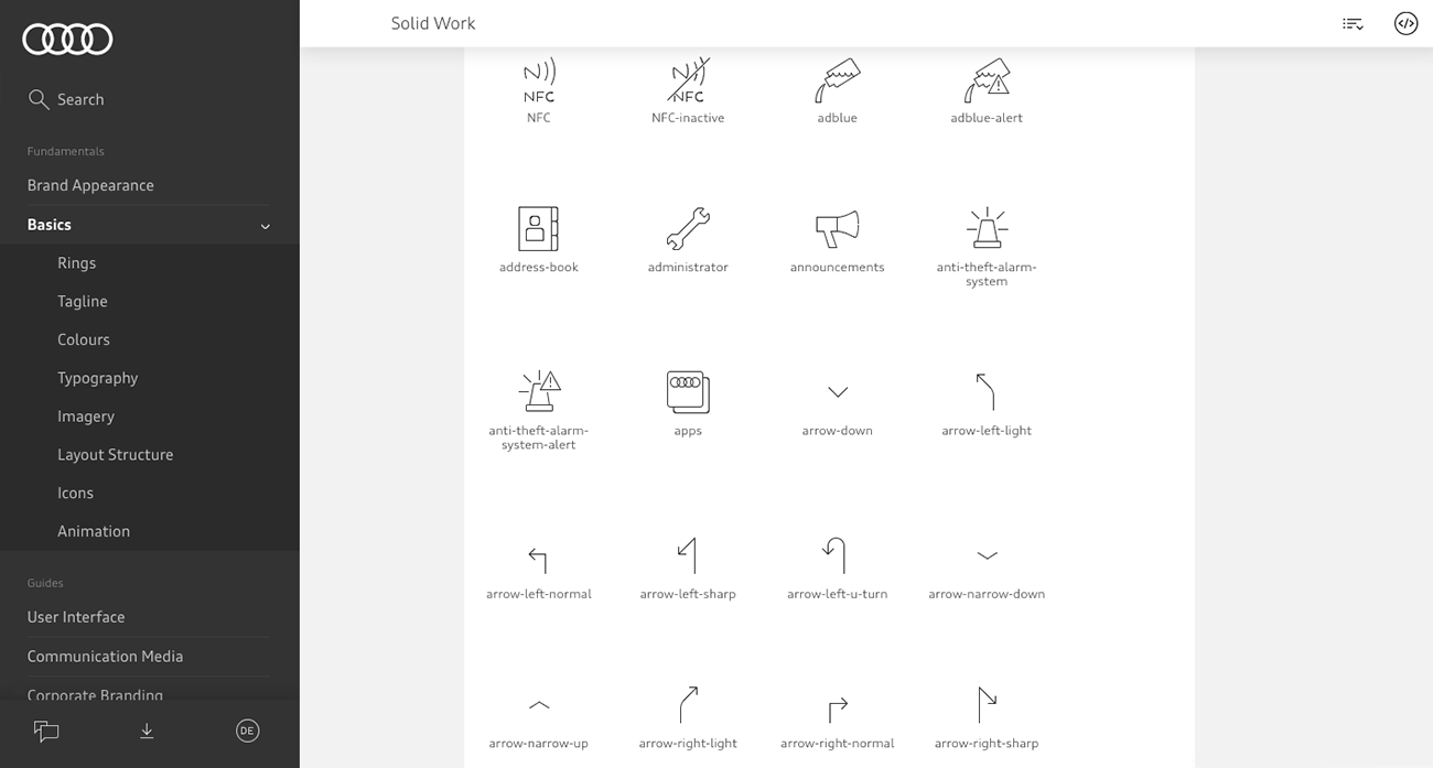
The Audi brand manual, meanwhile, begins with a short introduction to the brand’s identity. It is then divided into two sections: ‘Basics’ and ‘User Interface’.
Anticipating people’s needs is the best way to avoid the branding being altered, and Audi has chosen to go down this route in its guide. The ‘Icons’ section contains a library of downloadable icons, divided up by size and colour, meaning you really can’t go wrong.
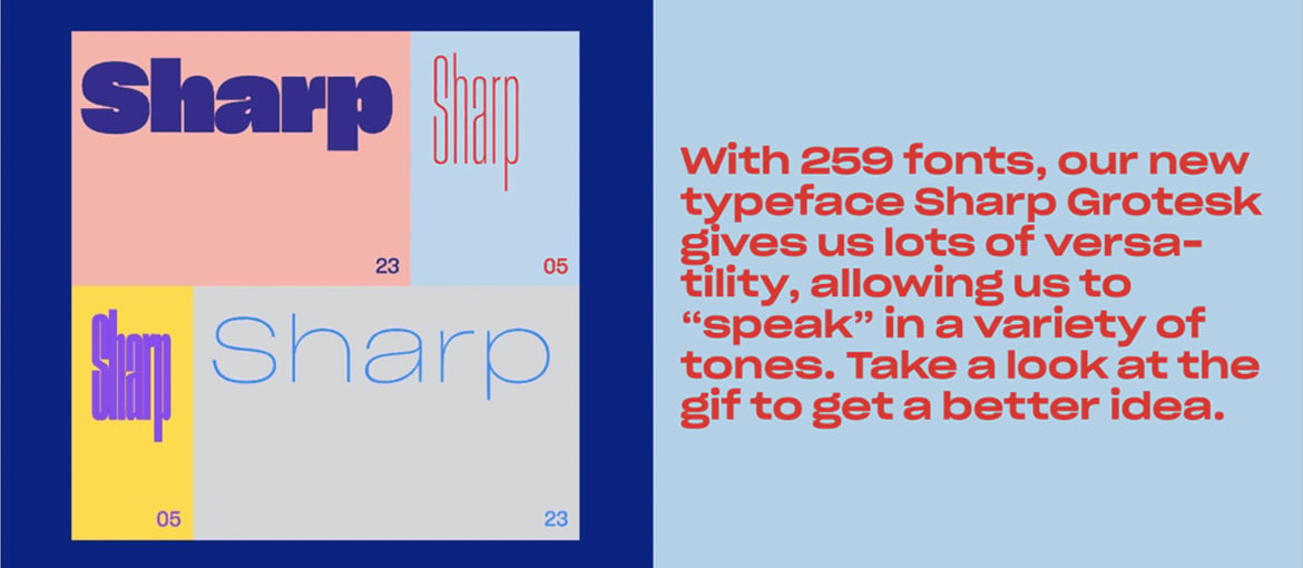
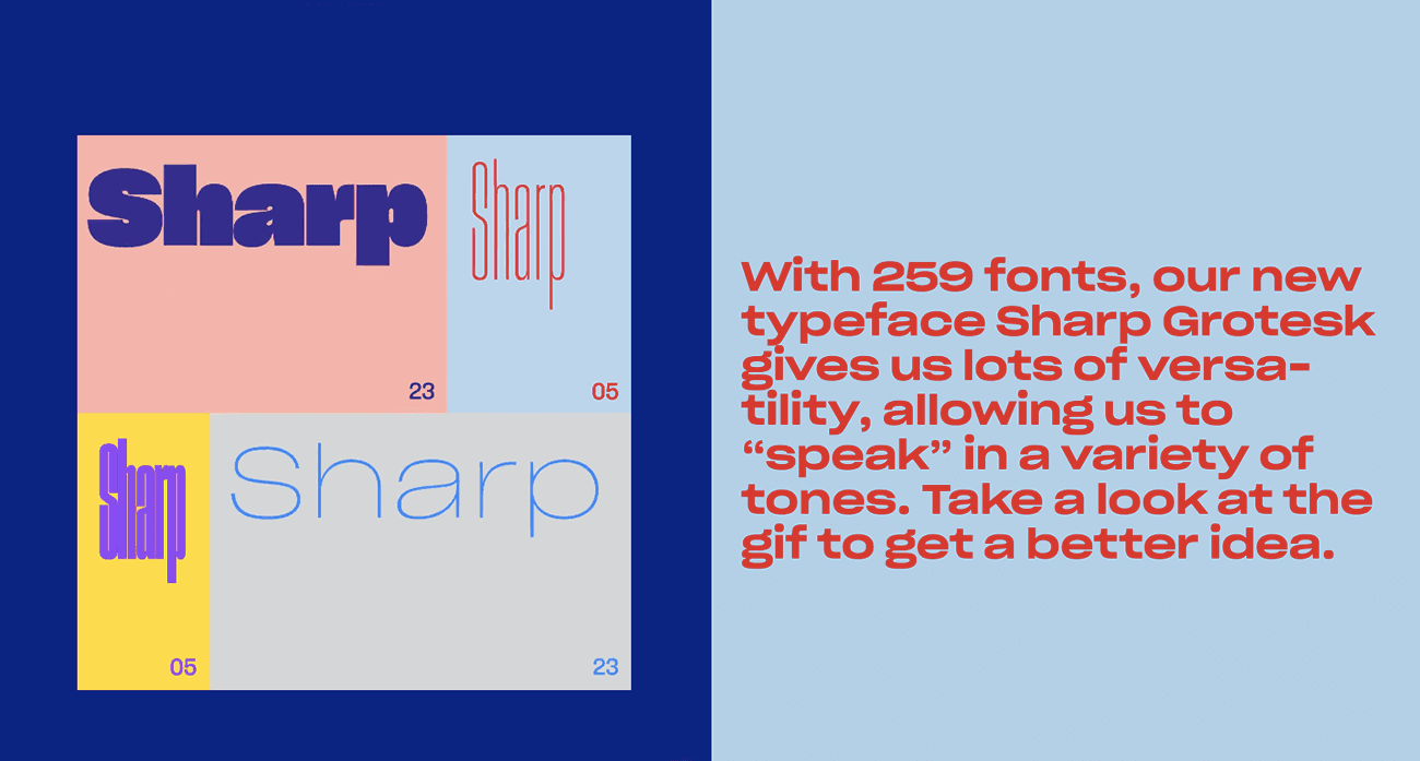
We have an absolute peach to finish off with. A preview of Dropbox’s rebranding was released recently. Here, for example, is how the guide shows which font to use:
You will have to wait a little longer before you get to see the new manual, but it is already obvious that a radical change is on the cards. So radical, in fact, as to make the brand almost unrecognisable. Dropbox is repositioning itself away from merely being a simple file storage system, instead moving towards being a living place to assemble ideas. The new design is expressive, packed with bright colours and dynamic images.
Enhancing Usability with Interactive and User-Friendly Brand Manuals
To enhance usability, modern brand manuals should incorporate interactive elements that make them more accessible and engaging. Interactive manuals allow users to navigate effortlessly through various sections, ensuring they can quickly find the information they need. For instance, clickable sections in a digital brand manual can take users directly to specific guidelines, such as logo usage or color schemes, without having to scroll through multiple pages.
Embedded Media: Integrating videos and tutorials within the brand manual can provide visual demonstrations of branding guidelines. For example, a video tutorial can showcase the correct and incorrect usage of the brand’s logo, making it easier for users to understand the guidelines in a practical context. These videos can be particularly helpful for new employees or external partners who may be less familiar with the brand’s standards.
Downloadable Templates: Providing downloadable templates for common brand assets such as business cards, letterheads, and social media posts ensures that all materials adhere to brand guidelines. These templates can be pre-formatted with the correct fonts, colors, and logo placements, reducing the risk of deviations from the brand standards.
Interactive Tools: Including tools like color pickers or font selectors can further aid users in applying brand guidelines accurately. For example, a color picker tool can allow users to select and copy the exact color codes specified in the brand manual, ensuring consistency across all platforms and materials.
Search Functionality: Adding a robust search functionality within the digital brand manual enables users to find specific information quickly. This is particularly useful for large organizations with extensive branding guidelines, allowing users to enter keywords and locate relevant sections instantly.
Responsive Design: Ensuring that the brand manual is accessible on various devices, from desktops to tablets and smartphones, makes it convenient for users to refer to the guidelines wherever they are. A responsive design adapts the layout and content to different screen sizes, maintaining readability and usability across all devices.
By incorporating these interactive and user-friendly features, brand manuals become not just a static reference but a dynamic tool that actively supports consistent and effective brand communication. This approach not only enhances the user experience but also ensures that the brand’s visual identity is maintained across all touchpoints.
Stay tuned for the full transformation!