
Table of Contents
Some time ago, a piece of market research was carried out in an American office. The employees were given pencils, some painted yellow and others painted green. A week later, they were asked which worked better: most people complained about the green ones, saying the quality wasn’t as good. What the workers didn’t know is that the pencils were completely identical; the only difference was the coloured paint on the outside.
Why do most people prefer yellow pencils? In this article we’ll explain this mystery, as well as looking more generally at the central role colour plays in marketing.
Why do people prefer yellow pencils?
The pencil anecdote, described in Riccardo Falcinelli’s latest book, Cromorama, shows how colour can affect the way we see objects and our relationship with them. The preference for yellow pencils can only be explained by delving into their history.
The first yellow pencil was produced way back in 1893 by Koh-I-Noor. They chose to paint it this colour for two reasons:
- Yellow was the colour of the Austro-Hungarian Empire, where Koh-I-Noor was based.
- Yellow conjures up China, which is where the graphite came from.
It is unlikely that anyone in the office knew the history of yellow pencils, but nevertheless all the employees preferred them to the green pencils. The reason for this preference is explained by Falcinelli in his book:
“A yellow pencil is […] more ‘pencilly’ than any other pencil. It is an archetype, a mental template to which we compare all the others. With apologies to Plato, we could say that the yellow pencil represents the very idea of a pencil, and that green, red or blue pencils are nothing more than pale copies”.
Colour is therefore not merely a simple attribute of a product, it is connected to consumers’ perception and expectations. People often associate a certain colour with an idea, for example the idea that a traditional pencil must be yellow, and ignoring this conviction is very risky.
Research into colours in marketing
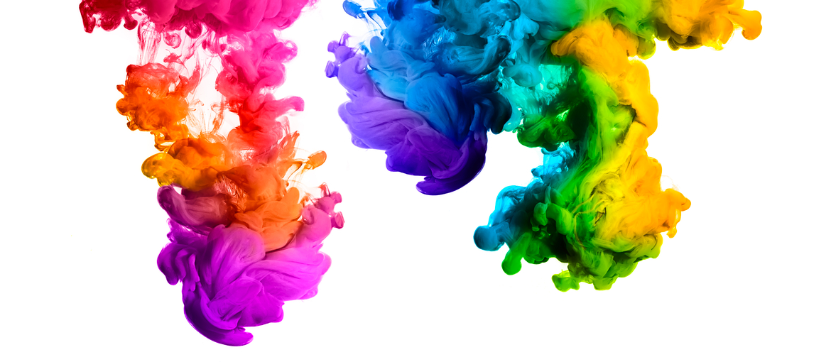
Colours are not just connected to ideas, but also to states of mind. Colour psychology looks into how the human brain responds to the stimuli produced by colours. Physiologically, each colour sends a signal to the hypothalamus, the area of the brain responsible for endocrine functions, and in the space of a few seconds this signal produces an emotional response.
It is well known that emotions are the main factor that drive people to purchase particular items. That’s why colour is an extremely powerful marketing tool, and an aspect that cannot be ignored. Indeed, an experiment conducted by Satyendra Singh for a paper entitled ‘Impact of Color on Marketing’ demonstrated that 90% of interactions between a product and a potential customer are determined by the product’s colour.
It is therefore essential to:
- research the target users carefully;
- work out what emotional response you want to provoke;
- choose the colour that creates that response.
But how do you find the colour that inspires the emotion you’re looking for?
Colours and their meaning
Colours are an extremely powerful communication and positioning tool for brands. With the help of a few examples, we’ll try to provide some insight into how they have been used by some well-known companies.
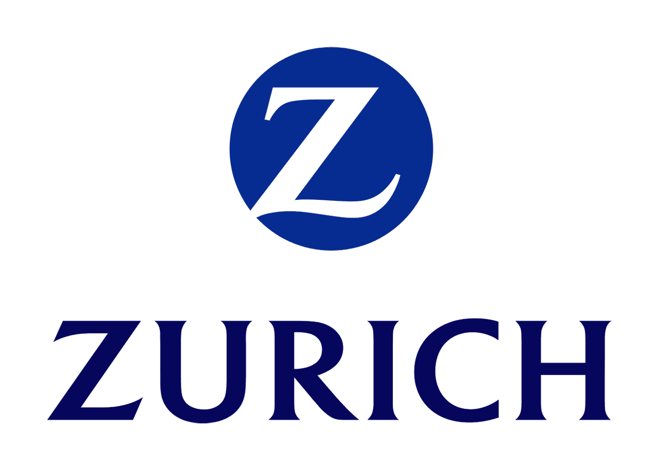
Blue evokes a feeling of trust and security, and for that reason it is a favourite colour of banks, insurance companies and the political world. Consider, for example, the logo of Zurich Insurance, and most political manifestos.
However, not all banks are coloured blue. ING DIRECT chose an unusual colour for the sector for its Orange Everyday bank account: yes, you guessed it, orange is the colour of happiness and youth, but also trust.
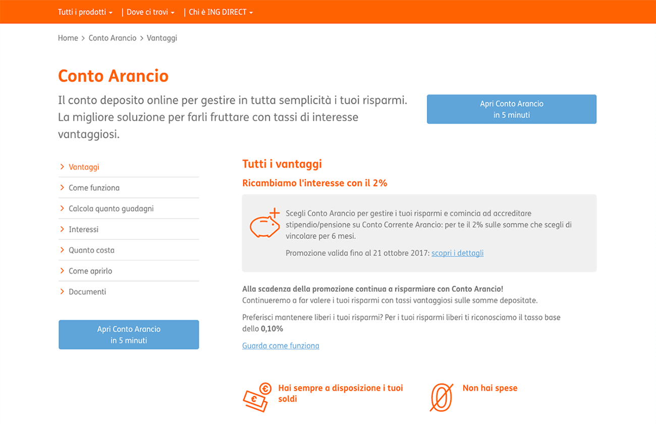
This choice was, without a shadow of a doubt, related to positioning. The Orange Everyday account is a “zero-fee online account to manage your everyday spending, always keeping things simple”. In a word, it is young. The brand is aiming specifically at young people, and so the choice of colour is no accident.
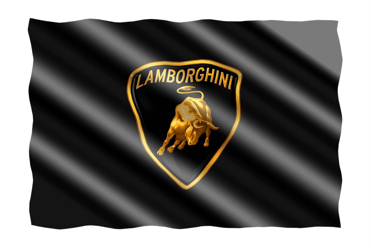
Black and gold are the colours of luxury and elegance. The Lamborghini logo ensures it conveys the maximum amount of splendour by combining the two.
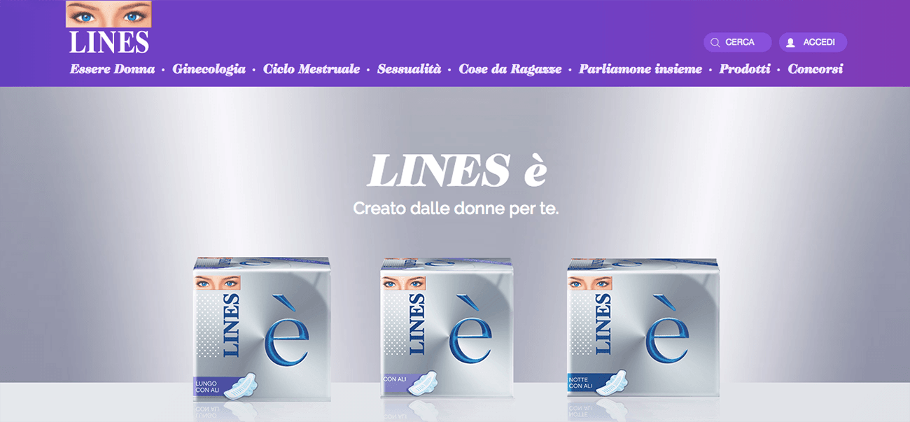
According to a survey conducted by marketing guru Neil Patel, purple appears to be one of the colours favoured by women, conveying a sense of calm and quiet, sensations that apparently appeal to the female mind. Perhaps brands like Always had this in mind when they chose purple and blue as their main colours.
However, in the world of marketing, purple is also a colour that represents luxury. Cadbury, the famous chocolate brand from Birmingham in the UK, chose purple for its logo because it wants to present itself as a ‘respectable’ product.
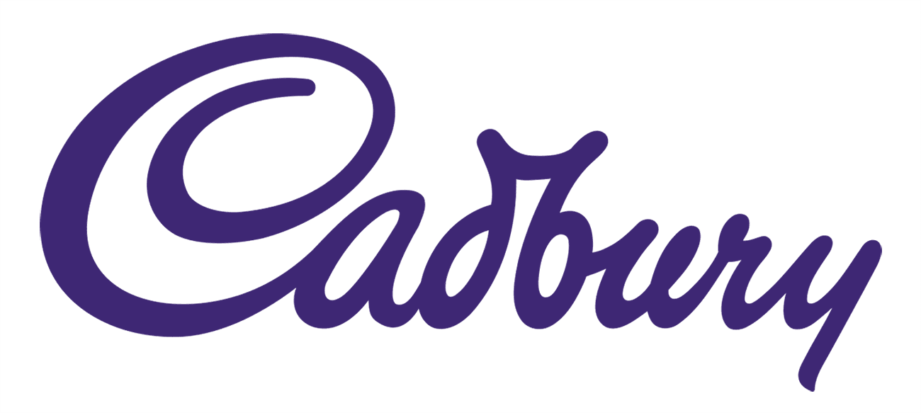
However, the meanings of colour are not universal. The emotions and meanings associated with each hue vary depending on the cultural context. For example, while in the West purple is associated with elegance, in China it represents poverty, because it is the opposite colour to imperial yellow. For this reason, when Cadbury exported its brand to the East, it added yellow to its products’ packaging, thus avoiding the risk of being perceived as selling ‘lower-class’ products.