
Table of Contents
Today we’re going to investigate a 68-year story – but don’t worry, we’ll keep it brief! We’ll discuss the evolution of the Burger King logo, one of the most famous brands in the world of fast food. We don’t need to name the rival with which it has fought for dominance over the decades; the creative shots the two companies have taken at each other have gone down in history. It’s worth refreshing your memory of one famous McDonald’s campaign, to which Burger King responded with this. What can we say? Pure genius!
But let’s not get sidetracked: today we’re concentrating on Burger King’s visual identity, a logo that underwent numerous changes before reaching, in our opinion, the perfect balance of colours and forms. Let’s get started!
A short history of the company
Burger King has had its ups and downs since it was founded in 1953 in Jacksonville, Florida as Insta Burger King. When it first ran into financial difficulties in 1954, David Edgerton and James McLamore decided to buy the company and relaunch it, shortening the name to Burger King. From then on the fast-food giant went through numerous owners, and its branding changed with each step. Right up to the present day: the company is now part of the Restaurant Brands International group, and its visual identity is still evolving.
The Burger King logo: a 68-year history (in brief)
It took 68 years and seven redesigns to find the perfect logo, although from 1969 onwards the changes have been relatively minor. Speaking of which, did you know that the logo has only just been redesigned? We’ll come to that in a moment, on the last leg of a journey that began way back in 1953.
1953, the first logo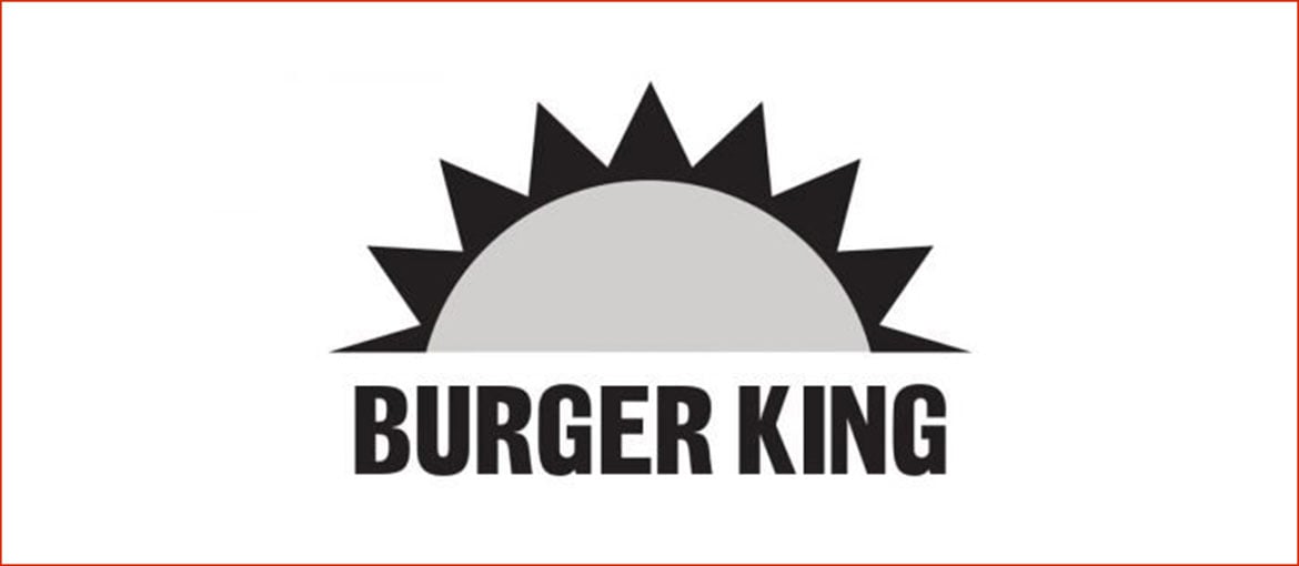
The Insta Burger King logo was very simple and featured an icon of the rising sun – symbolising the dawn of a new era for fast food.
1954, even more minimalist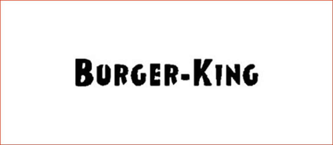
When the name of the fast-food company was shortened to Burger King, the logo was simplified too. All that remained was bold lettering in a custom sans-serif font with irregular edges and no frills. Whatever you think of it, the logo remained unchanged for three years.
1957, a revolution!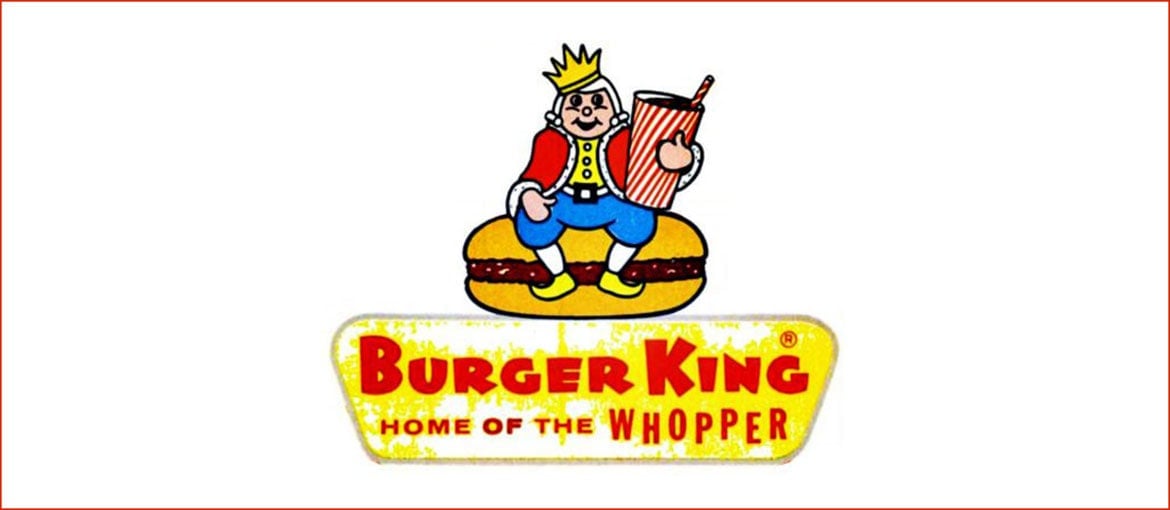
The logo became more complex, with added details and a wider colour palette. The king appeared for the first time, sat comfortably on a hamburger with a drink in his hand. The red text, in a fun and playful font, was set against a bright yellow/gold background, accompanied by a new slogan: “Home of the Whopper”.
1969, a new iconic logo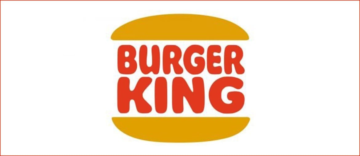
The first ancestor of the current Burger King logo was created in 1969. The thick, red text, now on two lines, was placed inside the iconic bun like a double hamburger, while the font remained a rounded sans serif with uneven edges.
1994, small tweaks
The logo remained almost unchanged, but the font became a bit less wobbly and more solid, and the colours were made brighter.
1999, a more dynamic logo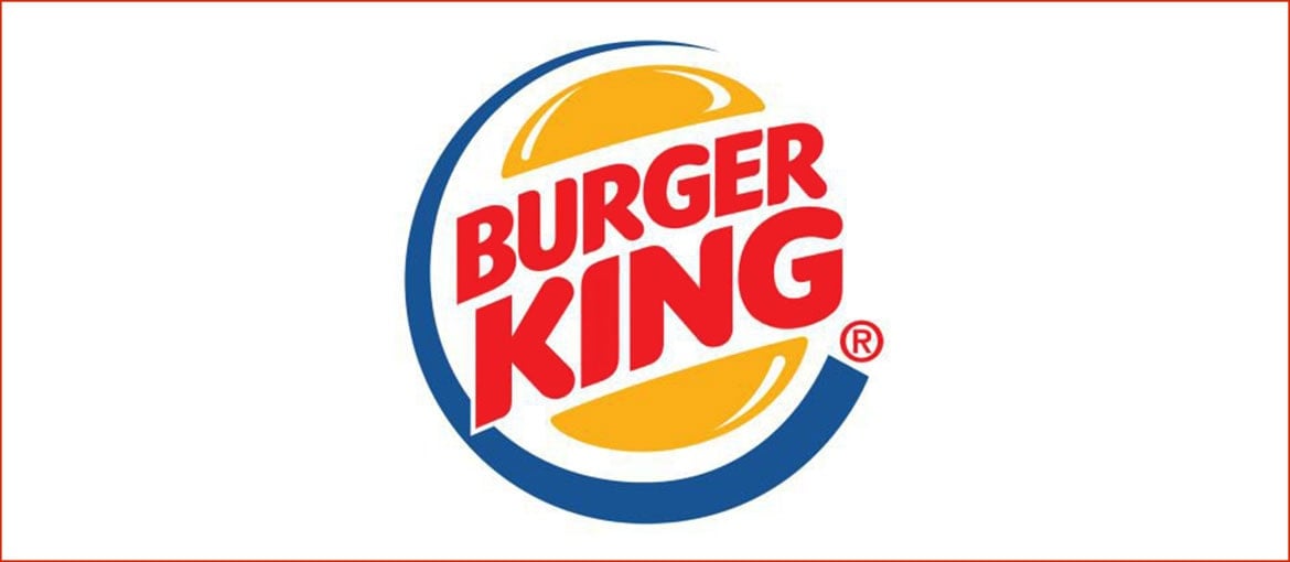
The 1999 redesign was the work of the Sterling Brands agency. The various elements of the logo were revamped: the logo was positioned diagonally, giving it a more dynamic effect, while the font of the text was changed and enlarged, so it spilled out of the bun in a celebration of abundance. A new element was also added to the logo: a blue crescent that framed the left-hand side and enhanced the feeling of movement.
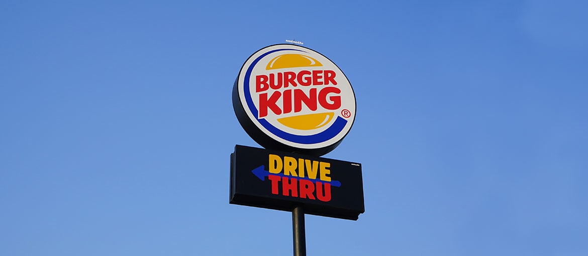
2021, a new (old) logo!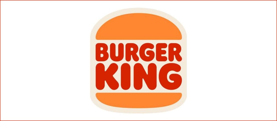
CNN Business has called Burger King’s new visual identity “retro-influenced”. In an intentionally nostalgic move, the blue accent introduced in 1999 has been removed, and the new logo seeks to establish direct continuity with the 1969 logo, as if celebrating the long history of the 68-year-old brand. However, at a visual level at least, its youth, vitality and playfulness remain intact.