
Graphic design is a job seen as being fun, highly creative and decidedly cool. And designers often feel this way too, confident in their passion and talent. They know they have an audience for their work, an audience who will be moved to think and act by their design. However, between the creative process and the relationship with the public – two amazing, thrilling stages – there is another phase overlooked by many: preparing files for printing. Excitement quickly gives way to a cold sweat: will something go wrong during printing? Will I make a mistake? Will the product turn out as expected? You’ll start to worry, and only stop doing so once the finished product has been delivered by the printers. Experience doesn’t help either: even after an entire career spent in the industry, the fear of making a mistake remains.
Of course, times have changed. Just 20 years ago, some mistakes could hold up printing for a whole day: with today’s digital technology, however, it’s much easier to correct something that’s already gone to print. But some errors are only spotted after printing…
What are the most common mistakes you’re likely to make when sending a file for printing out?
Let’s take a look.
- Sending a file for printing in an RGB colour profile
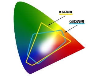
This is one of the most common mistakes, something easily overlooked when switching from Photoshop to InDesign. Yet using the wrong colour profile is a major mistake. To recap what they taught us in school: RGB is an additive colour model that uses light (hence screens), while CMYK is a subtractive colour model that uses pigments (printing). The image shows both colour models compared within the spectrum of colours visible to the human eye. As you can see, they are quite different, especially in the rendering of colours like greens, deep blues and reds. What you see on the monitor can be very different to what will be printed. Therefore, always work on print files that have been converted to CMYK.
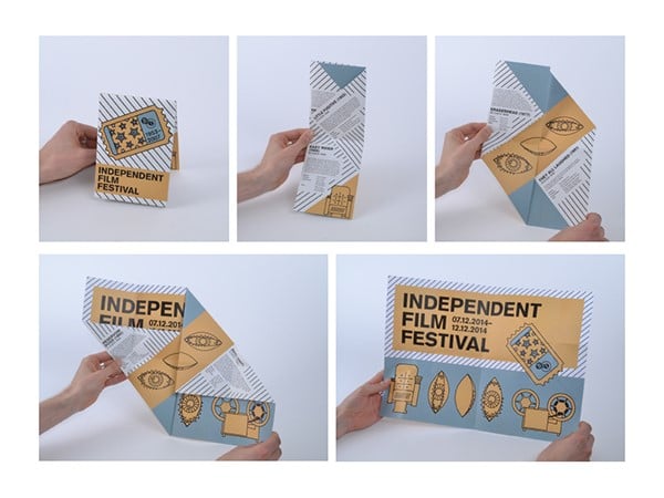
- Getting the orientation and/or pages of a folded flyer wrong
The folded flyer, even just the standard three-sided version, is not as simple to set out as you might think: you have to take into account the print orientation and how the flyer will be opened.
It’s easy to get it wrong, especially if you’re a beginner.
So always print a draft to check the folds and the layout so that everything is right in the Illustrator or InDesign file.
- Forgetting the bleed
The classic schoolboy error: you send the file for printing out and there’s no bleed, in other words the margin that will be cut off.
A cut that’s out by 1 mm might seem like nothing, but forgetting the bleed is a very visible mistake: it creates an annoying white line around the edge that can ruin even the best artwork… unless, that is, you have a completely white background!
- Not calling
You prepare the file on your computer, then place the order online and e-mail the file. Job done. The file’s been sent, so you can kick back and crack open a beer. As if everything were automatic…
But you’re forgetting that at the other end there’s someone who will receive, open and check the file (some services check it automatically). Carefully read the warnings and guidelines for the type of printing service chosen, remembering that you can always phone or email if you need an answer to more complicated technical questions. That way, you can avoid nasty surprises when you’re enjoying that beer.
Think about working with printers as a collaboration: the finished product will be that much better if there is good communication between the designer and the printer.
- Sending the wrong file for printing
This happens more often than you’d think, but can be avoided with a little bit of organisation.
Simply add sequential numbers to the names of files you work on, from 0 or 1 for the first draft upwards; alternatively, add the date the file was modified, or the work stage (draft -> final -> print).
- Using colours incorrectly
There are many ways in which colours can be used incorrectly. The problem is that when we see files on a monitor, all the colours are bright and bold: they are backlit after all, and, if displayed on an LCD screen, colours are rendered exceptionally well.
But when sent for printing out, we have to contend with different paper opacities, variable lighting, ink rendering and, of course, the CMYK colour model.
All this means that the printed product can disappoint.
It’s therefore important to be aware of the following colour pitfalls:
- When printed, colours that are too light can turn out even lighter
- Text and backgrounds must contrast well, because bold combinations are legible on screen, but not in print
- Be careful with green rendering because the range available in print is much narrower
- On highly absorbent papers, dark colours can mix, becoming even darker or losing detail
- Printing the black colour is a real nuisance.
These are just some of the most common mistakes that can be made when sending a file for printing out. Taking extra care isn’t always enough to prevent them (you’re often tired when you complete a piece of work). Our advice is to put in place procedures which never change, allowing you to better monitor the process using all the software tools available (like PreFlight in InDesign) and to always print a draft.
It’s a crying shame when great designs turn into poor prints…