
Table of Contents
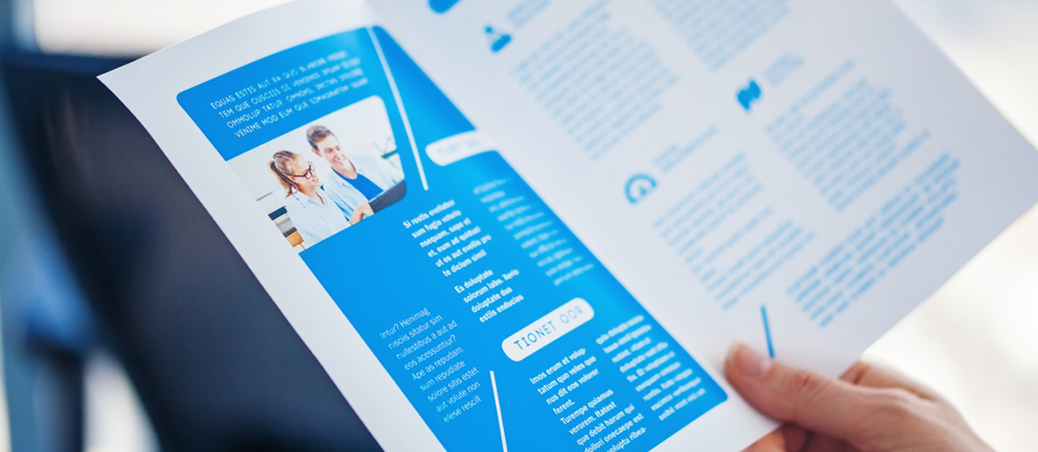
Typography is an aspect of graphic design that is often overlooked. For many designers, it’s just a case of choosing a font. Yet, while the choice of font is important, even more so is the layout of text in the space. Getting the words in the right place is fundamental for creating aesthetically pleasing design with clear and legible information.
Good typographical composition allows the reader to focus on the message rather than reading. On the flipside, bad typography is distracting.
What happens when we read a text?
Understanding how we see and read a text is useful for organising and adding it correctly in the artwork. When we read a line of text, our eyes jump along it. These jumps are called “saccades”. So our eyes perform lots of “jumps” backwards and forwards along the line, analysing the text with a series of saccades. Between one saccade and another there is what is known as a “fixation”, the moment when we take in the information from a word. The average breadth of a saccade is 5-10 characters, or 1-2 words (if we assume an average-sized font, like one used in a book). In reading, overall vision has an important role to play in guiding saccades[1].
First we look and then we read
Typography plays a dual role in the quality of written and visual communication. In fact, as readers analyse a page, they are subconsciously aware of each of these functions: first they take in the general graphic design of the page and then they analyse the language by reading the text[2].
Saccade breadth and fixation time depends on the reader’s experience and familiarity with the text. If we’re reading a scientific text and are not experts in the field, we will spend longer fixed on a word or re-read it several times to understand the meaning of the sentence.
Legibility and readability
The text on a printed document (and on a webpage too) will be more effective the easier it is to identify and read. When we talk about reading a text, we need to differentiate between legibility and readability.
Legibility is the degree to which text can be easily recognised in terms of clarity, contrast and illumination.
Readability, on the other hand, is about ease of reading and degree of fatigue.
As Stephen Coles of Typographica wrote it in a tweet a while back:
The term readability doesn’t ask simply “Can you read it?” or “How fast can you read it?” It also asks, “Do you want to read it?”
Legibility and readability help us to understand that text should not just be clearly recognisable in its composition, but should also be appealing to the reader’s eye.
To achieve this, a number of variables come into play, such as:
- Correct arrangement of text in the space
- Hierarchy of information
- Choice of typeface
- Choice of keyword
- Conciseness and clarity of information
- Tone of voice and style of text
In this article, we’ll focus on:
- Correct arrangement of text in the space
- Correct choice of typeface
- Hierarchy of information
There are, of course, other aspects to consider that have more to do with the choice of content and power of words in the strictest sense. Judgements about content are just as important for piquing readers’ interest, then getting them to look at the text and take in the key information at a glance. That’s why it’s worth working with a copywriter, as well as a graphic designer, to ensure that the text used on printed material contains the right information and is well written.
Text elements: laying them out right
When a reader picks up a magazine, brochure, catalogue or flyer, the first thing they look at is the combination of elements that it comprises. They see how they interact with one another and then start reading, skimming the page until they find something that interests them. So, it’s important that there is a clear connection between textual elements and that this connection is easy to recognise at first glance.
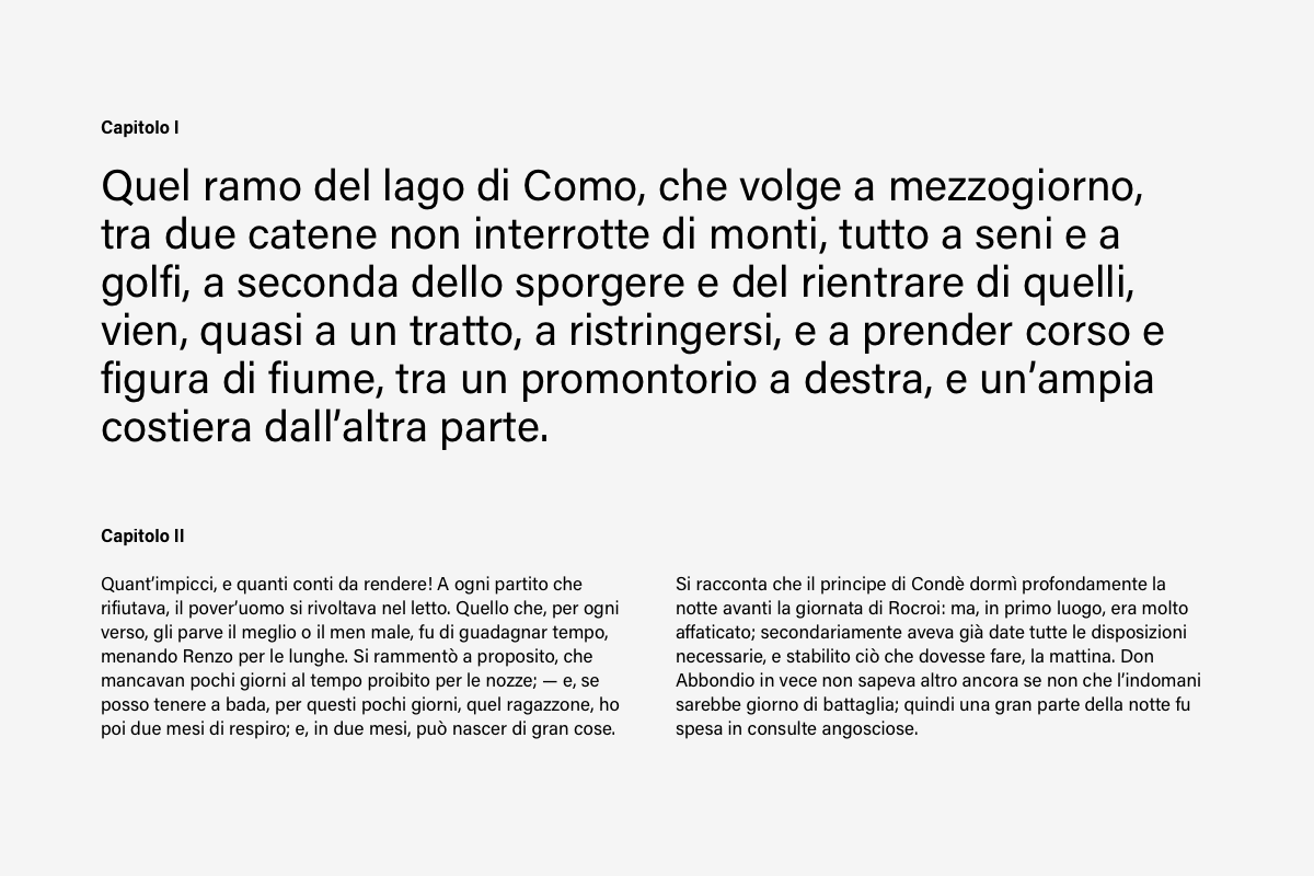
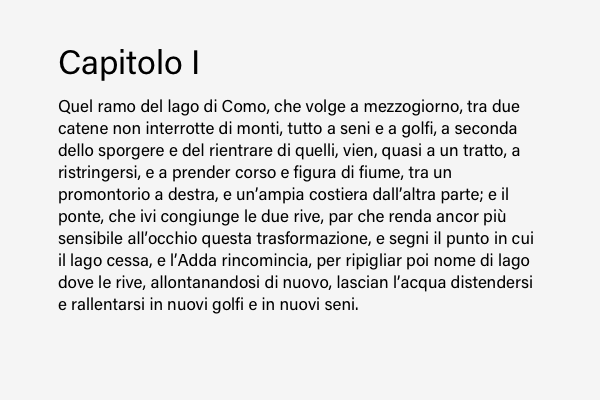
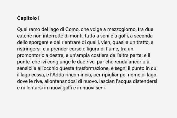
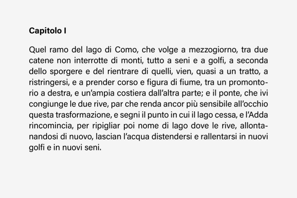
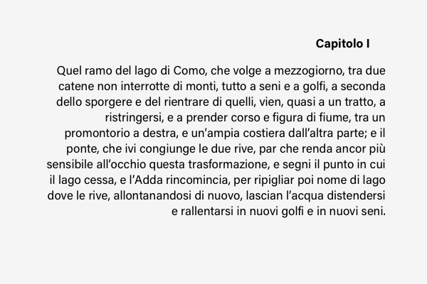
In the images below, you can see how tiny changes can change the perception of the text and layout.
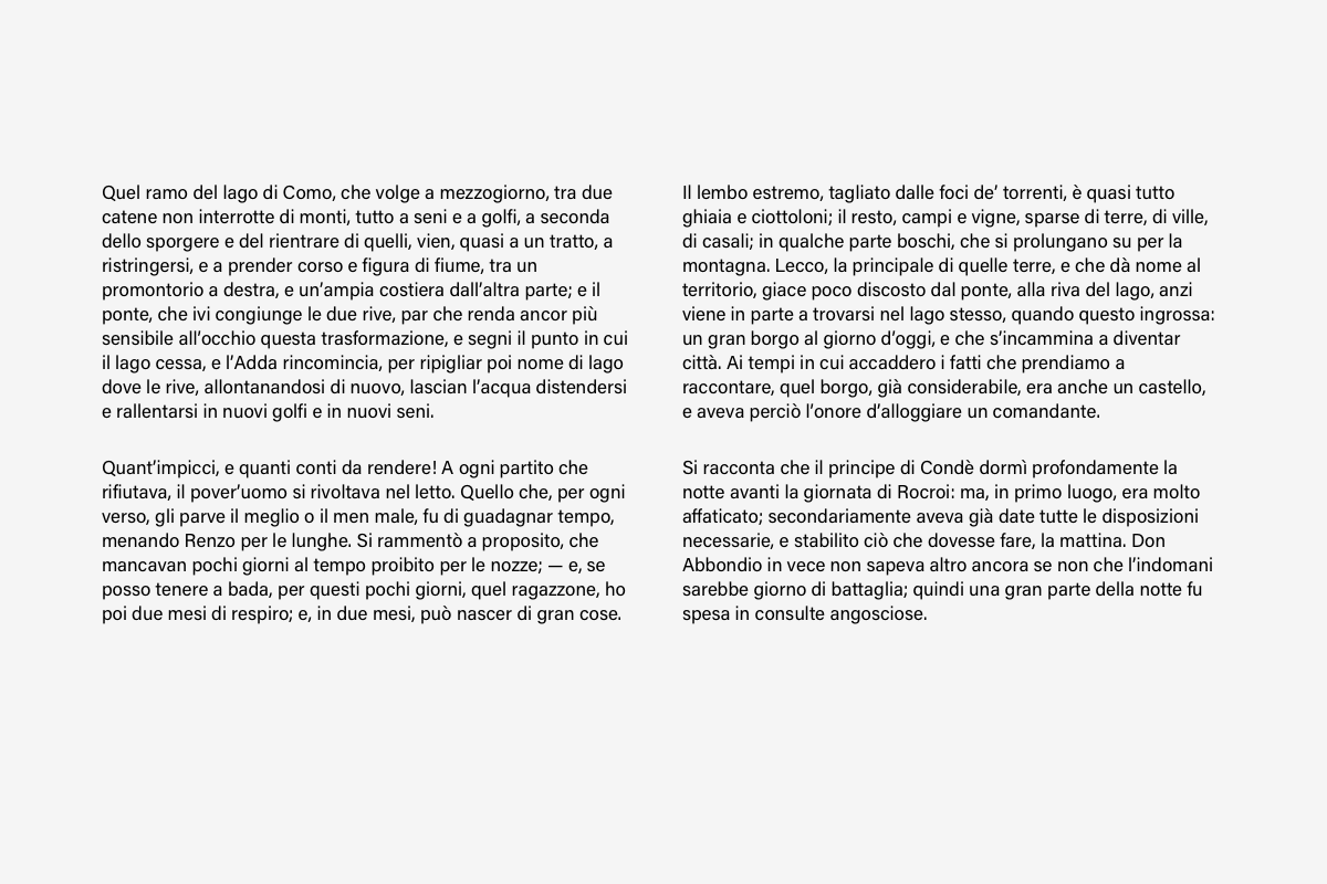
In the first image, we can’t see the links: the four paragraphs might be connected or they might not; we can only find out by reading them.
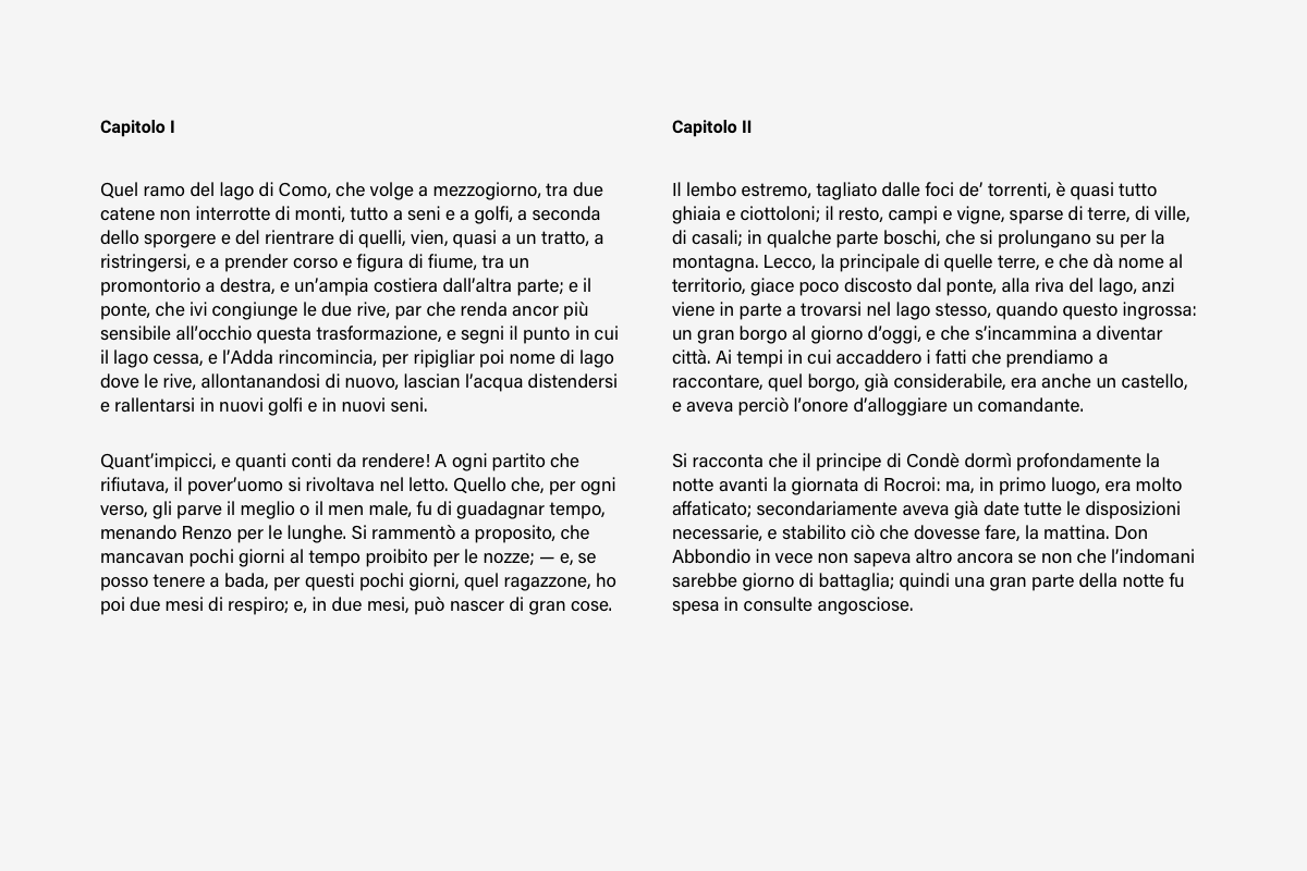
In the second image, through the addition of a title, we understand that the text is divided into two blocks , one on the left, the other on the right.
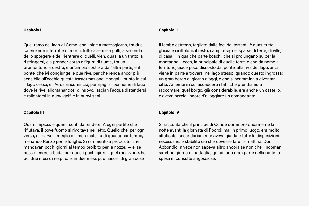
In the third image, the four paragraphs are clearly separate and distinguishable thanks to the four titles.
In the last image, the difference in font size tells us that the first block of text is clearly separate from the others below.
As readers can spot the tiniest differences, it’s important not to go over the top with different styles and typefaces.
Hierarchy of information
The elements in a graphic layout differ in importance and function. Good (or bad) design depends on a clear visual hierarchy.
To define an effective hierarchy, you need to read the text and try to answer questions like:
- What is the most important element to highlight?
- How do the other elements relate to one another?
- Which group of words should the reader see before focusing on the main part?
Hierarchy between elements can be signalled through positioning: we give greater importance to things that are located at the top of the page and that are bigger than others. But care must be taken with size when creating a hierarchy: a common mistake is to make the main content too big and the secondary content too small.
Hierarchy can also be created through contrast, as we’ll see below. By using a single size and playing with font weights and slight changes in colour, the same result can be obtained.
Another useful element for creating hierarchy is colour, as we saw in a previous article.
Choice of typeface
To understand how to handle text in a layout, it’s useful to break down the elements that make up a text. A text comprises:
- Letters
- Words
- Lines
The shape of letters changes depending on the typeface that we use. One of the most basic ways to group characters is into:
- serif
- sans-serif
- script
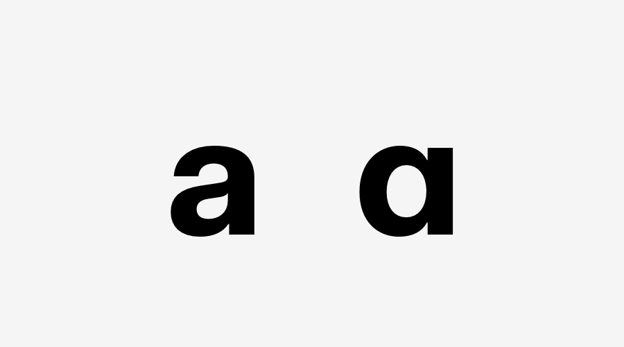
Over the centuries, various classifications of fonts have been proposed based on variations in the anatomical features of the glyphs (the graphical representation of a character) that they comprise. The same letter may have two different glyphs. Below is an example of two glyphs for the letter “a” from the Fakt font.
When we talk about a typeface, we’re taking about a type family. Each family has variants or styles called “fonts”. Garamond is a type family, while Garamond bold is a font (a variant).
The variants of a typeface differ in terms of weight and width. By weight, we mean the thickness of the stroke. Some of the most common weights are:
- light
- regular
- bold
- black
- heavy
Common widths include: condensed and extended. The width of a typeface is determined by the ratio between its width and height.
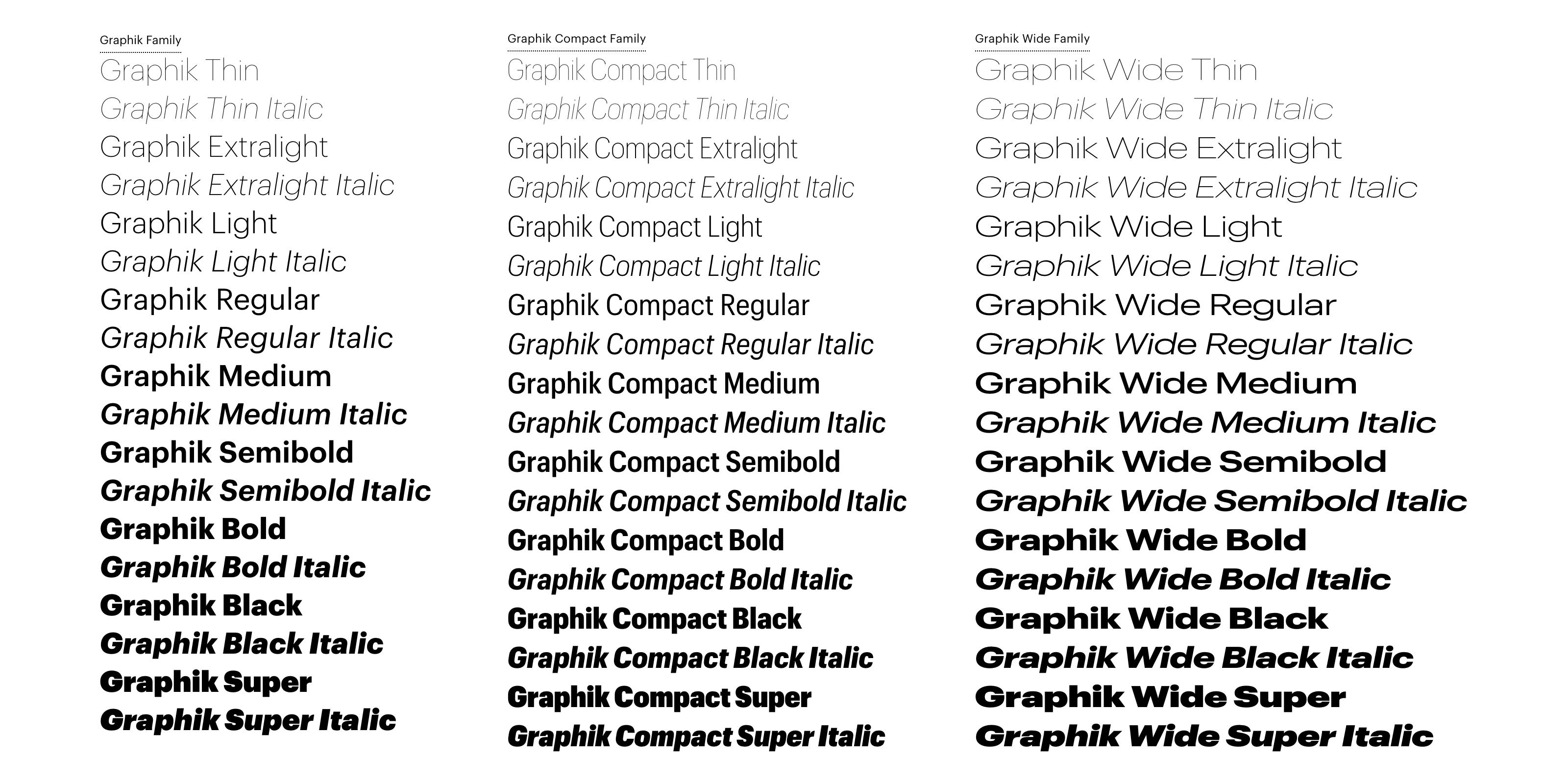
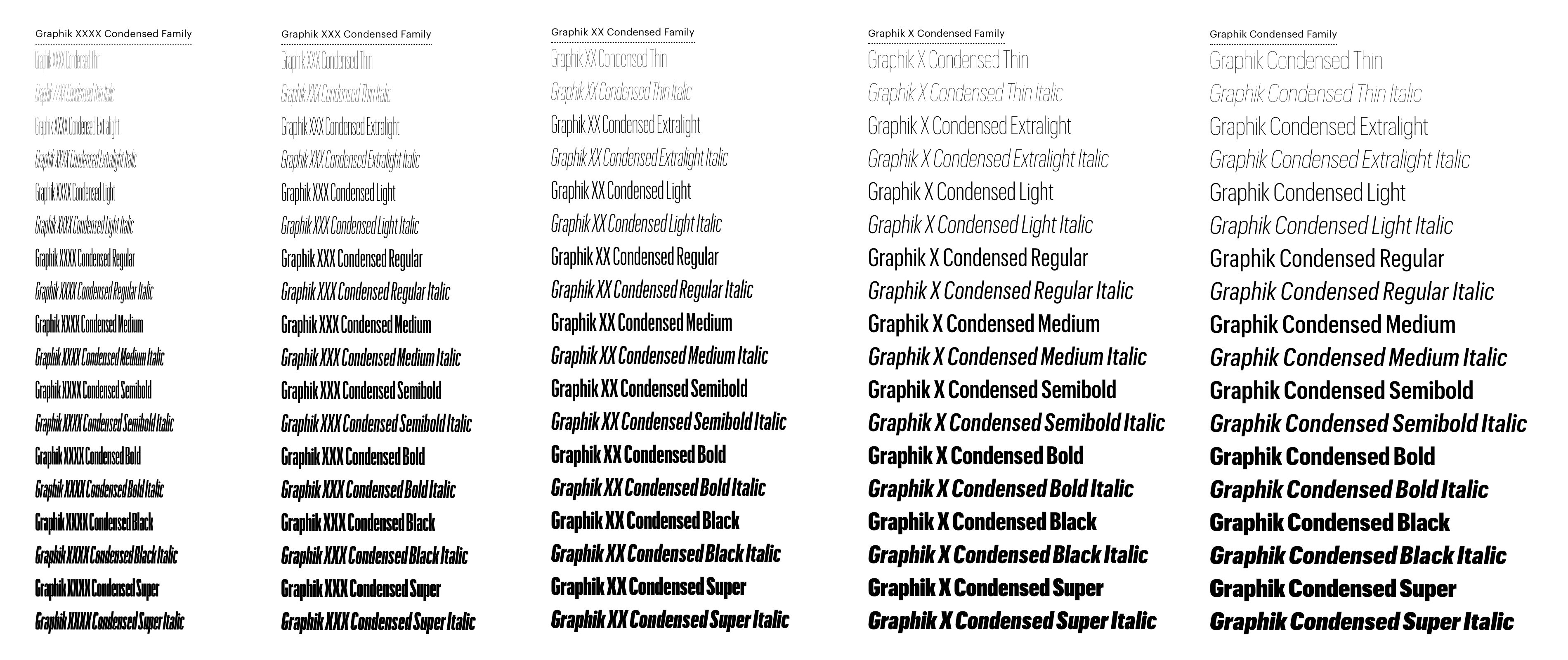
One of the largest type families out there is Graphik, created by type foundry Commercial Type. Graphik has nine different weights (from thin to super) and eight different widths, from xxxx condensed to wide.
A typeface can come in a roman version (i.e. upright), or italic. Some typefaces don’t have an italic version but an oblique one instead. The glyphs in the oblique version have the same shape as the roman but are slanted.
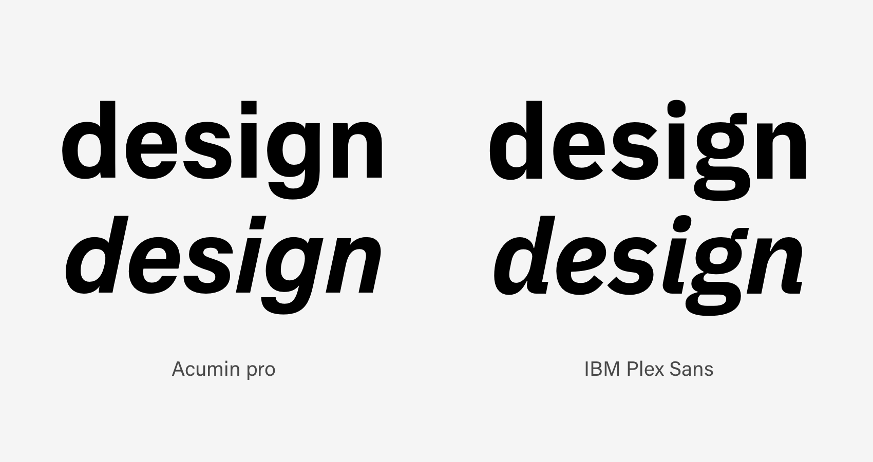
An example of a typeface with an italic version (IBM Plex Sans) and another with an oblique version (Acumin Pro).
Each to their own: there’s a typeface for everything
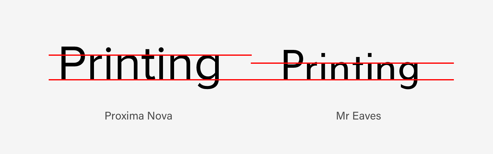
Most typefaces are legible when used in large sizes, but lose readability in small sizes. That’s why some typefaces are designed to be effective in large sizes and others in smaller ones.
Some typefaces are great for titles, others are designed to be better in long texts. Almost all typefaces are hard to read at small sizes in the bold, black and heavy variants, as are condensed variants and those that have a low x-height (lowercase height).
When choosing a typeface, it’s important to take into account both its graphical characteristics (shape) and the emotional reaction that it generates. The shape of a typeface directly influences reading quality, making the text more or less readable in a piece of artwork.
For example, Georgia is a typeface that was created by Matthew Carter specifically for use on monitors. As it was designed to be readable on screens even at small sizes, at large sizes it looks huge and produces a strange effect. (The same goes for Verdana, also designed by Carter for monitors.)
Choosing a typeface for long texts
A typeface suitable for long texts needs different characteristics to those used for headlines on posters, adverts, book covers or decorations.
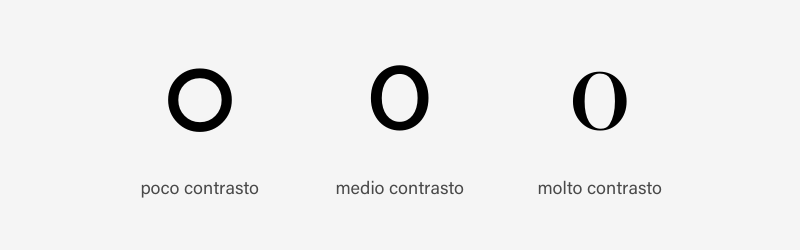
When choosing a typeface suitable for long texts, you need to take into account the x-height (not too low), contrast and the difference between thick lines and thin lines (this shouldn’t be too marked or lacking) – it shouldn’t be condensed or extended.
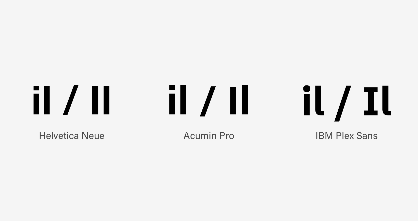
For long texts, both serif and sans serif typefaces can be used. In the past, particularly in print, serif typefaces were recommended because their irregularity makes characters more cohesive and easier to recognise.
Today, however, there are many sans serif typefaces designed for long texts in which the uppercase i and lowercase l are immediately distinguishable.
Characters used for long texts should not, according to Stanley Morison, be “very ‘different’ or ‘extraordinary’”.
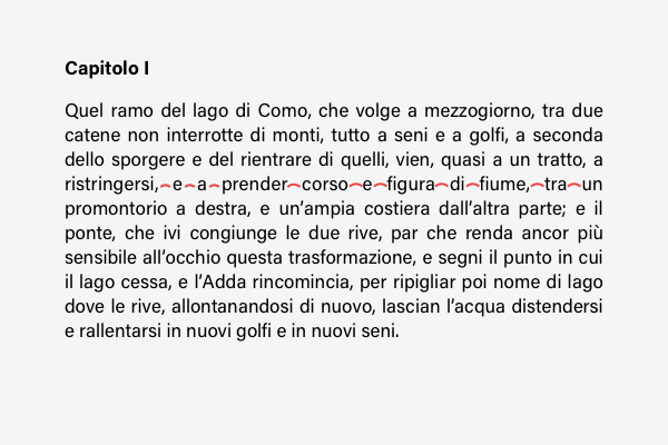
When we read a text, we don’t read single letters but groups of them as words (or part of words). For a word to be readable, it’s important that letters aren’t all uppercase and that the distance between letters is right.
A sentence in uppercase just produces a rectangular outline. So a text written in capitals reads particularly poorly and takes up lots of space.[1]
Choosing a typeface for short texts
For short texts, and especially for headlines, the typeface should stand out. Both typefaces with lots of contrast and very little contrast work for headlines, as do condensed or wide ones.
A headline or short text can also be used for decorative purposes in a piece of artwork – it doesn’t necessarily have to be legible at first glance.
Text alignment
Paragraph text can be aligned in two different ways:
- With fixed justification
- With variable justification.
With fixed justification, the text is justified. The left and right margins are perfectly aligned, except for the last line. When text is justified, it’s advisable to use hyphenation to prevent too much space being created between words.
With variable justification, the text has one uniform margin and another variable one. The uniform margin can either be on the left (in which case we say that it is flush left) or on the right (flush right).

The hierarchy of information and text: takeaways
When two graphical elements are placed in the same space, the reader automatically compares and evaluates them based on differences and importance. Just as for single elements in a layout, the rules about hierarchy and contrast also apply to text.
- A good rule of thumb is to use two typefaces at most, typefaces that contrast in some way.
- Often, a sans serif is used for the headline and a serif for the text (or vice versa).
- Contrast can also be created by juxtaposing weights (light/bold) or widths (regular/condensed or extended).
Typography isn’t an art. Typography isn’t a science. Typography is a craft, not in the sense of blindly following arcane rules, but in using tried and tested experience. [1]
[1] J. Hochuli, Detail in Typography, Hyphen Press, London, 2008
[2] R. Bringhurst, The Elements of Typographic Style, Hartley & Marks Publishers, Dublin, 2013