
Table of Contents
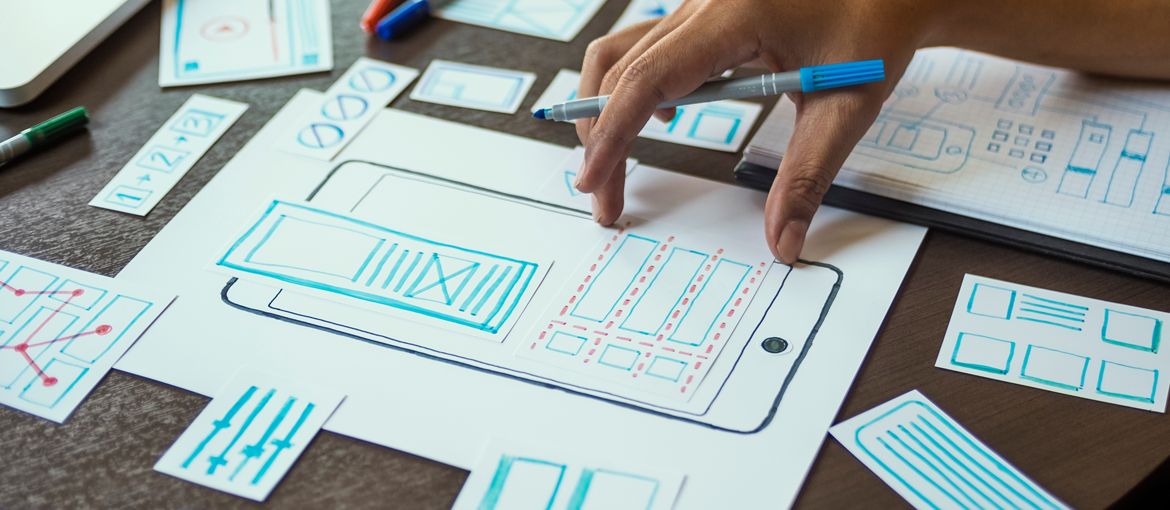
To create a graphic design fit to print, you need an immaculate layout.
When we talk about layout, we mean the organisation and positioning of objects and elements in a given space. To explain the idea of layout, Italian graphic designer and author Riccardo Falcinelli compares the process to setting the table.
The layout of plates, cutlery and glasses always follows a discursive logic, in other words, the position (and the way) in which the items are arranged says something specific: from the conviviality of an informal lunch to the extreme sophistication of an official dinner.
Creating a layout? It’s like setting a table!
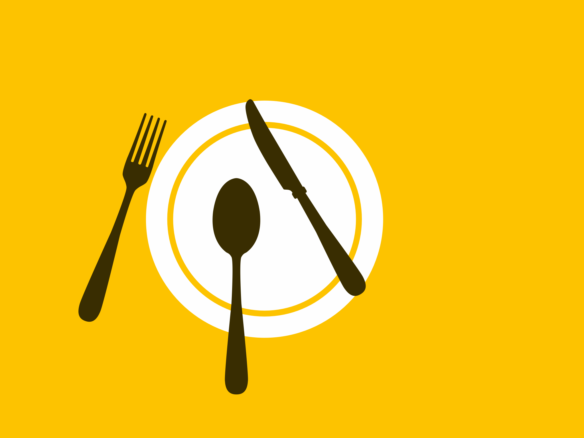
With cutlery, plates, glasses and napkins positioned in an orderly fashion, we know a dinner is about to start.On the other hand, if everything were positioned haphazardly, we would be confused, perhaps thinking that it’s a table to be cleared. If we found pasta on the plate, we would think that the dinner has already started; but if the pasta were laid out asymmetrically, we might think that the pasta has already been tasted.
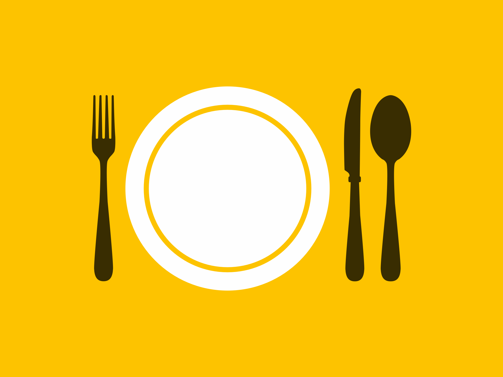
When we look at something, we can’t help but interpret it. This applies to the position of cutlery, plates and glasses as it does to the layout of elements in a piece of artwork. When we position items within a space, we create relationships between them. This establishes a structure that enables a certain message to be communicated.
When approaching a layout, we need to lay the foundations, starting with formats and grids. Then we need to establish hierarchies: informative, symbolic and perceptive (Gestalt). Lastly, we need to set out the page by deciding on typefaces, formatting and compositional balance.
There are two main elements that we use to lay out a piece of artwork: text and images.
One of the first designers to explain how to correctly lay out text and images in space was Jan Tschichold in his 1928 essay Die Neue Typographie. In it, Tschichold set out a series of rules that would inform modernism, especially the so-called Swiss School.
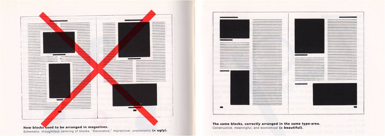
In a double-page spread in his book, Tschichold shows a magazine layout. On one side, he shows how magazines had been laid out until then, with centred blocks and text running around it, hampering readability. The caption below the image reads: “Schematic, thoughtless centring of blocks, impractical, uneconomic (= ugly).” The image is struck through with a big red cross, as if to say: wrong.
Next to this image is the correct one, which is far easier to read and does not have centred elements. The caption reads: “Constructive, meaningful and economical (= beautiful).” Tschichold’s suggestion is to lay out images to fit the content, rather than forcing the text to run around blocks fixed in the middle of the page.
To improve the readability and understanding of a page there are several things you can do. Let’s take a look at some.
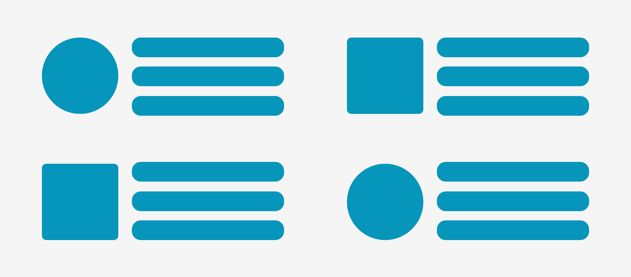
Contrast: distinguishing elements clearly
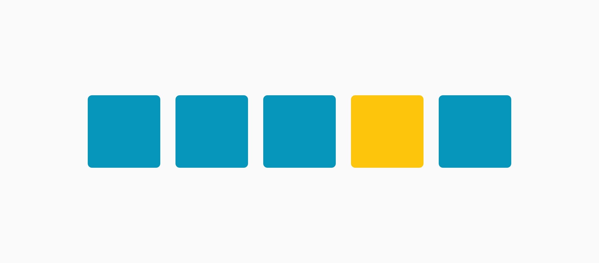
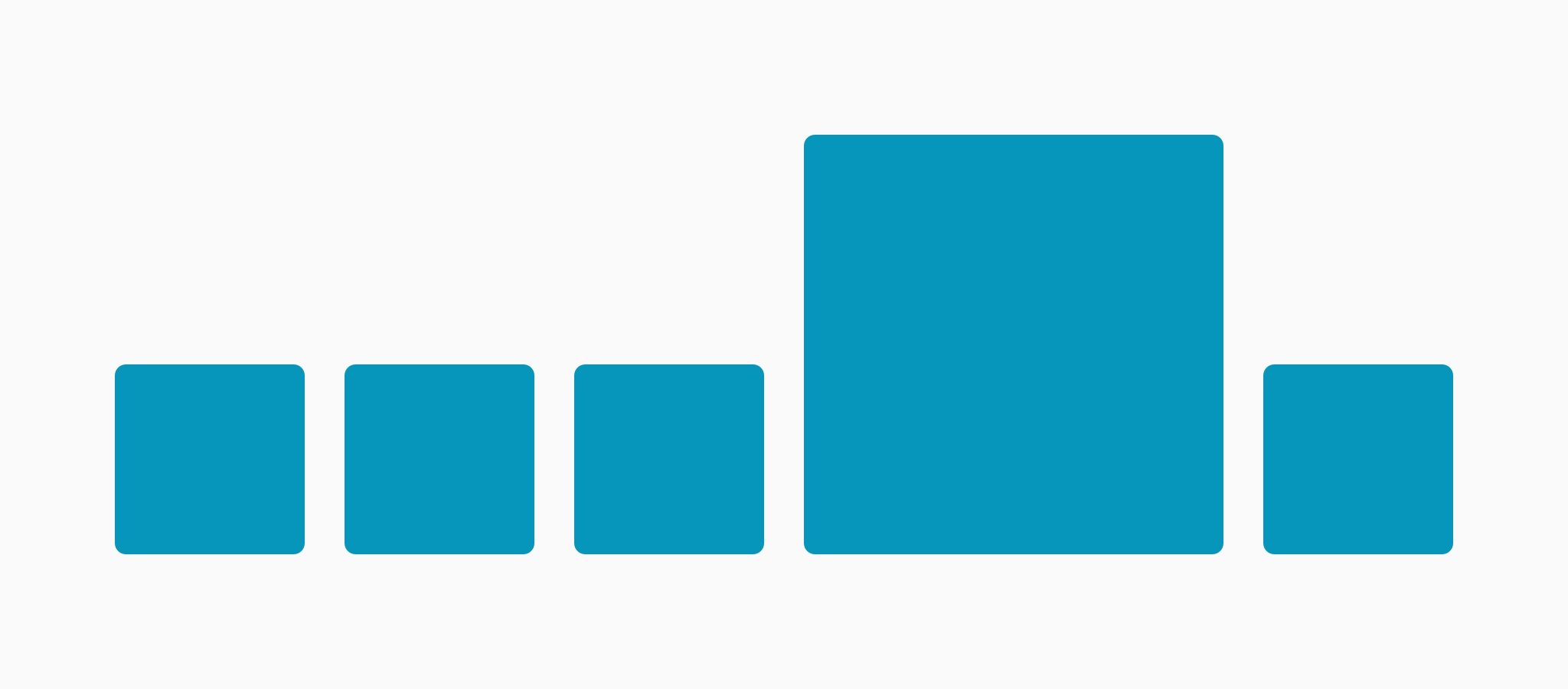
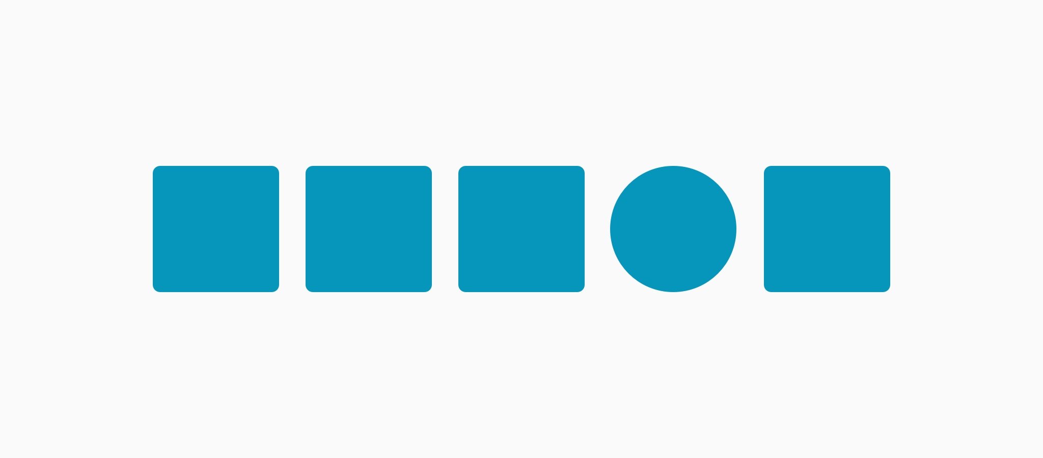
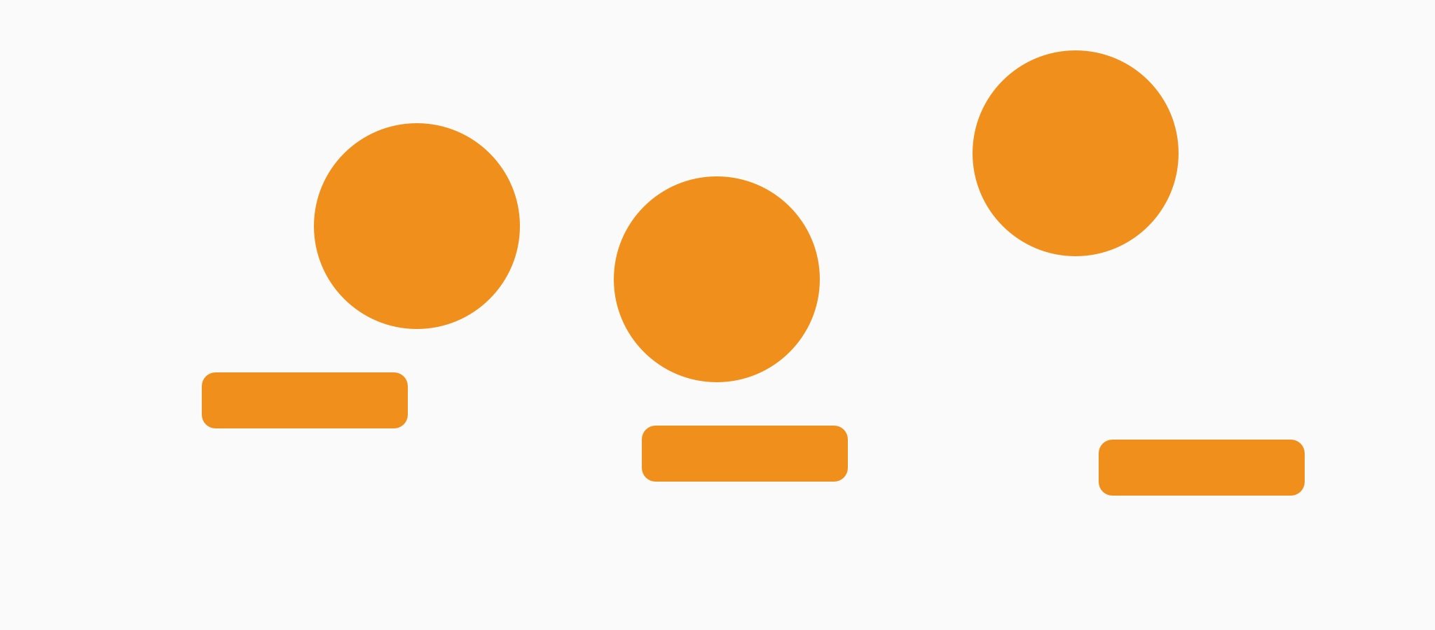
One of these is contrast. Through contrast, we can emphasise differences between elements. We can highlight what we want people to read first, or we can stress or draw attention to something important. To create contrast, we can use colour, size and shape.
Proximity: creating relationships between objects
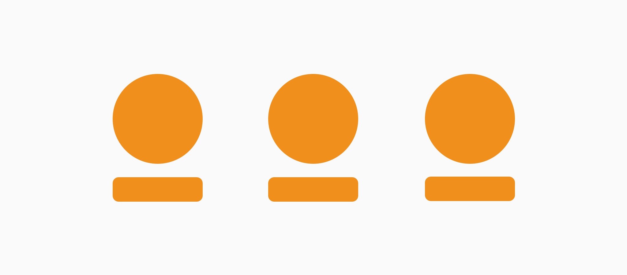
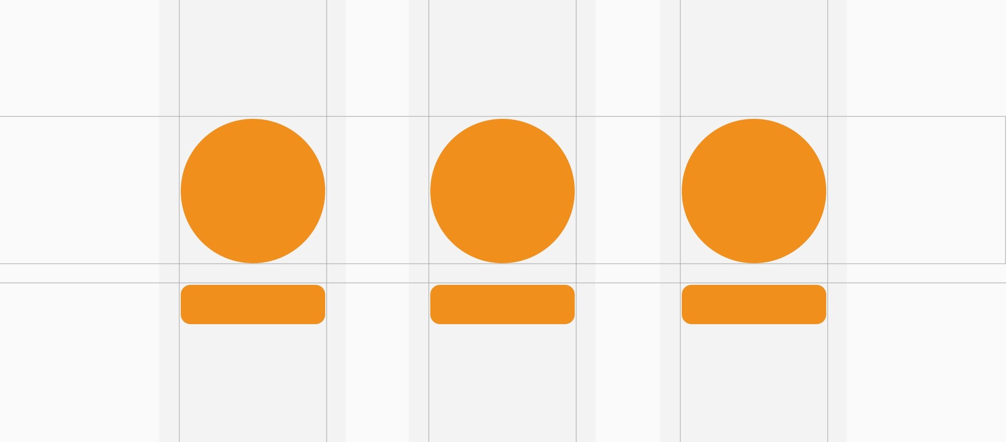
We can also work with proximity, which means managing the relationship between two or more objects on the page.
Elements that are close to each other are perceived as one unit. Based on this principle, by moving elements closer or further apart on the page it’s possible to create visual relationships that allow the reader to immediately distinguish between areas and groups of elements. And by following the principles of good form as set out in Gestalt theory, it is also possible to create relationships through the so-called “Law of Similarity”. Elements with shared characteristics are perceived as belonging to a single group.


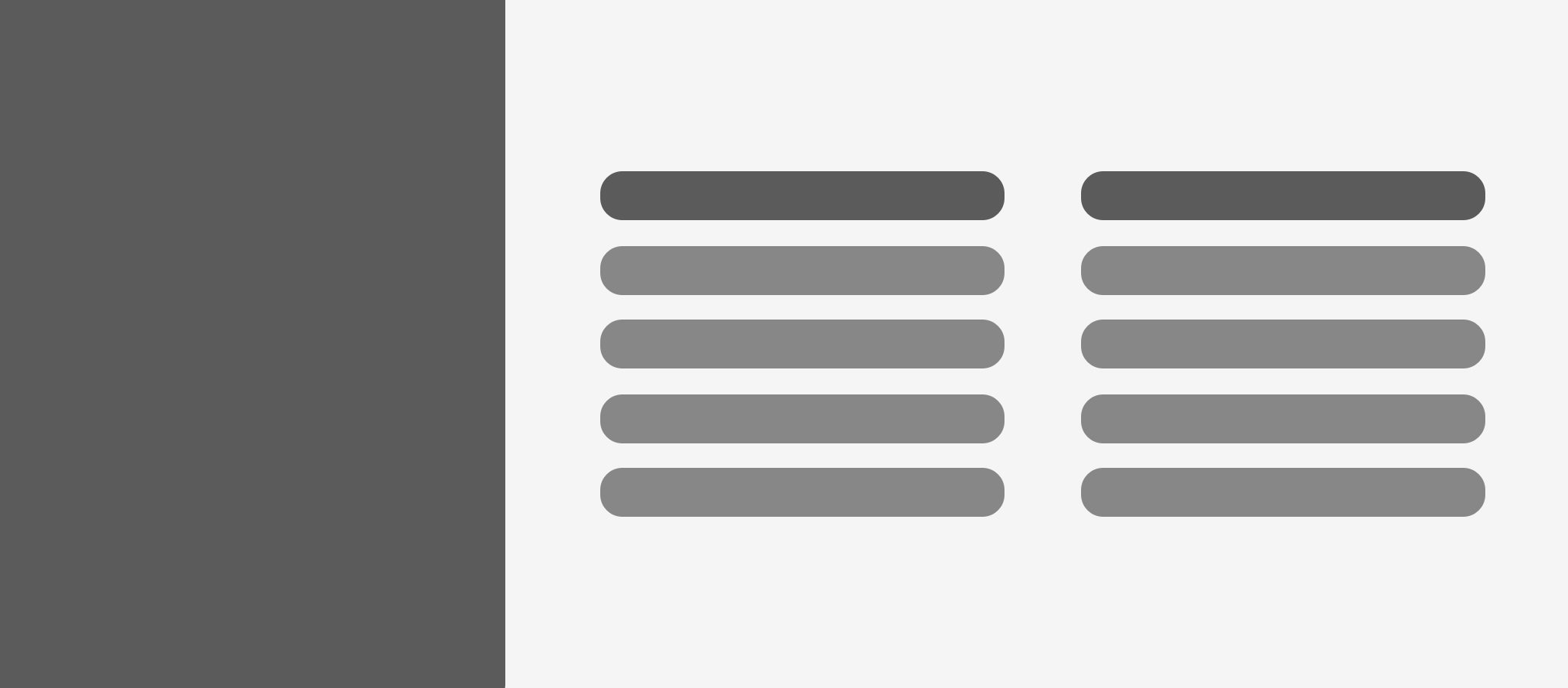
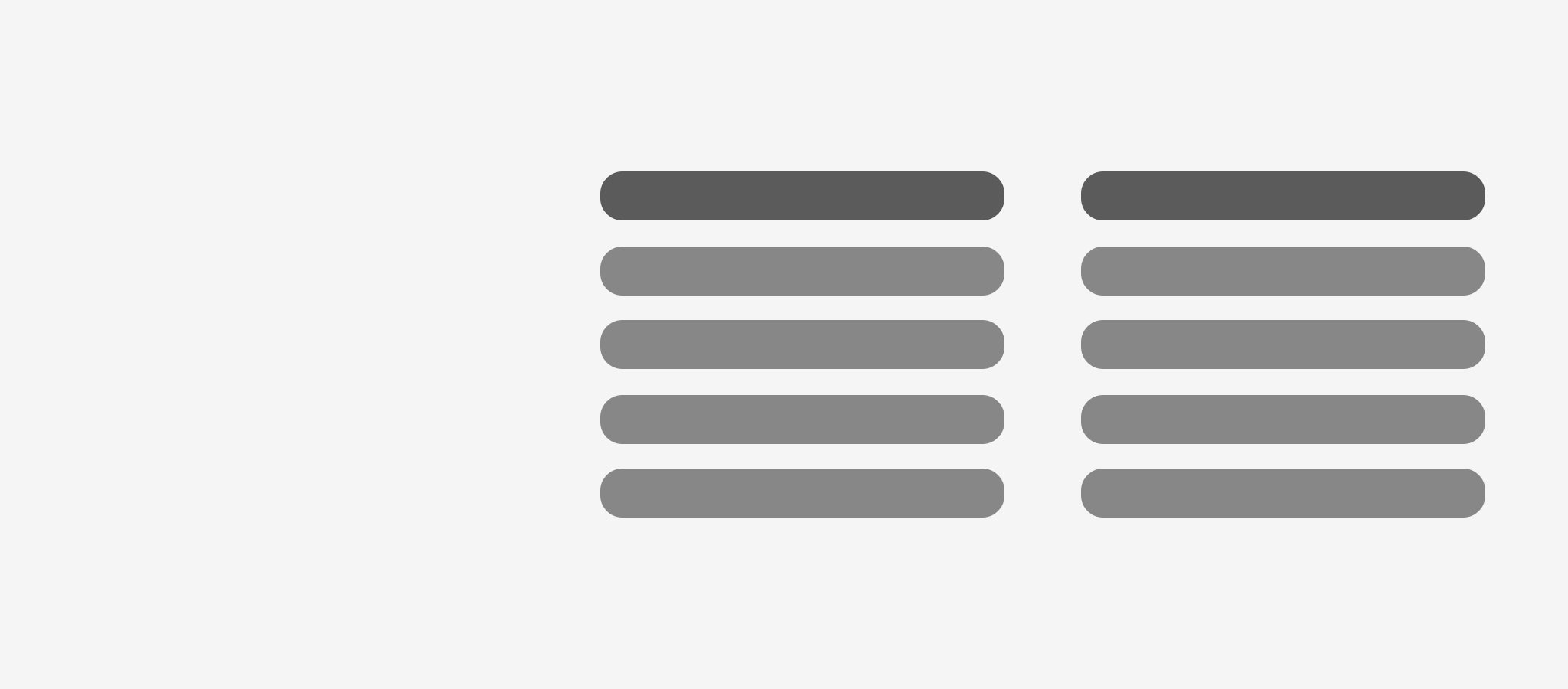
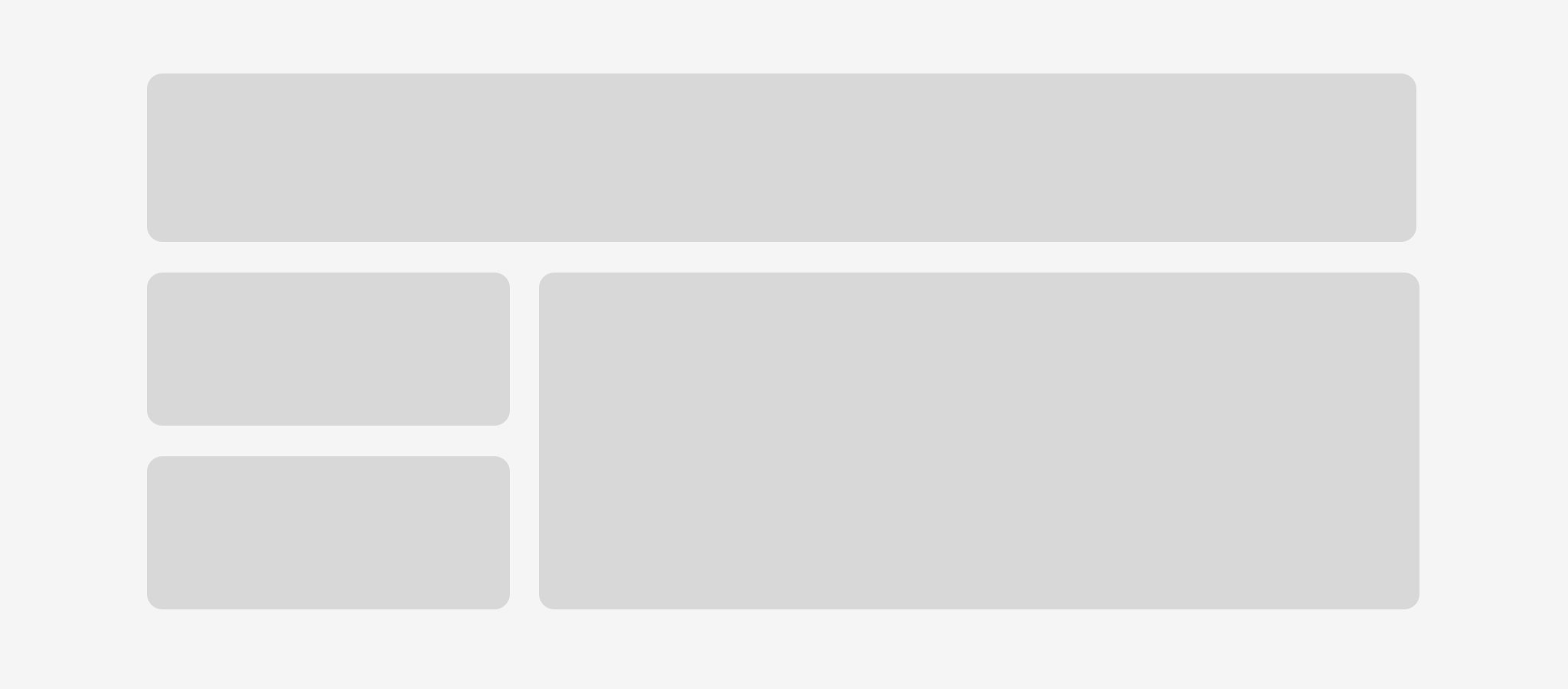
Blank space: allowing the page to breathe
Blank space is a tool we can work with. Blank space (which doesn’t necessarily have to be white) is an empty, unused area on the page. Tschichold defined it as “the lungs of a good design”. The right balance between content and empty space allows the page to “breathe” and establishes hierarchies. In the second illustration below, the block on the left can be left empty or filled with an image, as required.
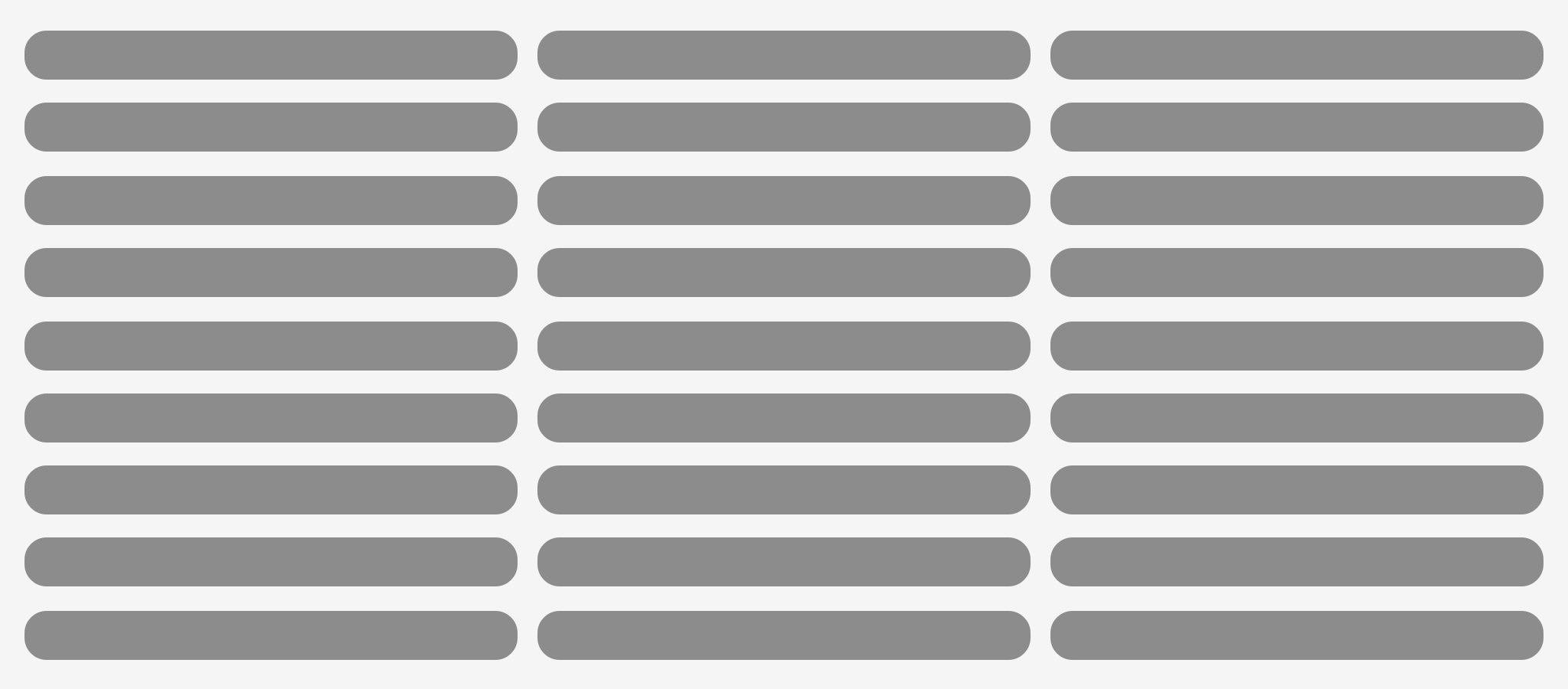
Alignment: imposing order and rhythm on graphical elements
We can also work with alignment, and not just when it comes to text, but between elements too. Like cutlery that is positioned too far from the plate, a layout with objects scattered all over the place generates a sense of disorder, disorganisation and improvisation.
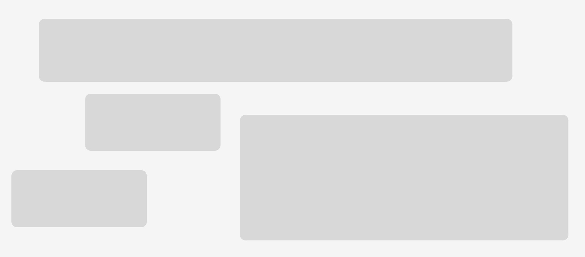
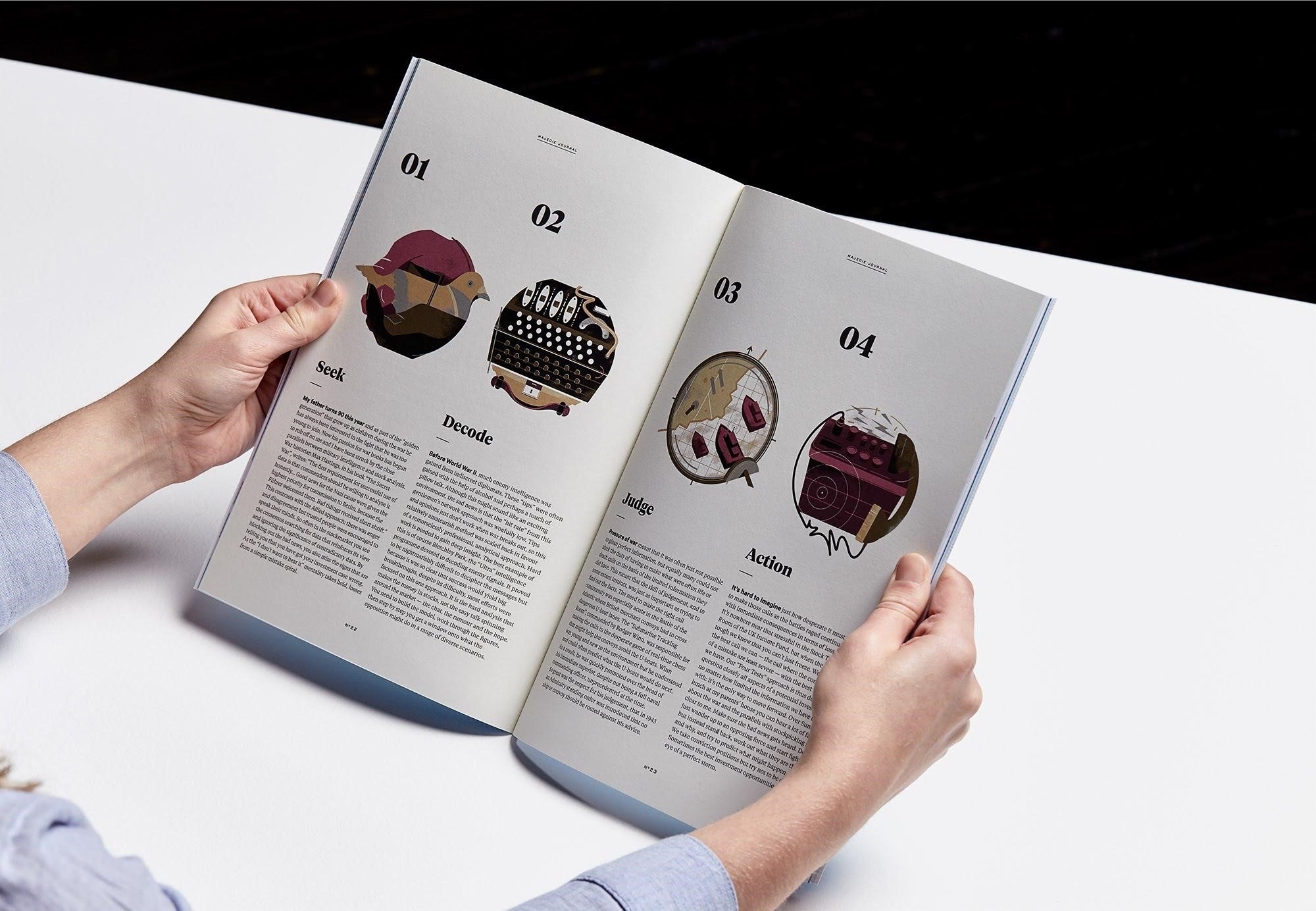
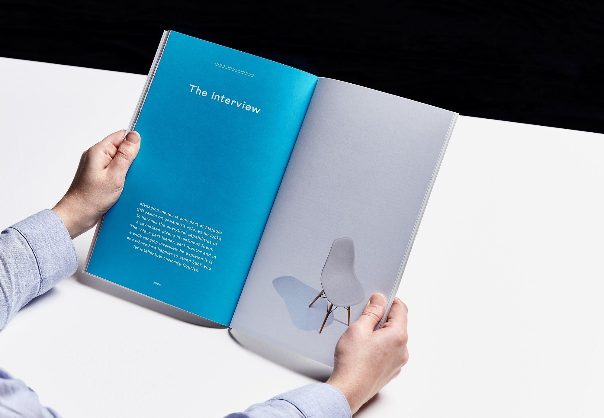
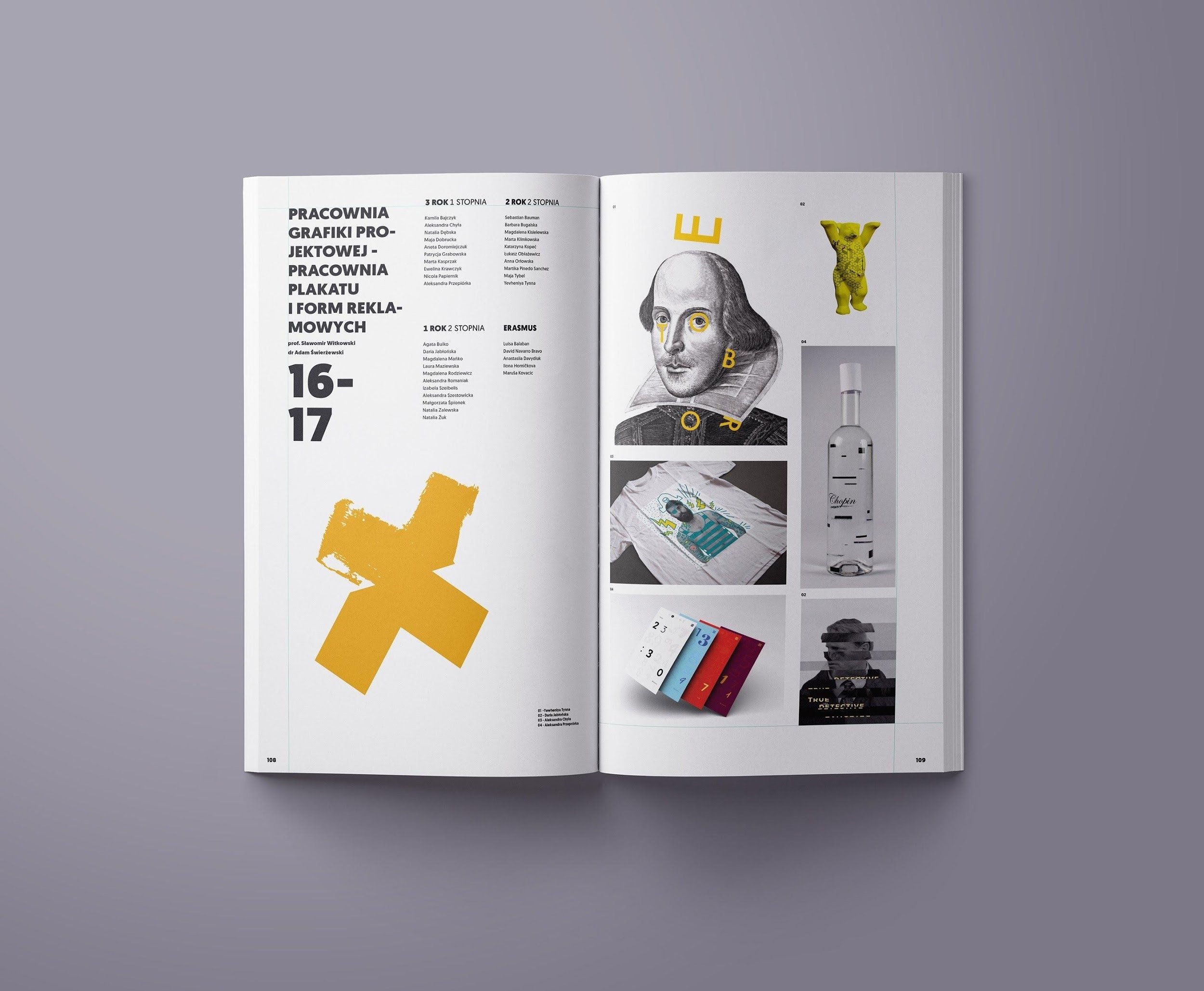
Examples of blank space and alignment from the magazine Majedie Journal and the yearbook for a graphic design course in Poland.
Analysing and comparing graphical elements
Before laying out elements in an organised and attractive manner, we need to analyse the elements that we have to manage. This is a preliminary phase in which the communicative objectives of our graphic design are decided. There are many factors to consider. We analyse, interpret and compare the graphical elements that we’re going to use in our layout. Specifically, we assess:
- The audience the graphics are aimed at (viewer, reader or user)
- The content (long, short, informative, important, not so urgent, entertaining)
- The context in which the graphics are enjoyed (sitting down, in a meeting, on the go, at a desk, in the workplace, under water)
- The audience’s motivation (interested, bored, dependent, negative, reluctant)
- The technology that it’s produced with (not always digital), how many colours can be displayed and the technology used to print the pages (offset, inkjet, flexography, screen printing, letterpress, laser)
The aim is to find a layout that fits the format, usage context and information presented. Images and typefaces must be coherent with each other and clearly identify the hierarchy of graphical elements.We will then be looking at a graphic design creation that is useful, attractive and memorable.