
Table of Contents
Colour is an extremely valuable tool when preparing a graphic design file for printing. It both helps readers to find their way around the document – highlighting different areas of the page – and puts them in a certain state of mind.
However, colour is very subjective, both physically (the light the objects reflect and the properties of the viewer’s visual system) and from the cultural and symbolic point of view.
All light frequencies are contained within what is known as the electromagnetic spectrum. Each colour corresponds to a certain frequency, and the human eye can only distinguish a certain proportion of these frequencies. Sir Isaac Newton was the first person to describe colours scientifically and to link them to light, and he was also the first, through his experiments with prisms, to demonstrate the visible spectrum of colours, the colours of the rainbow (red, orange, yellow, green, blue, indigo and violet).
The majority of mammals have dichromatic vision, meaning they can distinguish between two colour pairs: black and white and yellow and blue. Human beings (and monkeys) have trichromatic vision, adding the ability to distinguish between red and green to the other two pairs. Our brain’s colour vision mechanism is based on antagonistic pairs.
Josef Albers, a painter and teacher at the Bauhaus, wrote in his book Interaction of Colour[1]:
If one says ‘Red’ (the name of a colour) and there are 50 people listening, it can be expected that there will be 50 reds in their minds. And one can be sure that all these reds will be very different. […] Colours present themselves in continuous flux, constantly related to changing neighbours and changing conditions.
Colour’s three characteristics: hue, brightness and saturation
The difference between a red pepper and a green pepper is clear to see – they are the same vegetable, but the colour is completely different. If, on the other hand, you put a green pepper and a courgette together, you can see that both are green, but one is darker than the other. Colours are differentiated based on three separate characteristics[2]:
- hue
- brightness
- saturation
The hue corresponds to what is often called the ‘colour’: red, green or yellow, for example.
The brightness is the extent to which a colour is light or dark, bright or sombre, and is connected physically to the quantity of light reflected by the surface.
The saturation describes the intensity or brilliance of a colour. A saturated colour is very intense, while opaque (or pale or faded) colours are considered drab.
Another characteristic of colour is its temperature. The associations we make between colour and warmth or coldness are mostly conventional – we consider red and orange to be warm colours and blue and green to be cold. However, blue things are not always cold (and vice versa); consider the flame on a gas stove, for example.
Colour mixing
The visible spectrum (the colours of the rainbow) is made up of just seven colours. All the other colours we see are obtained by mixing two or more of them together.
There are two types of mixing:
- Additive mixing, when light is added to light;
- Subtractive mixing, when light is taken away.
Additive mixing uses coloured lights, like a TV screen made up of red, green and blue (RGB) lights. If, in a certain area of the screen, the red lights are lit, you will see red, and if the green lights are lit too you will see yellow.
Subtractive mixing, on the other hand, involves solid colours, such as inks, and entails light being subtracted. Natural light contains all wavelengths. A yellow pigment reflects those wavelengths that correspond to yellow and some of those corresponding to green, and absorbs the others (red, orange and blue). A blue pigment reflects those that correspond to blue and some corresponding to green, and absorbs the others (red, orange and yellow). When the two colours are mixed, they’ll continue to absorb (and therefore subtract) the wavelengths they absorbed before, but, in addition, blue will be absorbed by the yellow component, and yellow will be absorbed by the blue component. The only wavelength remaining is therefore green.
How we perceive colour: perception, psychology and application
Colour is a perceptive phenomenon, associated with and connected to our understanding of an object.
For example, colour can alter the flavour of food and drink. We tend to refuse food with a colour other than the one we are expecting, even if we know that the nutritional properties are the same. And colours also have a direct impact on our state of mind. For instance, a black suitcase feels heavier than an identical white one.
Understanding colour and the associations it evokes is crucial. The meaning we assign to colours is a historical and cultural issue that varies depending on our country of origin, and it changes over time. Today, blue is often associated with peace and calm, but this was not true for Ancient Romans, for whom “dressing in blue was considered degrading, eccentric or a symbol of mourning.”[3]
And while colours take on meaning and properties on their own, the effect is amplified and multiplied when they are used alongside other colours, and sometimes their properties change altogether. The first person to delve into the psychological aspects of viewing colour was Johann Wolfgang von Goethe, while the French chemist Michel-Eugène Chevreul was the first to find a practical use for Goethe’s ideas. Chevreul, who had been appointed director of the dyeing department at a major textile factory in Paris, ran into a problem related to perception. The black of the designs embroidered onto plain-coloured fabrics seemed to change depending on the context: it had a greenish tinge on a red background, and a yellowish appearance on a blue background. The colour was the same; the perceived difference was in the eyes of the beholder. Chevreul therefore set to work studying the various types of contrast.
Chevreul realised that the only way to solve the perception issue was to cheat, noting that if a grey placed on top of a red looks too green, you just have to add a dash of red to the grey thread to make it appear completely neutral[4]. He named the effect of the colours’ interaction simultaneous contrast.
His research into the principles of colour harmony and contrast and their application in the arts was then turned into a book[5], becoming an essential reference for generations of artists.
The relationships between colours: colour theory
Since the time of Johannes Itten,[6] all discussions oncolour combinations have focused on the idea of harmony. Before Itten, colour theory was based on circles (like those produced by Newton, Goethe and Moses Harris) containing isolated colours, without an analysis of the relationship and links between them.

Itten was also interested in what happened within the circle, showing how three solid colours (yellow, red and blue) could be used to generate secondary and tertiary colours.
He investigated the relationships between the colours compared to their position on the colour wheel. He found that combining colours that are near to one another leads to better harmony and correlation, while combining distant colours produces more contrast.
Itten identified seven different types of contrast:
- Contrast of hue, the simplest of the seven, created by pairing any colour at its highest level of saturation;
- Light-dark contrast, where colours with different levels of brightness are paired together;
- Cold-warm contrast, where colours are paired based on their temperature;
- Complementary contrast, where two colours are paired that, when mixed, produce a neutral grey-black, such as, for example, yellow – purple, yellow/orange – blue/purple, orange – blue, red/orange – blue/green and red – green;
- Simultaneous contrast, the phenomenon due to which our eyes, when subjected to a certain colour, at the same time (simultaneously) demand the complementary colour, and, if they do not receive it, create it themselves (as described by Chevreul, cited above);
- Contrast of saturation, where intense and bright colours are paired with pale and dim colours;
- Contrast of extension, based on the respective amounts of two or more colours. This is the juxtaposition of ‘much and little’ or ‘large and small’[7]

Itten dedicated particular attention to contrast of saturation. He noted that if every colour has its own characteristic brightness value, to achieve ‘colour harmony’ the different quantities of light need to be balanced.
To explain the concept better, Itten produced a new circle, in which the six main colours are given an amount of space inversely proportional to the quality of the light they reflect. For example, red and green have the same brightness and are therefore given the same space, whereas yellow, being three times brighter, takes up a third of the space of red and green.
The colour wheel

Moving around the colour wheel, Itten identified certain pairings and contrasts that were more ‘harmonious’ than others:
Analogous colours
Colours that are next to each other.

Complementary colours
Colours located opposite one another.

Triadic colours
Three colours located equidistantly on the colour wheel. The contrast here is not as strong as it is between complementary colours.

Colour rectangle
Two pairs of complementary colours.

Split-complementary colours
A three-colour scheme, where, unlike complementary colours, you do not use the colour directly opposite, but those to the left and right of it.

Itten’s theories on harmony were very successful, and today they still form the basis of many marketing and design handbooks. As Riccardo Falcinelli noted in his book Cromorama, however, colour is not a closed, self-sufficient system that functions regardless of human input.
The idea that an ‘a priori’ harmony exists is therefore false […] While one may suggest that the contrast between red and black is more markedly appealing than the contrast between green and beige and be right ninety-nine times out of a hundred, there will always be a time when green combined with beige turns out to be exceptional and perfect. It is all about talent and sensitivity. When creating a colour, it is not harmony that counts so much as having a story to tell.[8]
Takeaways
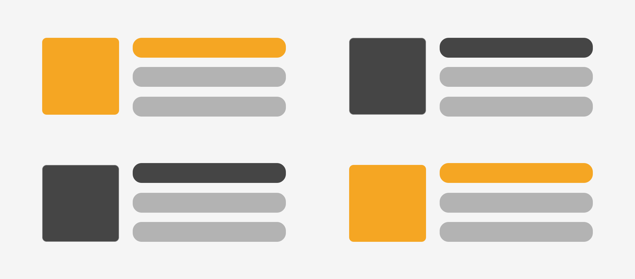
When dealing with complex layouts, colour can help us distinguish various types of information and establish relationships between items. Colours can also help identify various textual components (such as titles, subtitles and browsing menus) or specific sections.
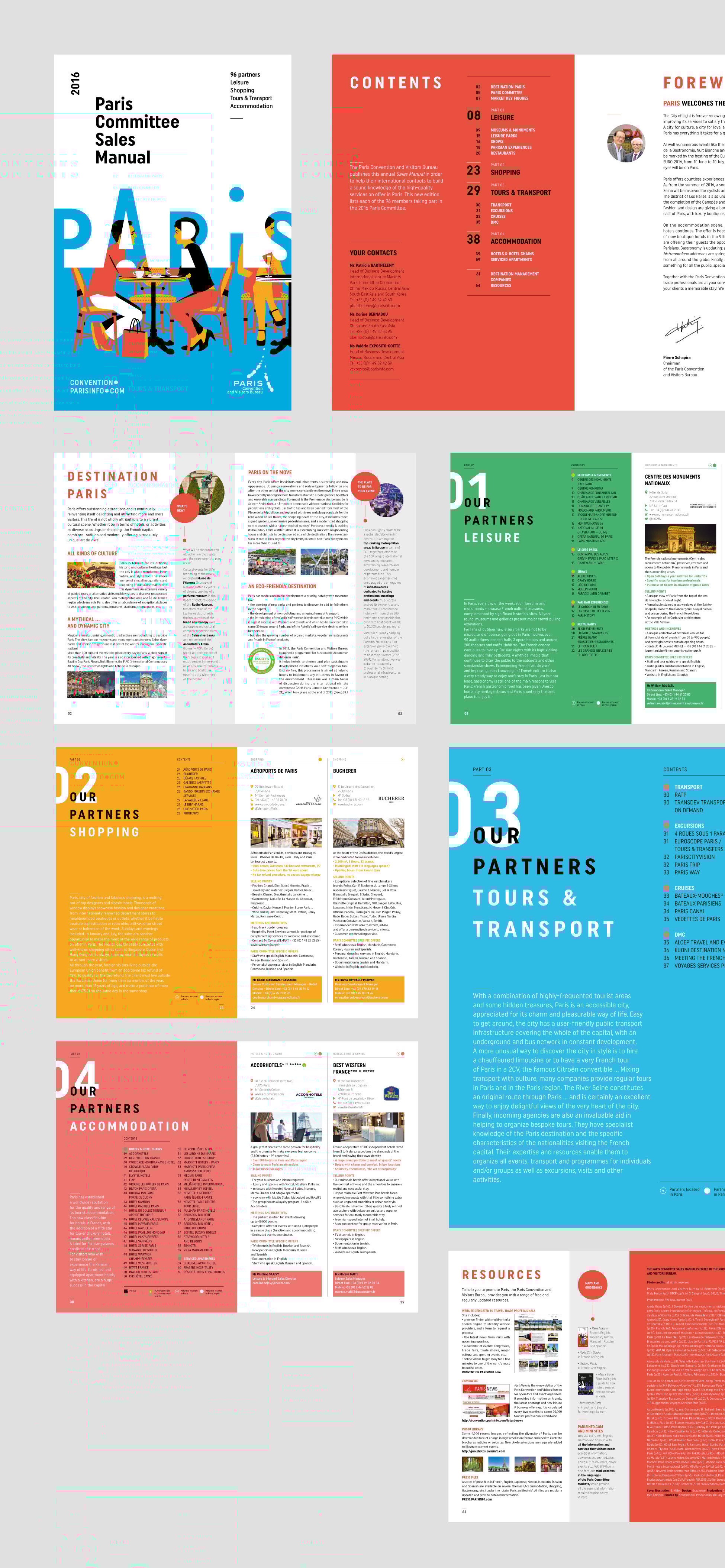
In this map of Paris, created by the Graphéine design studio, colour is used to highlight the various sections. To reinforce the concept, the colour of the titles changes with each section.
To be effective, the colour palette should not be too extensive, otherwise you risk confusing readers, forcing them to memorise too many associations between colour and information.
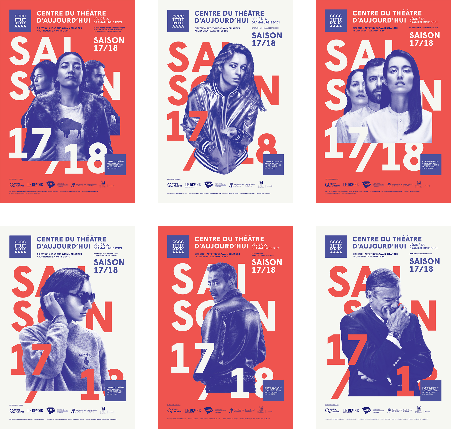
Below is a series of posters for the Centre du Théâtre d’Aujourd’hui in Canada. The centre only used two colours for all of the 2017-18 season’s promotional materials, including the photos.
Useful resources
Three useful resources related to colour:
- Adobe Color, which allows you to create, save and (if you have a Creative Cloud subscription) share colour palettes;
- Color Hunt, a collection of colour palettes to use in your projects;
- Coolors, an online service (an app is also available) that, like Adobe Color, allows you to create, save and share colour palettes. Coolors can be added to Adobe software as a plugin.
[1] Interaction of Colour was first published in 1963. It summarises the lectures on the properties of colour Josef Albers gave at various American universities.
[2] Bressan P., Il colore della luna, Editori Laterza, Bari, 2007
[3] Pastoureau M., Blu. Storia di un colore, Ponte delle Grazie, Milan, 2008
[4] Falcinelli R., Cromorama. Come il colore ha cambiato il nostro sguardo, Einaudi, Turin, 2017
[5] Chevreul M., The Principles of Harmony and Contrast of Colors, 1839
[6] Itten’s key text is The Art of Colour, first published in 1961.
[7] https://www.sofonisba.it/i-sette-contrasti-cromatici/XXXX
[8] Falcinelli R., Cromorama. Come il colore ha cambiato il nostro sguardo, Einaudi, Turin, 2017