Table of Contents
The most common typographical errors and how to avoid them
Typographical errors are every graphic designer’s worst nightmare, because they affect a text’s readability and affect the overall quality of a product destined for printing. In this article, we’ll go through the most common typographical errors graphic designers make and offer some hints on how to avoid them.
1.Insufficient or excessive leading
The leading is the spacing between rows of text, which gives the piece of writing its rhythm when it is read. If the leading is too narrow or too wide it will make the text difficult to read, as the lines will be respectively too close together or too far apart.
It is also important to pay attention to the spacing between paragraphs: it should be greater than the leading to avoid creating walls of text. Finally, the space between a title and the text that follows should be bigger than the line spacing, but smaller than the paragraph spacing, to allow a clear distinction between the various blocks of text.
2.Insufficient word spacing
The spacing between letters and words, or tracking, can be increased or reduced depending on the font type and size and the space available for a particular text block. Excessive spacing creates unsightly gaps between the letters and makes the text disjointed and difficult to read; similarly, having characters too close together hinders your reading and creates an unpleasant crowded effect.
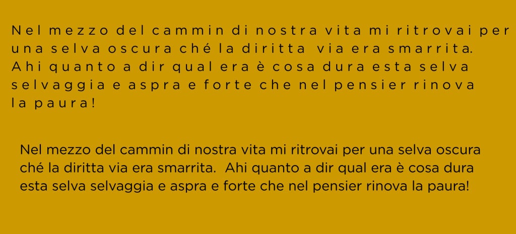
As a general rule, the tracking should only be increased for medium-sized uppercase fonts, to avoid the letters being dispersed in too wide a space. However, if the font used is very small, slightly increasing the tracking will make the text easier to understand. Adjusting the spacing is also useful for removing widows: words that go onto a new line and end up on their own.
3.Justified alignment
Although justifying text gives the impression of order and neatness, it actually alters the spacing between words, compromising readability. Flush left alignment, meanwhile, allows you to keep the tracking even and makes it easier to read. However, in some cases, justified or even centred alignment can – with great caution – be used to emphasise certain portions of text.
4.Insufficient contrast
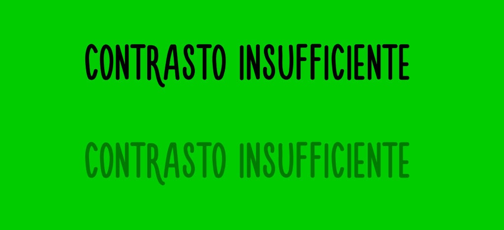
Insufficient contrast between the background and font colour, or between text and a semi-transparent image it overlaps, can strain the eyes and cause people to stop reading. In general, it is best to choose a light shade for the background and a darker one for the font, but you can also sometimes opt for a dark background with a white font.
5.Abusing fonts
Mixing too many fonts can make your graphic design look chaotic and unprofessional and annoy the reader. You’re better off choosing a maximum of two or three well-matched fonts for the different text elements: titles, subtitles and body text.
6.Incorrect formatting
Improper use of capital letters, italics and bold type give writing a cluttered look and slow down the reading process. Here are some tips for perfect formatting:
Uppercase letters should only be used for titles and not to emphasise certain words, to avoid seeming like you are shouting;
In general, italics should be used for titles of films etc. or foreign terms;
Bold, meanwhile, is useful for adding emphasis to individual words or short phrases. Using it for entire paragraphs weighs the text down and defeats the point of using it, which is to highlight selected terms.
7.Overly wide text column
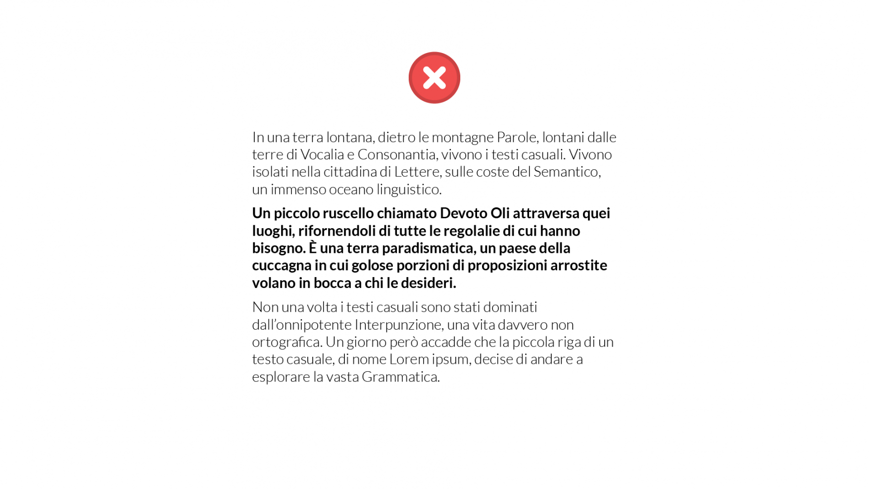
Another aspect to bear in mind when designing a product for printing is the width of the text column. For easy readability, this should not be too wide, containing no more than 75 characters (letters and spaces included), or 50 for pages with multiple columns of text.
8.Illegible characters
We’ll finish our round-up of typographical errors with a mistake that may seem trivial, but which can be found in a vast array of printed materials: making the font too small. Remember that the font size should always be chosen based on various factors:
Font type: sans-serif fonts are definitely easier to read than serif fonts.
Text element: the font size should follow the content’s hierarchical order, with titles and subtitles larger than the body of the text.
Leading: if the leading is smaller, the font size must allow for quick and easy reading. Similarly, if there is a large space between the lines, you can make the font slightly smaller without compromising readability.
Available space: as well as balancing the tracking and leading, adjusting the font size allows you to distribute the text evenly across the page.
While this list is not exhaustive, if you pay attention to the issues above you are less likely to make errors that affect the quality of your graphic design project.

