
Table of Contents
Colour analysis is a discipline that identifies a person’s ideal colour palette based on their skin tone and eye and hair colour, enabling them to perfect their image by carefully choosing the colours of their clothes, make-up and hair.
Colour analysis divides people into four categories corresponding to the seasons, each identified by the natural hues on display at that time of year. Spring comprises warm and bright colours like coral red, peachy orange, deep turquoise and meadow green; summer features delicate and cold hues like pink, lilac, light blue and grey; autumn has warm and deep shades including brown, yellow, red and orange, while winter colours are neutral and cold, such as light blue, dark purple and black. Each season has a ‘pure’ version and three subgroups, with differences in value, undertone, contrast and intensity:
- The colour value refers to the overall darkness or lightness of skin, eyes and hair on a scale of greys;
- The undertone is the skin’s basic colour and can be warm, cold, neutral or olive;
- The contrast is the difference in colour between the eyes, complexion and hair.
- Winter and spring feature high-intensity hues, while summer and autumn have more muted, less bright colours.
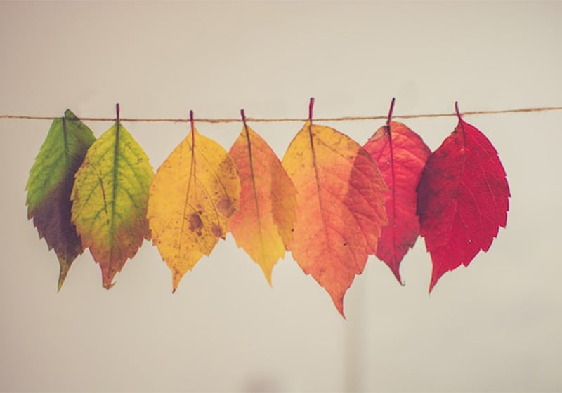
Seasonal palettes can be used to choose your wardrobe or make-up, but they can also be used in other fields, such as graphic design, interior design and home decor. In this article, we’ll take a look at the various shades in the autumn palette and see how to create a palette of autumn colours for your graphic design project.

Autumn according to colour analysis
In the world of colour analysis, people are described as Autumn if their skin, eyes and hair have a golden undertone. They have a fair to dark complexion, brown, amber or olive-green eyes and blonde, ginger or brown hair with warm highlights. Let’s take a look at the four sub-groups in the Autumn category and the colours best suited to each one:
- True Autumn: this subcategory perfectly balances all the characteristics we’ve described (warm undertone, dark value, low intensity and contrast). People in this group tend to have hazel- or honey-coloured eyes, chestnut- or dark chocolate-coloured hair and a bright, amber complexion. Their ideal palette comprises medium-dark and neutral-warm colours: burgundy, olive green, brick red, marsala, brown, forest green and grey.
- Deep Autumn: dark dominates the skin, eyes and hair of people in this category, ranging from medium to dark brown. Their look is enhanced by warm, dark and intense hues such as brown, purple, burgundy and teal green.
- Warm Autumn: as the name implies, this variant describes people with warm-toned eyes (amber, brown or hazel) and red or auburn hair. The recommended shades in this case are gold, mustard yellow, salmon, antique pink, orangey red and burgundy.
- Soft Autumn: People in this category have fair skin, blue, green or amber eyes, and blond, light brown or auburn hair. The best colours for people in this group are taupe, terracotta red, olive green and burnt umber.

How to choose an autumn colour palette
The ideal palette for autumn consists of nature-inspired warm, dark and low-intensity hues, ranging from chocolate brown and burgundy to yellow ochre and forest green. An autumn palette can enhance a graphic design project by imbuing it with deep, enveloping colours that convey a feeling of balance and calm.

Let’s say you want to create some content for autumnal promotions or events, such as invites, flyers, social media or web graphics, decorations or branded promotional gifts. There are various websites and social media pages available to give you inspiration on colour pairings that match the various seasons. Here are a few of the most interesting:
- Design Seeds suggests the colour palettes associated with a given photo;
- Color Lisa examines the colour choices made in famous works of art;
- Color Hunt provides thousands of palettes created by users with the site’s own Palette Creator tool.
- Brandcolors is a vast archive of colour combinations used by top brands.

You can also create your autumn palette with the help of various free online tools.
Here are a few examples:
Free tools to create your autumn palette
The free platform Mycolor.space provides countless different palettes based on a single colour, as well as allowing you to create gradients from one hue to another.
With Adobe Color you can create palettes based on the principles of colour analysis, or extract palettes from your favourite photos. The ‘Trends’ section gives you an overview of the latest trends in various creative sectors (fashion, graphic design, architecture, etc.), while the ‘Explore’ section offers a vast archive of colour themes found in Adobe Stock images and in designs created by the Adobe Color and Behance community.
Colormind uses artificial intelligence to generate a range of different colour palettes. You can also test them on a demo website, giving you a preview of the end result.
If instead of starting from a colour, you would rather take inspiration from online photo galleries, simply go to websites like Pinterest and Unsplash and enter the name of your starting colour or a key word like ‘autumn’.

Once you have downloaded the images that grab your interest, upload them to Adobe Color or Muzli Colors to extrapolate the colour palettes for each one. If, meanwhile, you would prefer to start from a text-based search, the website Picular lists the colours associated with a particular term.

Once you’ve identified your favourite colour combinations, you can test them on the various graphic media you need to develop to see how effective they are and choose the one that best meets the goals of your project.

Our guide to choosing an autumn palette ends here, but keep an eye on our blog: we’ll be discussing winter colour palettes in the next article!