
Table of Contents
Every film by David Lynch, the director famous for the cult TV series Twin Peaks and for his dreamy, unsettling and unusual creations, seems to contain the same message: that sleepy, ordinary American towns hide terrible secrets, with the apparent serenity concealing a hotbed of impulses and desires.
Once you’ve seen Twin Peaks, it’s difficult to forget the ambiguous and unnerving feel of each episode’s opening titles. And this got us thinking: to what extent have the font choices influenced David Lynch’s other works? From the sci-fi flick Dune and the dreamlike Mulholland Drive to Blue Velvet and the horror film Eraserhead, here are some interesting facts on the lettering and fonts chosen each time by the director whose middle name is mystery!
Eraserhead
Eraserhead, David Lynch’s first feature film, released in 1977 after six years in production, is a black-and-white horror masterpiece that has since acquired cult status. It could have been a standard tale of a man’s worries about having a child without being in a stable relationship, but because it was directed by David Lynch the newborn turns out to be a horrible mutant creature that utters disturbing verses (it is rumoured that Lynch used a rabbit or calf foetus to make the horrific creature).
The choice of typography for the opening credits also reflects the strange Gothic perspective the director gives to the whole story. The title is white on a black background, a nod to the tradition of early twentieth-century horror films. Lynch chose the most ordinary of fonts, but modified it by stretching the letters vertically – a small touch that is enough to ensure the title reflects the sense of alienation that characterises the rest of the film.

The typeface in question is the condensed version of Times New Roman: one of the most common fonts in the world, in part because for a long time it was the default Microsoft Office typeface. It was always designed to be as easy to read as possible – it was created by typographer Stanley Morison for the newspaper The Times, which began using it in 1932. The following year, the font was made commercially available to the public, and it soon became practically ubiquitous.
Blue Velvet
The 1986 film Blue Velvet, a homage to Bobby Vinton’s famous song, is one of many variations on some of David Lynch’s favourite themes: an ambiguous and apparently peaceful middle-class provincial life with an undercurrent of lust, violence and desire.
The film embodies the idyllic side of society and the human psyche not only through the orderly houses and gardens, excessive friendliness and the greetings and smiles of neighbours, but also through the typeface used for the film’s titles.

The opening titles appear above a soft blue velvet background in Snell Roundhand, a classic and extremely elegant font with very pronounced flourishes. Although Lynch was probably unaware of it, the history of this typeface is also rather mysterious. Snell Roundhead is based on an English cursive script created in the seventeenth century by master calligrapher Charles Snell, who wanted to take inspiration from puritan ideals but at the same time produce a simple and effective lettering that could be used by the rapidly expanding English middle classes. However, it was only in 1965 that Snell Roundhead became a proper typeface, thanks to Matthew Carter, who developed it based on Snell’s script using the latest advances in photocomposition.
Twin Peaks
Twin Peaks. For many of us, the mere mention of this name sends shivers down the spine.
The opening episode of the cult series created by David Lynch and Mark Frost first aired in the United States in April 1990. The credits feature two unforgettable elements: Angelo Badalamenti’s theme tune and the title lettering. Both have similar characteristics, accentuated by the everyday images in the background: there’s something peaceful and folksy about them, but there’s also something deeply unsettling.
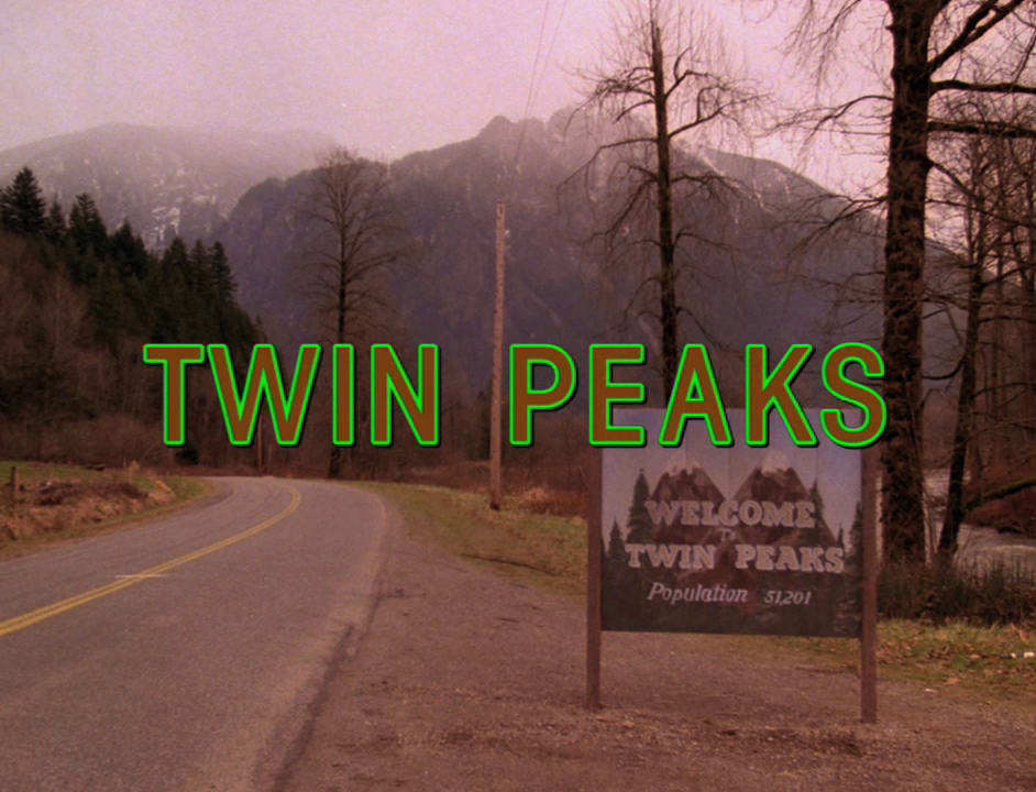
The font used for the credits is ICT Avant Garde Gothic, created in the 1960s for the graphic design magazine Avant Garde, before being developed by the lettering designer Tom Carnase. It is a highly geometric font that is also seen in much more ‘relaxing’ contexts, including the Adidas logo. In the titles of Twin Peaks, however, the brown lettering and acid green outline undercuts all the peacefulness it would otherwise convey.
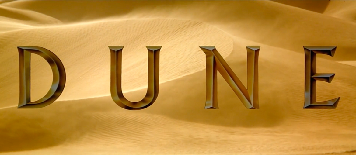
Dune
Dune is the film that is most dissimilar to the rest of David Lynch‘s work. This adaptation of Frank Herbert’s visionary science-fiction novel, released in December 1984, cost the producer Dino De Laurentiis an extraordinary amount of money, and ended up being Lynch’s least-loved film, both by viewers and by critics, who didn’t hold back in their disapprobation.
It certainly is a very strange and at times incomprehensible film, but the typeface chosen for the opening titles is actually less odd than Lynch’s other films.

The credits were the work of Robert Schaefer – who had previously worked on the titles for The Flintstones and other Hanna-Barber cartoons – and use the font Albertus. This austere, slightly serifed font matches the alien atmosphere Lynch creates for the planet June perfectly. It was created by the German type designer Berthold Wolpe in 1932, and is named after the thirteenth-century philosopher and theologian Albertus Magnus. Wolpe was a metal engraver and wanted to create a font that would remind people of letters carved into bronze.
Albertus is today used on London’s street name signs, while in the world of cinema it is famous for being one of John Carpenter’s typographic obsessions – the director used it extensively in his films.
Mulholland Drive
Mulholland Drive, perhaps David Lynch’s best-known feature film, came out in 2001 and took viewers on a disorientating journey through the world of Hollywood and the psyche of a young aspiring actress.
Here again, as others have already noted, the typeface used for the opening titles presents spectators with something familiar and ordinary that will be completely turned on its head during the course of the film. The font used for the titles is the same as the famous Hollywood Sign on the hills of Los Angeles, which is appropriate given that the film goes on to reveal the most secret mysteries and impulses underpinning the glossy world of Hollywood itself.

But as those who know their history will be aware, the giant text overlooking cinema’s most famous district has an unusual story of its own. The enormous letters – 15 m high and 9 m wide – were erected in 1923 to advertise a series of building plots in the rolling hills outside the city: Hollywoodland (the name was shortened at a later date), a district where you could live peacefully just a stone’s throw from the city. A few years later, the area became famous all over the world for its film industry and the opportunity to become a star, and it was decided not to dismantle the text, which had come to symbolise the area.
We can therefore say that the unsettling content in many of David Lynch‘s films is often matched by something unnerving in the typography. The fonts are typically ordinary and extremely well-known like Times New Roman and Avant Garde Gothic, or familiar pieces of lettering, like the Hollywood Sign. At the same time, however, they also contain something else – a clashing colour or a barely perceptible change – that suggests the apparent serenity the title should instil in the viewer is actually on borrowed time.