
Table of Contents
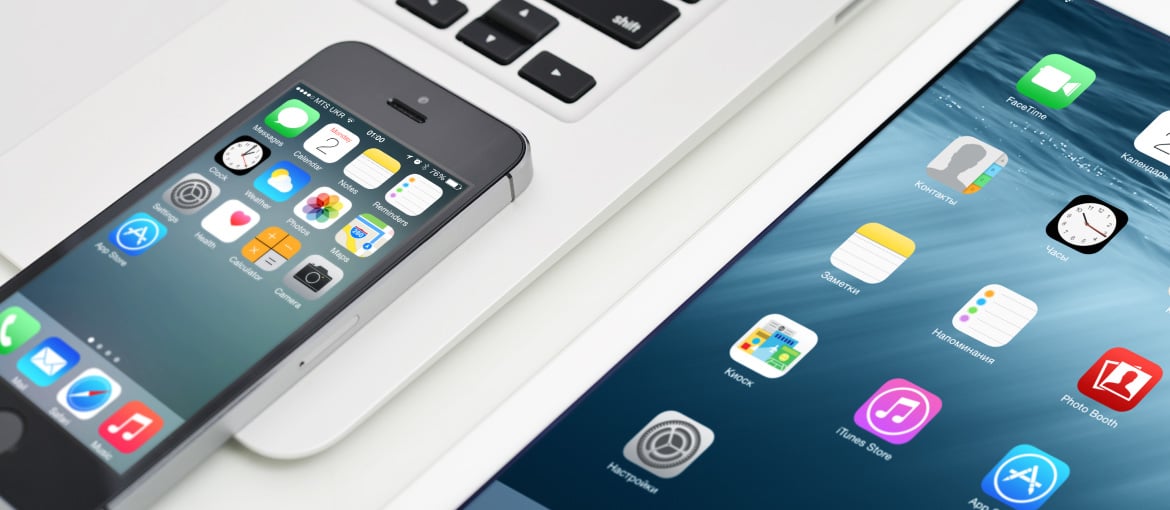
Like most prestigious chefs, who have secrets that only they know to add a special touch to their dishes, app developers must draw on a number of resources that ensure that their creations are downloaded many million times, and that a large proportion of these downloads translates into active users. Design plays an essential role in this: as useful as an application may be, if it is not easy to use, if users are unable to understand how it works and navigate around it intuitively, it will end up being uninstalled.
The figures speak for themselves. Every year the percentage of users who ditch an application after a single use increases.
In 2016 it was 23%, and in 2017 it has risen to 24 %. One of the main causes of this high failure rate is the designers being unable to give clear expression to the app’s functions.
However, unlike what happens with the culinary masters, who keep their tricks hidden from the diners, app developers cannot prevent their secrets from being in plain sight of everyone. It comes as no surprise, then, that there are so many apps that follow the same model as applications like WhatsApp, Spotify and Instagram in order to reach the top of the download charts both in the Android universe and on Apple devices.
Simplicity rules
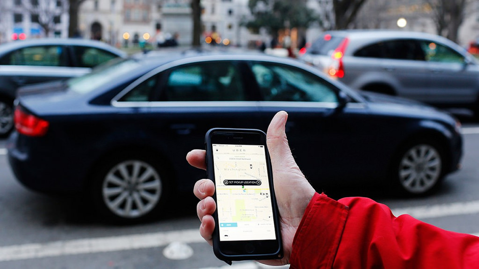
One example of an app that is gaining more and more followers globally is Uber. The first thing we find is a bar indicating the address to which we want to travel. Simplicity rules. It is not even necessary for a message to appear to tell us how to proceed. The design is so clear that intuition guides us.
When you have indicated the destination and chosen the type of car that will come to collect you, the Uber app enables you to specify your precise location by moving an intuitive icon on the map. Then you will see the driver travelling towards you in real time, street by street, even if the car takes a wrong turn. This is how the creators of the application decided to put into practice another infallible method for winning over users: supply a lot of information in a few words. While others opt for messages filled with text in the form of banners or pop-ups, Uber has gone for a more visual and attractive solution.
An enticing design
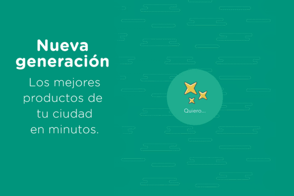
Another recent application which is making a dent in various markets is Glovo, a tool for ordering home-delivered food (or anything else). Once again, no tutorial is needed on how to proceed after opening the app. A wheel with bright and colourful icons and the most striking of lettering transmits the various options to users at a quick glance, inviting them to jump from one option to another to discover what the various restaurants and establishments are offering.
Standing out from the crowd
Competing with a giant like WhatsApp, which now has 1.2 billion active monthly users, is not easy. However, there are applications that have found a way to stand up to it. And their formula is simply to adopt elements that are not included in the instant messaging app for which Facebook paid 14 billion euros.
Applications like Line, more focused on eastern markets, and Telegram, of global success, have tried to win the battle by focusing on the visual element. In the case of the Japanese firm, the aim is to enable virtually everything to be expressed through stickers, with a large repertoire. Then came the app from Russia that, in addition to centring on privacy, decided that opting for much more fun and varied emojis could be the key to gaining ground against WhatsApp.
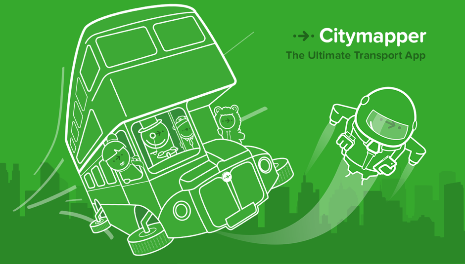
Differentiation in design has an impact when it comes to attracting users and making them stay. This is certainly the case with Citymapper. With so many similar applications available both on Google Play and the App Store, standing out was always going to be difficult, but they achieved it with powerful branding, creating characters for each of the cities where they are present and using a design that anyone who has used the app at any time recognises straight away.
Although the secret formula of the most famous apps in the world is right there, in plain sight, it is not enough just to replicate their good ideas (and avoid their faults) in order to achieve millions of downloads and active users. Standing out is key. It is possible to imitate their good design qualities and apply them to a different service (such as Uber, for instance) and it is also possible to compete for the same clientele by changing the visuals (as Line and Telegram have done). At any rate, on a battleground as fiercely competitive as the app stores, developers have no option but to take risks. Calculated ones, of course.