
Table of Contents
Asking the public to choose your visual identity – whether it is a logo, symbol or image or another graphic design element – is a strategy pursued by small and large organisations alike. Local cafes, associations, universities, political parties, cities and even countries frequently use public surveys or online voting to involve the public in creating their branding.
Does it work? It depends! It can be dangerous, but equally it can fit perfectly into a more inclusive communications strategy. Today we’d like to give you a few examples of graphic design decisions made by the public. We’ll see which ones went well and which ones went slightly… erm… pear-shaped!
New York State licence plate
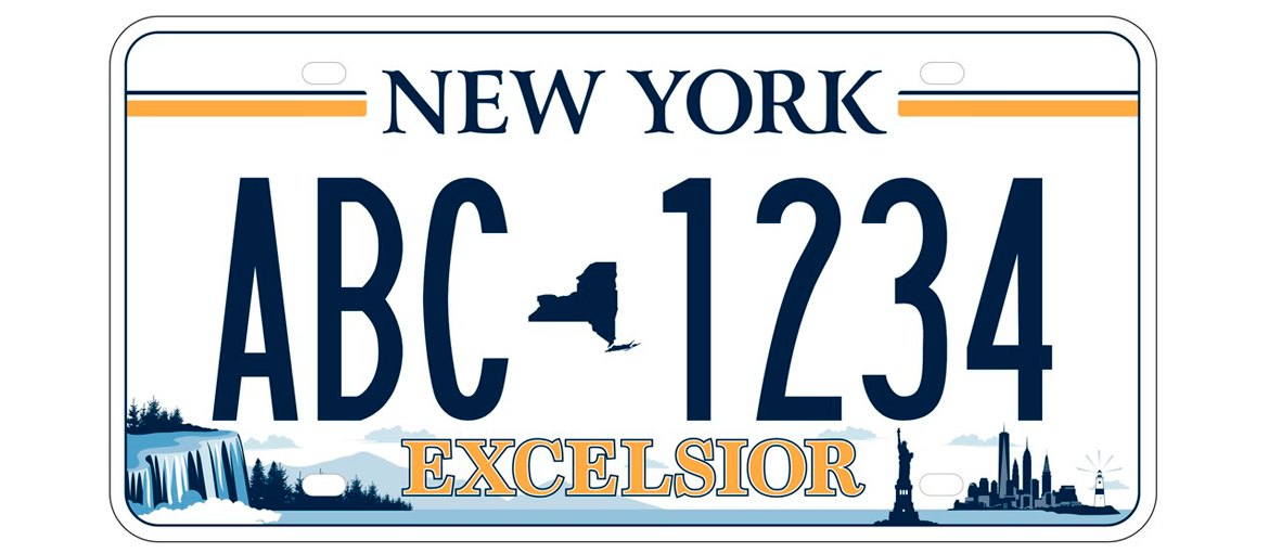
In summer 2019, the state of New York decided to involve its citizens in an important decision: the design of the licence plate that would adorn vehicles from 2020 onwards. Licence plates in the USA have a unique history, and are viewed fondly by inhabitants and collectors alike. They differ from state to state, are updated periodically and since the 1980s have tended to depict locations and features unique to that particular state.
All this adds up to a difficult decision, and so the state’s government decided, for the first time, to entrust the choice to its citizens, through this tweet:
Vote for your favorite New York State license plate design!
The winning design will become New York’s official license plate and be made available in April 2020.
— State of New York (@NYGov) August 19, 2019
The various suggestions featured a range of elements: the motto of New York State Excelsior (which means ‘ever upward’), the Statue of Liberty, the skyline of the city of New York, Niagara Falls and even a bridge built by the father of the current governor of New York State.
So how did it go? Around 325,000 people took part in the online survey, and 49.7% decided that the next New York license plate, released in spring 2020, would be the design featuring multiple elements, not only from the city of New York, but the entire region.
Although the participation rate was pretty impressive, an enormous number of citizens took the opportunity to highlight myriad problems and issues, including complaints about having to pay for a new licence plate. Oh, in case you’re interested: the plate with the bridge came last.
The logo for Peru’s bicentenary
A nation’s 200th birthday is a major event, one which merits a celebration involving all of its citizens. This may in part explain why the Peruvian government decided to seek the public’s opinion when choosing the official logo for the country’s bicentenary celebrations, to be held in 2021.
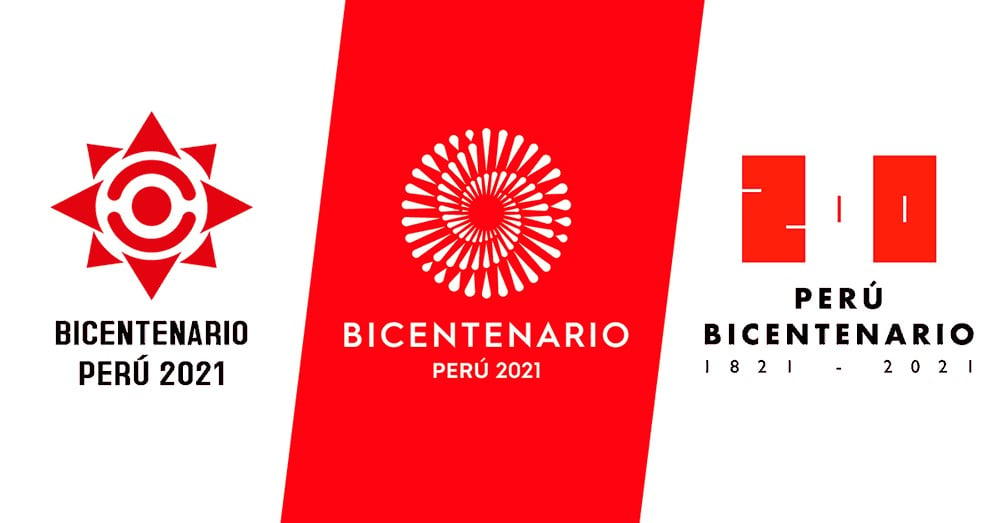
Citizens were asked to give their views online by choosing one of three proposals from young Peruvian professional graphic designers, who explained the meaning of their creations in a video.
In the end, the winner was the logo created by designer Angela Rossmery Alberca Caro entitled ‘Il Perù se mueve’, featuring three spirals – representing Peru’s coastal, mountain and jungle populations – meeting in the centre. In this case, the competition seems to have gone well, although the number of people who voted was not made public. It didn’t lead to arguments and the contest saw increased public discussion among Peruvians on what their nation means to them, especially on social media.
Food labelling in the Netherlands
The Dutch consumer association used a survey to find out the public’s thoughts about the nutritional information labelling for food on sale in supermarkets, and to discover which type of design they liked most. Here, of course, there was more at stake than just design: the aim was to understand which labels provided nutritional information in the simplest and most accurate way possible.
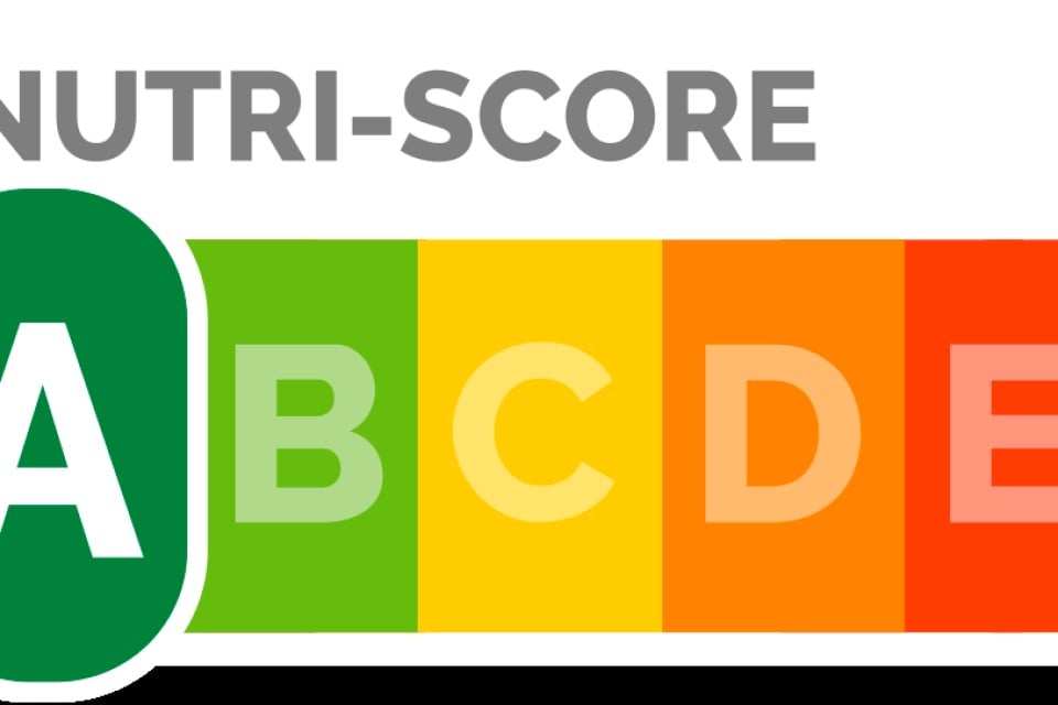
The result was that 71% of consumers found the nutritional information label useful, and that of the various design options available – the traffic lights system (used in the UK), the Nutriscore (employed in France) and the so-called keyhole label used in Nordic countries – the British design came out on top.

The labelling system used in the UK succinctly shows the calories, fat, sugar and salt found in 100 g of the product, and uses the colours green, yellow and red to highlight how healthy the concentration of each one is.
The logo of Italian political party Italia Viva
Recently the use of surveys to choose a design has even reached the world of Italian politics. When Italia Viva broke away from the main Italian centre-left party, it decided to use an online survey to choose its logo, with the public given three different options.
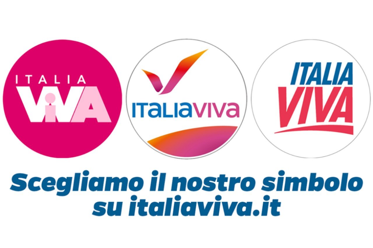
This was clearly a carefully considered communications strategy, designed to give the new party an inclusive image. However, it led to heckles being raised in two areas – design and politics – where people do not tend to hold back when it comes to criticism. Commentators therefore made fun of how similar the choice of colours in the winning proposal was to the Instagram logo and how it looked like the logo of a feminine hygiene product.
The logo of the state of Colorado
Let’s return to the USA to round off our collection of stories. When the state of Colorado was developing its branding, it decided to involve citizens on social networks to find out what they thought of the various options for the state logo. Not a lot, it turned out.
Many citizens questioned the need to create a logo at all, instead declaring their unconditional love for the flag of the state of Colorado – even though state branding often breaks away from the traditional insignia.ù
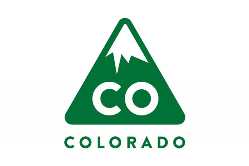
In the end, the government chose a separate logo anyway – the one created by Evan Hecox in the image above.
What can we learn from these stories?
Getting the public to choose a design works if the operation forms part of a wider participatory communication strategy. However, the decision will inevitably take into account more than just graphic design considerations.
Public input on design is certainly useful, but it should be analysed carefully, requested in plenty of time and directed to the appropriate target audience. These and other ideas feature in an interesting article on the subject by designer Jeff Jimerson.