
In our increasingly digital, impalpable and virtual world, certain tools that seem like ancient relics of another era can still be powerful and effective.
Posters are one such tool.
First created centuries ago, for a while they were used by painters and artists, before their golden age, when they became the undisputed champions of advertising. And in recent years they have once again started to warm the hearts of graphic designers and their clients.
From the smallest sizes through to enormous 6 x 3 m posters and giant placards, posters continue to reign supreme in our cities despite a decline in their use as a purely promotional tool, and are particularly suited to certain sectors.
Posters are extremely powerful information and promotional tools for the twenty-first century: on the walls of our towns and cities, they talk to anyone who happens to be walking by and feels compelled to stop. As a result, they have increasingly been used as a way of sharing information, especially for cultural and artistic events and festivals, and by governments and public organisations, while they have become less popular with businesses.
They are still useful as a tool to get the word out about seasonal and closing down sales at a local level but, apart from occasional enormous and specific formats, posters are nowadays only used sporadically by large companies for advertising purposes.
WHAT MAKES A GOOD POSTER?
Posters have to capture the public’s attention, often in spaces overcrowded with different advertising materials.
The key piece of advice for effective poster design is to attract the curiosity of passers-by.
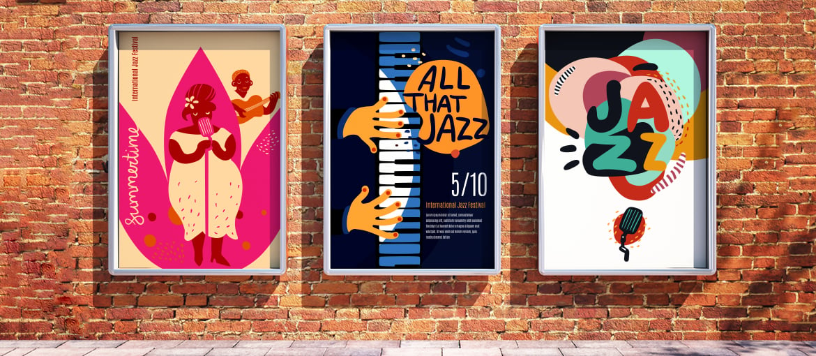
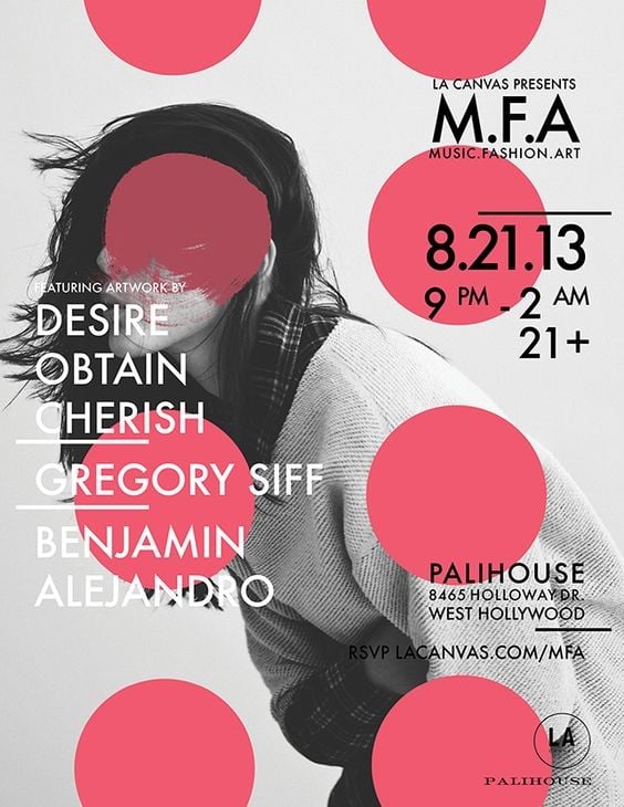
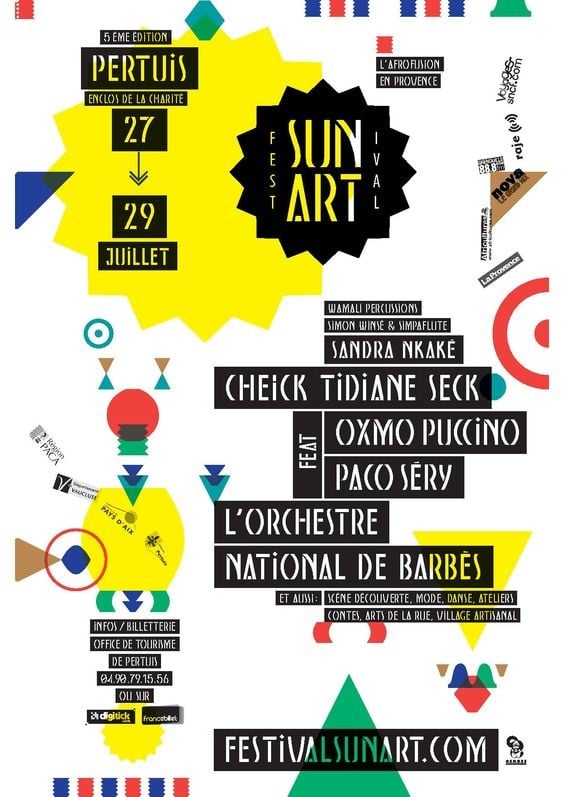
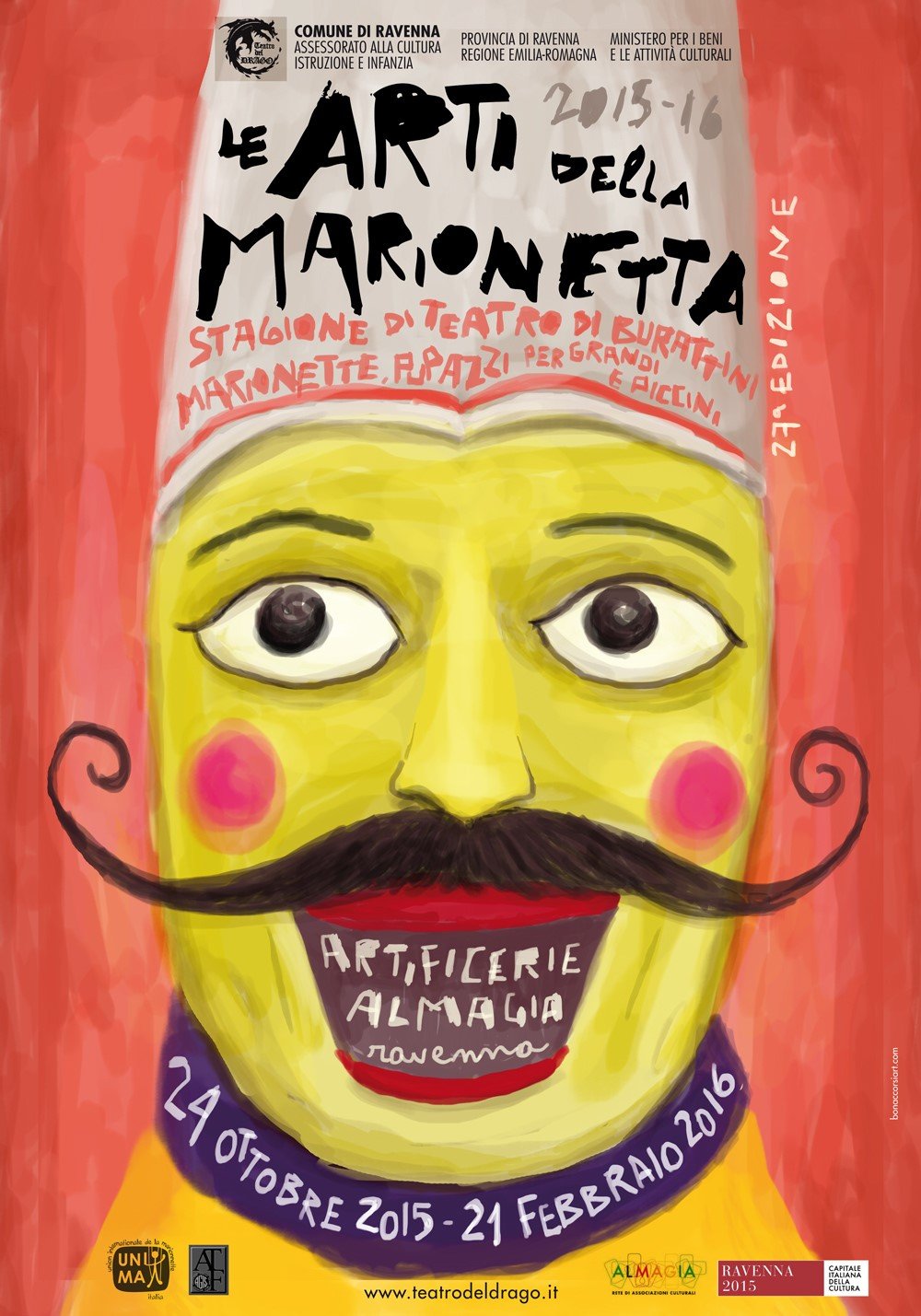
A good piece of artwork should be well-balanced and be made up of clearly visible elements: contrasting colours, geometric shapes and nice, big titles are all ideal. A 70 x 100 cm poster provides plenty of space for movement and visual hierarchy.
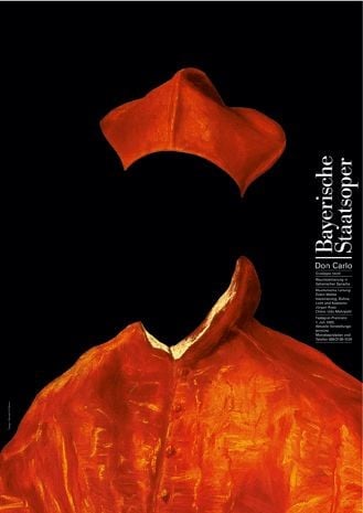
USE A STRIKING IMAGE
The easiest way to design a poster is to look for a nice image, stick a heading above it along with the required information and send it off for printing.
However, because lots of the posters you see out there are based on this simple equation, if you manage to move away from this design you will produce something more visible and more memorable.
Poster design should be the first step when it comes to, for example, creating the visual communication for an event: the poster should be the guide and point of reference on which to base all the other communication materials.
Use it as the starting point for creating leaflets and flyers, folded flyers, invitation cards and any messages you put out using social media.
ORGANISE THE INFORMATION
Like every graphic design project, the information that must be communicated is crucial: the title of the event and the dates and places where it will take place should be clearly visible. Don’t forget to include the website and contact information, and make sure the font is clear to read from half a metre away. Also, bear in mind the target audience of the poster: if they are above a certain age, they are more likely to be shortsighted and find reading texts below 24-30 pt a challenge at that distance.
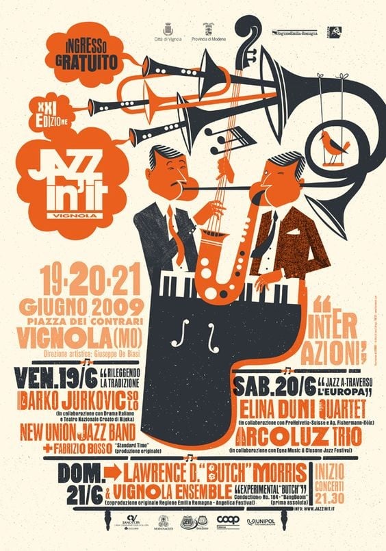
INCORPORATE LOGOS
It’s every graphic designer’s worst nightmare: having to add inserts, footers and boxes to give some kind of order to a jumble of logos and branding, often poorly designed and delivered in unlikely formats. You get more and more frustrated, and it feels like a great design could be ruined in a single stroke.
To get around this, it’s always a good idea to:
- check whether logos are actually necessary – often the names of bodies and organisations will be sufficient
- use transparency effects (or in Adobe software use the Multiply tool whenever possible to superimpose the logo over the background). The final colour of the logo is often not important; simply being included is enough, particularly for poorly designed logos
- consider inserting a blank space to add any logos and text that might need to be added
HOW TO CREATE A SMALL INDOOR POSTER
How do you create a poster for indoor use, or adapt the design of a poster for smaller sizes (35 x 50 cm) or, even trickier, different proportions (A3 and A4 format, 32 x 48 cm, etc.)?
It’s important to consider this option at the design stage, and split up the artwork so that it can be used in various different versions.
Good design above all means ensuring that the information is easy to read.
The fonts should be legible and the name of the event must be clear, since the poster will be placed in the most unlikely of places (at the bottom of the window, on a shop shelf, in amongst other posters, etc.)
Here’s a brief tutorial on the various possible stages and which software you should use for them.
1. Main image
- Create an image using Adobe Photoshop, Adobe Illustrator or Inkscape.
- If possible, the image and background should be on two different layers.
2. Information and text
- Open the image using desktop publishing software like Adobe InDesign or vector graphics software like Illustrator or Inkscape and position it on the background. Use the outline and various areas of the image to display your text and information: be creative!
- The text does not necessarily have to be above the picture; it can interact with the image and its shape.
- However, it is crucial that the fonts are legible: check the contrast, colour and brightness of the areas where the text will go.
- White writing is always best on dark backgrounds!
3. Logos and other elements
Insert any other graphics at this stage as well, including logos, and feel free to play with transparency and multiplication effects. It’s always a good idea to keep these elements on separate layers, because last-minute corrections are highly likely.
4. Finalise the file and prepare it for printing
- Both InDesign and Illustrator handle the creation of PDFs with ease. With InDesign, it is important to check any errors flagged up by the software, such as images not in CMYK or in low resolution, problematic fonts, transparencies and so on.
- Fonts can be converted to outlines at this stage.
- One recommendation: before doing this, it’s always worth saving a copy of the definitive file with fonts that can be changed, before saving another with the fonts converted into outlines.
- You’re now ready to create the file and send it off for printing, using the predefined PDF settings (like those requested by Pixartprinting).
All you have to do then is wait for the posters to arrive and for the bill sticker to do his job and display your work, so it can be admired by passers-by.
It’s nice to be able to brighten up the walls of our cities with attractive items, and posters allow graphic designers and their clients to do just that (even if it’s only for as long as the poster is up!)
Have fun!