

Table of Contents
People don’t always realise it, but every nook and cranny of our world is full of graphic design: it’s everywhere, right in front of our eyes. As a result, graphic designers have the weighty responsibility of having to produce good designs. And they can achieve this by following a few simple, common-sense rules.
They need to avoid adding to the visual clutter, noise and ugliness that already overwhelms our limited attention span and confuses us when we’re browsing the web, walking down the street, looking for information or reading a newspaper (as we said, graphic design is absolutely everywhere!).
Based on these observations, we have put together ten golden rules of good taste for graphic designers, ten principles that can help you produce slightly better graphics. In the process, we also poke fun at a few cliches and faux pas made by a certain type of mainstream graphic design.
Enjoy!
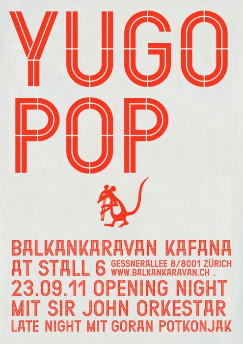
Rule 1 – Don’t use more than three fonts
Don’t use more than three fonts in any one project. Two is perfectly fine. Four makes a mess, five causes chaos, and six or more is just hoarding! The aim of graphic design is to organise information in a clear and understandable way. Using too many fonts prevents people understanding the hierarchies and the type of content being displayed.
Rule 2 – There are more colours in the world than the ones predefined by your software and the Pantone presets
Indeed, you can create your own colours, based on your needs. Books called colour books are available to show you the colours as they appear when printed and how they behave in action, in other words how they look as backgrounds or font colours, which colours they go best with, and so on.
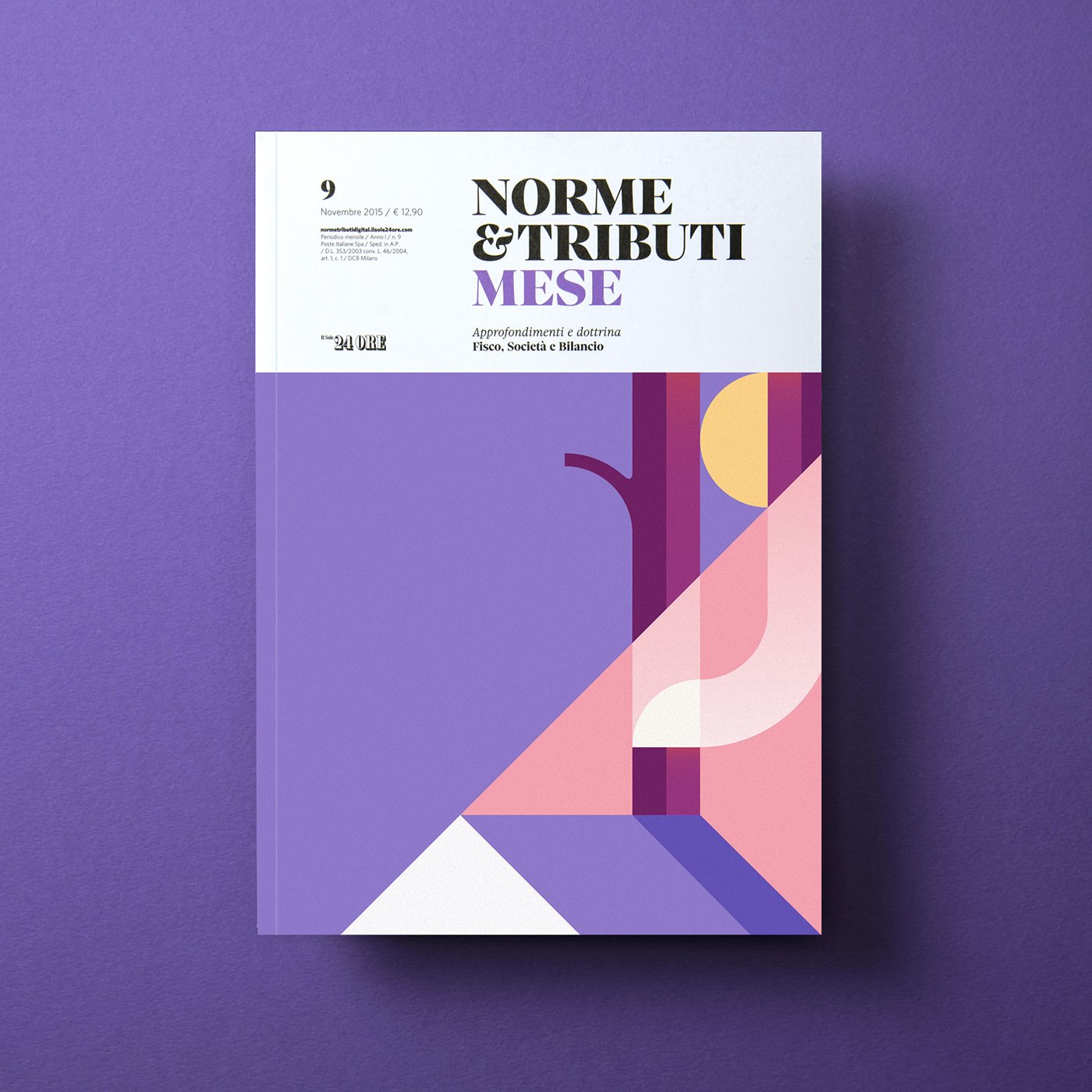
Rule 3 – Empty spaces are important
Just like we demand rest and enjoy our peaceful weekends and free time, so the eyes and brains of those using your designs need a break too. Don’t fill every last corner, but instead use the empty space to highlight what is most important. And get rid of anything unnecessary.
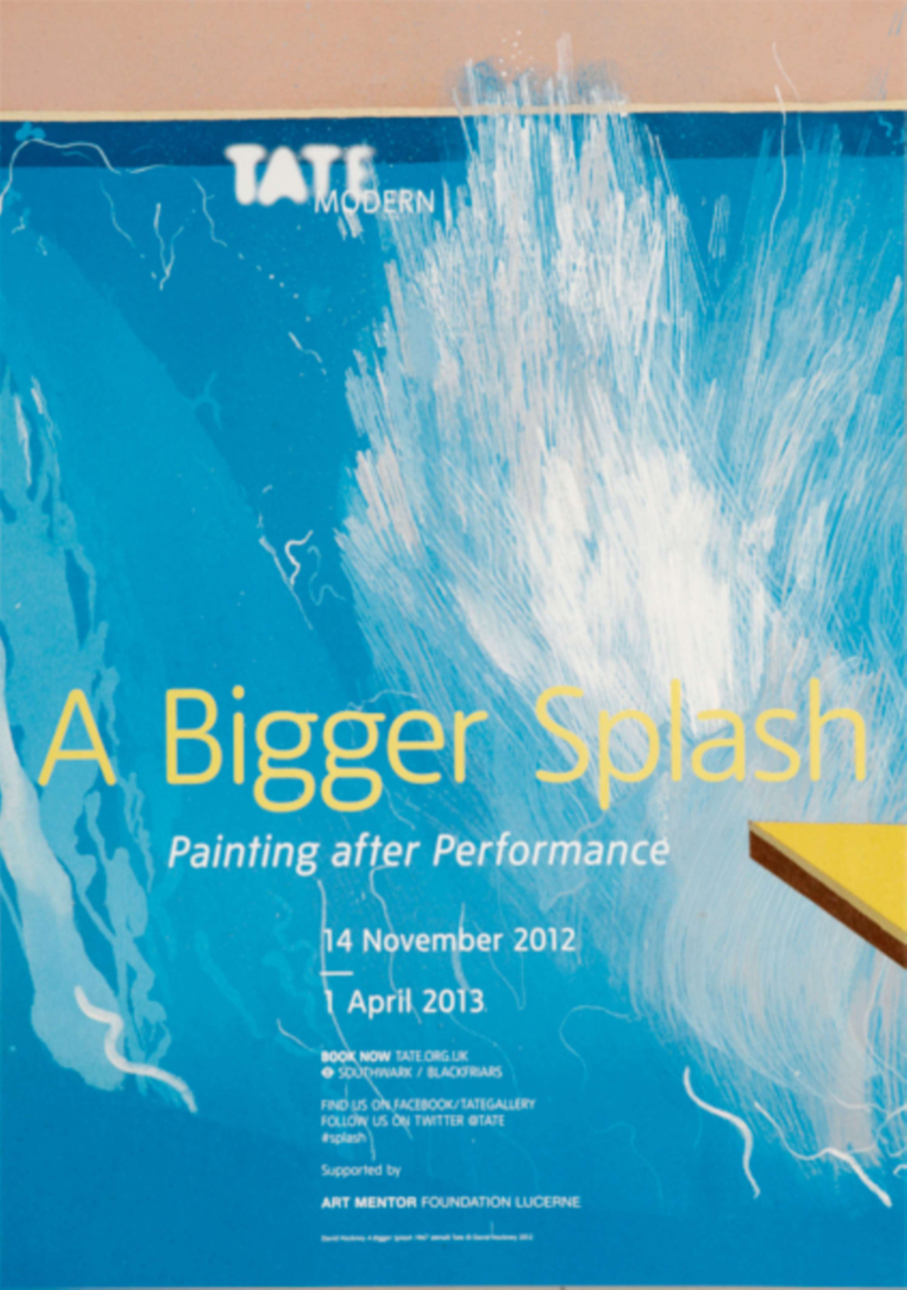
Rule 4 – Use full-bleed images
‘Full bleed’ in printing jargon means stretching images beyond the page margin before they are cut. Basically, don’t confine them to a frame; have the courage to spread them over the full page. This involves a certain amount of effort to ensure the information is legible, but problems stimulate your intelligence, and finding solutions in this situation will make you a better graphic designer.
Rule 5 – Choose suitable fonts
Don’t just use your favourite font, but instead select the most suitable one for your project. Each font has its own history and features that make it suitable for some purposes and not for others. Studying these is the best way to understand fonts and give your projects a powerful feeling of consistency.
For example, Times was designed for the small text of a newspaper, Futura was designed in the 1920s, and so isn’t really that modern any more, Arial is an ugly copy of Helvetica, Frutiger was designed for airport signs, and Comic Sans… well that deserves a rule of its own.
Rule 6 – Comic Sans was designed for comics. If you’re not making a comic, don’t use it
It’s time to consign Comic Sans to the dustbin! Try to look for new, more attractive fonts; there’s a huge number to choose from, many of which are free.

Rule 7 – Shadows and embossed effects are to graphics what socks and sandals are to haute couture
Every so often someone tries them to cause a stir, but the rest of the time they are the epitome of ugliness, and always have been.
Shadows can occasionally be useful, but if you look at the work of leading graphic designers in recent years, they’re almost never used. Could there be a reason for that, I wonder?

Rule 8 – Take inspiration from those who are better than you
The world has always been full of excellent graphic designers. Many of their works can be found in books and on the web, and those who live in large cities or provincial towns with a strong design tradition often have them right under their noses. Often, all you need to do to find excellent examples of graphic design is travel around European capitals and visit their tourist information centres. Take inspiration from them, learn to analyse and understand the choices made by those who have done a good job and create an archive of samples to draw on each time you are called to create a new piece of work: this will help you to create good graphics, and slowly you will manage to find your own style amongst the paths already travelled.
Oh, and one piece of advice: being inspired by something is not the same as copying. If you copy, you won’t learn!
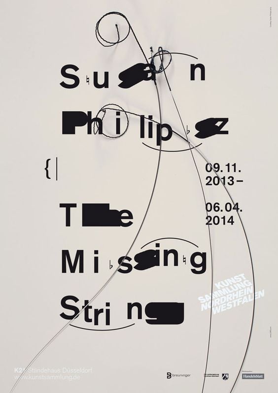
Rule 9 – Learn how to use grids before breaking the rules
Graphic design is all about organisation, and therefore the grids that keep text, images and shapes in order and facilitate reading and understanding the design are important. It’s important to learn about them and understand them, and then, every so often, break the rules, experiment, and think outside the box.
You can only think outside the box if you are in the box in the first place. If you’re not, you risk creating something incomprehensible. Like talking without any knowledge of grammar, without knowing how to put a sentence together.
Rule 10 – If you can’t make something beautiful, at least make it understandable!
Being pragmatic is a very important skill. You can’t always give a personal touch to your project, you won’t always receive glowing praise for your projects, and you won’t always be proud of what you produce. However, you can still offer a good service and ensure that whatever has to be read and understood can be read and understood easily. This is perhaps the most important rule, because as a graphic designer you should always remember that you are acting on behalf of the people who use your products, and ensure they have the best possible experience with the product you design. Even if it means just using a white background and two different fonts. Yes, even that. Just like many great graphic designers have done before.
Happy designing.