
After consulting experts and readers, “Creative Review”, a prestigious British design magazine, compiled a list of the 20 best logos of all time. The top spot went to the symbol for pure virgin wool, created way back in 1964 by Franco Grignani. A simple (but by no means ordinary), understated and immediate logo. In other words, the perfect logo.
What is the DNA of a successful logo? When we closely examine iconic logos, we see that they all have at least three essential qualities. Here, with the help of some famous examples, we identify the qualities that a logo needs to climb the rankings.
When can a logo be considered a success?
First of all, we need to clarify what we mean by “successful logo”. A logo is not judged on aesthetic criteria alone. There are many who can design a nice logo, but few, however, who can design a logo capable of becoming an icon.
A successful logo is one in which brand identity – what the brand wants to represent – and brand image – the image that the public has of the brand – coincide. It’s impossible to create an effective logo without an intimate understanding of a brand and its history, strengths, distinctive features and values. And it’s equally impossible to do so without understanding its target audience. Because as well as telling a story, a brand must interact with people.
Simplicity is another vital quality. A logo should never have superfluous decoration; each element must have a clear role and meaning. From simplicity comes another fundamental value: immediacy, in other words, people need to “get” the logo straight away, and it needs to recognisable and stick in people’s minds.
But to understand best what “effective logo” really means, we need to learn from the “great logos”.
LEARNING FROM THE GREATS
Let’s start with the logo for Dropbox who, from 2007 to 2017, worked hard on the idea of simplification.
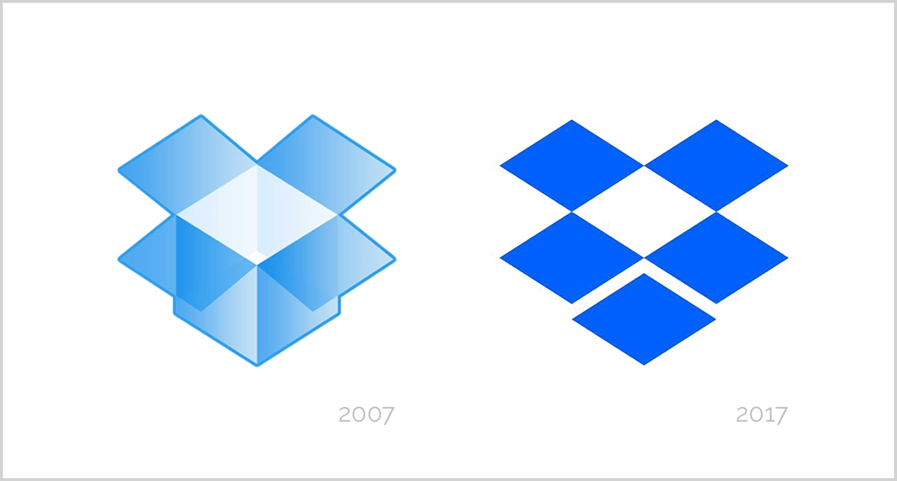
Over ten years, the logo has evolved from a three-dimensional box to five isometric squares, and the result is simpler, more minimalist and abstract.
Just as effective is the FedEx logo, designed by Lindon Leader in 1994. It’s very simple because the logo is just the company name.
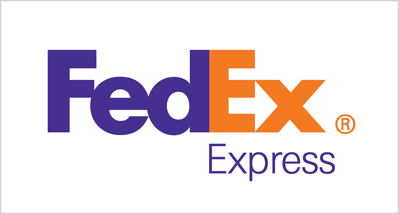
But, as always, this simplicity is the result of a design process that is anything but simple. If you look at the logo carefully, you will see a hidden symbol between the letters “E” and “X”: an arrow pointing to the right. This image perfectly encapsulates the brand’s identity, conveying a sense of speed and dynamism. What else could you want from a delivery company?
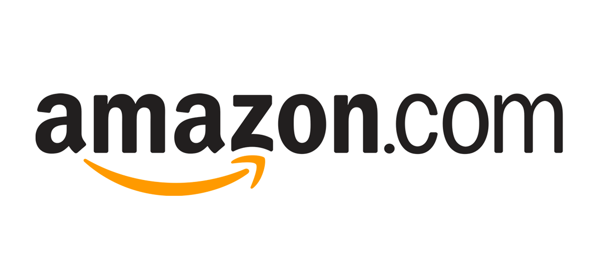
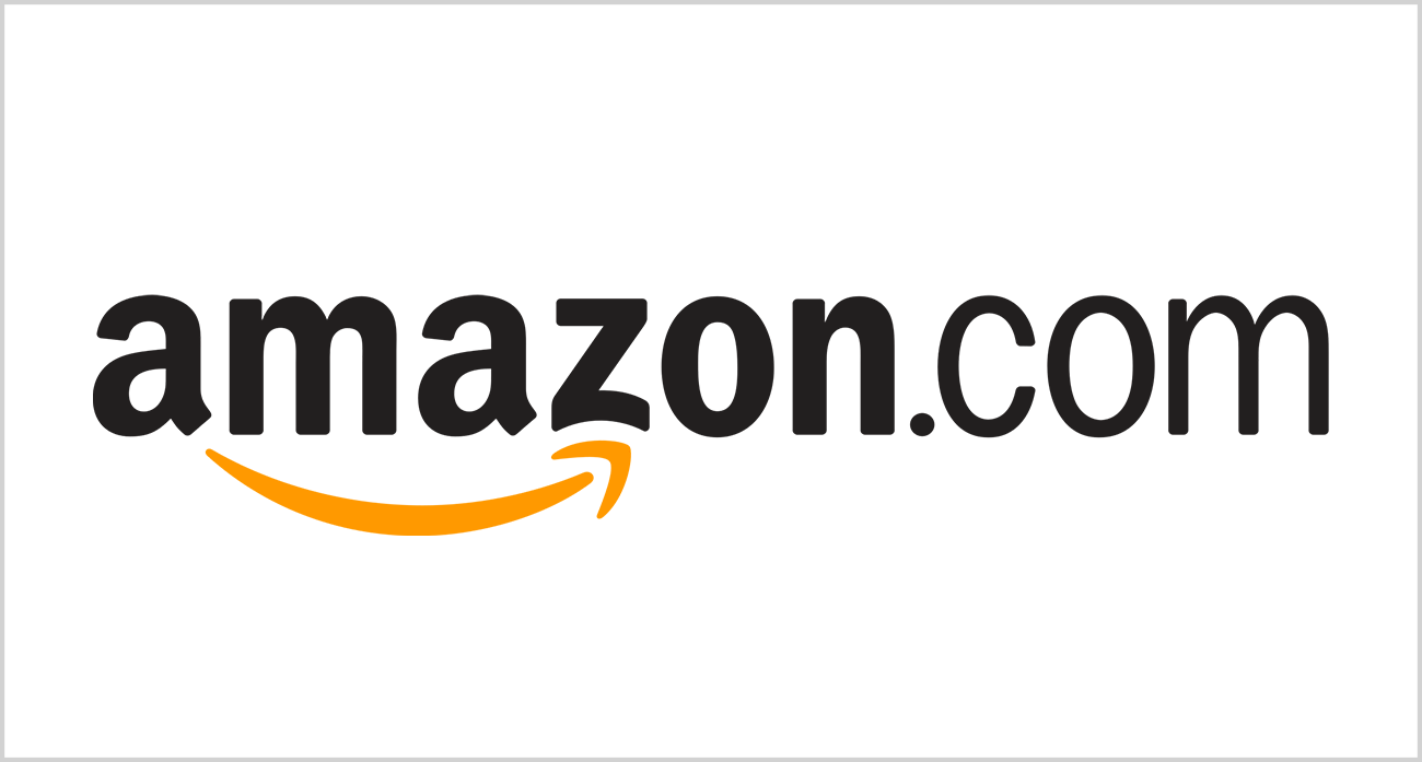
It’s the same story with the Amazon logo, which works just like the FedEx logo. At the bottom is an arrow which, once again, evokes the speed and dynamism of deliveries. But that’s not all: the arrow starts at the letter “A” and ends at “Z”. It’s as if to say: at Amazon you can find everything you want, from “A” to “Z”.
Perhaps less simple, but equally effective, is the logo for the Pittsburgh Zoo & PPG Aquarium.
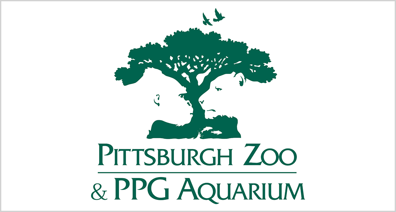
It’s a very detailed logo, but for a reason: the tree creates, in negative whitespace, the outlines of a gorilla, a lioness and fish leaping from the water. It thus represents the diversity of wildlife found at the zoo and aquarium.
Simplicity, the ability to tell a story and to speak to your target audience: Airbnb’s logo has all three.
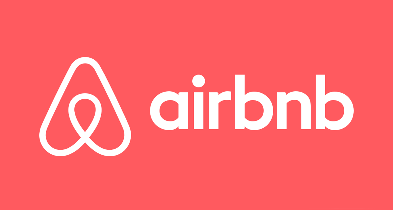
Inside the logo, there are no less than four images representing the company: the outline of a person with open arms, the geolocation symbol, a heart and the letter “A” of Airbnb. Airbnb is speaking directly to its target audience: those who love to travel and who see hospitality as an opportunity for meeting new people.
We’re all out of advice and examples. Are you ready to create a winning logo?