Table of Contents
Enticing, Delicious
Beyond offering a selection of food and beverage items, a good menu design is an extension of the restaurant’s identity, it’s well organized and easy to read, and hopefully it’s appetizing. Here, we offer up several menu designs with decidedly different ethnic and cultural offerings.
Köksbordet by Hörte Brygga, Hörte Harbour, Sweden.
Design: Björn Berglund
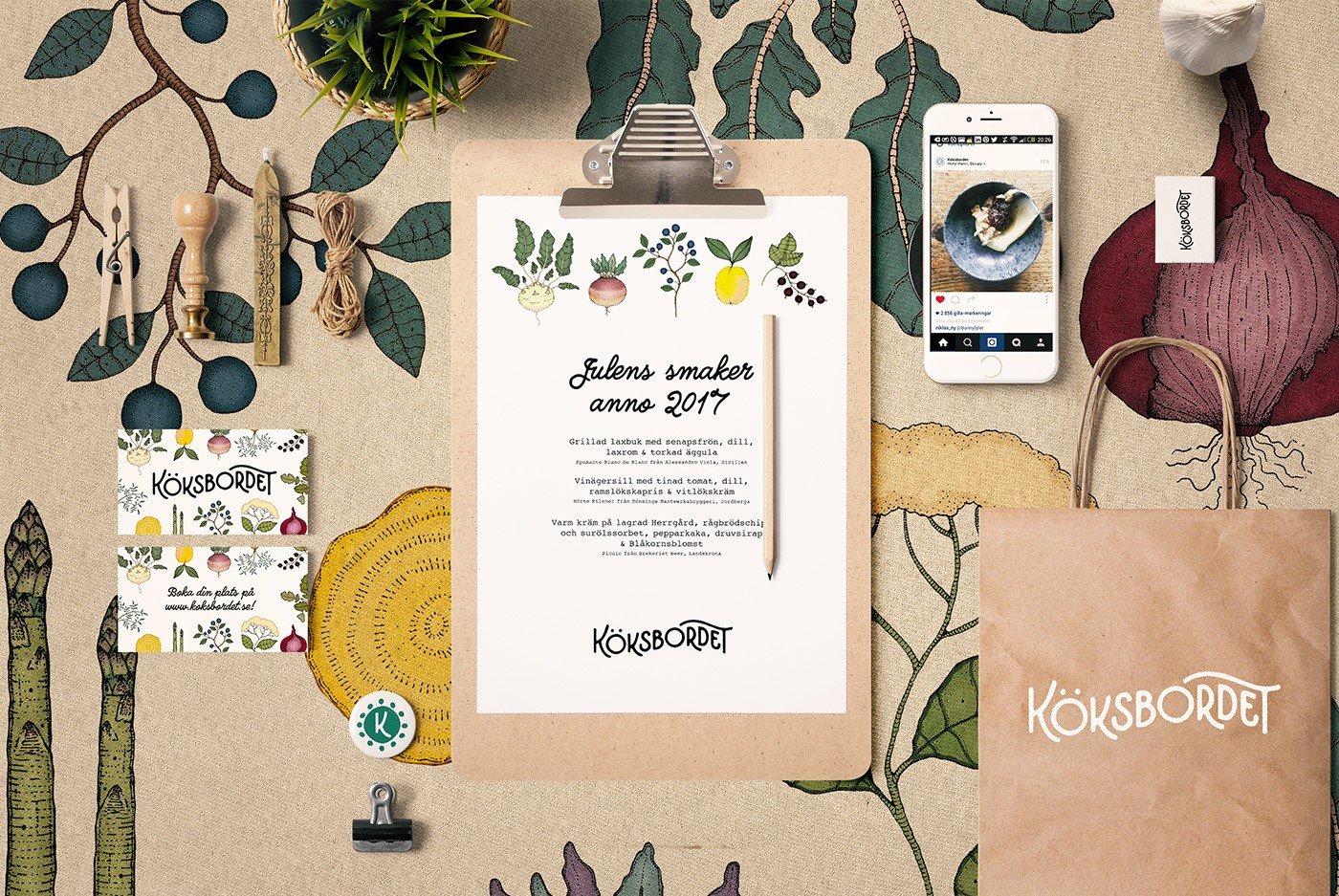
Köksbordet is a family-style restaurant serving locally produced foods in a friendly, relaxed atmosphere. Designer Björn Berglund, who’s known for his hand-lettering, was tasked with creating the identity. Köksbordet literally means “kitchen table,” so he intentionally made the o’s look like a round table, and the wavy baseline for the word indicates the restaurant’s close proximity to the sea.
Once the logo was determined, Berglund focused on a color palette derived from the natural ingredients served at the restaurant, and he worked with illustrator Fanny Schultz, who drew the imagery. “I love to collaborate on larger projects, if you find the right partner. The overall quality is so much better,” he says. The illustrations are used on the menus, business cards, and on the website.
“The menu basically follows the rest of the identity – but it´s important for me that it´s easy to navigate and that it makes you hungry and ready to order,” Berglund explains. He designed a simple template so the owners could easily update the menu offerings each day, and could be printed on a basic printer.
Common Bowlery, San Pedro, Mexico.
Design: La Tortilleria
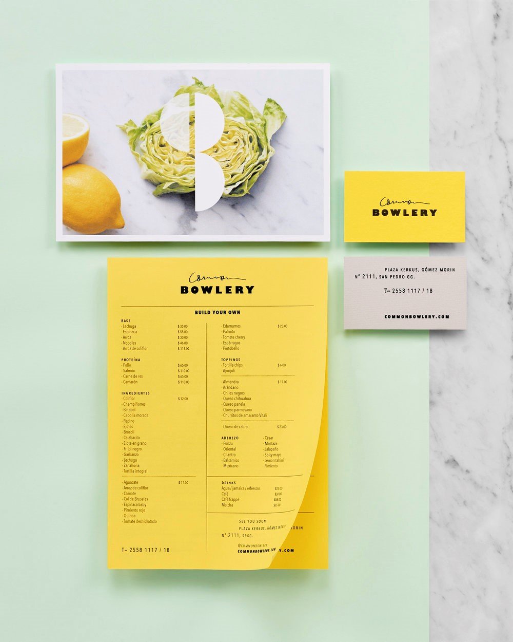
Common Bowlery invites patrons to select ingredients and create their own bowl of goodness. The menu features an array of fruits, vegetables and legumes to let customers mix and match according to their tastes. La Tortilleria created a complete identity system for the restaurant, starting with a name that fit the offerings, and then devised a unique logo that incorporates a custom hand-written style for the word Common, and a robust sans serif typeface for Bowlery.
Zita Arcq, cofounder of La Tortilleria, says, “When we created the brand colors, we knew from the start that we didn’t want to use the typical broccoli-green hues so overused in health-centered restaurants. Instead, we developed a color scheme inspired by lemons and mint. This harmonious blend proved to be a winning combination and was used on every communication application, and on the interior decoration, including the menu.”
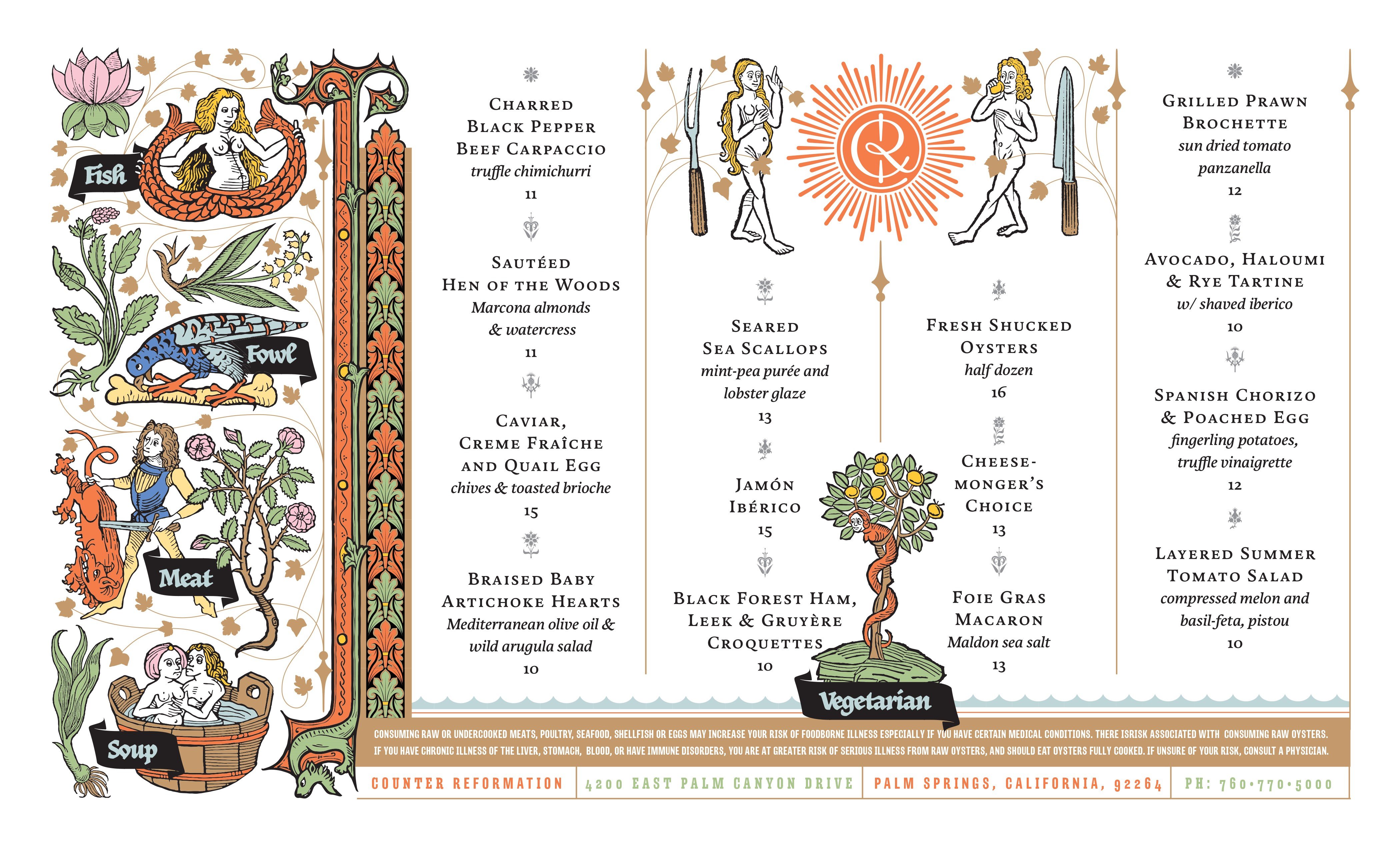
Counter Reformation, Palm Springs, California.
Design: Roberto de Vicq de Cumptich
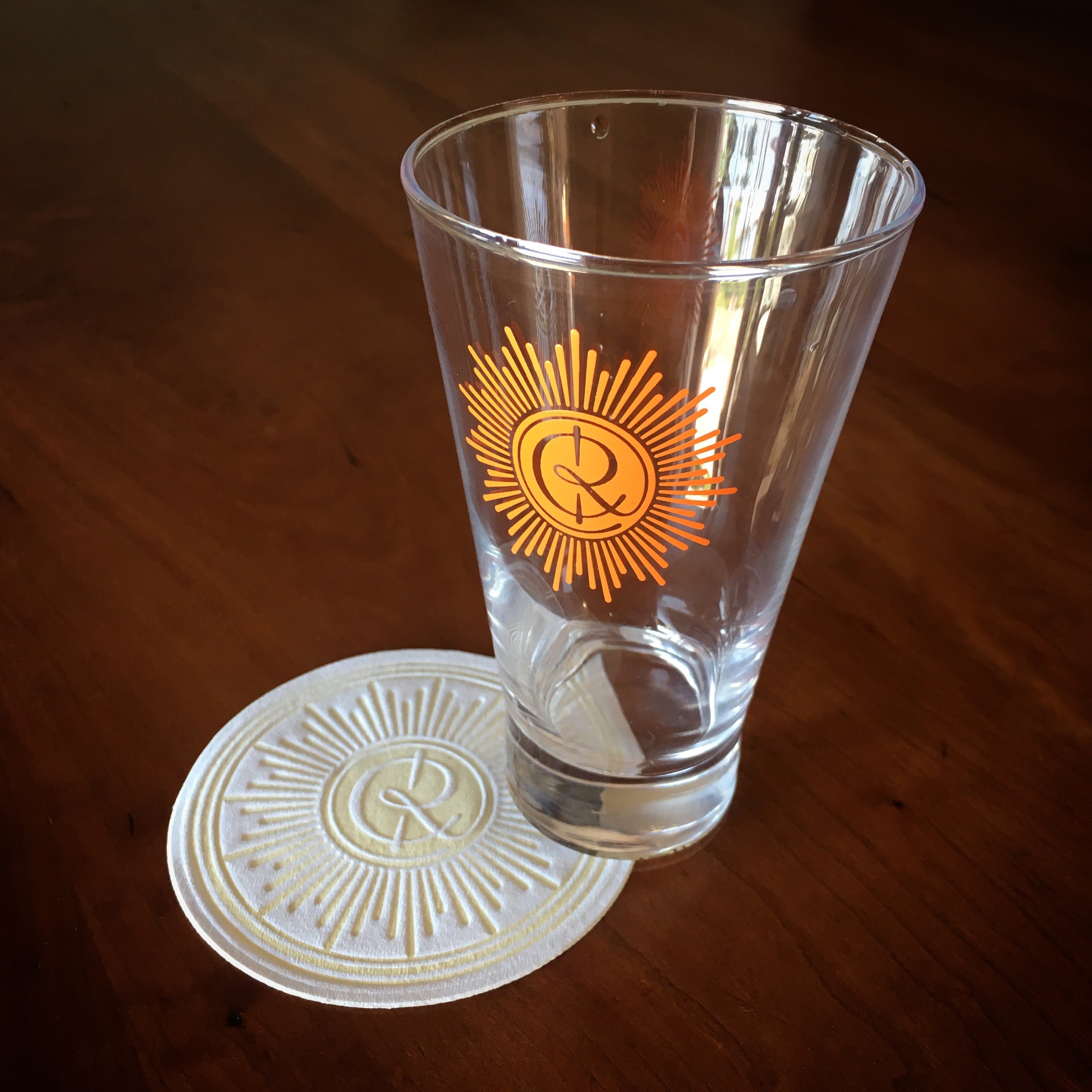
This wine bar/restaurant is located within the swanky Parker Hotel, which also houses two other restaurants. “When the owner was throwing out ideas for the name, he came up with Counter Reformation, and we started working with the idea of tongue and cheek religious themes,” explains designer Roberto de Vicq de Cumptich, who is well known for his restaurant identities around the world. “Palm Springs is a unique place with a very liberal demographic that appreciates the antics of the branding.”
And the branding plays heavy on humor. For instance, the coaster imitates a holy wafer, the check is presented in an old hollowed out hymnal, and there are murals by the entrance depicting praying hands holding a liquor bottle. De Cumptich went so far as to recreate actual characters from old medieval manuscripts for the menus to create a masterful arrangement, sure to elicit a chuckle or two from customers.
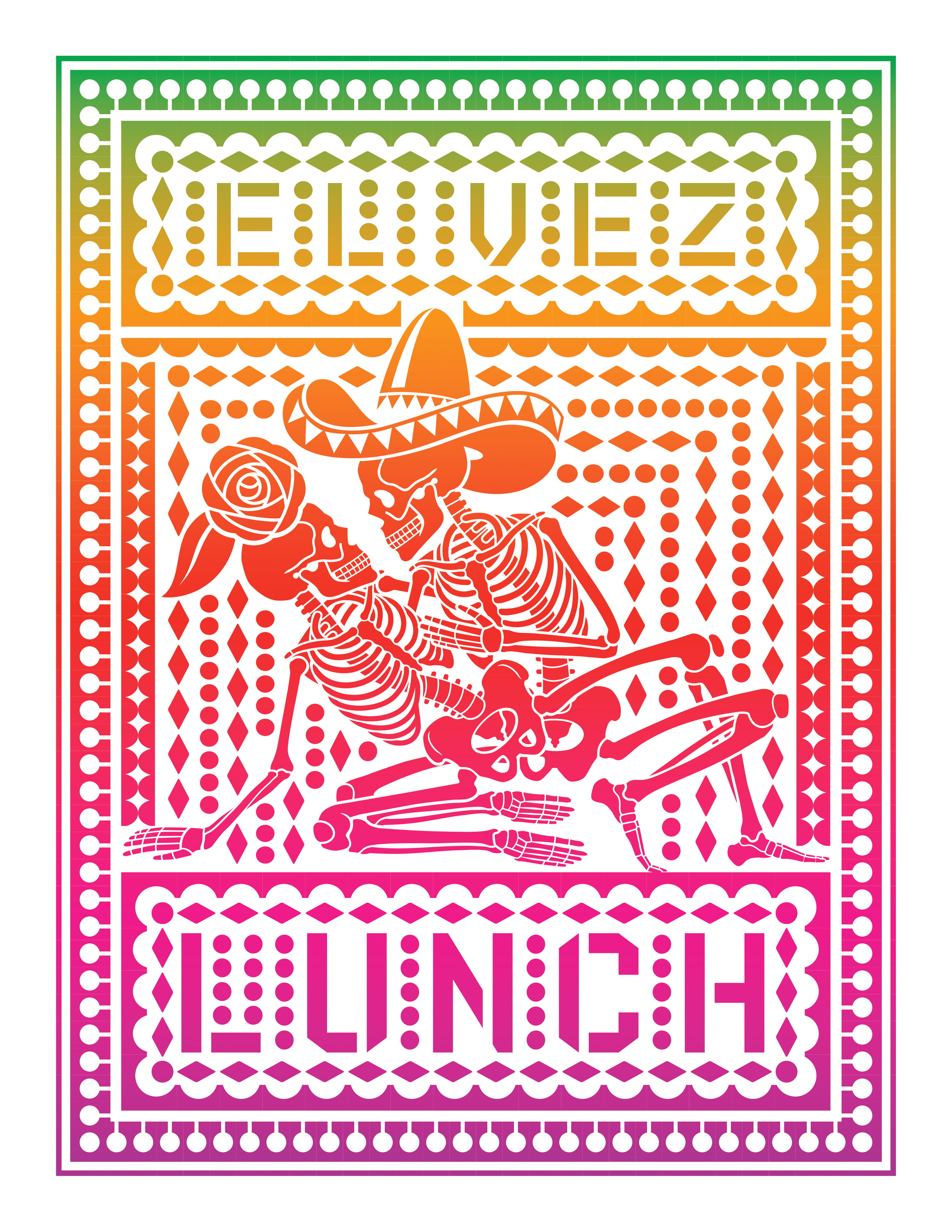
El Vez, Ft. Lauderdale, Florida.
Roberto de Vicq de Cumptich
El Vez is a Mexican restaurant with locations in New York City and Philadelphia. With the opening of its third establishment in Ft. Lauderdale, Fla., the owners worked with de Cumptich to establish the identity. “The owners like to mix the spirit of the city with Mexican culture and folklore, which is why each restaurant has a different theme. Ft Lauderdale is a tourist beach destination, with a big spring break contingency, so we wanted to convey the hedonism of sun-filled beaches that is part of the locale,” he explains.
“When you design a series of menus or wine list, they have to be identifiable at a glance and have a general common theme to unify them. ‘Day of the Dead’ themes are a bit cliché, and often expected in a Mexican restaurant, but on closer inspection you see what the skeletons are doing with each other, and it makes you smile and laugh,” de Cumptich notes. “We want customers to be part of the joke and laugh with us.”
Each menu features a different position—and he admits he had to tone down some of the depictions. The illustrations are paired with a geometric mosaic and printed in a warm or cool gradient to resemble popular printing techniques found in Mexico.