
Table of Contents
All large companies try to make their logos stand out. To do so, they carefully choose the colours, shapes and typefaces used. And, generally, this works well. Since we’re constantly exposed to them, we can identify them in the blink of an eye. Yet, paradoxically, because we see these logos on a daily basis, we pay less attention to them, and often miss the subliminal messages and symbols that are subtly (or not so subtly) hidden within. Let’s look at a few.
FedEx
The international shipping giant has, without doubt, one of the world’s most recognisable logos. Very simple, it has an arrow in the logo’s negative space, between the letters “E” and “X”. This minimalist arrow gives the impression of speed, movement and precision. Three qualities that are perfectly aligned with the company’s values, as Tom Hanks’s character in the film “Castaway” can confirm.

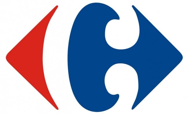
Carrefour
Another logo using negative space is that of French supermarket chain Carrefour. It uses the three colours of France’s flag, and features two arrows pointing in opposite directions, expressing the idea of a crossroads, which is what “carrefour” means in French. And the negative space between the red and blue arrows forms the letter “C” for “Carrefour”.
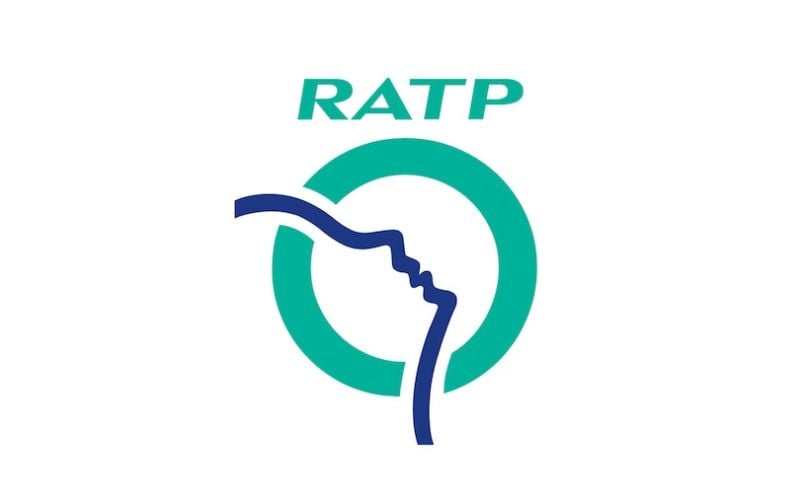
RATP
Staying in France, let’s take a look at the logo for Paris’s public transport company, RATP. Here, the green circle symbolises Paris, while the blue line represents the River Seine running through the city. But, look carefully, and you’ll notice that this line also forms the outline of a face looking skywards.
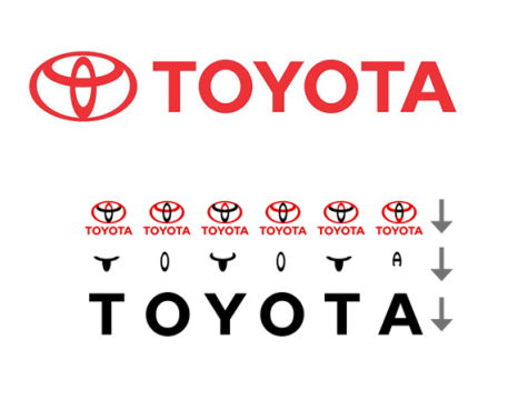
Toyota
The Toyota logo comprises three 3 ellipses that represent three hearts: the heart of the customer, the heart of the product and the heart of technological progress. You can also make out a “T” formed by the two inner ellipses. And, finally, the different parts of the logo form the word Toyota. This name was inspired by that of the company’s founding family, Toyoda. It was changed to Toyota because, in Japanese, this is written with eight brush strokes (a lucky number in Japan), rather than the ten used for Toyoda.
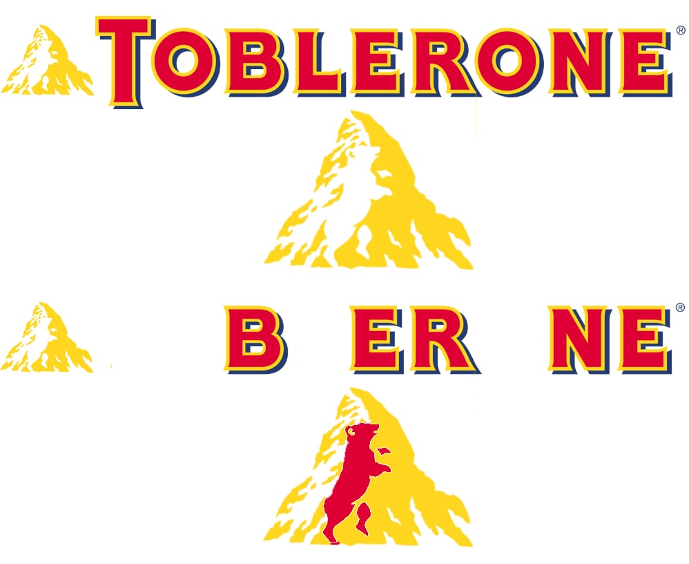
Toblerone
The logo of the chocolate brand created in 1908 by Theodor Tobler makes pointed reference to its roots. The mountain represents Mont Cervin, one of the symbols of Switzerland. You can also find all the letters of the Swiss capital in “Toblerone”. But that’s not all! On closer inspection of the mountainside, you can also make the figure of a bear, the mascot and emblem of the city of Berne, Theodor Tobler’s hometown.
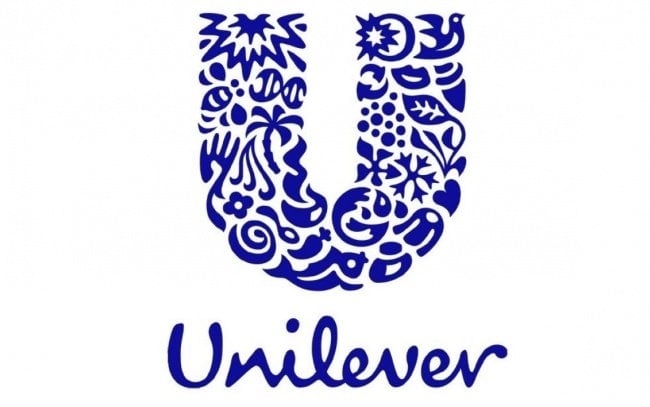
Unilever
Another famous logo containing a multitude of symbols is Unilever’s. It contains 25 of them, to be precise. The Anglo-Dutch multinational produces a wide variety of goods, and conveys this through the series of pictograms that make up the letter “U”. Each represents one of the firm’s values or product types: for example, there’s a bird that represents freedom, and locks of hair that are a nod to its range of haircare products.
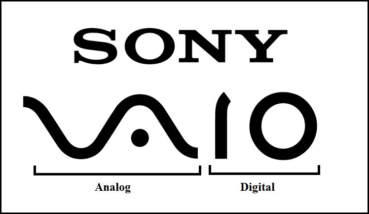
Sony Vaio
The Sony Vaio logo is much harder to understand for those who aren’t IT experts. Indeed, the word Vaio doesn’t appear anywhere. The wave formed by the “V” and the “A” symbolises an analogue signal, while the “i” and the “o” resemble the figures “1” and “0” respectively, which represent the binary code on which the digital world is built. So, “Vaio” stands for the transition from the analogue to the digital age.
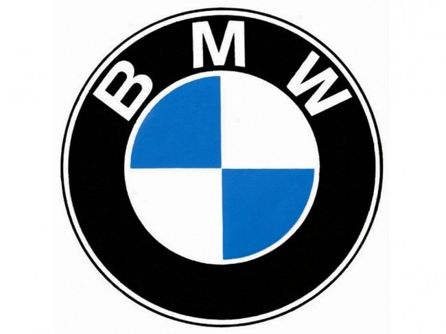
BMW
Founded in 1916, the German brand originally manufactured planes. But following the Treaty of Versailles, signed after the First World War in 1919, it was forbidden for the firm to continue making planes, so it turned its attention to cars and motorcycles instead. It is often incorrectly said that the logo represents a blue sky and a turning propeller. In fact, the colours used are those of the State of Bavaria’s flag, but arranged in reverse order, as in Germany it’s illegal to use a national symbol in a trademark.

Adidas
Another world-famous German brand is Adidas, founded in 1949 by Adolf Dassler. The logo combines the founder’s nickname, “Adi”, with the first three letters of his surname, “Das”. This logo has evolved several times over the years, but in its current version, which dates to 1991, it symbolises a stylised mountain. The mountain embodies the brand’s values: a taste for challenge and adventure, and the courage and a desire to continually move forward.

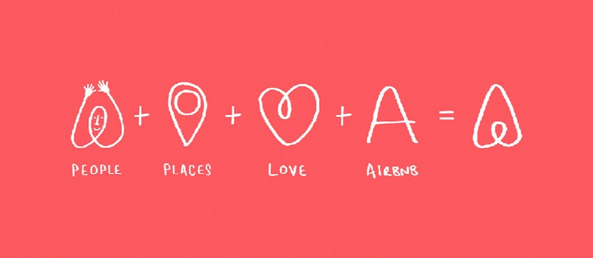
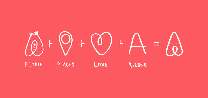
Airbnb
To wrap up, let’s consider for a minute a logo that was much discussed in 2014, when the firm it represents undertook a rebranding exercise: it’s the logo for Airbnb, the accommodation and experience sharing platform. It comprises the letters “A” and “B” from “Airbnb” and the firm’s tagline “Belong anywhere”. But it also contains a number of hidden symbols that embody the brand’s positioning and ethos: “people”, “places” and “love”.

Case Study: Amazon’s Multifaceted Logo
More Than a Smile
Amazon’s logo is a masterclass in simplicity and meaning. The design features a smile-like arrow that points from “A” to “Z,” encapsulating several layers of meaning:
- Comprehensive Product Range: The arrow signifies that Amazon offers everything from “A to Z,” emphasizing its extensive inventory.
- Customer Satisfaction: The smile represents happiness and customer satisfaction, aligning with Amazon’s focus on excellent service.
- Subtle Arrowhead: The arrowhead also subtly points to progression and delivery, reflecting Amazon’s efficient logistics.
This multifaceted design effectively communicates Amazon’s core values: variety, customer-centricity, and efficiency, making it a powerful symbol of the brand’s identity.