
Table of Contents
“To make things simple is difficult, and requires lots of creativity. To complicate things is much easier: you just add anything that comes to mind.” So said Italian master designer Bruno Munari, for whom Federico Alfonsetti, creator of the EasyReading font, does not hide his admiration. In fact, Alfonsetti is proud of the fact that Munari’s ideas on visual communication were the guiding principles for the font’s design. EasyReading is a font that was initially conceived to help readers decipher written words smoothly and quickly. The result, after almost a decade of research, is a typeface designed to break down the barriers to reading and to helps dyslexics: its specific graphical features have been praised by the Italian Dyslexia Association.
How EasyReading was born
Alfonsetti is from Turin, and has worked all his life in typography as a designer and publisher: “My passion for typefaces, which once were drawn ‘just’ by hand, was kindled in 1969 while studying to become an advertising designer. At the time, the characters were still made of lead and the tools of the trade were pencil, brush, India ink, scissors and glue. All tools which, at the end of the 1980s, I found contained in a plastic box: my first Mac. Making characters and the written page highly legible has always been an obsession of mine. Over the years, I started my own design practice and printing company. In 2004, I was one of the founders of the Casa Editrice Angolo Manzoni publishing house, for which I designed book series with layouts and fonts chosen for maximum legibility,” he told us. Today, together with Enzo Bartolone and Nino Truglio (with the backing of investor Marco Canali and consultant Umberto Cardellini) Alfonsetti is working towards his main goal: legibility for all through his EasyReading Multimedia company.
In 2006, Alfonsetti and his publishing house published a book on dyslexia, which is how he became aware of the difficulties caused by the condition. Dyslexics suffer from a reading disorder which manifests itself as a difficulty in deciphering text. It is estimated that 700 million people, or 10% of the world’s population, are dyslexic. The book’s author, a dyslexic himself, suggested that Alfonsetti create a font specially designed to help people suffering from dyslexia: “As with all design projects, the first phase was to take a closer look at the science involved and the target market. This was followed by a motivational phase that included meeting dyslexic children and their families. It was these meetings that convinced us to create the font,” he continued.
Over time, the EasyReading project has broadened to encompass a Design for All approach, in other words, one in which diversity is seen as an asset rather than a problem. The difficulties faced by dyslexic readers became an opportunity to design a font that made reading easier for everyone, thus making the project inclusive.
Why EasyReading is more legible
What graphic characteristics does a font need to have to be highly legible even for dyslexics? There are three problems that need solving:
-
- Should it be serif or sans serif?
- How to avoid the crowding effect?
- How to prevent confusion between letters with similar shapes?
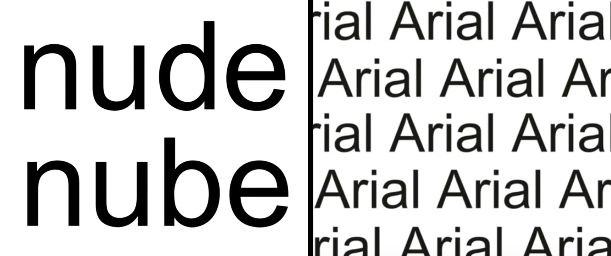
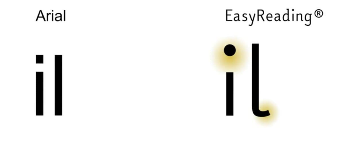
It is widely believed that popular fonts like Times New Roman, which have serifs, can be hard to read, especially for dyslexics. However, choosing a sans-serif typeface, like Arial, does not solve the problems of crowding and letter confusion. Take the words “nude” and “nube” in the example above: the “d” and the “b” are mirror images of one another and can be confusing, especially to a dyslexic.
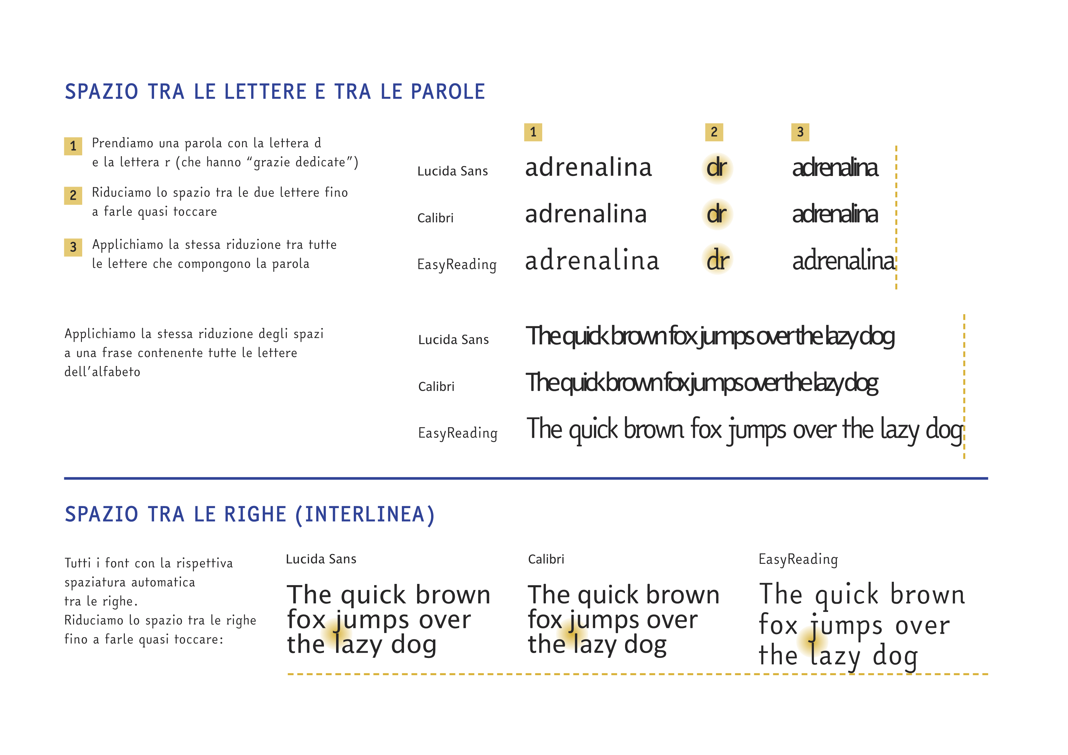
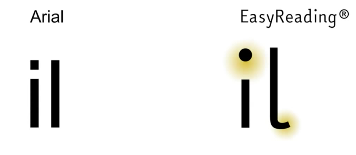
EasyReading solves these problems using various solutions: it’s a hybrid font comprising both serif and sans serif letters. The font’s high legibility derivesfrom the careful design of the characters, while its hybrid nature prevents the so-called crowding effect: the letters have special serifs so they aren’t confused with those of a similar shape. This provides wide, calibrated spaces, allowing words and lines to “breathe”. Longer than average upstrokes and downstrokes create more space between the lines. The typeface comprises 811 glyphs — letters, numbers, accents, symbols and punctuation marks — and can be tried out in real time on the official website. The font currently covers languages based on the Latin and Cyrillic alphabets, with Greek (ancient and modern) and Coptic to be added in future.
Commonly used fonts contain many letters that are easily confused due to their lack of differentiation. EasyReading, however, has been specifically designed to avoid confusion between different letters. None are mirror images of one another (e.g. “p” and “q”) and even when the spacing between letters is reduced, they tend not to be confused (e.g. double “n” does not form an “m”).
Fonts are everywhere
“ There are infinite uses for typefaces: from the web to road signs to heads-up displays for jet pilots,” explained Alfonsetti. That’s why EasyReading is used in a wide variety of settings. Users of the font include publishers Pearson, Rizzoli and SEI, the websites of the University of Turin, MIUR and of Fondazione Einaudi, Milan’s Triennale and Palazzo Reale museums, the SlowFood movement, and Turin’s Teatro Regio, which uses the typeface to subtitle operas.
The font was also the subject of a scientific study conducted by Dr Christina Bachmann (published in the Italian scientific journal “Dislessia” in 2013 and available here [in Italian]) which argues that EasyReading is an effective aid to readers with dyslexia and a highly legible font for all readers.
Of course, EasyReading is not the only easy-to-read font in existence. Various solutions are available, which we’ll list here for the sake of completeness: how effective they are, we’ll leave for readers to decide. Other fonts that claim to be highly legible include free, open-source typefaces like OpenDyslexic, which is also free for commercial use. Then there’s ReadRegular or Sylexiad, developed by Dr Robert Hillier, lecturer at the Norwich University of the Arts.
Indeed, to simplify is anything but simple. We’ll wrap things up with more wisdom from Bruno Munari, which is applicable not to typeface designers alone: “Visual communication includes all graphical expression: from the shape of a character to the limits of a word’s legibility — everything that makes a text easier to read. The image used must be legible to all — and legible in the same way — otherwise there’s no visual communication, indeed there’s no communication at all: there’s just visual confusion”.