
Table of Contents
Controversial, outrageous, sadistic, dark: Lars von Trier is without doubt one of the most non-conformist and influential auteurs of contemporary cinema.
Perhaps distracted by far more striking and disturbing elements of his work, few have focused on an aspect that, although minor, is in fact highly sophisticated in von Trier’s films: his typographical choices.
In keeping with the rest of his cinematographic style, his fonts and lettering are unusual and unconventional: often, the titles and intertitles are nervously hand written, while other times they use less unhinged typefaces – but in any event, his typographic style adds to the extremely emotional tone of his films.
Today, we’re going to take a closer look at the typographical choices of Lars von Trier and some of the fascinating facts about four of his masterpieces – Europa, Dogville, Melancholia and Nymphomaniac. But before we do, it’s worth checking out this tribute in which director Joshua Gaines re-uses some of the most idiosyncratic lettering found in von Trier’s work.
Europe
Europa, released in 1991, is von Trier’s fourth film and the final chapter of his so-called Europa Trilogy. Here, as in the other films in the trilogy, the director explores the social decadence of Europe during the Second World War.
Europa is a hypnotic journey through Germany in 1945, just after the war has ended. In the famous opening scene (which you can watch here), the narrator, using tricks and techniques of hypnosis, puts us in the shoes of the main character: a young, slightly naive American who has arrived in Germany to help with reconstruction.
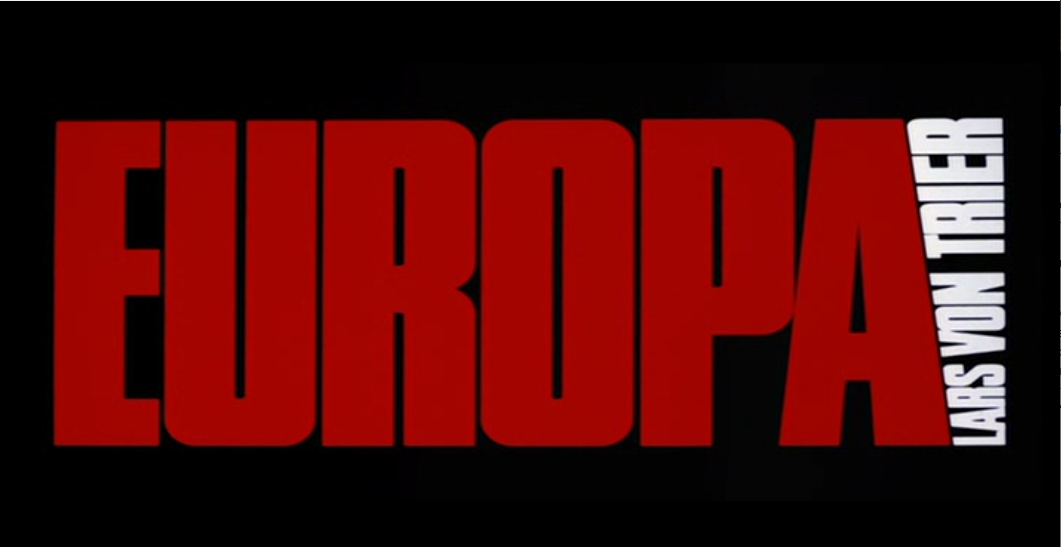
The film is punctuated by intertitles that use a geometric and condensed sans serif font, and at the end of the film, the main title appears in the same form. The use of intertitles – a technique which was used in silent films to describe scene changes – is a careful stylistic choice by the Danish director that he frequently uses in his films: while the images bring us intimately into the film, the intertitles create a certain distance and remind us that we’re watching a show. In other words, they stop us from identifying too closely with the characters and their tragic fates.
A fan has created a font inspired by that used in the film and has made it available for free here.
Dogville
Released in 2003, Dogville is the film that, despite being an undeniably challenging avant-garde film, brought Lars Von Trier to a wider audience.
The minimalist aesthetic of the film probably helped to keep it indelibly etched into our minds. The whole movie is shot on a soundstage: only a few, essential objects make an appearance, while streets and walls of buildings are just simply drawn in white chalk on the black background of the stage. To indicate street names, von Trier chose an almost glamorous font: Glaser Stencil.

Glaser Stencil was created in 1967 by legendary American illustrator and designer Milton Glaser. If you haven’t heard of him, he’s the man behind the famous “I love New York” logo, devised in the seventies and now an iconic piece of design. His font was inspired by the art of stenciling – the technique that uses a stencil to reproduce identical images or lettering on different surfaces – which is today synonymous with street art, but has actually been widely used since the forties. Naturally, Glaser Stencil itself became a much-loved design object.
Melancholia
Melancholia came out in 2011. The inspiration for the film was a period of depression suffered by von Trier, so, unsurprisingly, the film’s subject matter is not terribly cheery. The film centres around the conflictual relationships between characters during a disaster that is literally waiting to happen: the giant planet Melancholia will shortly collide with the Earth and destroy it.

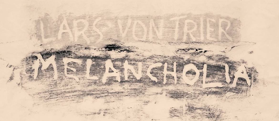
The visual power of the film is undeniable and evident from the outset in the long opening sequence that concludes with the title credits. Set to the notes Richard Wagner’s Prelude to Tristan und Isolde, images of a world whose laws of physics have been turned upside down as it nears destruction appear in slow motion on the screen, including Pieter Bruegel’s Hunters in the Snow. These glossy images contrast jarringly with the first title, “Lars Von Trier Melancholia”, which appears as an intertitle against a pale, yellowy background, as if it has been drawn by hand in dust. Everything – together with the oppressive absence of music when the title appears – creates a powerful distancing effect: as this long analysis explains, in his composition of images and titles, von Trier creates something that is simultaneously very intimate, yet also distant.
https://www.youtube.com/watch?v=1JEYnjKxf4A
Nymphomaniac
Nymphomaniac was released in 2013 and premiered in two parts in 2014, the first at the Berlin International Film Festival and the second at the Venice Film Festival. In this daring film, von Trier tells the story of the main character Joe and his erotic experiences.
The film caused quite a stir, and publicity for the movie didn’t hesitate in using its steamier aspects: one of the most famous posters showed characters’ faces at the moment of orgasm.

A series of more minimalist, but no less erotic, posters was based on typography: parentheses were positioned in a way that clearly suggested female genitalia – or, according to some interpretations, the emptiness that pervades this nihlistic film. The font chosen by von Trier for these posters and for the film’s logo is Minion, a typeface created in 1990 and inspired by the timeless beauty of renaissance typefaces.
As it happens, Minion is a widely used typeface: it’s often found in books and is the standard for some Adobe programs. In contrast with the provocative posters of Nymphomaniac, Minion is also the font used for the logo of that most serious of American scientific institutions, the Smithsonian.

So, we’ve seen how Lars von Trier consciously uses lettering and fonts – even the most banal and sober typefaces – in a manner that’s highly unconventional and far removed from their usual context. But the plethora of titles and intertitles in the Danish director’s work also has a very specific function: they remind us that we’re watching a show and create that minimum distance necessary so that we can come away (almost) unscathed from the tragic intensity of von Trier’s films.