
Table of Contents
David Fincher is undoubtedly one of Hollywood’s most versatile directors of recent decades, creating films that are simultaneously mainstream and anarchic, iconic and grotesque. He is the man behind two of the films that made the biggest impression on Generation X: the gloomy Se7en and the subversive Fight Club. And he also deserves credit for creating a film on Facebook and its creator before the social network became so deeply intertwined in our lives and our society.
As well as being famous for his meticulous approach and the close relationships he builds with actors on set, David Fincher has also been praised over the years for a very specific reason: bringing the opening credits back into the limelight.
Enormous, minimalist, post-punk, 3D, eye-wateringly expensive, analogue, digital and macabre: someone once described David Fincher’s collection of opening credits as representing a genuine renaissance of this form of graphic and typographic design in cinema.
With this in mind, today we’re going to take a look behind the scenes of David Fincher’s titles, describing the director’s innovative techniques and typographic choices and the talented designers he worked with.
Se7en
Se7en is a dark, psychological thriller, in which the two detective lead characters – the young, impetuous Brad Pitt and the more reflective Morgan Freeman – try to stop a macabre string of crimes, all linked by the same, unsettling leitmotif: the seven deadly sins. The film came out in 1995, and is one of David Fincher’s darkest and most anxiety-inducing creations, which developed a cult following in the 1990s. The same characteristics can be seen in its famous title sequence.
The titles – created by designer Kyle Cooper, who is also responsible for the opening credits of American Horror Story and Home Alone – are an absolute masterpiece: they are considered to be some of the best ever created and one of the most important innovations in design in the 1990s, in part due to the way they combine analogue and digital technology.
From a cinematic point of view, the opening titles of Se7en do something particularly interesting: they take the spectator into the mysterious mind of the serial killer a long time before he actually makes an appearance in the film, using an excruciating collage of old anatomy books, obsessive pages from a diary and macabre images, with a fleeting and disturbing font catapulted on top.
Se7en’s typography was created by mixing handwritten text with characters in Helvetica, one of the most popular and widely used fonts in the world: the two overlap nervously and inaccurately, increasing the feeling of angst in the scene. As Kyle Cooper revealed in an interview, the idea was that spectators should feel like the film’s typography was created by the unknown serial killer himself.
Creating the lettering was not a simple process: the characters were first handwritten on black cardboard then transferred onto film, before being made even more smeary in post-production. The entire scene was intentionally put together using analogue tools, which naturally produce more technical inaccuracies. According to their creator, the titles took on “a life of their own”.
You can find detailed information on these titles, including a storyboard and interesting additional materials, here.
The Game
The Game describes a rich businessman whose brother gets him involved in a strange role-playing game that will slowly turn his life upside down.
it was David Fincher‘s third film, released in 1997 after the enormous success enjoyed by Se7en. Just watching the opening titles is enough to reveal the American director’s versatility: they are light-years away from the credits of his previous film, as minimalist as you could possibly imagine, featuring only a single screen, the title of the film and a puzzle that breaks up into infinite pieces. “I don’t believe in decorative titles — neato for the sake of being neato”, David Fincher noted in a long interview with Art of the Title. “[Titles have to] help set the scene, and you can do that elaborately or you can do it minimally”. In The Game he opted for the latter: in just few seconds, the image of the puzzle pre-empts what will happen shortly to the life of the lead character.
The font used for the title of The Game – Trajan – has an interesting history. Although it was designed in 1989 for Adobe by the American Carol Twombly, it has much older origins – indeed, it is considered by some to be the oldest font in the world. Twombly was inspired by the letters chiselled into the base of Trajan’s Column, a monument erected in 113 A.D. in Rome by the emperor Trajan to celebrate his victory in the Dacian Wars.
The perfect inscription at the base of the column has always been a mystery for typography enthusiasts. In the 1960s, Edward Caitch, a priest and calligraphy expert, became convinced that the letters had been painted before being carved into the rock. Carol Twombly became interested in his research, and, years later, created the stylish font (the full, fascinating story is recounted in the book ‘The Eternal Letter’ published by MIT Press).
Ironically, Trajan turned out to be unsuitable for writing in Latin, but extremely attractive for Hollywood: it has been used on over 400 Hollywood film posters.
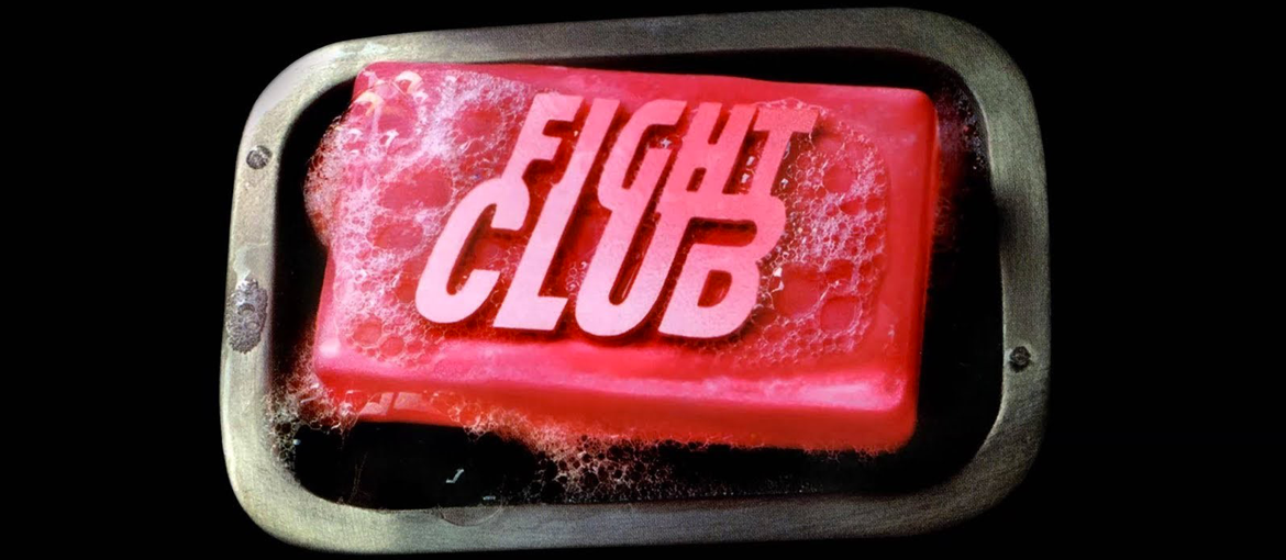
Fight Club
Fight Club was released in cinemas in 1999 and is considered David Fincher‘s masterpiece. Inspired by the novel by Chuck Palahniuk, the film is both Hollywood-esque and subversive at the same time. Starring Edward Norton and Brad Pitt, it revolves around a combination of combat, office life, capitalism, male friendship, society and psyche. It is a strange and to some extent punky film, which came to epitomise Generation X.
It all begins with 90 seconds of opening credits, to the beat of Dust Brothers’ electronica soundtrack. And these 90 seconds have gained a cult following too.
Fight Club‘s opening sequence depicts what happens inside a man’s body – from the reaction of his synapses to his profusely sweating skin – when someone points a gun at him and is about to press the trigger.
The titles were created by Digital Domain, which enlisted the help of a scientific illustrator to understand how to recreate this lightning-fast journey into the biology underpinning a man’s emotions. A sans-serif font is used, once described as a “rave-flyer-inspired” typeface that suits the monochrome scene devised by Fincher perfectly.
The lettering was designed by the renowned graphic designer and type designer P. Scott Makela. In the late 1990s, Makela was nearing the end of his career and had acquired a certain amount of fame: he was one of the first to explore the use of digital programs like Photoshop and Illustrator to create fonts, and honed his own distinctive style. He is also known for creating the Dead History typeface.
If you’re looking for more Fight-Club-related content, you’ll find the incredible sketches for the film’s opening sequence here.
Panic Room
Panic Room was released in 2002. This time David Fincher assembled a claustrophobic thriller, set almost entirely within a flat in New York. The film in its own way pays homage to Alfred Hitchcock, taking the suspense for which the master of the hair-raiser was known and transporting it to the 2000s.
This tribute starts as early as the opening credits, which are clearly inspired by Hitchcock’s North by Northwest. While Hitchcock’s masterpiece used kinetic typography for the first time to make the titles appear on the facade of a skyscraper (as we explained here [link to the article The Fonts of Alfred Hitchcock]), in the opening titles of Panic Room David Fincher integrates enormous letters into the cold New York skyline, making extensive use of computer graphics. It was probably his decision to use what was at the time an incredibly cutting-edge technique that caused the costs of the sequence to skyrocket: the opening sequence of Panic Room became one of the most expensive ever made.
However,it was worth it for the effect he achieved: the wide, open cityscape contrasts with the enclosed spaces we see in the film, and the enormous letters that hang eerily between the buildings instil the perfect sense of unease in the viewer.
The titles were created by the Picture Mill agency, which took over a year to complete them. Even choosing the font was no easy process, and involved looking at old New York signs for inspiration for a font that would pair nicely with the architecture. Certain sans-serif typefaces like Helvetica and Univers were judged too cold and rejected; eventually, three serif fonts were selected: Copperplate, Requiem and Meyer. David Fincher did not hesitate when he saw the options: he knew instantly that Copperplate was the perfect font (you can read the full story in this interview with the credits’ curators).
The typeface Copperplate Gothic was created in 1901 by Frederic W. Goudy. It is an unusual font, designed at the start of the American designer’s career, with various historical influences (including engravings in stone and copper). Only produced in uppercase, it is often seen printed on office doors and business cards. You may also have seen it on screen on the TV programme ‘Who Wants to be a Millionaire?’ and the opening titles of American Psycho.
The Social Network
Creating a film about Facebook and the origins of the world’s most famous social network was by no means an obvious thing to do in 2010. David Fincher succeeded, however, with The Social Network, providing us with an honest and sometimes merciless portrait of its creator, Mark Zuckerberg.
The opening credits of The Social Network were created by graphic designer Neil Kellerhouse, known in Hollywood for his later work on The Revenant, Under the Skin and Gone Girl. In this film, Fincher returned to a simple yet effective style of titles, featuring a jpeg that slowly uploads and, of course, Facebook’s font Klavika in its bold version.
Facebook’s logo actually uses a modified version of Klavika, a versatile and modern sans-serif font family created in 2004 by the young and talented Eric Olson. The design studio Cuban Countil then altered the letters k, f and a to produce one of the best-known logos in the world. It’s amazing to think that while designing his font, Olson was unconvinced and for several months considered scrapping it all.
We have seen that for David Fincher the opening credits are never an afterthought; they have an important cinematic function of introducing the characters from another perspective, whether that is from inside their cells, as in Fight Club, or in the intimate space of a diary as with the terrifying serial killer in Se7en.
His titles are sometimes grand and extremely expensive to produce, and sometimes extremely stripped back. However, regardless of the complexity of the techniques employed, David Fincher has never set out to create ‘just’ titles: he has constantly innovated, experimented with fonts, chosen exceptional creative partners and brought together analogue and digital technologies, stretching them to their absolute limit. And the result is a series of miniature graphic design and typographic masterpieces.