
Table of Contents
Dirty faces, ice-cold stares, deserted villages, cynical gunslingers, swaggering outlaws and the unforgettable scores of Ennio Morricone: there are many things that have made Spaghetti Westerns – the cinematic genre whose founding father is Sergio Leone – timeless classics.
But they also owe part of their success to something else: credits, lettering and the typographical experiments that – although often forgotten – brought a new aesthetic to the Western genre.
Not many people know that the credits for the first Sergio Leone films were created by a completely self-taught graphic designer by the name of Iginio Lardani. While Leone reinvented a dying genre, Iginio Lardani experimented with cutting-edge techniques to add that touch of original craftsmanship so typical of Italian Westerns.
But not all Sergio Leone titles were produced by Lardani… So, from the classics like A Fistful of Dollars, For a Few Dollars More and The Good, the Bad and the Ugly, to films with a different tone like Once Upon a Time in the West and Once Upon a Time in America, we’re going to look at the typographical choices of Sergio Leone, the king of the Spaghetti Western.
A Fistful of Dollars
A Fistful of Dollars, which came out in 1964, was the first Spaghetti Western. Inspired by – or copied from, as some allege – Akira Kurosawa’s Yojimbo and Carlo Goldoni’s play The Servant of Two Masters , the film was an unexpected smash hit.

The opening credits were designed by Iginio Lardani, who adopted an aesthetic that used daring lettering and experimented with animation. Just a few years earlier, the world had first seen the famous credits created by Saul Bass for Alfred Hitchcock [link to internal article “The fonts of Alfred Hitchcock”] and those created by Maurice Binder for Dr. No. Iginio Lardani’s credits were equally ground-breaking and were almost a film within a film.
The men on horseback seen in the credits were created using rotoscoping, an animation technique invented in 1915 by Max Fleischer that involves tracing over previously shot film. The two colours – black and red – foreshadow the struggle between the two families at the centre of the film.
The title sequence culminates in a white light that blots out everything, marking the end of the animated prologue and the beginning of the cruel tale that is about to unfold before our eyes.
For a Few Dollars More
For a Few Dollars More was released in 1965, a year after the extraordinary success of A Fistful of Dollars. It’s the second film in the so-called Dollars Trilogy and ranks fifth among Italian films for most cinema admissions of all time in Italy..

In this case, too, the title credits were created by Iginio Lardani. This time, the text appears on a fixed background: a typical Western landscape – the film was actually shot in Spain, like most Spaghetti Westerns – across which a horse trots without its gunslinger.
Like Saul Bass with his credits for Alfred Hitchcock’s North by Northwest, Lardani was one of the first to experiment with kinetic typography, an animation technique that blends movement and text using video animation. While Hitchcock’s credits are tense and urgent, those that Lardani created for Sergio Leone are almost playful: as they appear onscreen, the credits are shot up by bullets from an unseen rifle. So, from the very start of the film, Sergio Leone subverts the triumphalist rhetoric typical of American Westerns by adding a touch of humour that goes hand in hand with the brutality of the tales he’s about to tell.
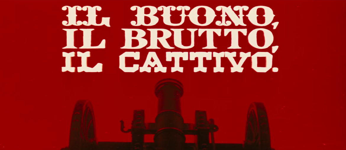
The Good, the Bad and the Ugly
Considered Leone’s masterpiece and a milestone in the genre, The Good, the Bad and the Ugly came out in 1966. Set during the American Civil War, the film denounces the folly of that war and once again subverts one of the pillars of American Westerns.

Today, The Good, the Bad and the Ugly remains one of the finest in its genre; indeed, Quentin Tarantino rates it as one of the best films of all time.
The opening credits – again created by the masterful Iginio Lardani – bring together the experimental techniques used by the designer on his two previous films. There’s a bit of everything: a mix different lettering that would be inconceivable in more serious contexts, kinetic typography, cowboys animated using rotoscoping and various other homemade effects created using high-contrast photography and materials like coffee powder and oil (check out this interesting article on the use of these techniques).
Once Upon a Time in the West
Sergio Leone’s Once Upon a Time in the West was released in 1968. In some ways, it’s a more mature piece of work than his previous films, and it would influence many directors, including Quentin Tarantino and Martin Scorsese. Today, it’s considered one of the best Westerns of all time.

One the many unforgettable things about this film is the extremely long opening scene. In the first seven minutes of the movie, virtually nothing happens, apart from a fight between a gunslinger and a fly. But, through the editing and music, Leone manages to create just the right amount of tension to start off the film. The opening credits, unlike those of his previous films, lazily slide on and off the screen at the same slow pace as the images. And the font used is Cooper Black.
This rounded, uneven and retro-looking serifed font was created in 1921 by Oswald Bruce Cooper, a designer from the American Midwest, and would become very popular in the twenties and thirties, especially in advertising. Then, strangely, it was rediscovered in the sixties, in just a few years becoming one of the most used fonts in the world. Thousands and thousands of young Americans started using the typeface in home-made flyers printed for demonstrations, concerts, debates, film screenings and the like, while Cooper Black also started appearing on the covers of legendary albums: Pet Sounds by the Beach Boys, L.A. Woman by The Doors and Ziggy Stardust by David Bowie – as well as records by The Rolling Stones, Johnny Cash, James Brown and many others. This fascinating video delves deeper into the strange history of this font.
Once Upon a Time in America
Once Upon a Time in America, released in 1984, was Sergio Leone’s last film. It differs from his other films in genre (it’s not a Western), but not in underlying themes: the dramatic trials and tribulations of an outlaw, masterfully played by Robert De Niro, and his gang. Set in New York City, the tale spans forty years, from the roaring twenties to the swinging sixties. Despite a lukewarm reception on its release, the film has been re-appraised over the years and is now regarded as among the Italian director’s best.

For the opening credits of Once Upon a Time in America, Sergio Leone chose a decorative, vintage font: Victorian. Although its name harks back to the Victorian era and the signwriting style of the 19th century, the typeface is in fact almost the same age as the film, created in 1976 by British designers Freda Sack and Colin Brignall.
Here’s the font being used in the closing credits.
So there we have it: how Sergio Leone challenged the clichés of the Western, reinventing the genre in a series of timeless movies. And his typographical choices – particularly through his collaboration with Iginio Lardani on his early films – also challenged the aesthetic norms of the era. They experimented with language, lettering and techniques, from kinetic typography to rotoscoping, and established an aesthetic that has become synonymous with the Western genre ever since. Embodying the originality and craftsmanship so typical of Italian cinema from that era, the credits for Sergio Leone’s spaghetti Westerns are among the most celebrated in film.
If you’d like to know more about the (too often overlooked) work of Iginio Lardani, we highly recommend this long read by Ben Radatz.