
Table of Contents
Since her debut, Sofia Coppola has invited viewers to experience highly sophisticated atmospheres, creating worlds in pastel colours and ‘non-places’ where the characters try, with great difficulty, to communicate with one another. Over the years she has built upon and cemented this style, while telling us stories of adolescence, obsession and complex human relationships.
Today we are taking our own look at this unforgettable and fascinating visual style by analysing Sofia Coppola’s choices of font.
The opening titles of Sofia Coppola’s films always reveal an incredible attention to detail, often created in partnership with designers and contemporary artists, and give us an opportunity to explore a vibrant range of different typographic styles from the past few decades, from ‘pop’ designs to more ornamental fonts, all of which are iconic in their own way.
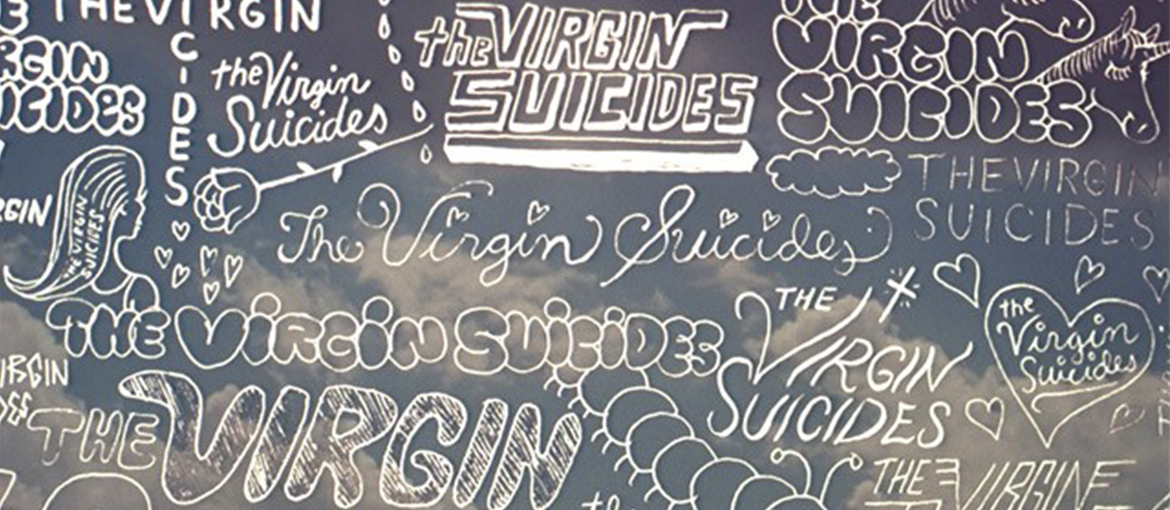
The Virgin Suicides
The Virgin Suicides was Sofia Coppola’s first film, released in 1999, when the director – who was born into a film-making family – was just 27 years old. Set in Detroit in the mid-1970s, it describes a group of teenage boys’ obsession with five mysterious sisters who are protected very guardedly by their parents.

Even in this, Coppola’s first film, the unusual opening credits undoubtedly stand out, featuring highly effective teenage scribbles that manage to be simultaneously naive and creepy. The titles were created by Geoff McFetridge (see his Instagram profile here), a Canadian artist and designer probably chosen in part for his unique ability to draw ‘like a girl’
“Something in [the way] girls drew really fascinated me”, the artist explains in this interview. “There’d be these doodles of, like, caterpillars and fantasy animals, but then they’d also draw scary stuff. I think it worked for the film because it weaves naïve romanticism with a fascination with death“.
Lost in Translation
Lost in Translation was released in 2003, and as well as being Sofia Coppola’s breakthrough film also introduced one of the director’s favourite themes: physical and emotional isolation. This cult favourite – a comedy with a gloomy side starring Scarlett Johansson and Bill Murray – describes the meeting of a fading actor and a young female graduate in a Tokyo hotel.

The detail from the opening scene that probably made the biggest impression on viewers was Scarlett Johannson’s pastel-hue pants. The film’s title appears above this intimate image in Kabel, a geometric sans-serif font created by Rudolph Koch in 1927.
We have mentioned this prolific German type designer before, when we told the fascinating story of the creation of the font used for the Jurassic Park logo. Voted one of the 100 best fonts of all time, Kabel (which means ‘cable’ in German) takes its name from the enormous cables laid at the bottom of the ocean at the time, which made futuristic transatlantic communication a reality.
If you think you’ve seen this font somewhere before, it’s probably because it is also the font used in Monopoly. The famous board game created in 1935 employs it extensively, both on the board and on its dreaded chance cards. Another place you may have glimpsed Kabel is the secondary credits from the theme song of the unforgettable 1990s sitcom The Fresh Prince of Bel-Air.
Somewhere
Somewhere arrived on the big screen in 2010. In this film, Sofia Coppola once again investigates the relationship between her characters as they move through a cocoon-like – yet slightly unsettling – world. The ‘non-place’ in question is the Chateau Marmont hotel in Los Angeles, where an actor’s hedonistic and apathetic lifestyle is interrupted by the unexpected (and permanent) arrival of his teenage daughter.

The typography for the minimalist opening titles was entrusted to Peter Miles, a highly sought-after British artist and designer based in New York. He chose Van Condensed for the font, a rounded sans-serif design created by the Portuguese designer Ricardo Santos in 1998 (although it was only finished and published in 2004). The font is published by Vanarchiv, an interesting digital font foundry.
The Bling Ring
The Bling Ring is a 2013 film that tells the true story of a gang of thieves from the Los Angeles region who successfully burgled several houses belonging to leading figures from the world of showbusiness, including Paris Hilton and Orlando Bloom. In this black comedy Sofia Coppola once again takes a tongue-in-cheek look at her favourite subjects: teenagers.

The opening credits – curated by the Peter Miles Studio – feature an extremely ‘pop’, casual font: Dom, created in the early 1950s by the American designer Peter Dombrezian. The informal style of this brush font has seen it crop up everywhere over the decades: from various Warner Bros. cartoons and the Super Mario video game to Inspector Gadget and Disney’s Phineas and Ferb.
The Beguiled
The Beguiled was released in 2017, and was Sofia Coppola’s second costume drama, following on from Marie Antoinette. Based on the novel of the same name, the film is a remake of a 1970s flick featuring Clint Eastwood. In her version, Coppola provides another perspective on the special relationship that develops between an injured soldier and the women who care for him.

Coppola again entrusted the opening titles of The Beguiled to Peter Miles’ studio, which chose the font Kuenstler Script as the basis for the lettering. The name is an abbreviated version of the more complicated German word ‘Künstlerschreibschrift’, meaning ‘artist’s handwriting’.
This extremely elegant and ornamental typeface was created in 1902 in a foundry in Frankfurt am Main, and has at least two centuries of calligraphic history behind it. The font recalls the late-nineteenth-century fashion for English Roundhand or copperplate, a form of calligraphic writing used for decorative purposes in the seventeenth century, before acquiring more commercial, standardised uses with the onset of the industrial revolution.
Here are the opening titles of the film
In conclusion, we can say that Sofia Coppola uses typefaces to add the finishing touches to her already strong visual style. She often chooses strong ‘pop’ styles, such as Geoff McFetridge’s doodles for The Virgin Suicides, the fun font used in The Bling Ring and the rounded typeface selected for Somewhere, but she is also comfortable with more geometric and ornamental fonts. Either way, her collaborations with designers and artists are extremely interesting, and provide an excellent representation of the last two decades of American visual culture.
Would you like to help us add to or improve the content of this article? Check our guidelines and send us your request via email at: seo@pixartprinting.com.