Table of Contents
The primary purpose of packaging is to protect the product inside.
This is all the more important when packaging food because, if not protected properly, it could pose a health hazard. But packaging is also the art of presenting products. And this art is changing with the times. It’s not just the clothes industry that adopts new fashions every season. New trends are constantly emerging in the packaging space too. Because if you want to sell something, you need to make look appealing. And there’s no shortage of ideas among food brands. All the better since we see some food packaging every day. And it can be easy to forget that packaging can be an incredible vehicle for expression and communication.
To stand out from the crowd, some brands play with shapes, materials and transparency to show off their product. The idea is to create an emotional connection with consumers and win them over. Packaging can attract customers, get them to repeat purchase, and encourage them to share their buying experience on social media. Of course, there are hundreds of examples of creative, inclusive and ethical food packaging out there, so what follows is just a small sample.
Packaging that makes you laugh
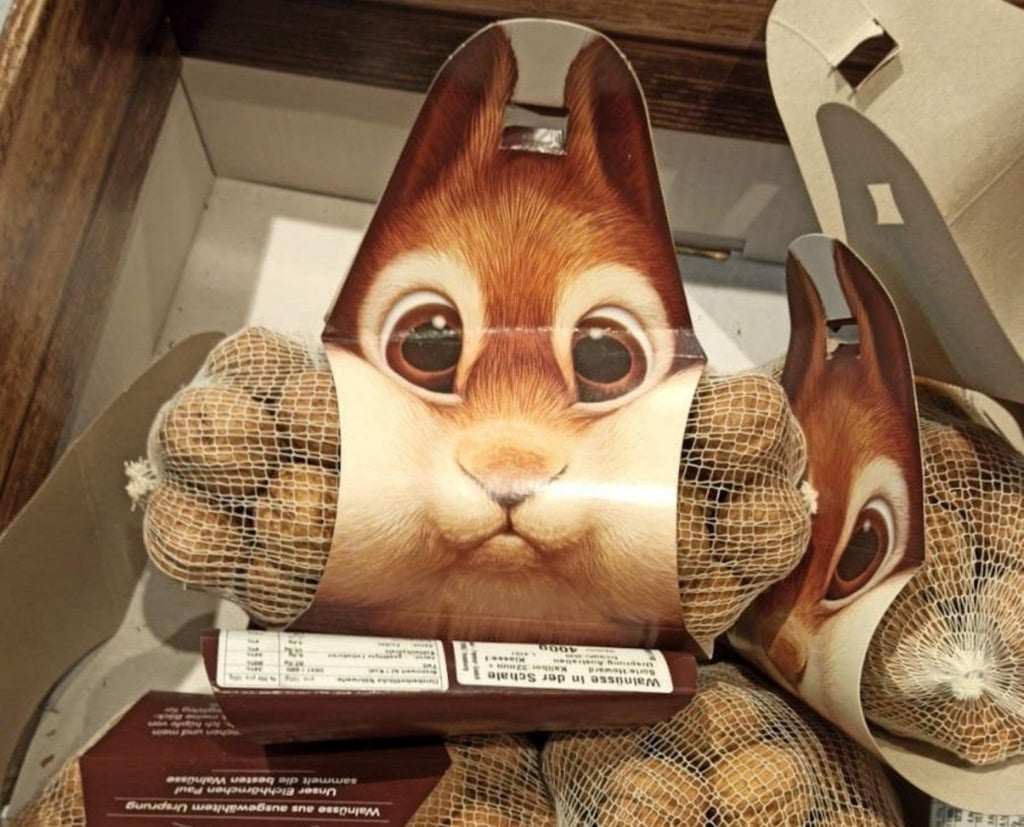
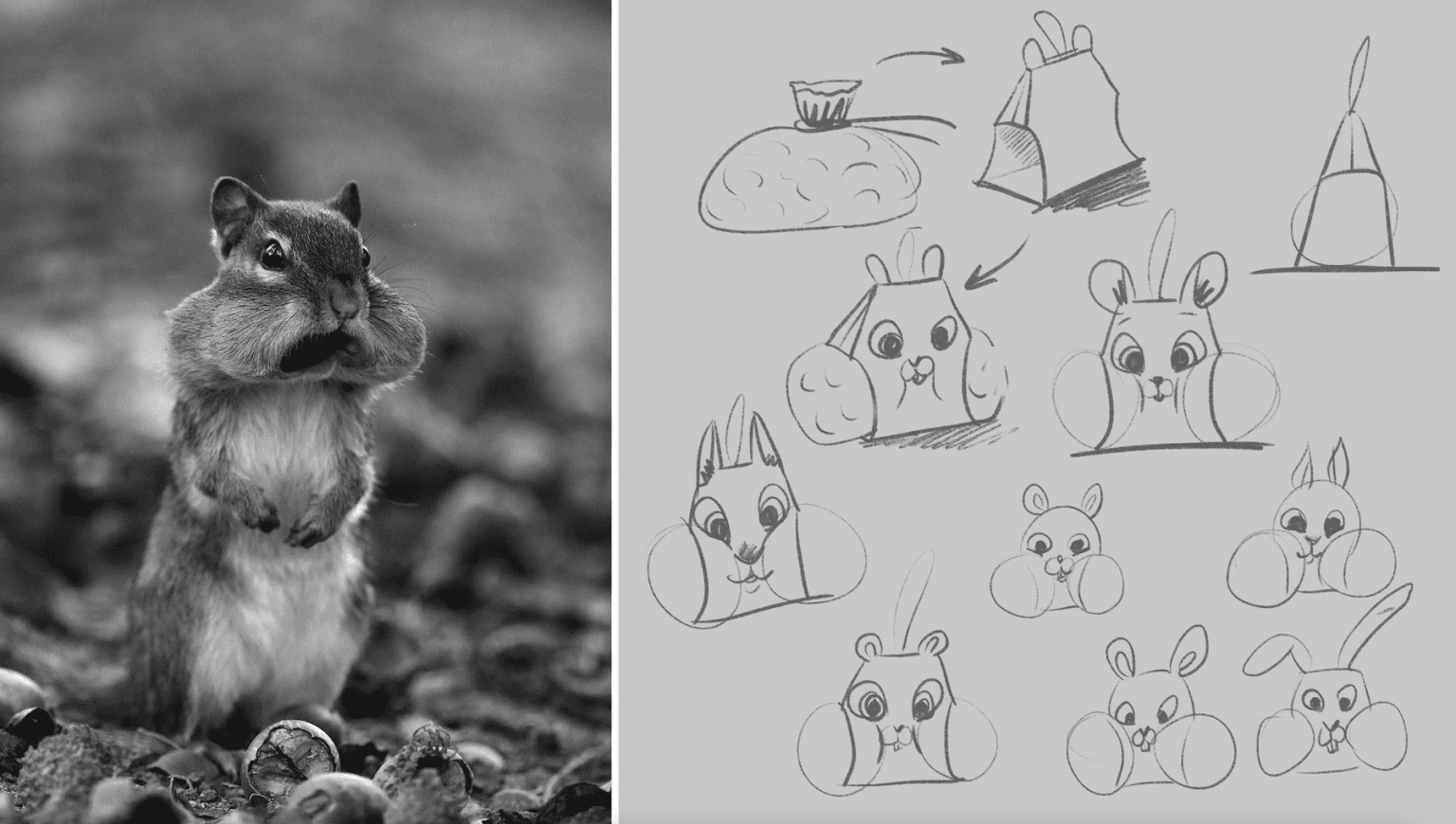
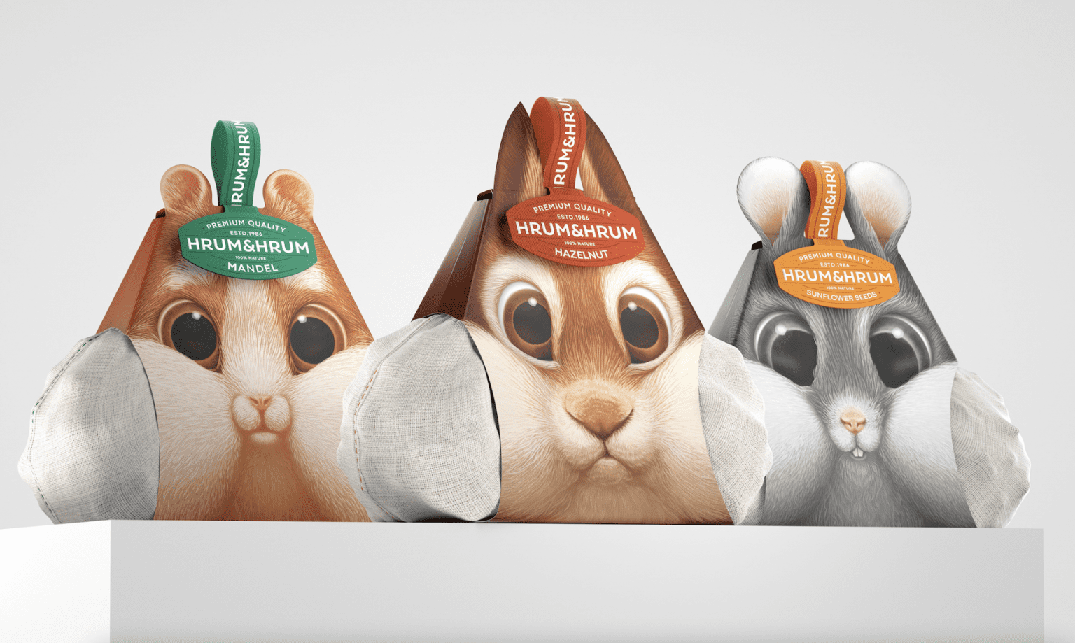
Let’s start with this packaging for walnuts, hazelnuts and other nut varieties created by designer Constantin Bolimond. The highly creative yet relatively simple paper design wittily takes the form of a squirrel whose cheeks are bulging with nuts.
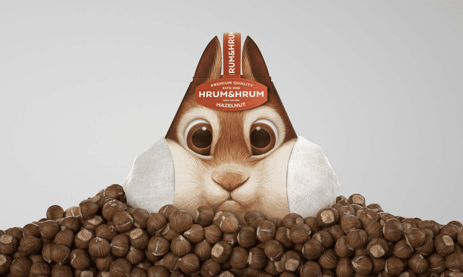
Hrum&Hrum. Credit: Constantin Bolimond
Packaging that’s useful
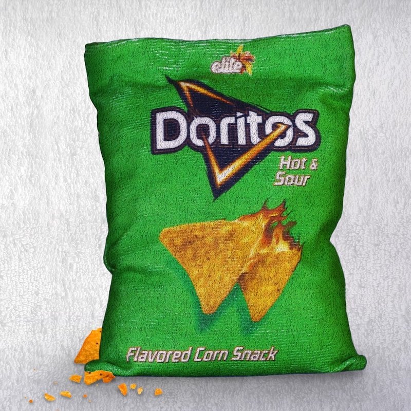
Everybody knows Doritos. In 2019, the brand famous for its marketing campaigns (and especially its TV ads during the Super Bowl) created a special cloth bag for wiping your hands on. Because you can’t eat tortilla chips without getting your hands dirty! The idea is simple: just slip your packet of Doritos inside the bag and you’re good to go. To create this 100% washable and reusable bag, the brand worked with Israeli design agency Gefen Team.
Packaging that fires the imagination
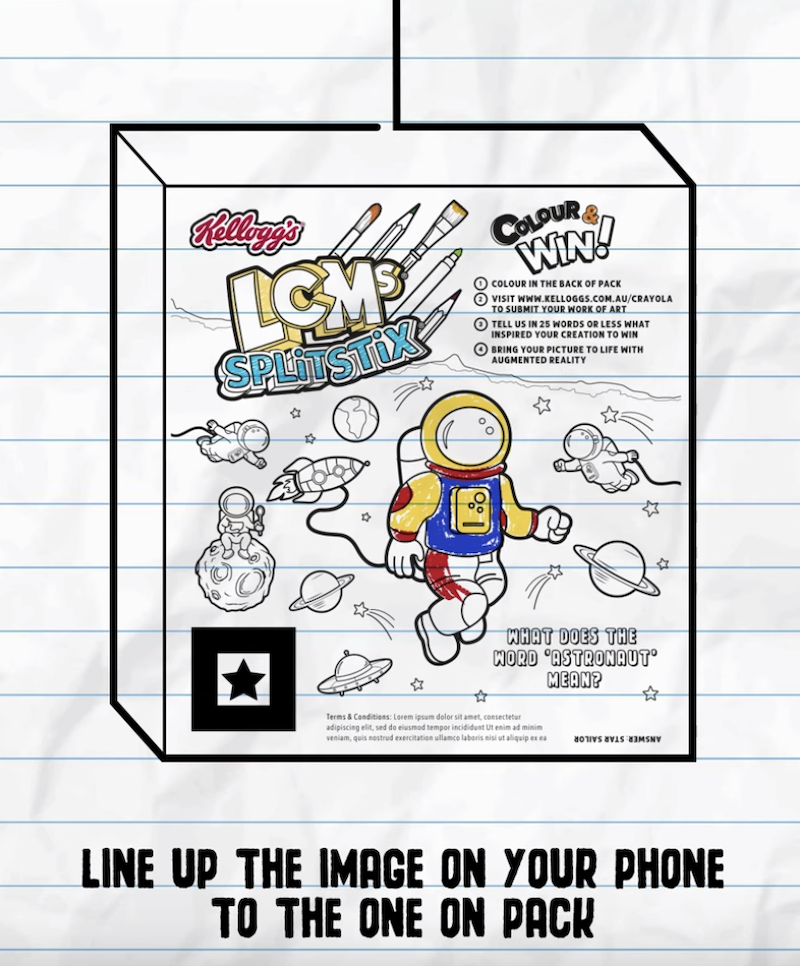
In Australia, to boost children’s creativity, Kellogg’s collaborated with The Kinetic Agency and Crayola to produce a series of black and white cereal boxes. The idea? To encourage kids to colour in packets and let their imagination run wild. They also developed an “augmented experience” app that brought to life the characters that kids coloured in.

Packaging that’s functional
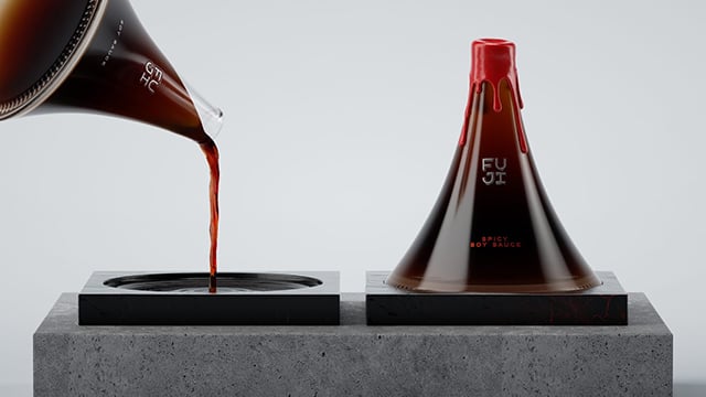
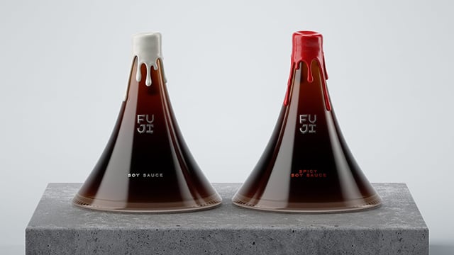
This packaging design for FUJI Premium soy sauce was the brainchild of student Evgenia Kudrinskaya. The clever design references Japan and its culture, in particular Mount Fuji, the highest mountain on the archipelago. The bottle comes with a base that can be used either as a stand or a serving dish.
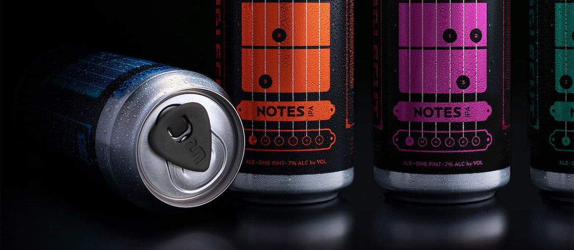
Packaging that’s fun and connected
Single cut is a type of guitar. And SingleCut Beersmiths is an American brewery founded in 2012 with strong ties to the music world. Together with design agency Zulu Alpha Kilo, the brewery created a series of cans designed to help drinkers learn basic guitar chords. Each can comes with a plectrum stuck to its pull tab. Of course, it’s probably best to practice before opening… Anyway, to complete the package, there’s also a Snapchat filter showing how to play various different chords.
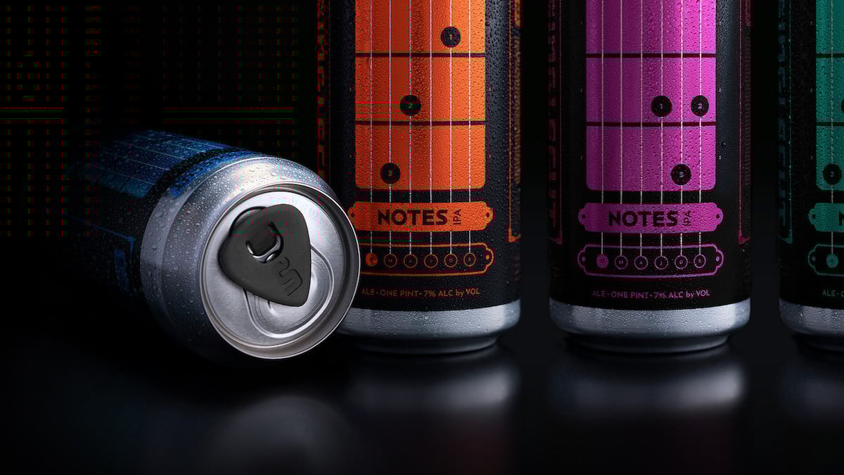
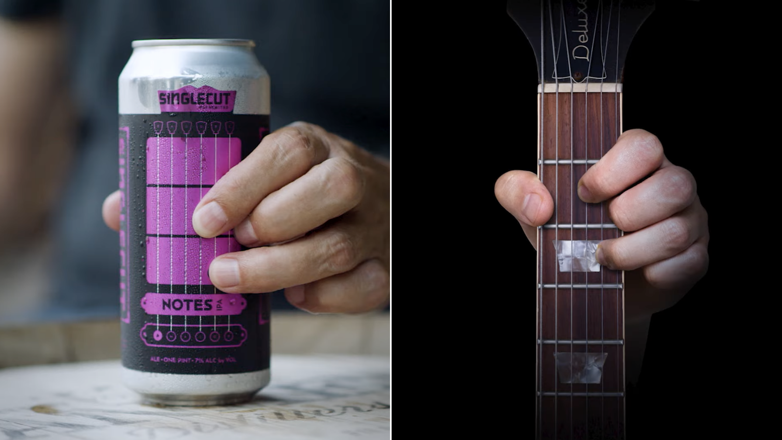
SingleCut. Credit: SingleCut
Packaging that’s ingenious
Pasta might be easy to cook, but it’s often hard to get the quantity right. So Alesia Lurtcevich designed a pack that also doubles as a measurer so you can get the portion right every time. The box has six pre-cut tearaway sections that are each the equivalent to one portion of pasta. Simple and ingenious!
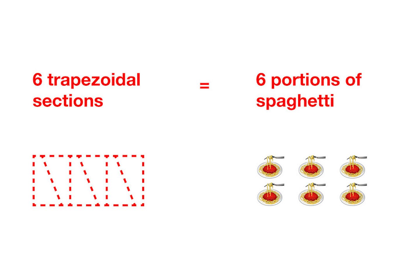
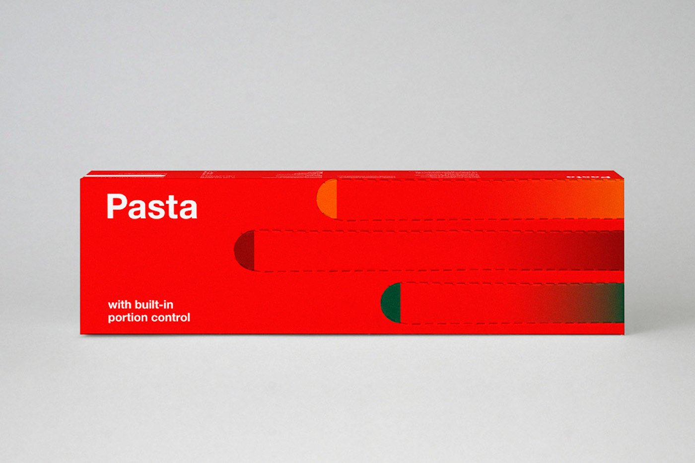
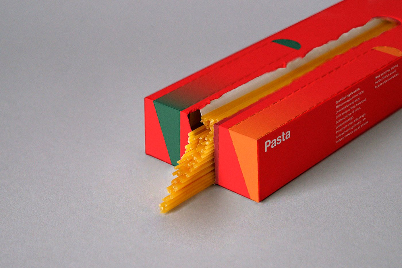
Pasta – the right dosage. Credit: Alesia Lurtcevich
Packaging that’s eco-friendly
Devised by Armenian branding agency Backbone, this rice packaging is special because it’s environmentally friendly, highly functional and pays homage to little producers. Indeed, it implicitly tells consumers about the way the rice was produced. The little hat, which resembles those worn by traditional farmers, can be used to measure portions of rice. The RiceMan logo was hand drawn by an Asian calligrapher. And the packaging – cloth covered with a card lid – is made from 100% sustainable material.
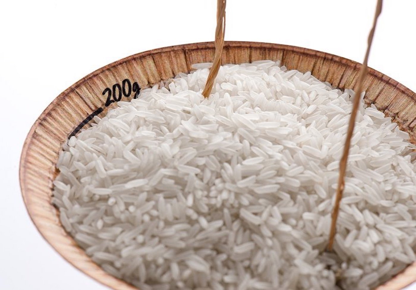
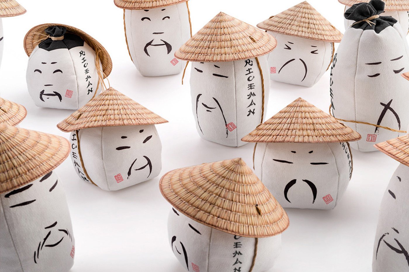
RiceMan. Credit: Backbone Branding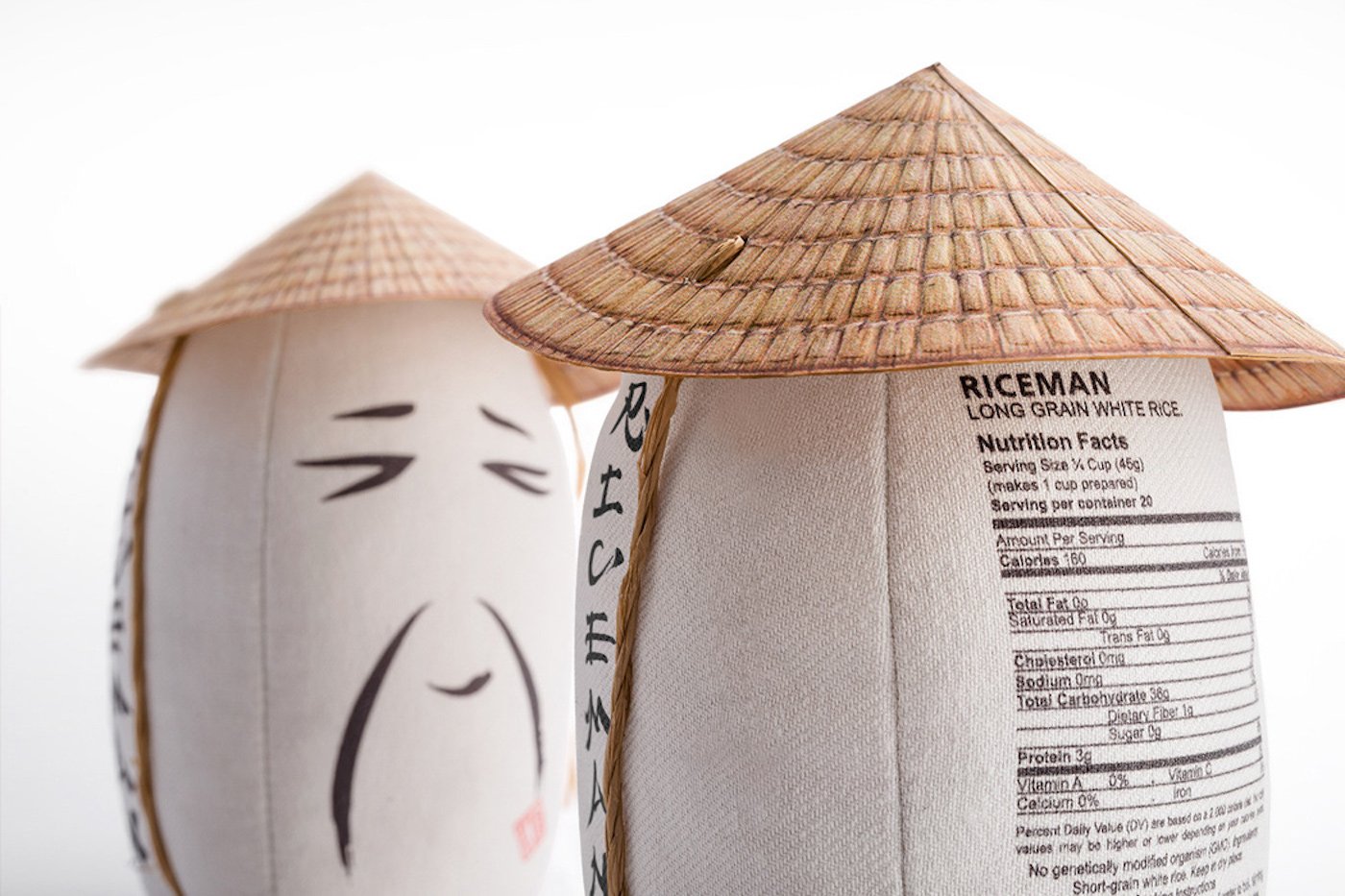
RiceMan. Credit: Backbone Branding
Packaging that’s political
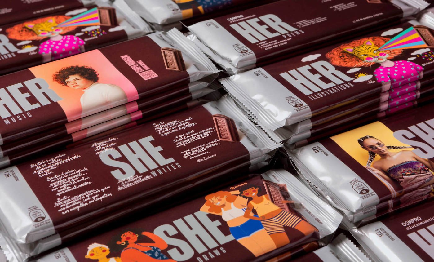
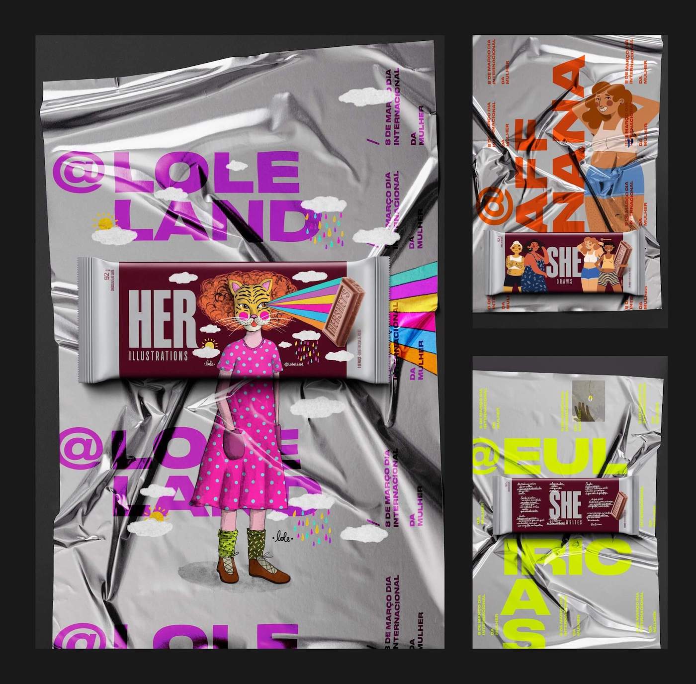
Lastly, to mark the occasion of International Women’s Day on 8 March 2020, Hershey’s and BETC / Havas decided to play with the brand name, spelling it as HerShe and using the packaging to promote the work of six female talents (musicians, singers, illustrators writers, and poets). The result was an art exhibition in chocolate wrapper form.