
Table of Contents
Futurism was born in a period of turmoil as a revolutionary movement that sought to renew every art form to keep step with the technological and industrial innovations that were emerging. Futurism emphasised speed, technology, youth and violence and the things that embodied these qualities, such as the car, the aeroplane and the industrial city in general. Traditions of the past had to be left behind to focus on the dynamic present.
The typographical revolution led by Filippo Tommaso Marinetti
Between 1909 and 1944, the years that are conventionally taken to mark the beginning and end of Futurism in Italy, the approach to calligraphy, fonts and typography saw a stark break with the past. Out went the typographical and literary conventions that had developed over the years to be replaced with more expressive and less rational composition. The composition of letters on the page now had to visually reproduce the verbal expressions they contained.

The Futurist typographical revolution began in 1912 when Filippo Tommaso Marinetti wrote his first “parole in libertà” (words in freedom), works in which words have no syntactic or grammatical connection between them and are not organised into phrases and sentences. The style was as phonetically revolutionary as it was visually. The sounds of the words, often onomatopoeic, and their typographical treatment on the page are of utmost importance in this blend of literature, music and visual art.
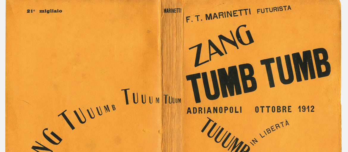
An example of words-in-freedom in use can be found in Filippo Tommaso Marinetti’s book Zang Tumb Tumb (1914) which celebrates the battle of Tripoli. The title evokes the mechanical sounds of war – artillery, bombardments, explosions. The typography reflects the crude and evocative power of the language. Rather than follow the rules of syntax and punctuation, the letters come alive and express themselves on the page.

The Futurist book
In the manifesto Destruction of Syntax–Wireless Imagination–Words-in-Freedom, Marinetti writes:
“I have initiated a typographical revolution directed against the bestial, nauseating sort of book that contains passéist poetry or verse à la D’Annunzio12—handmade paper that imitates models of the seventeenth century, festooned with helmets, Minervas, Apollos, decorative capitals in red ink with loops and squiggles, vegetables, mythological ribbons from missals, epigraphs, and Roman numerals. The book must be the Futurist expression of Futurist thought […]. My revolution is directed against the so-called typographical harmony of the page “.
Futurism’s graphic revolution did not stop at the page, but encompassed the whole book. In the twenties and thirties, the Futurists’ graphic experimentation extended to the form, binding, material and printing technique used for books, which became objects of art in their own right.
In 1927, Fortunato Depero, the Futurist painter, sculptor and designer, published Depero Futurista, a collection of his typographic experiments, advertising posters, tapestries and other works. Depero Futurista represented an evolution in the Futurist typography movement began by Marinetti, and was the first book-object.
Packed full of daring graphic experimentation, innovative page layouts and work from every artistic discipline, Depero Futurista is also known as the Bolted Book because it is bound by two large industrial bolts.

Reflection on the book’s form stretched to materials. The idolisation of cars and planes suggested that metal was one of the materials most representative of the Futurist mindset. In this context, Zinola’s “Lito-Latta”, a sort of workshop for producing lithographed metal boxes and cans, became a hotbed of Futurist art. Lito-Latta was renowned for having printed two famous book-objects that were directly lithographed onto tin plate: Words in Futurist, Olfactory, Tactile, Thermal Freedom by Filippo Tommaso Marinetti (1932) and The Lyrical Watermelon: A Long, Passionate Poem by Tullio d’Albisola (1934).
The layout of Words in Futurist, Olfactory, Tactile, Thermal Freedom is a constant surprise; at the same time, it emphasises the material from which it’s made with explosive and dynamic compositions.


Futurist, Olfactory, Tactile, Thermal Freedom (1932)

The Lyrical Watermelon presents Tullio d’Albisola’s words-in-freedom poems each accompanied by a Bruno Munari drawing, printed in 101 hand-bound copies.

Bruno Munari, today chiefly remembered for his work in the sixties and seventies, began his career as a designer when Futurism was at its height, producing lesser known but equally brilliant work.
In 1937, he contributed to the “Almanacco anti-Letterario Bompiani”, creating the photo montage for the insert entitled “Udite! Udite!”, which included Mussolini quotes on each page and a circular hole revealing the face of Il Duce as if seen through a telescope, so that his face was ever present as it was read.


Would you like to help us add to or improve the content of this article? Check our guidelines and send us your request via email at: seo@pixartprinting.com.