
Up until the 1920s, the colour pink was not generally associated with the female gender. In fact, quite the opposite was true: within the bourgeois, pink was seen as a ‘boy’s colour’ and was the counterpart to the feminine blue, which, based on Christian tradition and classical paintings, was ostensibly the colour of the Virgin Mary.
In 1914, The Sunday Sentinel advised its readers to observe convention and dress boys in pink and girls in blue; however, during the 1920s, blue became the colour of the male labour force, inspired by their work suits and naval uniforms. In the same way, red tones came to be seen as the colour of women. Mass production cemented this distinction. Since then, the association of colours with gender groups has become so deeply ingrained in our collective psyche that it would appear to be an innate, genetic part of humanity – rather than a mere custom. ‘Girly pink’ not only defines the corporate design of children’s brands like Barbie and Hello Kitty, but also of many products aimed at grown women.
With gender marketing, busy advertising departments have done a fine job in serving stereotypes through shape and colour schemes – everyday visual sexism greets us on the shelves of supermarkets and pharmacies in particular. Cliché-laden packaging meant to encourage purchase is tailored to specific target audiences; according to the rules of gender-based packaging, everything, at least in the finer details, is pink and rounded for women and dark and rugged for men.
Marketing departments know how to use this distinction to their own advantage. They employ gender mainstreaming to market their products. Yet far from feeling represented by this method of marketing, many consumers feel pigeon-holed by it.
When products and packaging are advertised as women’s products solely because of their cliched colour scheme, extreme gender mainstreaming can lead to faux pas. In the digital age, this manifests itself as consumers expressing their annoyance through customer reviews and Twitter threads. A well known example of this is the ‘For Her’ pen by BIC. The special-edition pink ballpoint, which the company claim was designed specifically for ‘delicate lady hands’ was met with derision on social media and was consequently taken off the shelves.
Various studies, including for example From Cradle to Crain – The Cost of Being a Female Consumer, have investigated the pricing of products aimed at women and men. It was found that products advertised as being for women are often significantly more expensive than the equivalent products for men. The aptly named pink tax was not only found to apply to toiletries, but also to children’s toys and clothing. Here, design gives rise to imbalanced power structures that legitimise a culture of sexism. Sadly, at many companies that present themselves as sustainable and forward-thinking, environmental and equal-opportunities policies are not reflected in the work of the design and marketing departments. Indeed, gender marketing turns out to be little more than gender stereotyping: women love princess-pink, especially in combination with sleek, sparkly packaging, while men love everything in matte black, dark blue, or chrome which promises ’48-hour’ protection and comes with ‘3-in-1’ benefits. ‘FOR MEN’ and ‘Sport’ are emblazoned on packaging that provides a burst of information within a limited space, ensuring that men perusing the supermarket shelves can make decisions as quickly as possible.
These kinds of purchasing decisions are influenced by the design of the packaging, meaning that the consumer’s needs are often misjudged. Indeed, an increasing number of people identify as non-binary, while others simply do not want to be defined by their gender or see themselves as genderless. In response to these developments, packaging designers are finding new, creative solutions and consciously choosing gender-neutral packaging for unisex products, thereby doing away with tired old notions. Design helps to inform reality, and gender-neutral design is a response to the diversity of society.
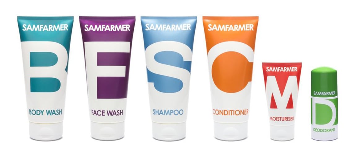
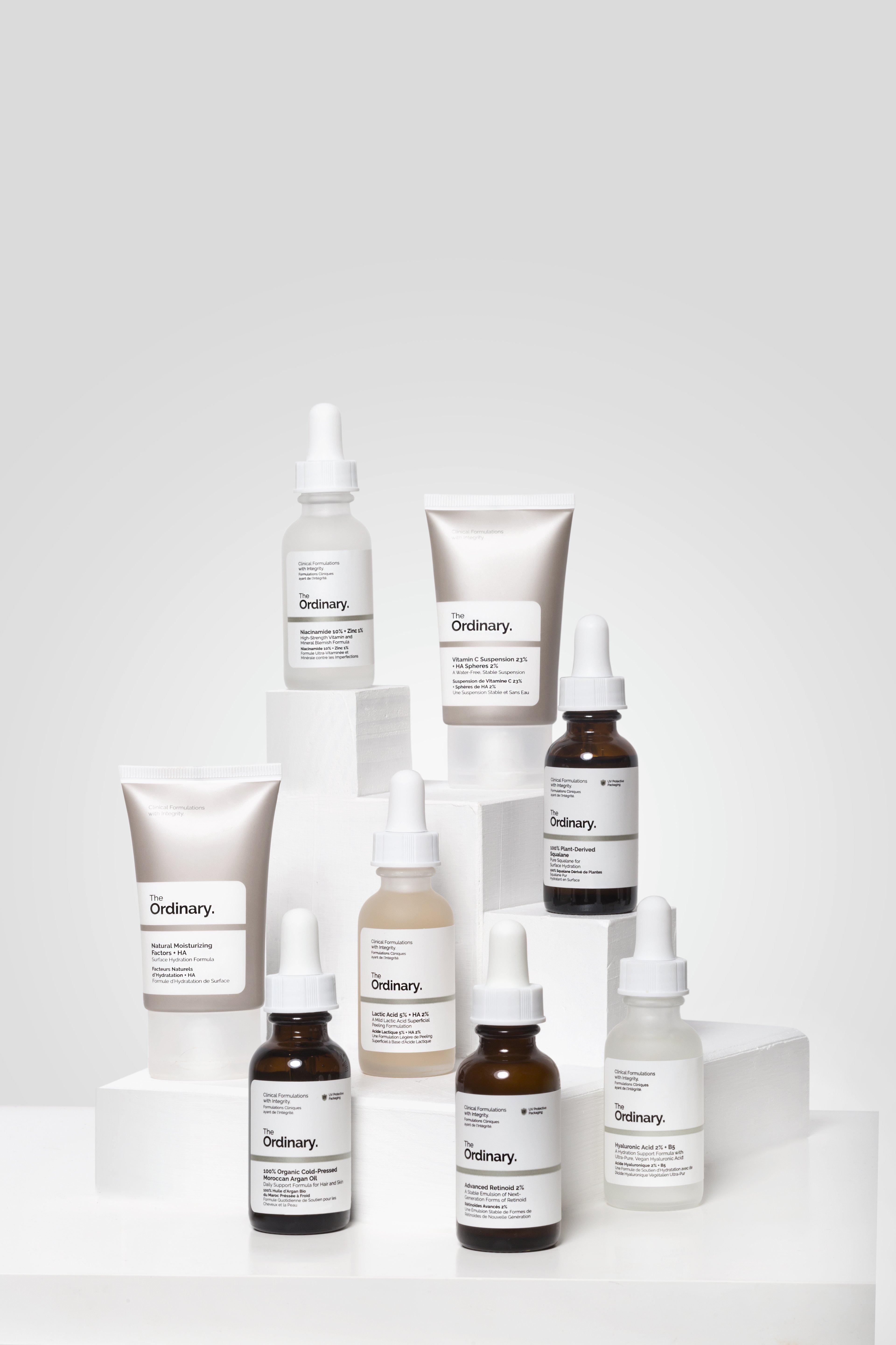
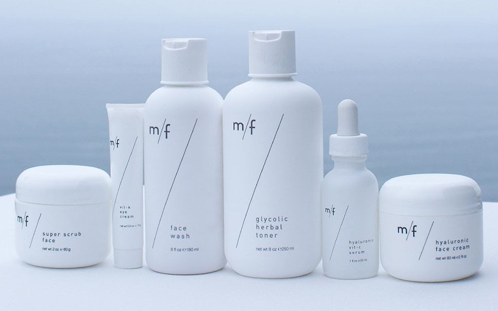
Through simple, gender-neutral packaging, brands like The Ordinary, m/f, and Sam Farmer strike the right chord, and this helps them to achieve success. The fragrances of their products are designed to appeal to everyone’s sense of smell. The packaging is unapologetically minimalist. Their restrained designs bring to mind the trustworthy packaging found in pharmacies, while their choice of font and generous use of white space give them aesthetic appeal.
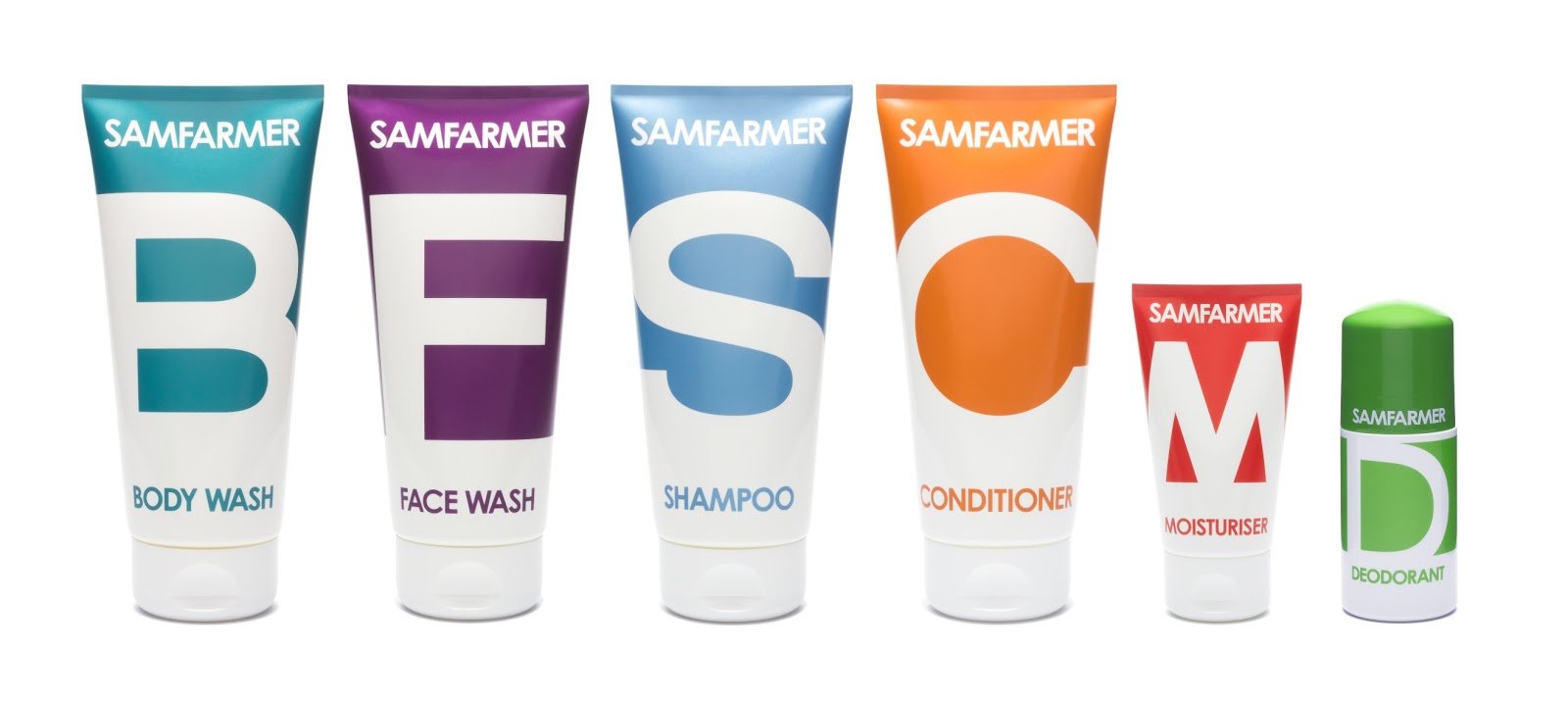
Many young brands that pride themselves on their gender-neutral packaging design also value environmentally friendly packaging materials. Their adverts communicate their message through design, with shots of models confined to the background. Rather than with slogans like ‘forever young’ or ‘forever beautiful’, the product is advertised through the quality of its ingredients. The packaging design draws attention to the function of the product and not to the biological sex of the consumer and the stereotypes associated with it; it is a response to a changing society and everything it encompasses. Gender-neutral packaging does not mean compromising on creativity, but rather discovering design possibilities that work ‘for everyone’.