
Often undervalued, typography is in fact one of the most important facets of design, and one that should rarely be left to chance or personal preference. Designing or setting a reader-friendly font means combining knowledge about the writing system with creative expertise. Variable fonts show just how closely the design of typefaces correlates with technological advancement.
Since typography is traditionally a craft that requires precision, generative typography represents a game-changer – one that is set to overhaul to process of designing fonts and symbols. By altering one or several parameters, it is now possible to create multiple designs based on a single font. Different widths, line thicknesses, and font angles or styles are interpolated based on specified limits; alongside typical settings like extra-thin or semi-bold, these yield countless possibilities. The variations cover over 64,000 axes that may affect not only the typeface’s width or thickness, but can also influence properties such as the serif form.
Another function enables short typographical animations to be created through interpolation – a feature that is especially suited to experimental display fonts. This generative sort of typeface design also allows the user to produce (typographical) animations that are particularly suited to animated banners. In theory, it could also be used to create non-alphabetical shapes to be integrated into animations. The Wind typeface, an experimental display font, designed by Hansje van Halem and published by the Typotheque type foundry, is just one of many examples of this kind of moving typography.

The foundation for variable typeface design was developed in collaboration with leading global tech giants Apple, Adobe, Google, and Microsoft. The project was presented as an expansion of the OpenType specification at the 2016 Concergence typography conference in Poland. The main objective was to make digital fonts easier to develop, share, and use.
The idea is not a new one, however. Back in the early ’90s, Adobe were at work on a similar project, Multiple Master Fonts; their aim was to meet the demand for limitless variation in typeface design. Due to compatibility issues and complexity, however, the project did not come to fruition. Since Adobe is now collaborating with other companies, today’s project – which, unlike the previous model, is user-friendly – is set to establish itself for web, and later for desktop use.
Yet further variations do not necessarily ensure that more typefaces will be selected, or that they will be put to better use. For graphic designers, variable fonts mean, above all else, that they can choose a font family from a larger selection. For example, in Autumn 2017, typographer Robert Slimbach’s Acumin became one of the first fonts to be presented via Illustrator CC and Photoshop CC with over 90 variations for users. It could be manipulated using sliders on the Axes tool, creating new font styles. In contrast to the many modifiable features and endless choices that variable fonts provide, there are limitations that used to be increasingly rare in digital typography. For instance, Acumin, as well as other variable fonts, lacks special characters, since often only the most necessary characters are available. Of Acumin‘s 90 font variations, there are just two in italics – the individual characters can only be tilted using an axis.
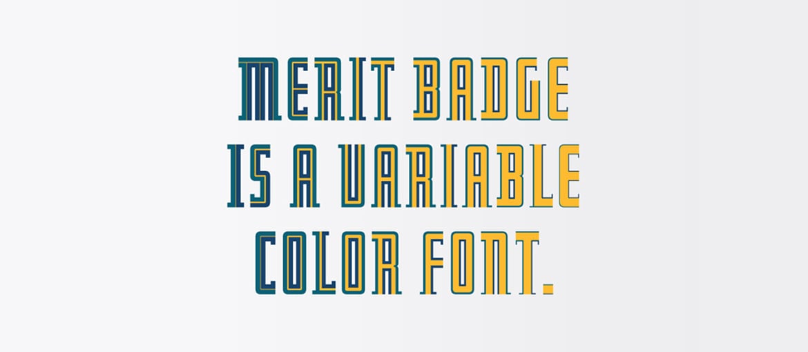
A further problem for users working with moving fonts is that combining typefaces, for which there are now infinite possibilities, calls for greater finesse and skill. After the fonts have been automatically generated, the application stage becomes a true balancing act. Another small hurdle that still prevents variable fonts from being used to their fullest potential online is their incompatibility with browsers; they only work with the newer versions of Chrome and Safari. Indeed, even on websites and apps, text used to be an exclusively static element. Entire font families can now be saved to a single font file with more styles and (using codes) additional colours. They therefore not only adapt to the designer’s specifications, but also make for improved visuals and a more pleasant reading experience. For example, David Jonathan Ross’s Merit Badge typeface brings together variable typography and colour. A result of his ‘Font of the Month’ project, the multicoloured font changes it colour based on additional code.
Made for testing variable typefaces, Variable Fonts – or v-fonts, for short – is a practical web-based tool designed by Nick Sherman. The site aims to enable users to test out variable fonts with ease. It also conveniently provides information on the font styles, their designers, and much more.

A further source of information is Very Able Fonts by Dutch type foundry Underware. Predictably, the website only works on browsers that support variable fonts.

Variable fonts are revolutionising typography, posing not only new challenges, but also new questions – particularly when it comes to payment processing and licensing: do the prices for high-quality typography decrease with the smooth and simple interpolation of fonts? How much is a font family worth if it contains numerous font styles that are generated, to some extent, automatically? Are differences in quality part and parcel of variable fonts? These questions will certainly require some attention going forward.