
Hugely experienced typographic designer Paul McNeil shares with Pixartprinting ideas, experiences and a glimpse of what the future holds for visual communication and type design. McNeil has an incredible breadth of subject knowledge thanks in no small part to his monumental work seven years in the making.
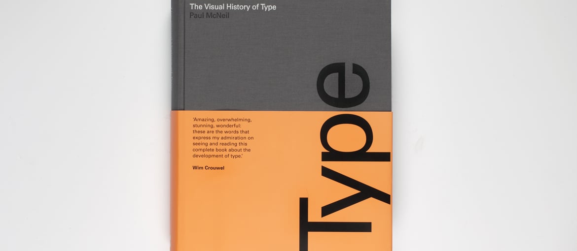
He has over 30 years’ experience working as a typographic designer in brand communication and visual identity for telecoms firms, governments and charities in the United Kingdom. Paul McNeil is a typeface design veteran: we’ve already briefly talked about his book, The Visual History of Type, in a previous post, but the meticulous research that went into each of the 672 pages that make up this hefty tome – a chronological history of type – and the very design of the book itself merit further exploration.
As well as leading a successful career as a designer, McNeil has also worked in education, teaching design at the London College of Communication, where he was Course Leader for the Master in Contemporary Typographic Media from 2010 to 2015.
In 2010 he co-founded MuirMcNeil with Hamish Muir, an agency that focuses on parametric design. Today, he is Senior Lecturer in Typography at the London College of Communication.
I chatted to McNeil about the evolution of the industry over the past decade, as well as the past and future of type design.

1) Tell us about your experience as a designer, how you took the first steps in the industry and how this has changed over the years.
I started out as a graphic designer working in the early 1970s as a junior in a large ‘commercial art’ studio. At that time the design industry was undergoing a massive transformation. Where almost all visual communications for publicity before that time had centred on processes of sketching, planning and specifying accurate instructions to various expert subcontractors such as typesetters and printers, in the early 1970s, instant lettering and photosetting arrived.
Combined with quick, cheap and efficient offset-litho printing methods, these brought about a revolution in visual communications, shifting core activities away from traditional printing houses to designers and typographers – people like me. These changes stimulated the growth of the graphic design profession, placing control of the origination of printed communications into users’ hands for the first time and directly foreshadowing the digital revolution of the late 1980s.
By that decade, I’d had my own studio for some years, running a business in branding communications and visual identity design largely for corporate clients in the technology and telecommunications sectors. When the first affordable, user-friendly design software packages were released for Apple Macintosh computers, a seismic shift in the design, printing and publishing industries occurred – the so-called ‘desktop-publishing revolution’. For my business, this meant lower costs, faster turnarounds, higher productivity and higher profits. In 2001, this allowed me to take time out in order to study for a Masters Degree in Typography at the renowned London College of Printing. Since then I have been much more selective in the direction of my commercial practice.
My career and my experience illustrates how the industry has changed quite accurately, I think. What used to be ‘commercial art’ has now become much more closely integrated with brand communications and where it used to be predicated on a definition of design as a difficult predictive activity directing the work of other craftspeople, it is now a much more flexible, economical and personal process. Technology has made it possible for anyone who wants to design to be able to do so. Although I would not go so far as describing this as democratization, it has made design for publishing (in the sense of ‘making public’) accessible to many people, and in doing so, has devalued it drastically. It should also be said that the field of graphic design today is far more diverse than it was forty years ago.
2) Why The Visual History of Type? From the historical approach to the design of the book it’s clear the intention to propose something different compared to other books and publications on the world of type.
I regard type and typography as the central pillars of communication, rather than merely as part of a design toolkit, and have been studying them throughout my career. A few years ago, I became aware of the absence of any definitive histories of type other than Jaspert, Berry and Johnson’s seminal Encyclopedia of Typefaces, which has been continuously in print since 1953, and Sutton And Bartram’s unsurpassed Atlas of Typeforms from 1968 — two books I hold in the highest regard. Working with students on a daily basis, I was also increasingly awareof their comparative lack of knowledge of the history of type. I wanted to fill the gap, not solely because of its usefulness in helping designers and students to understand how and whytype works but also because of the exceptional richness of its historical connections. Type is a microcosmic representation of culture that relates not only to technological development but to the aesthetic milieu of different eras and to cycles of social and ideological change.
Having been responsible for generating a considerable amount of printed material during my career, I was determined to avoid what might be called a conventionally rhetorical approach to the design. In many books, the layout and the typography deliberately draw attention to themselves (and thus to their designer) as if to compensate for deficiencies in content, in order to ‘make a stupid thing look beautiful’, to paraphrase the words of the designer and typographer Erik Spiekermann.
The approach to the design of The Visual History of Type is the exact opposite of this. Its structure and editorial approach are both intended to be plain and clear in order to provide a definitive visual survey of the major typefaces produced since the advent of printing in the 1450s until the present day. The emphasis throughout is on the faithful representation of key historical typefaces presented in their original specimens or, where more suitable, set in contemporary documents. All 320+ typefaces are displayed, at actual size or as close as possible to it, on spreads that are arranged systematically throughout, supported by succinct summaries of the development, appearance and application of each design, and tables locating it firmly within its context.

3) Can you explain the criteria for inclusion of type and exclusion of others? How much did the “beauty” or “usefulness and readability” of a type make the difference to a potential inclusion in the book?
Because I’ve been absorbed by design and typography for a quite a while, I had a reasonably clear idea of the typefaces I wanted to include from the outset of the project but I made many fantastic discoveries on the way, like Vojtěch Preissig’s extraordinary Preissig Antiqua from 1923 or Sandrine Nugue’s Infini from 2015, for example. Everything was itemised on a spreadsheet that was constantly updated as I visited libraries and archives while also receiving selections of images from the expert picture researchers at Laurence King. Of the 320+ typefaces represented in the book, many were no brainers. They had to be included because they are widely upheld as ‘classics’ having proven time after time to be readable, versatile and unobtrusive; designs such as Garamond, Caslon and Baskerville, for example. Because generations of readers have found these familiar forms effortlessly legible, generations of printers and publishers have depended on them and they have become accepted as durable benchmarks of typographic excellence, efficiency and beauty.
But the objective of The Visual History of Type is to present an accurate picture of every stage of its development. Not all typefaces are required to be either beautiful, legible or enduring. Some just need to draw attention to themselves and to the messages they convey. The book therefore includes several typefaces that may have only survived briefly, such as the extravagant novelties used for advertising during the early nineteenth century. The book also includes a number of ground-breaking experimental designs that may have failed commercially or never have been published at all, but that opened up discussions leading to new directions in the development of the field, like Wim Crouwel’s celebrated New Alphabet from 1967. Although my own preferences have influenced me of course, they have all been hand-picked diligently on the basis of their relevance to the chronological narrative instead of those that some people might deem more beautiful, legible or worthy. A consistent theme running though The Visual History of Type is the evolving relationship of technology and ideology, from the mediaeval period through to the modern era – and to today. The evolution of type represents these cultural shifts very effectively in visual form.
It is no exaggeration to say that I find type and typography utterly fascinating: they are products of human ingenuity that have had an influence on civilization greater than any other. On an almost daily basis I discover a new typeface that I wish I could have included (Bely, Nordvest, Minerale, BW Gradual, Brutal, Sang Bleu or IBM Plex for example) but, at the same time, I’m utterly delighted not to have to worry about changing the things I can’t change.

4) Who were your mentors, who inspired you for your work as a designer, especially for this book? In your opinion, since you are also a lecturer, which are the essential books for a type design student, but also for a professional, to keep in your library?
Without hesitation, I would cite Karl Gerstner’s work as a lasting inspiration. A Swiss graphic artist, his typographic work was always highly stylish but always self-effacing, not showy. His work is characterized by his thoughtful, analytical methods and a sense of intellectual enquiry that make it both aesthetically pleasing and conceptually challenging. His Designing Programmes (1968) and Compendium for Literates (1974) are seminal works that I recommend to anyone interested in visual communications.
My tutors at the London College of Printing, Ian Noble and Russell Bestley, will also always be hugely significant to me not merely as sources of expertise and knowledge but of confidence and positive engagement. The ideas underpinning their approach, as evidenced in their publication Visual Research, allowed me to begin to understand design not solely as an activity but as a way of seeing the world through a critical lens and of interacting with it accordingly. I remain eternally in their debt.
Essential reference books for type design students are few and far between. It’s a comparatively secretive and somewhat myopic industry whose practitioners are rarely keen to share their knowledge and skills, perhaps understandably, since their audience is not a general one. The most vital publications are the catalogues of the great foundries of the twentieth century – Monotype, Linotype, Berthold and American Type Founders in particular. People interested in type design should also keep abreast of the work of contemporary foundries, both large and small, always giving careful consideration to the provenance of new designs when looking at artefacts online. Many excellent print publications can always be found in the type design area. Of these, I would recommend Verlag Hermann Schmidt’s recent Futura and Birkhauser’s Adrian Frutiger Typefaces, the Complete Works as exemplary monographs.

5) How much has digital technology transformed the production and the design of new fonts?
Radically and irrevocably, like everything else in the digital realm. Some say that, as a result, we are now seeing a golden age of type design with more elegant, effective and sophisticated typefaces being produced by an increasingly mature community of type designers. Others believe that, since digital mediation has returned visual communication to the status of a personal tool for anyone with a computer to use at will, its quality is diluted and debased. Time alone will tell.
6) How has the print design industry changed with the increasingly pressing importance of digital technology?
Although digital media are now prevalent, obviously, they have not displaced print as dramatically as some have suggested. We often tend to see things that are different as oppositional – for example the idea that print is completely dead because we now access most information through screens. But there’s a good deal of evidence to suggest that both old and new media can and do co-exist and that they will probably continue to do so. It’s been a long time since print and publishing were the sole vehicles of mass communication, although in certain ways printed matter remains more interactive, more immediate and more personal than its digital counterparts and, unlike them, it will always have the merit of holding a value that is proportionate to what is invested in it, as much in terms of provenance and verification as cost.
Publication as a book is undoubtedly the most appropriate medium for The Visual History of Type because it provides a close fit between form and content: much of its subject matter relates directly to printing. There is currently no digital equivalent for such a commitment. It would be wonderful to see The Visual History of Type developed as a website with a continuously expanding relational database, providing that editing, curation and reproduction are to meticulously high standards.

7) So let’s talk about the future: how much can you still experiment with typographic characters, does the world need new fonts?
Max Kisman pointed out many years ago that anything can be a typeface – this remains a valid axiom. Everything depends on the definition of a ‘typeface’.
Does the world need new fonts? If it doesn’t need any more typefaces, then it doesn’t need more of anything at all. We must all look alike, dress alike, sound alike, eat the same food, sing the same song, watch the same show, listen to the same music and read the same book.