
Resolution, colour models, margins, composition, compression and formats are just some of the terms that graphic designers use in their work when preparing files for printing or for web publishing.
In this article, without going into too much detail and steering clear of jargon, we’ll try to get to grips with how best to prepare images for use, and how to make your communication materials more effective.
Vector or bitmap?
This is often an insoluble dilemma for those who aren’t graphic design experts. Bitmap images are the images you produce, for example, when you take a photo with your smartphone, or those that make up the pictures on your TV screens at home. They are made up of lots of tiny coloured dots, and the more dots there are, the more detailed the image is, and so the higher is the resolution and the more megabytes of hard drive space it takes up.
They are called bitmap images because they are literally maps of bits, or information. They are sometimes also known as raster images.
Vector images instead are images produced by software like Illustrator or AutoCAD: they contain a collection of information that is more accurate than bitmaps: not a map of bits, but instead details on the geometry of the lines, on colour filling, object positions, gradients and so on. The name comes from the fact that they’re based on lines, or vectors.
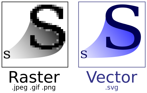
Bitmap images are the ones you’re most likely to come across, and are used by the most widespread image formats.
Image formats
For decades, research groups, companies and developers have been honing new formats to keep the file size of images down.
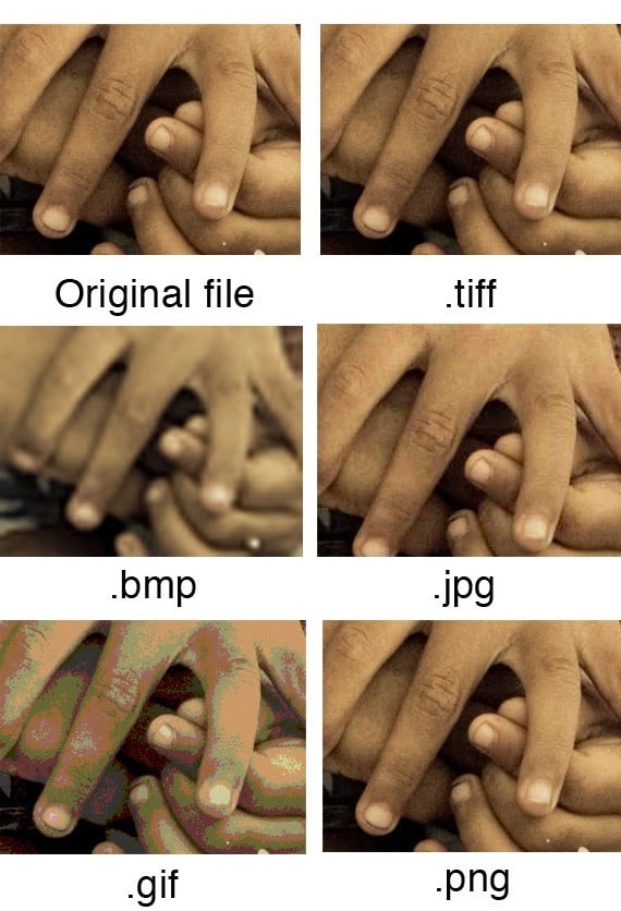
If you compare the quality of a JPEG (or JPG) file today with one from 15 years ago, the difference is incredible: nowadays a good JPEG can be used for printing, while 15 years ago it would have been out of the question! This means that images come in lots of different types, with a wide range of file extensions.
The format of choice for printers is TIFF, which combines high image quality with a significant file size.
JPEG images, on the other hand, have a very small file size (an A4 format image can be just 1 MB and still be good quality).
This is because the JPEG format removes any information it deems superfluous. If the image does not require any further modification (for example correcting the colour) it can be perfectly fine for printing, assuming the resolution is high enough. JPEGs are known as compressed files, and employ the same mechanism used for MP3 music files: all the unnecessary frequencies are removed to reduce their file size, while remaining suitable for listening on devices of ordinary quality. If you listen to an MP3 with a high-quality stereo system you will notice it is flat, lacking in dynamic range, and missing many subtle elements from the sounds, making it less engaging. However, if you’re listening to an MP3 through your smartphone on your commute, you don’t expect a high-quality listening experience, and so a poorer-quality sound is fine.

Here are some other popular formats, in addition to JPEG:
PNG, useful for web publishing, especially because it can include transparent sections;
PDF, a truly versatile format that can be either bitmap or vector, can contain a host of additional information and is perfect for printing files, but is not suitable for the web;
SVG, a widely used vector format;
GIF, initially designed as a ‘lightweight’ bitmap format with a limited number of colours, it has become the standard for simple animations and very short videos.
In addition, every software (graphic design, video or audio editing, photo editing etc.) has its own proprietary format, a format that can only be opened by that specific software.
To use these files for printing or on the web, they have to be exported in the required format. Any graphic design project, such as a logo, needs to be exported in multiple formats so it can be used by the client.
Colour models
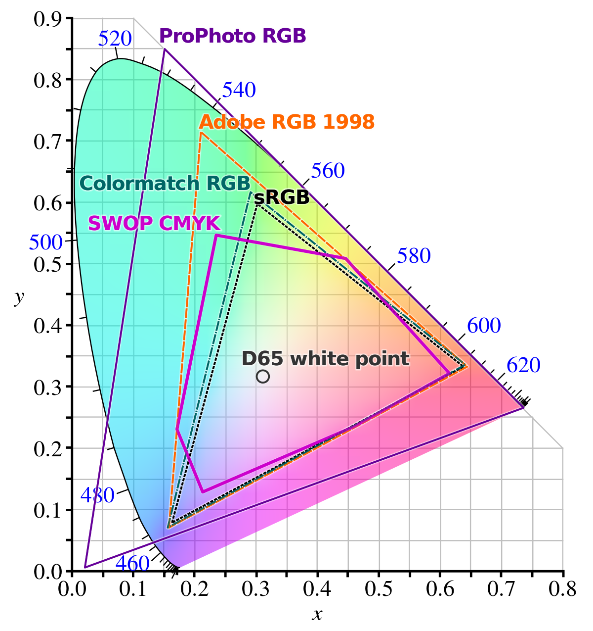
This is a complex subject that warrants further research. All you need to know for now is that the images you see on screens use a different colour model from printed images.
What does this mean?
It means that colour is formed differently, and perceived differently by our eyes, depending on the way it is reproduced. To put it simply, colour needs light to be seen. On a computer monitor or TV screen the images, and therefore the colours, are projections made of pure light. Black is not a colour, but rather indicates the absence of colour: when a screen is black, most of the time it is because it is switched off.
Instead, in printing, just like in painting, colour is created using extremely fine powders known as pigments. You can obtain all the colours you can possibly imagine by mixing them. White is both the absence of colour and a colour in its own right, and black is, more or less, the sum of all the colours (in reality combining all the colours gives you a very dark brown).
Because of these differences, you need to learn to use the RGB colour model for the web, and the CMYK (or four-colour) format for printing.
The problem is that certain colours that can be produced with one model cannot be produced with the other, and so a lot of care must be taken when exporting files.
For example, the RGB model used by monitors can reproduce many more shades of green than the CMYK model. CMYK is better at blues, but is a touch inferior when it comes to certain red hues.
Printing using the wrong colour model can lead to a substantial change in colour results.
Resolution
Once again, to steer clear of overly technical explanations, all you need to know is that resolution is the number of dots of colour (the bits we talked about earlier) each image contains. The higher the resolution, the more information it contains, and therefore the more detailed the image is. In general, offset and digital printing use 300 dpi (dots per inch) images, while for screens (web and video) the resolution is 72 dpi. Sending a 72 dpi image for printing could have embarrassing results, creating a grainy picture with visible dots or pixels that make it look like it has been put together roughly with Lego bricks.
The technical advice that follows should give you a basic idea of how to improve an image and ensure it is ready for printing or for publishing online. The best way to learn how to deal with images is simply to try, try and try again. Once you’ve done that often enough, you’ll be ready for the second part of this article, where we give you a few simple hints and tips on how to use images in your communication materials.
See you soon, and good luck!